Editorial Design
Supplements, guides and association publications for Delaware businesses and communities
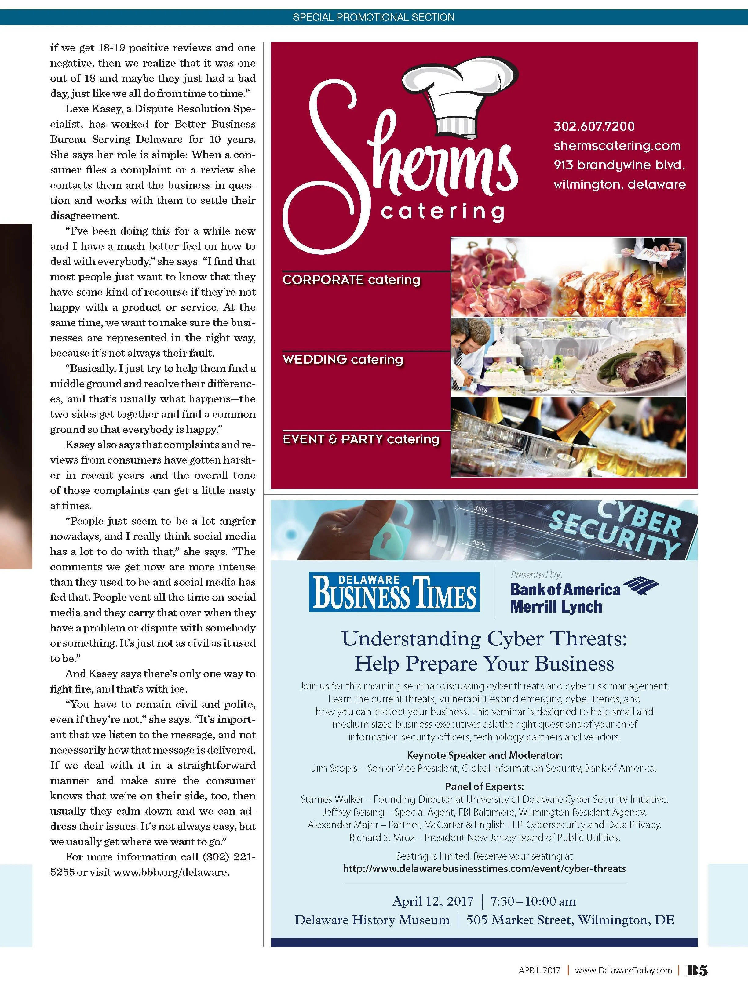
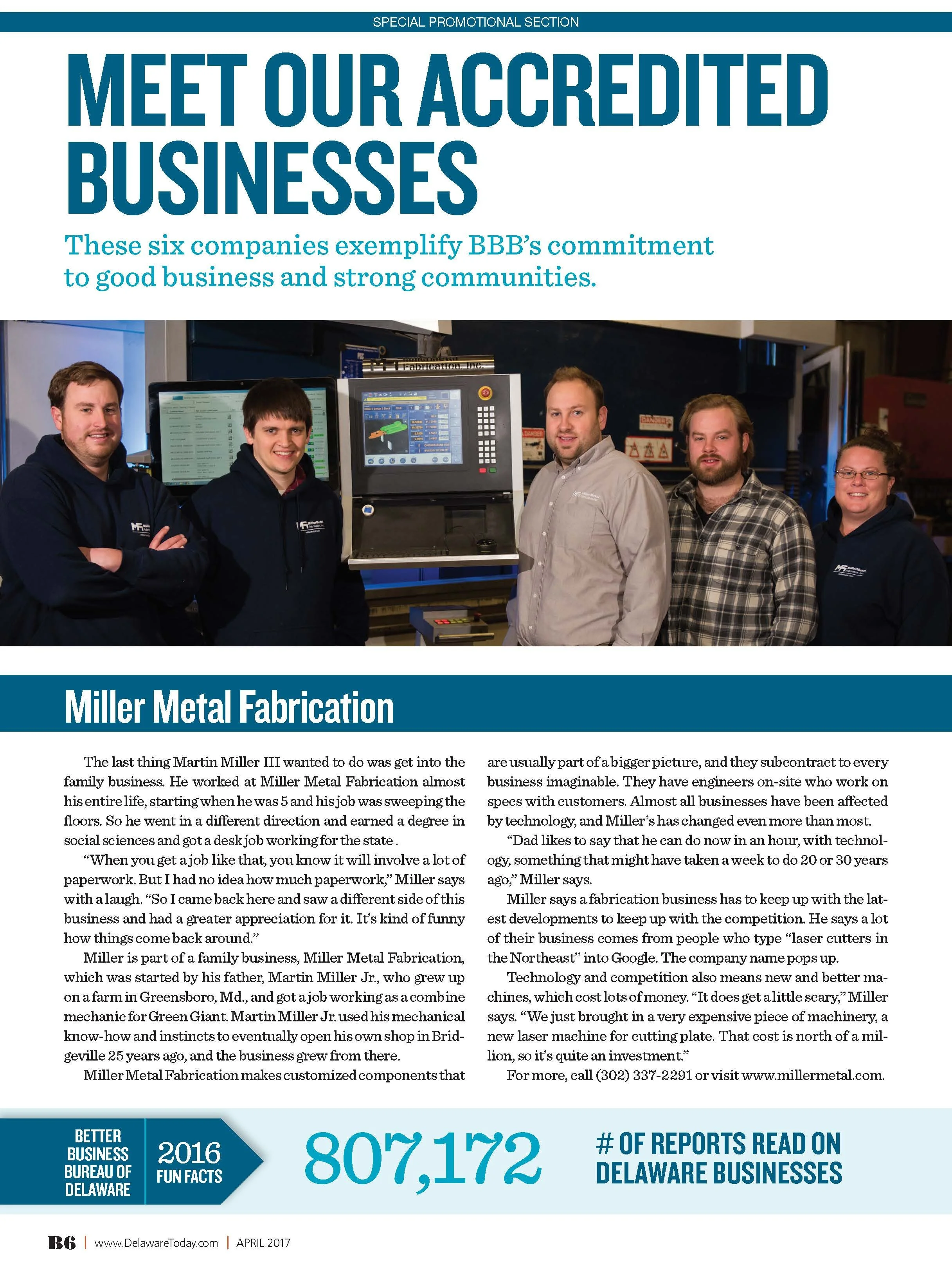
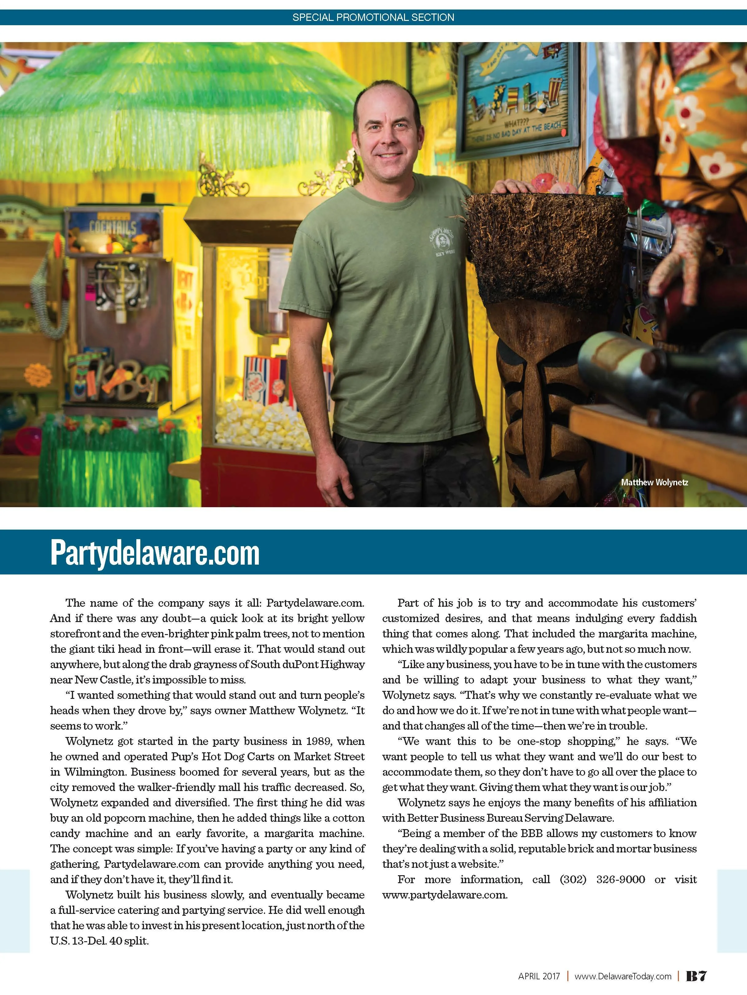
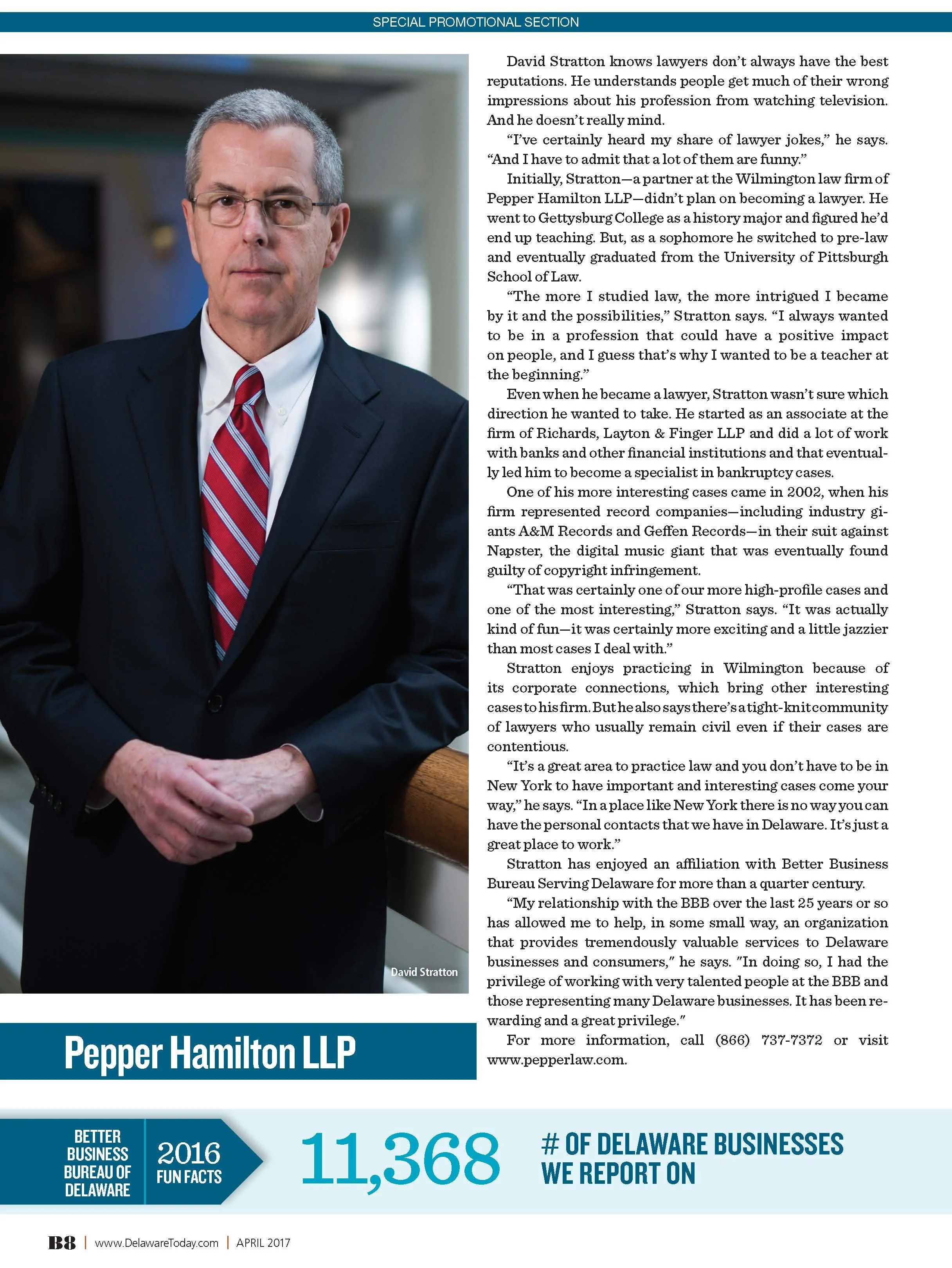
Better Business Bureau
-
A 16-page business and consumer publication that transformed BBB guidance, member stories and sponsor content into an authoritative, accessible editorial system.
-
Client
Better Business Bureau / Today Media
My Role
Lead Publication Designer & Art Director
Project Scope
Creative Direction · Publication Design · Editorial Layout · Cover Design · Information Design · Business Features · Advertising Integration · Typography · Print Production
Project Overview
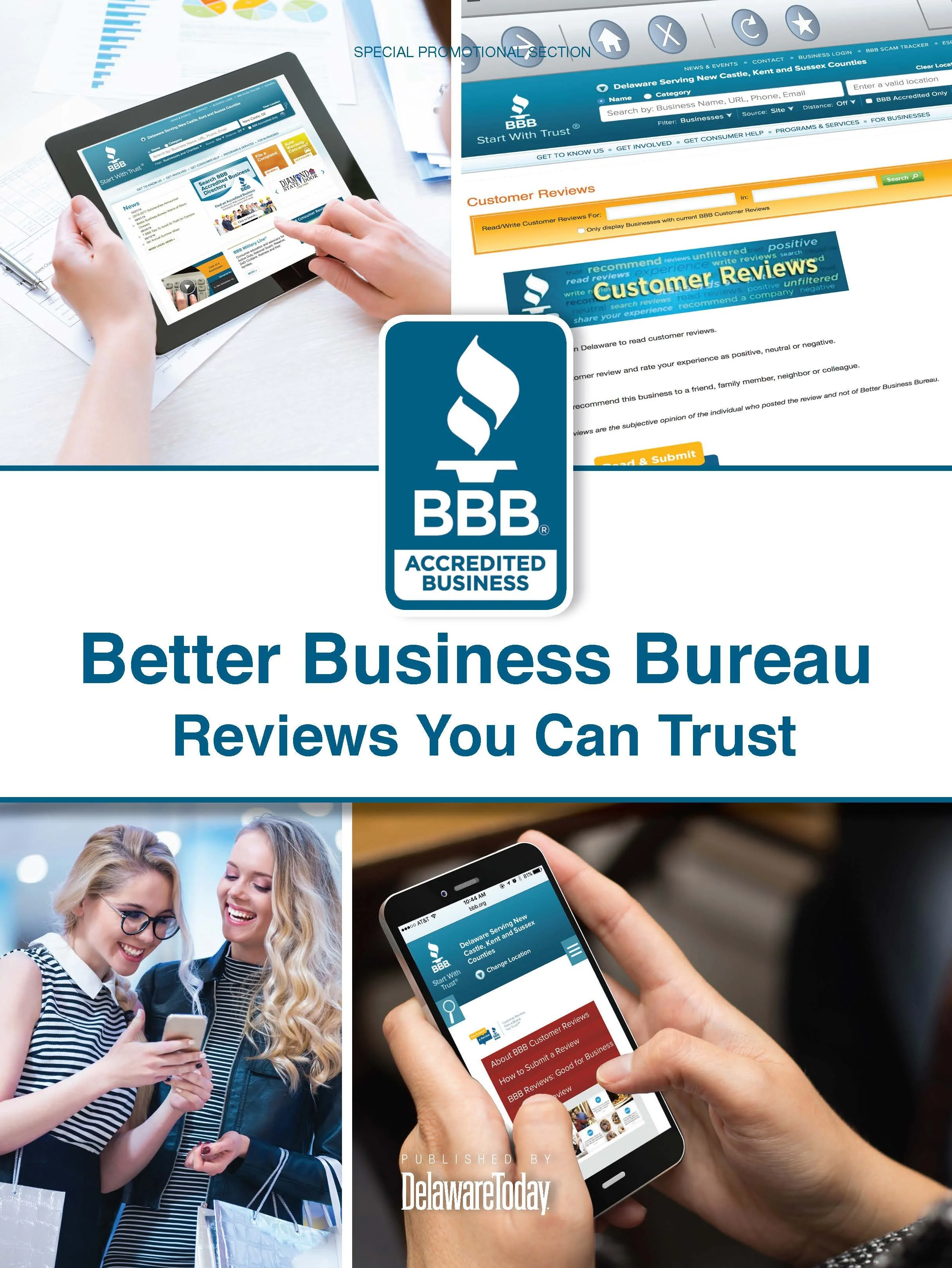
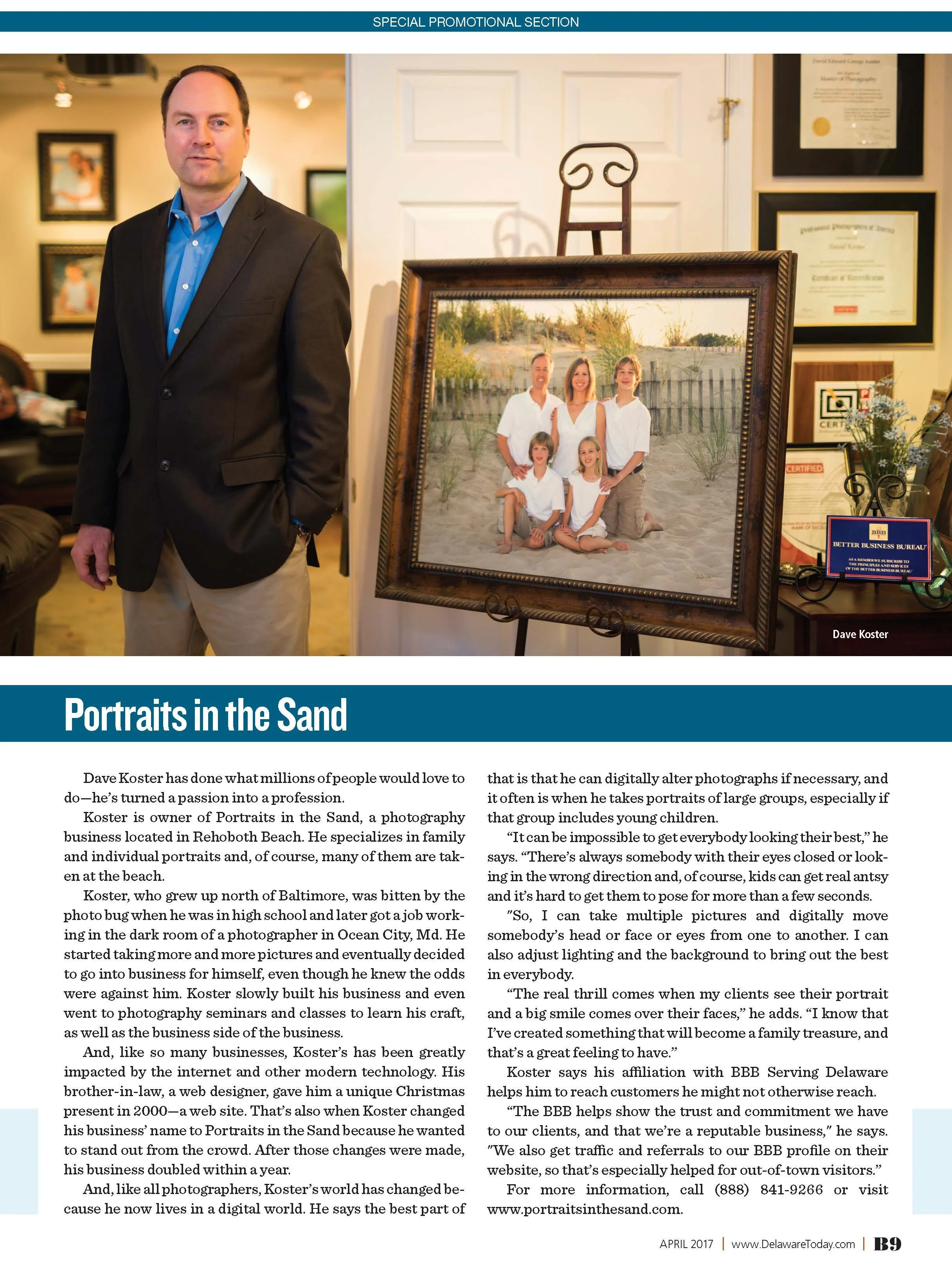
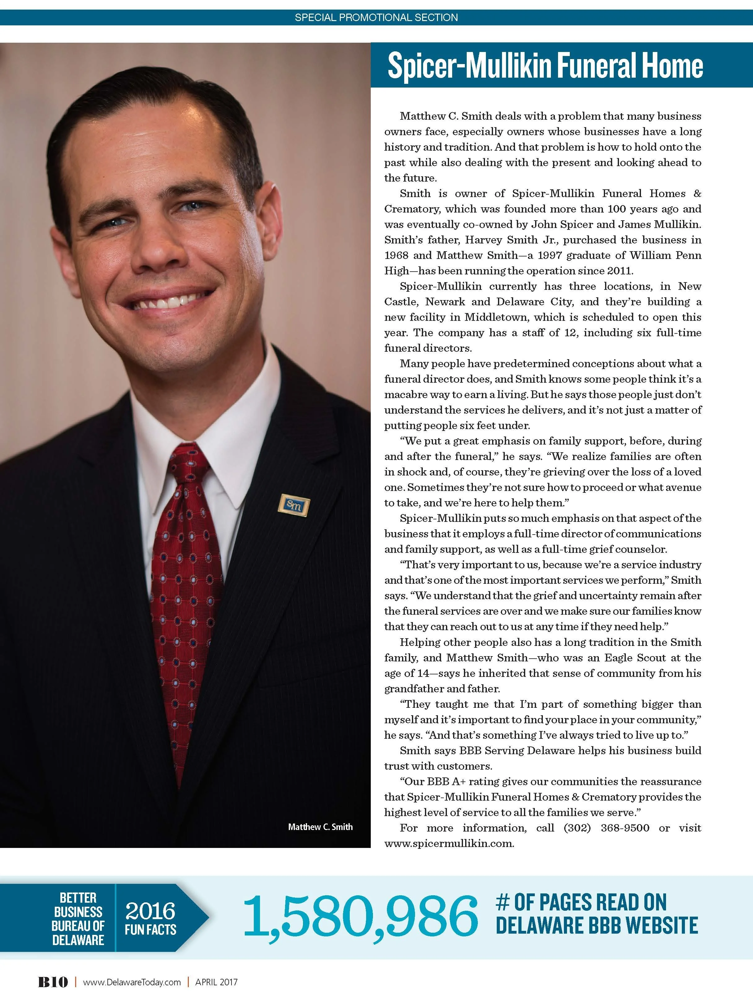
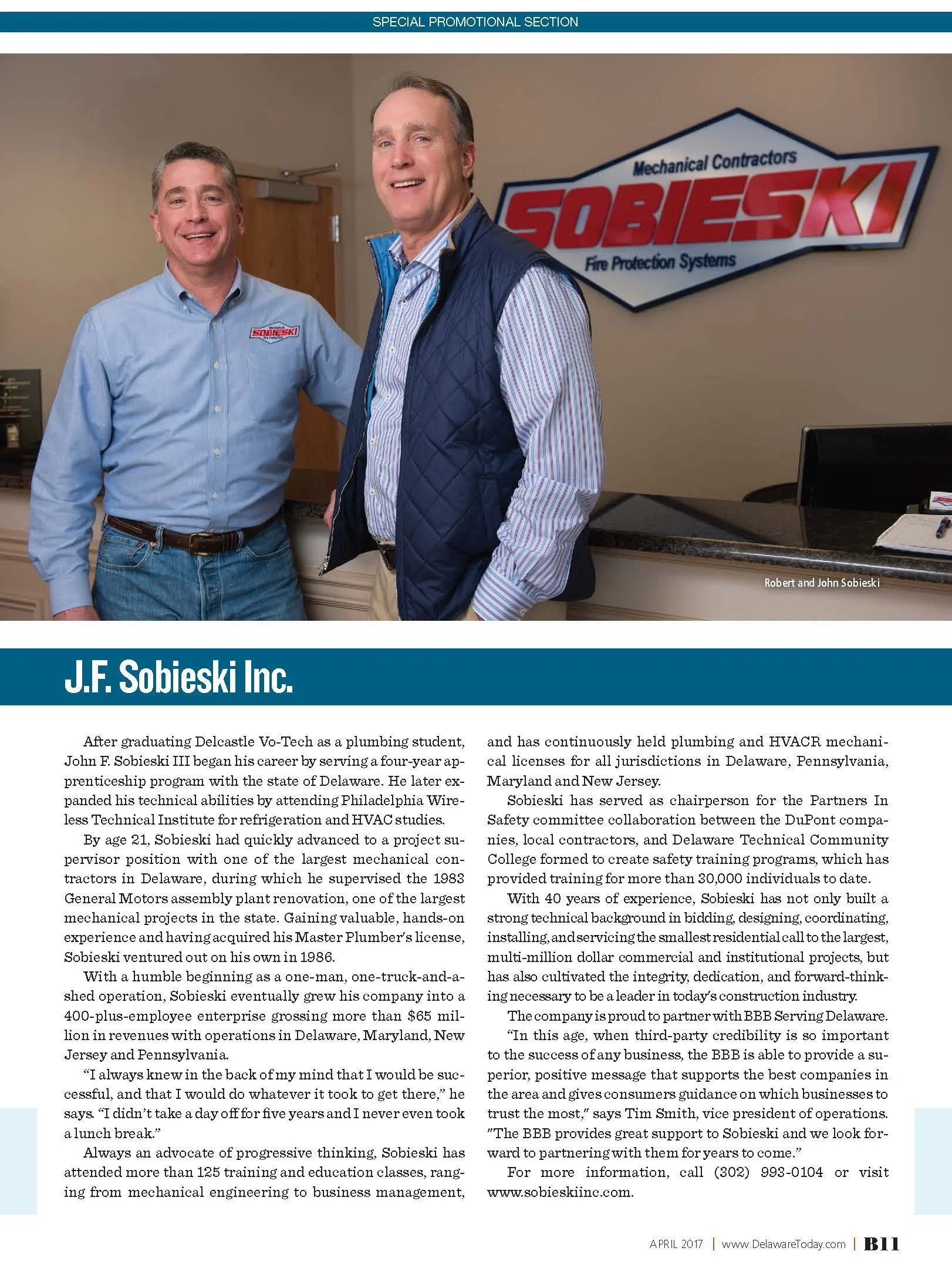
This 16-page Better Business Bureau supplement was created to translate the organization’s mission, guidance and member-focused information into an accessible editorial publication for consumers and the regional business community.
The source material included educational articles, organizational messaging, profiles, practical advice and sponsor content. My responsibility was to create a visual framework that made the information feel authoritative and trustworthy while remaining inviting enough for a broad audience.
Building Trust Through Design
The design direction emphasized clarity, structure and credibility. I used strong hierarchy, disciplined typography and consistent spacing to give the publication a professional tone aligned with the BBB brand.
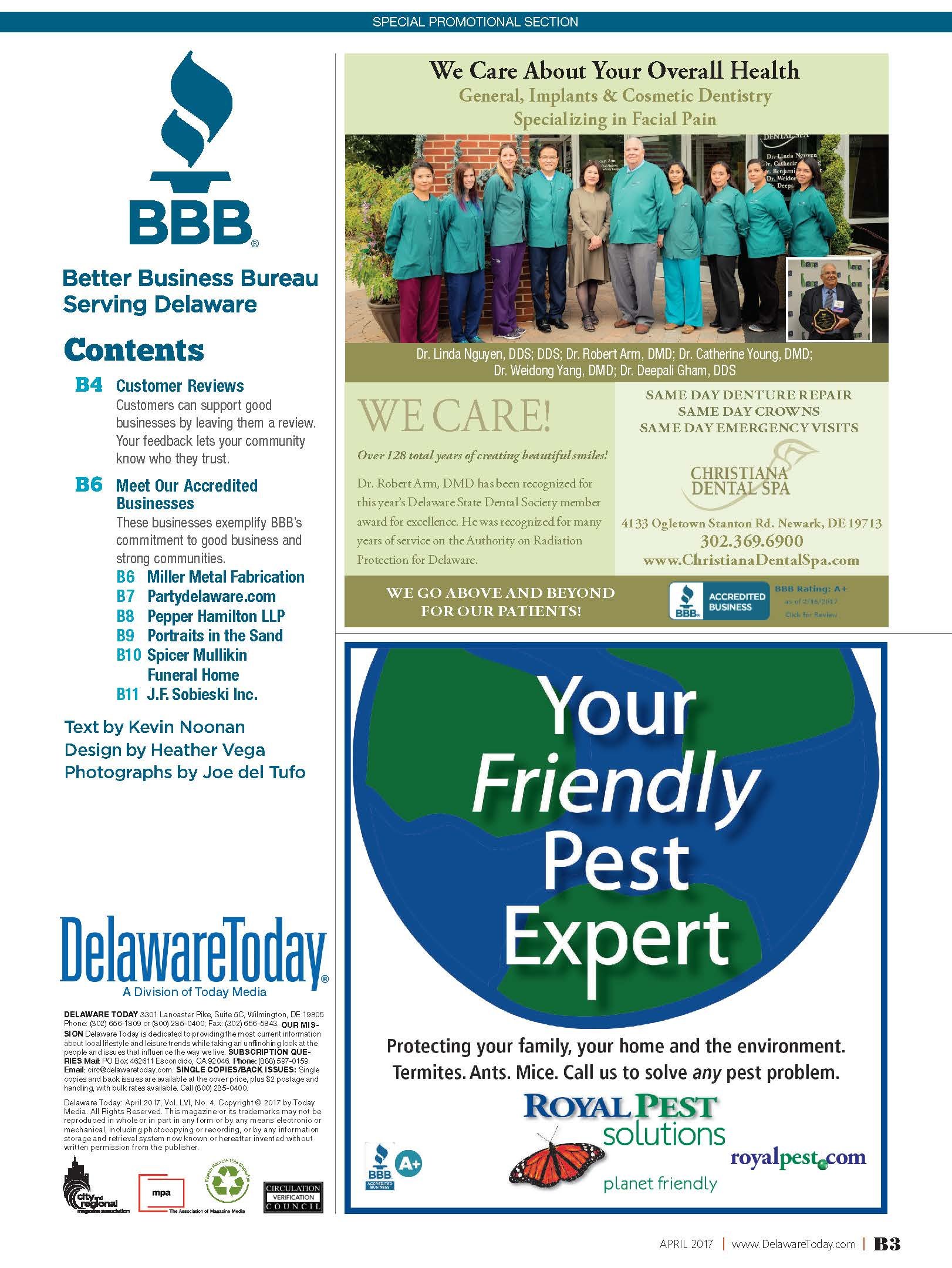
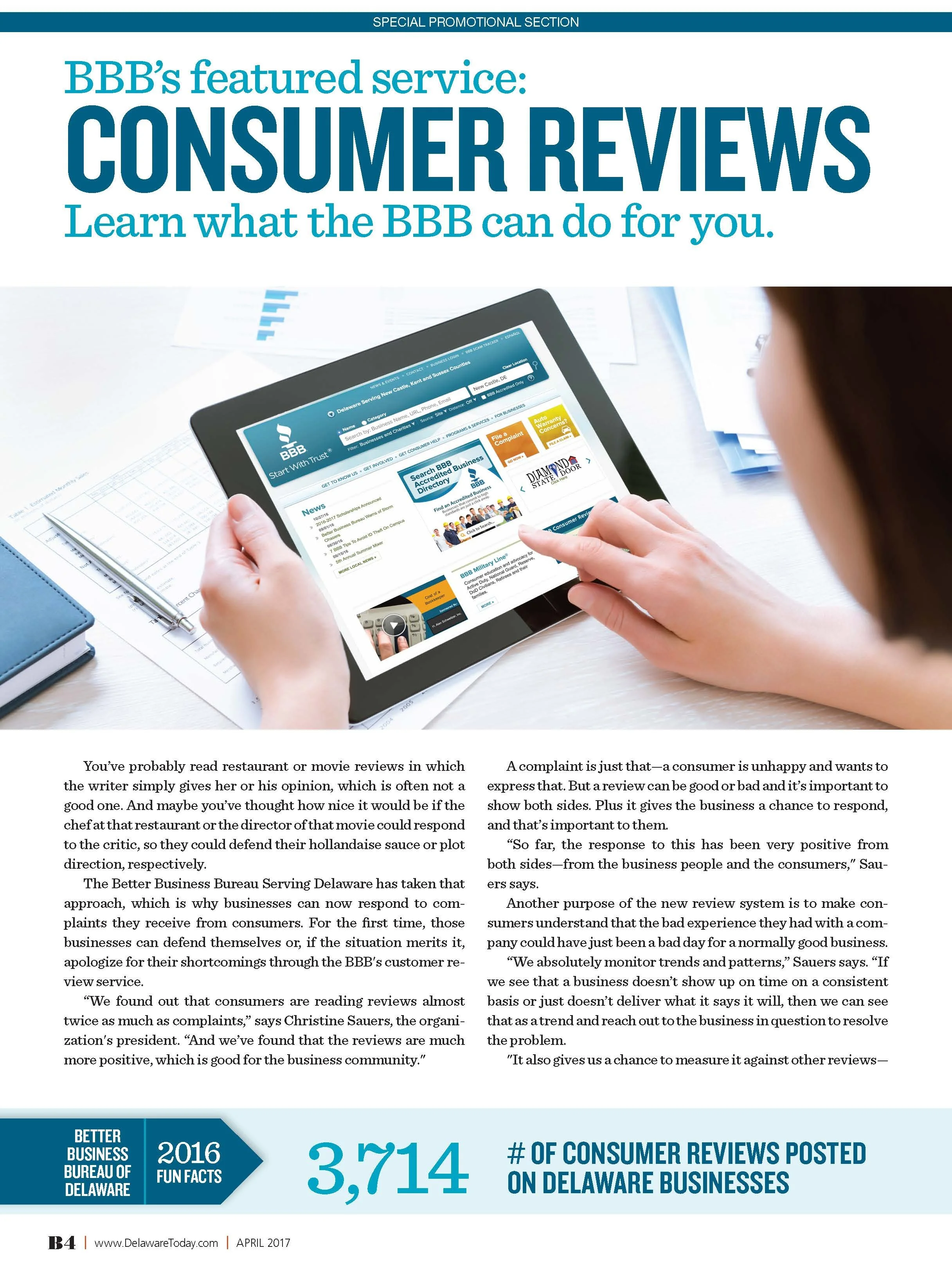
Rather than relying on decorative elements, the layouts used clear entry points and well-organized content modules. Headlines, pull quotes, supporting facts and photography worked together to help readers understand what each story offered and locate useful information quickly.
Managing Information-Rich Content
Many pages contained substantial copy or multiple types of information. I developed a flexible grid that supported long-form articles, shorter guidance, profiles and data-driven content without making pages feel dense.
Visual breaks, varied column structures and purposeful image placement created a comfortable reading rhythm. The system allowed important consumer guidance and business resources to stand out while maintaining continuity throughout the issue.
Editorial and Sponsor Integration
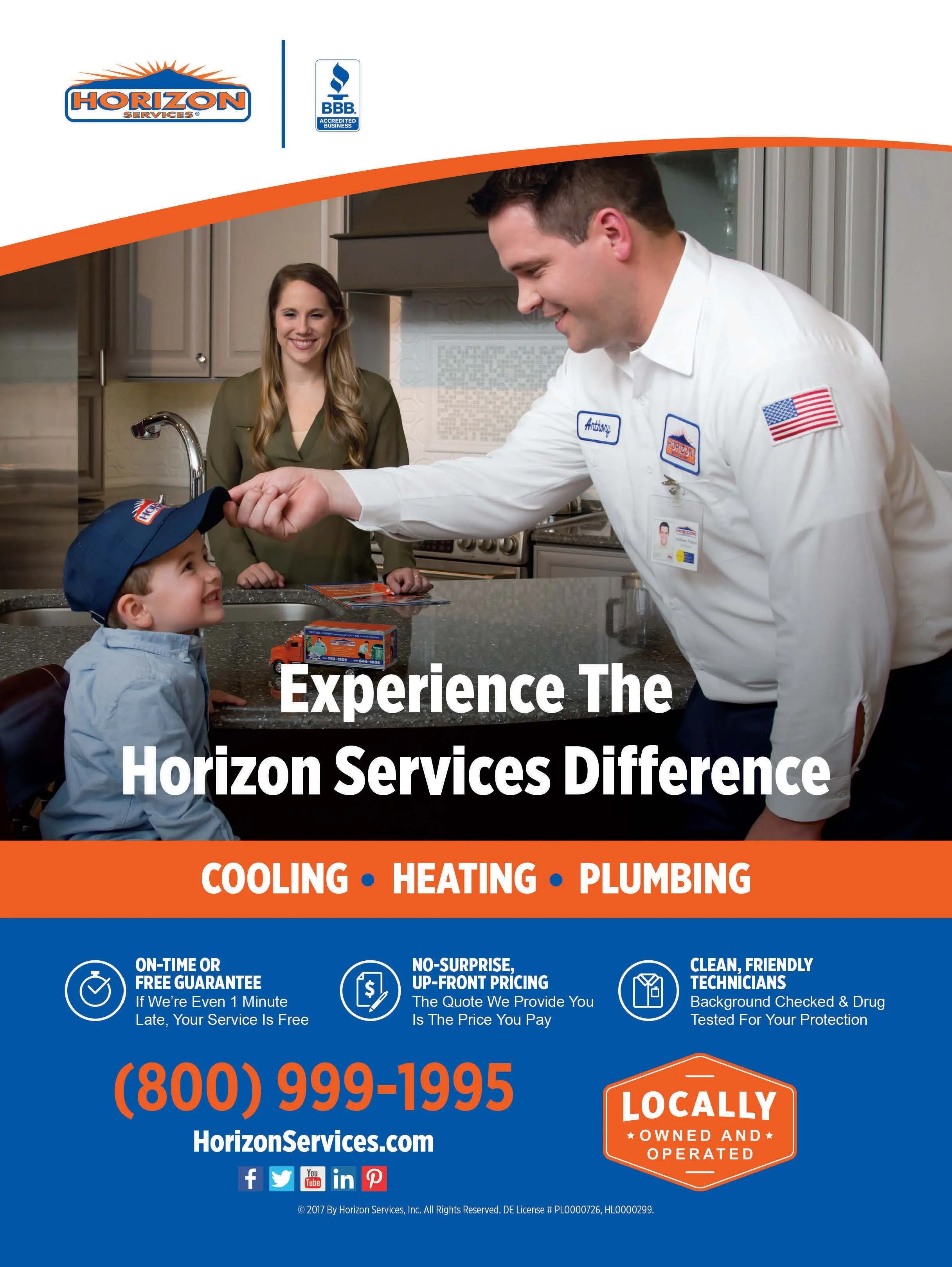
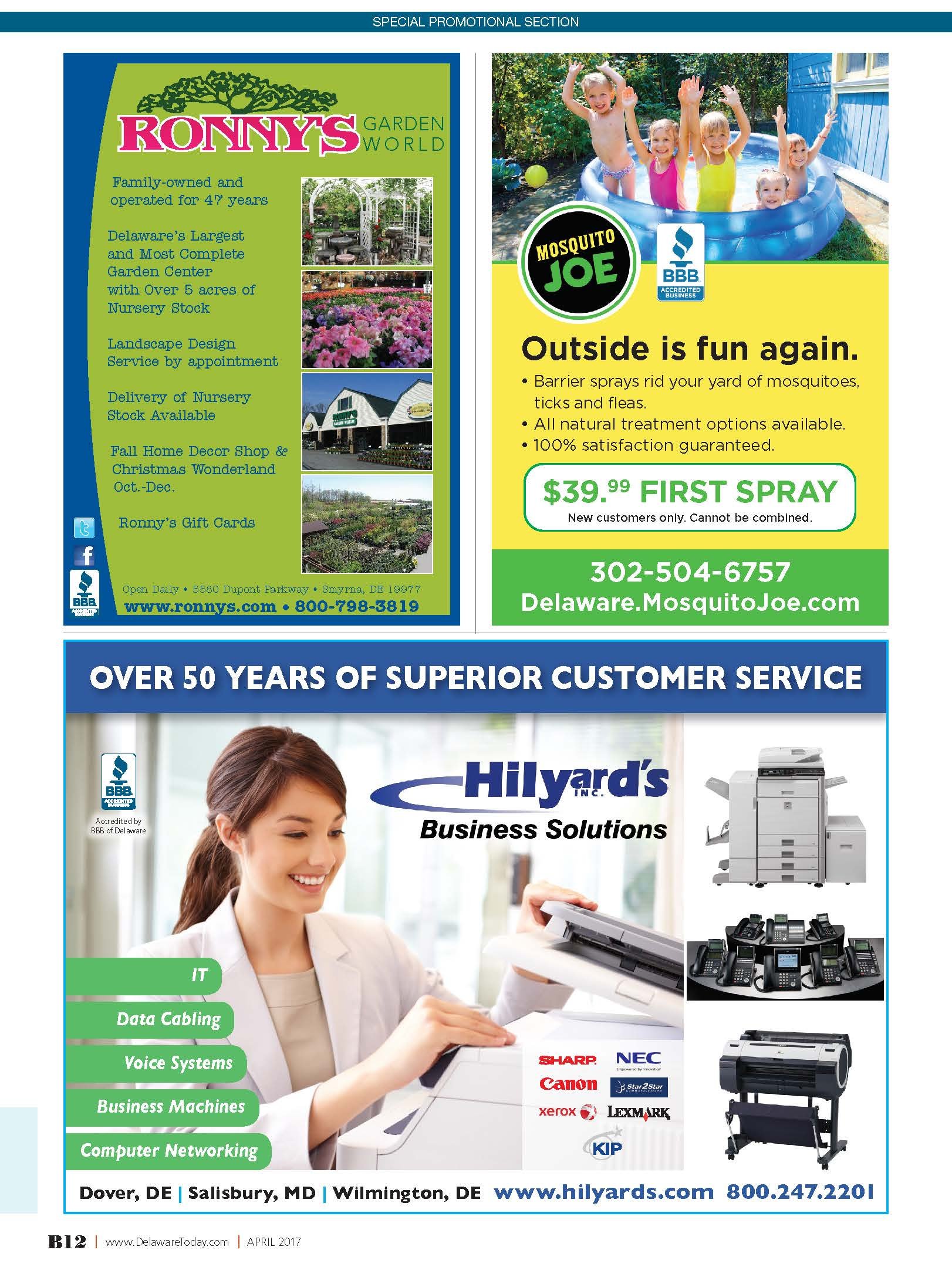
The supplement needed to serve both an educational and commercial purpose. I planned the sequence of editorial and advertiser content so that each had appropriate visibility and the overall publication continued to feel cohesive.
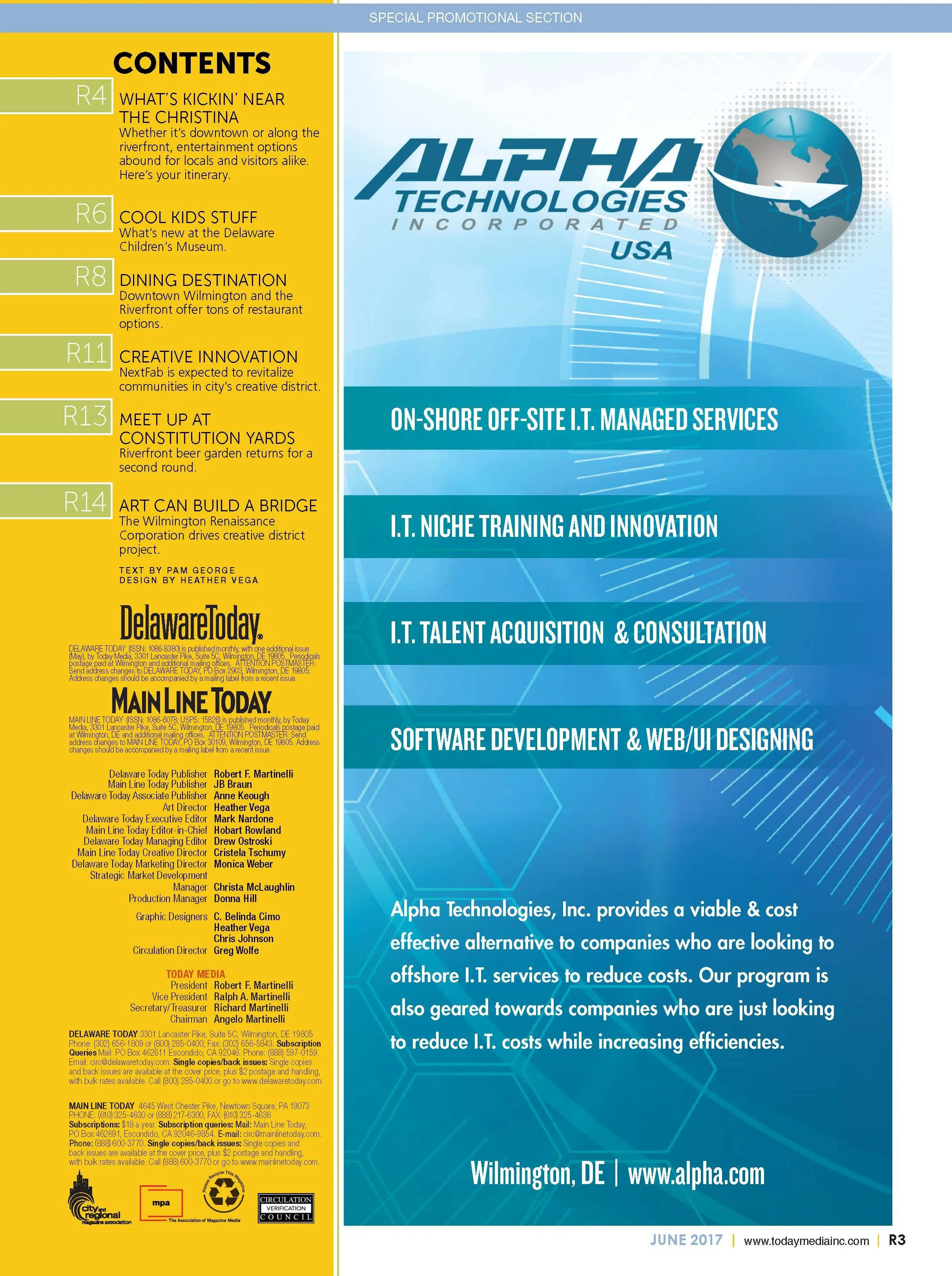
Consistent typography and page architecture supported the transition between BBB-created content, member stories and promotional material while preserving a clear distinction between editorial and advertising.
Production
I designed and prepared all 16 pages for print, managing image quality, typography, page order, alignment and final production requirements. The completed publication reflects careful attention to usability as well as brand presentation.
The Result
The final supplement gave the Better Business Bureau a polished editorial platform for sharing consumer education, organizational expertise and local business stories. It demonstrates my ability to make complex, information-heavy content approachable without sacrificing authority or visual consistency.
16-page custom business supplement
Consumer guidance and business content organized
Editorial and advertiser material integrated
Complete design through final print production
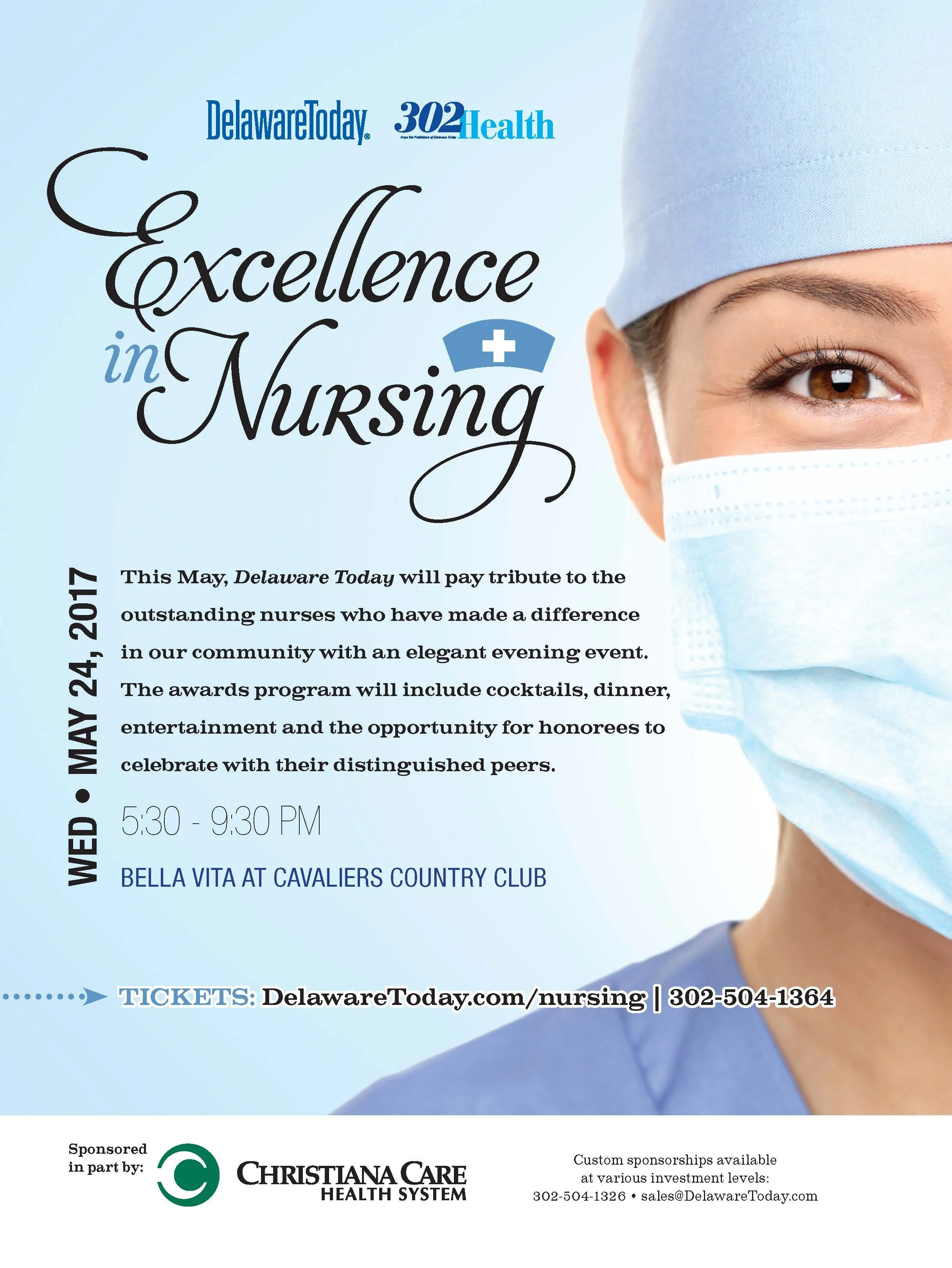
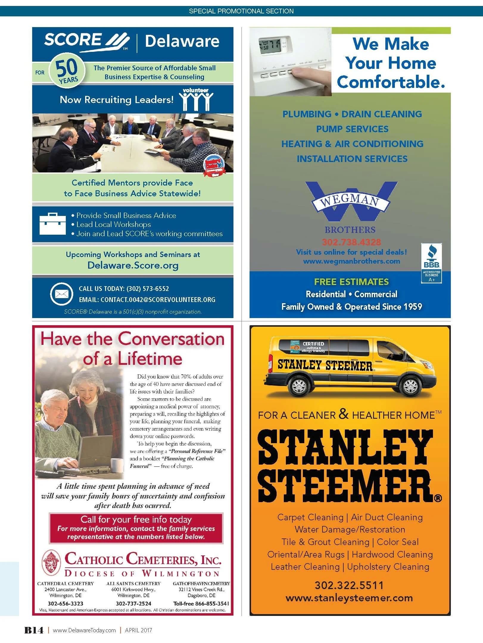
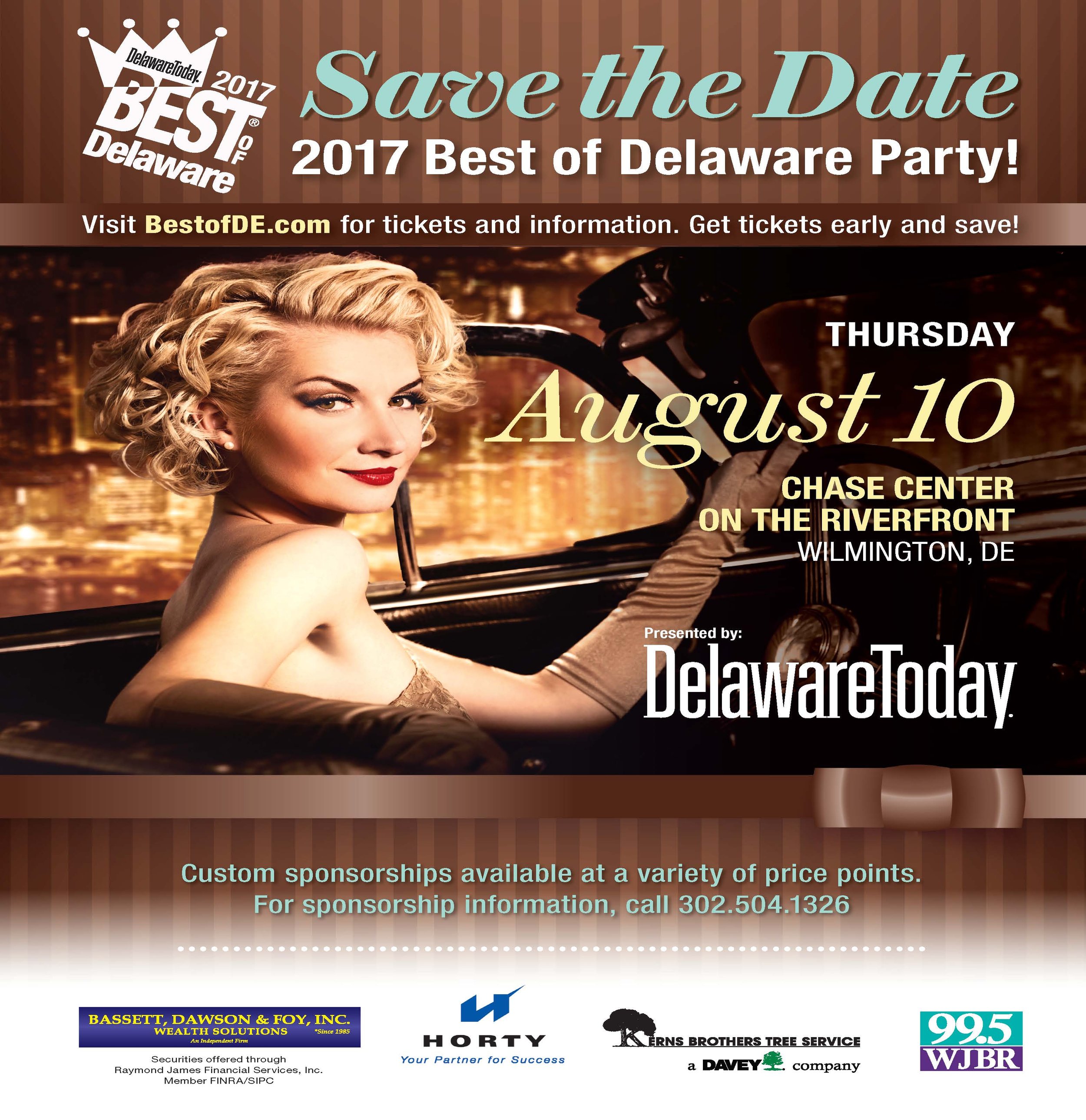
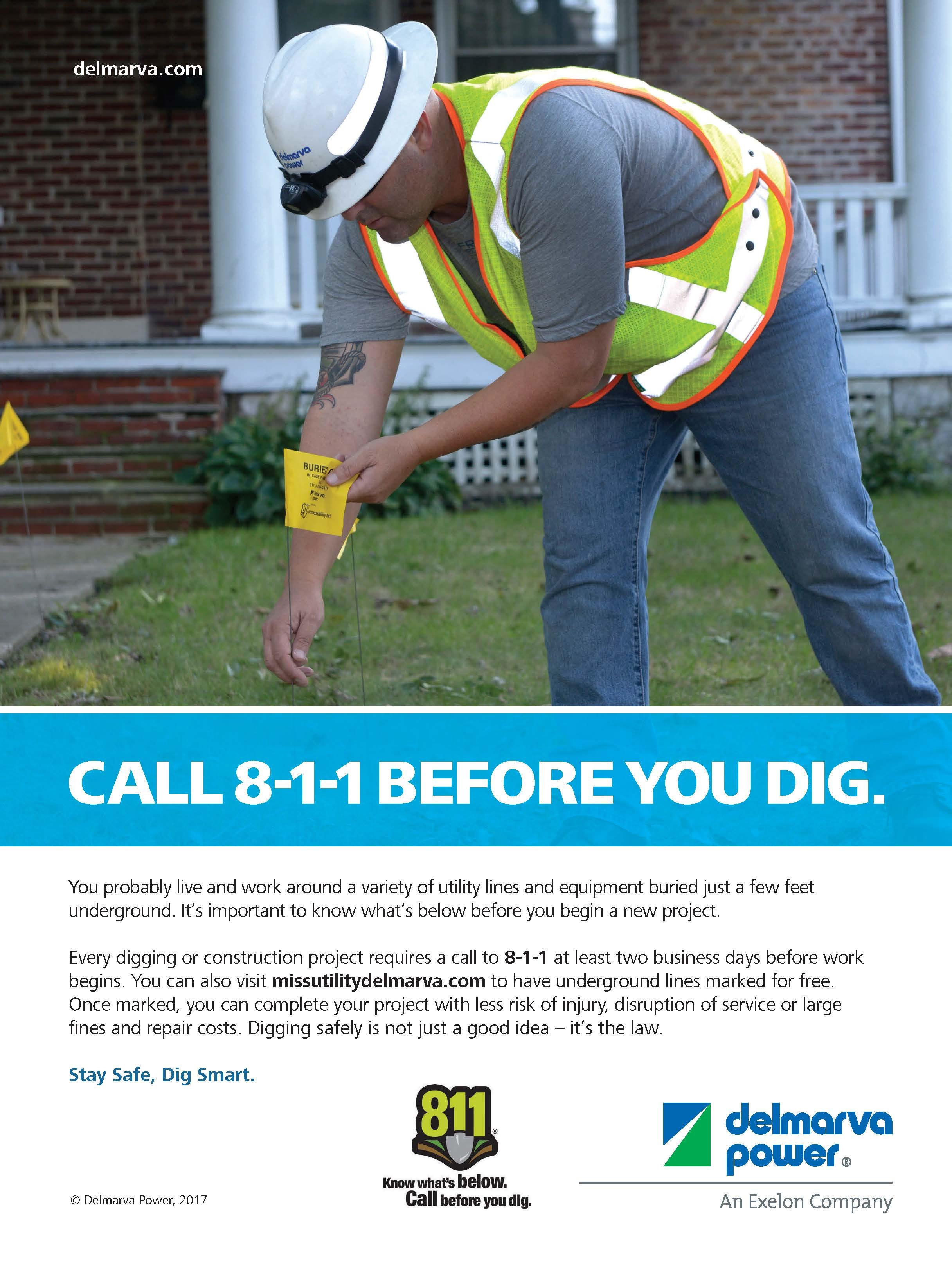
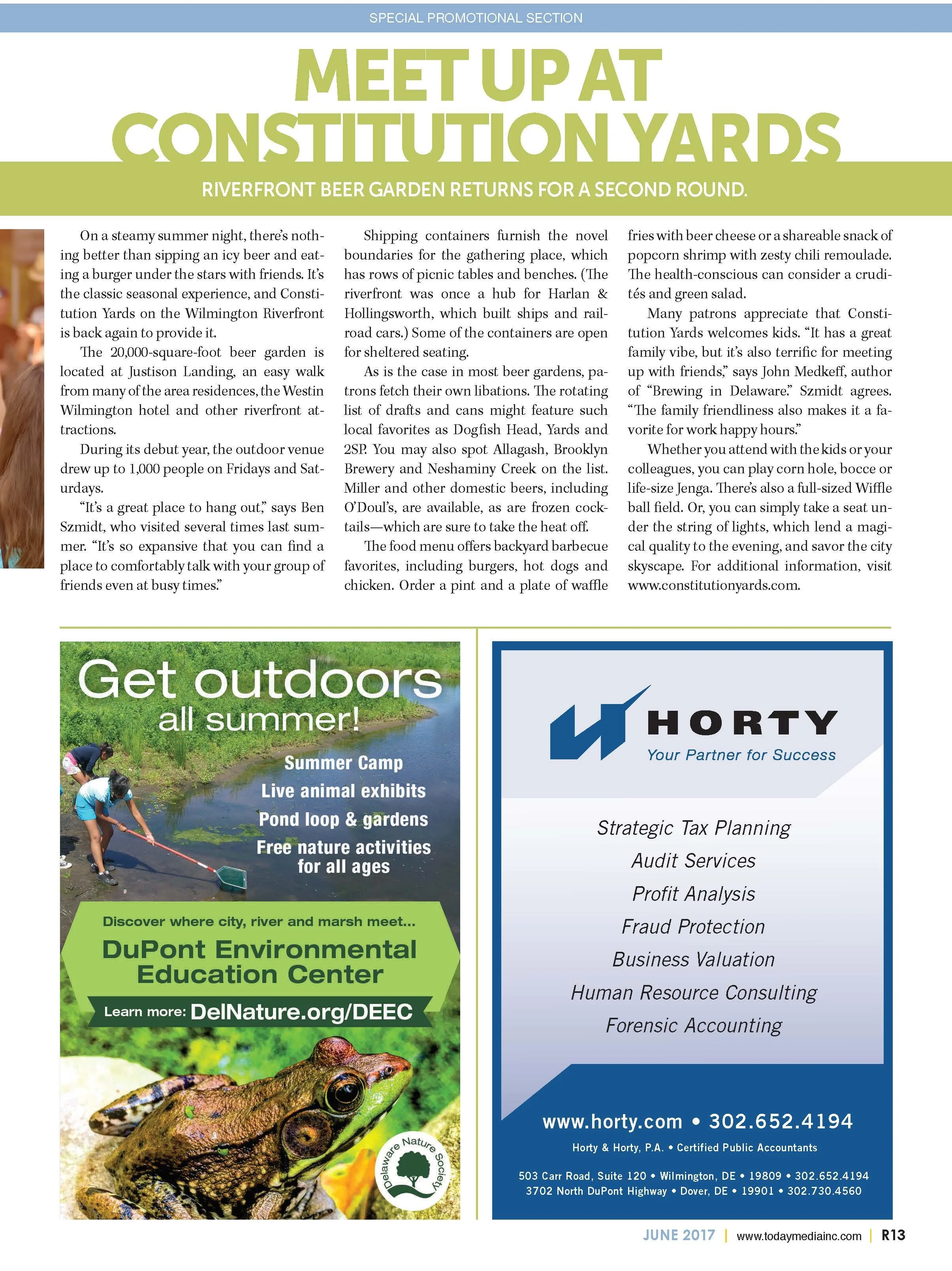
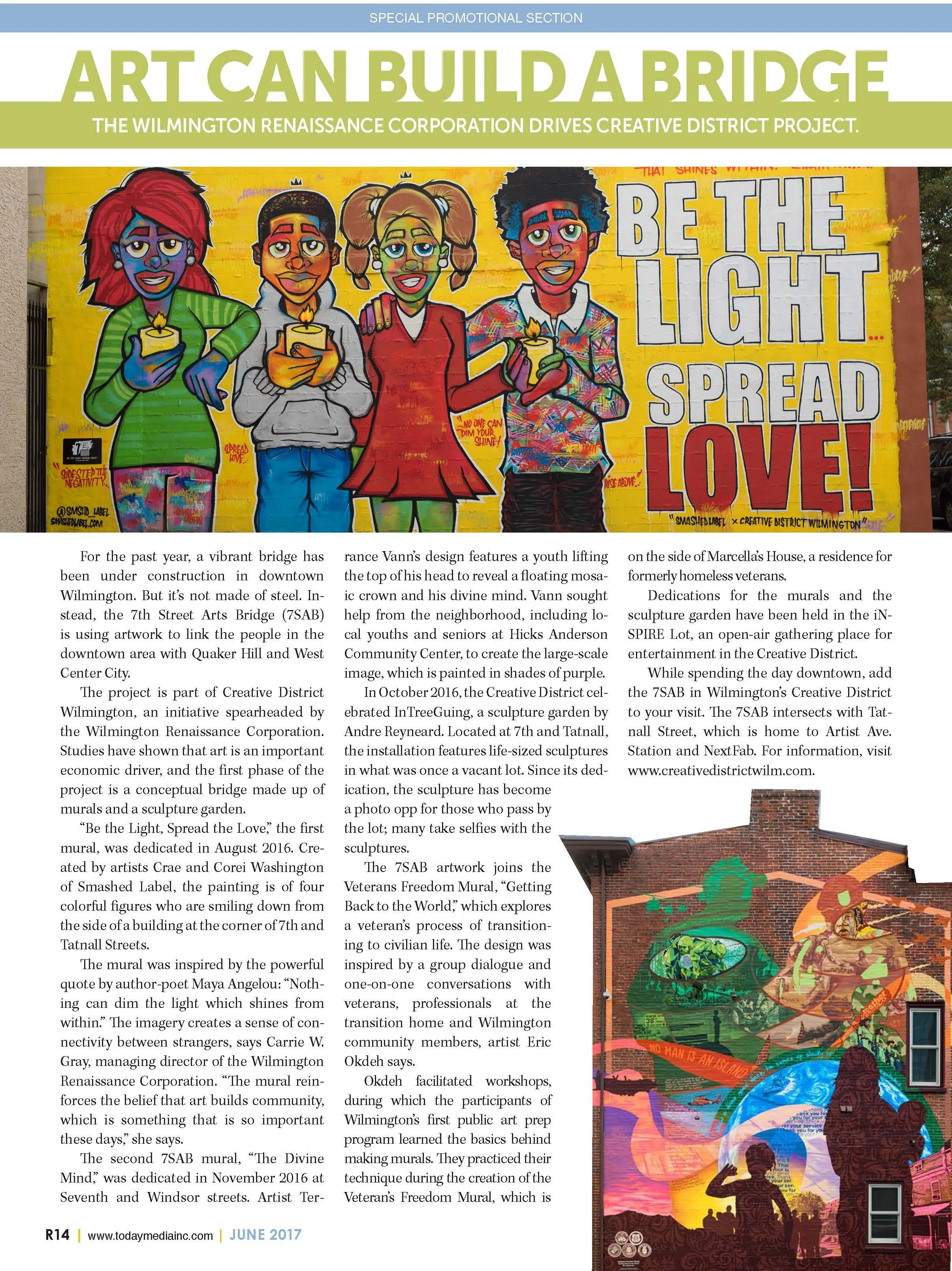
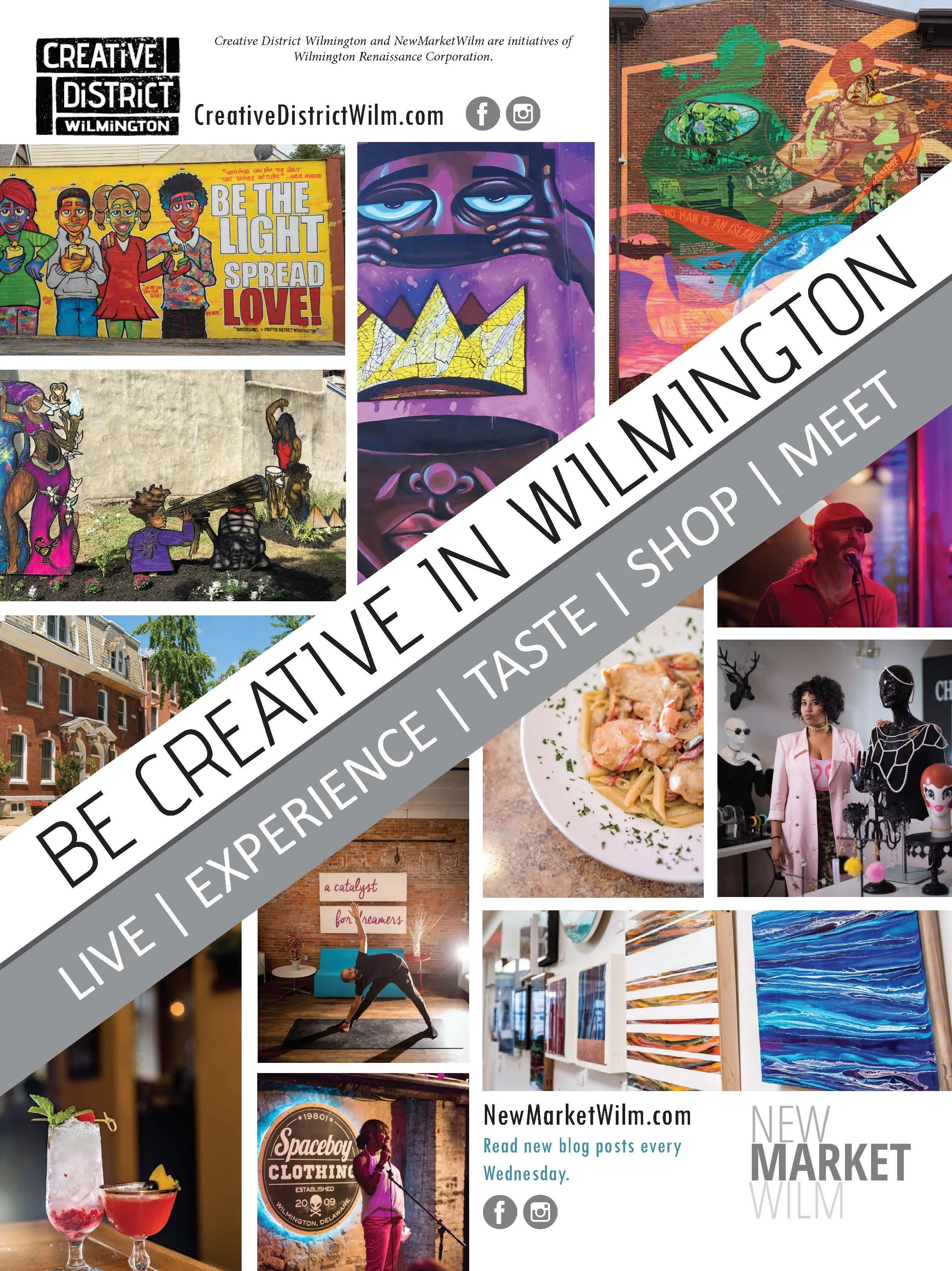
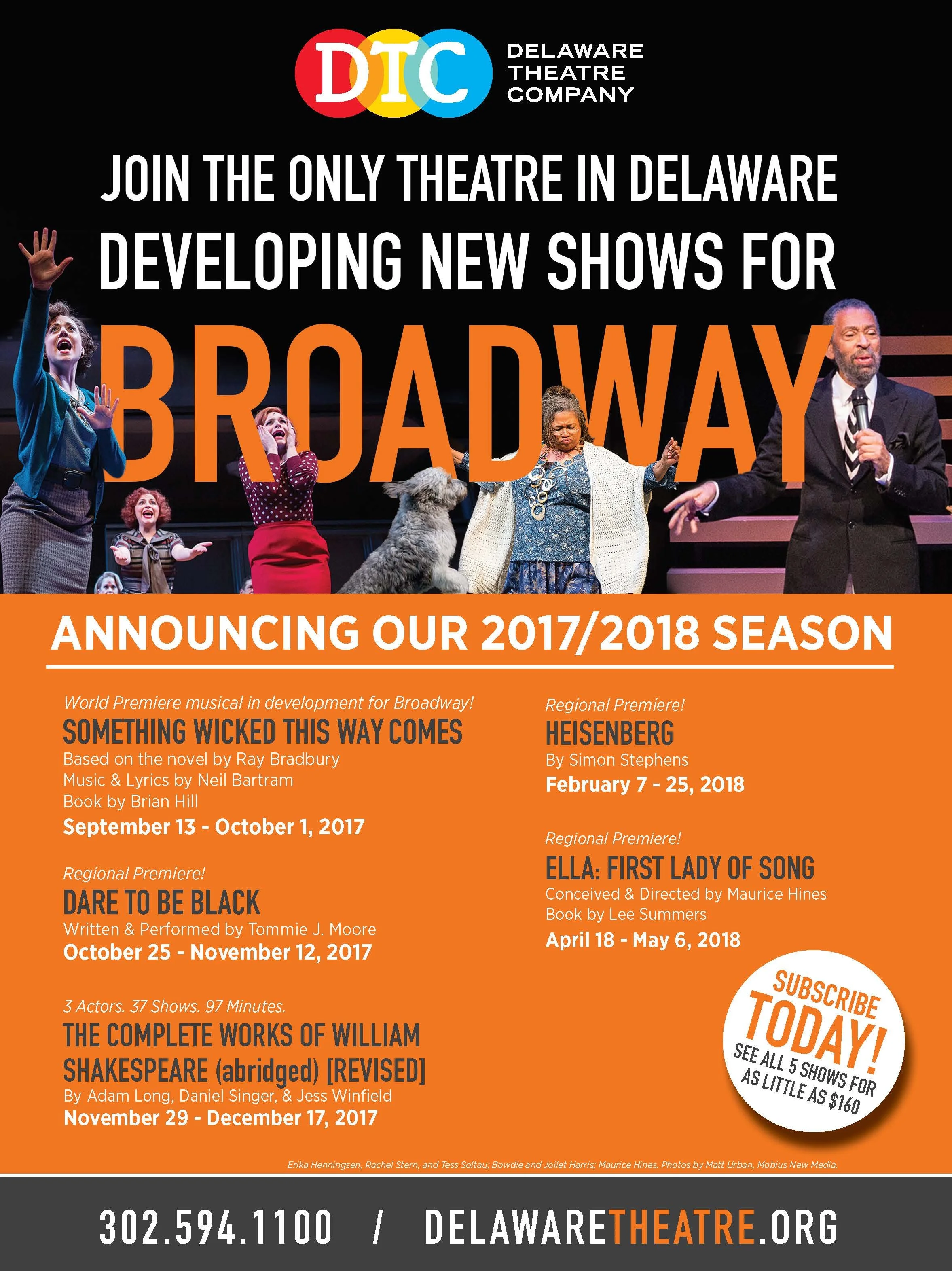
Downtown Wilmington & Riverfront Supplement
-
A 16-page destination supplement uniting Downtown Wilmington and the Riverfront through place-based stories, business features and visitor information.
-
Client
Downtown Wilmington & Riverfront / Today Media
My Role
Lead Publication Designer & Art Director
Project Scope
Creative Direction · Publication Design · Editorial Layout · Cover Design · Destination Storytelling · Business Features · Advertising Integration · Typography · Print Production
Project Overview
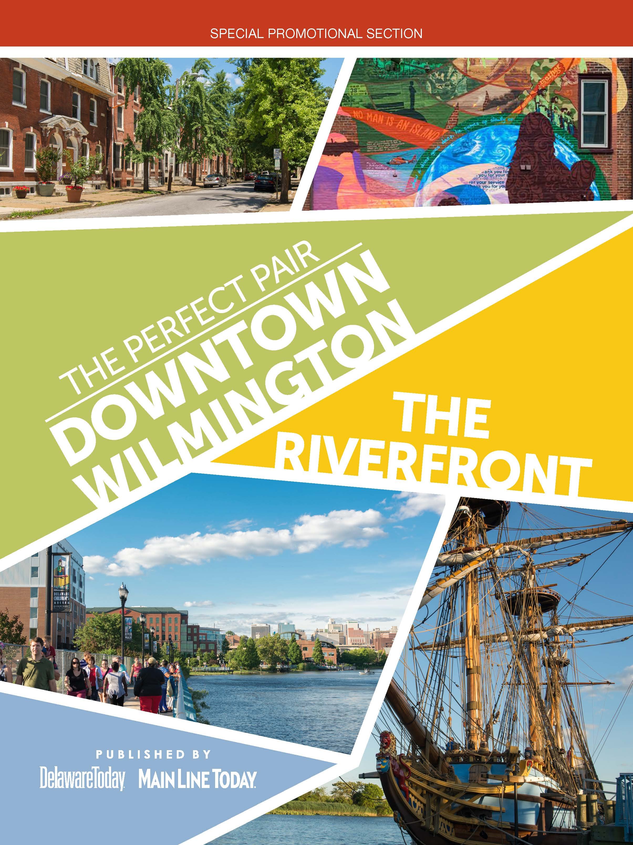
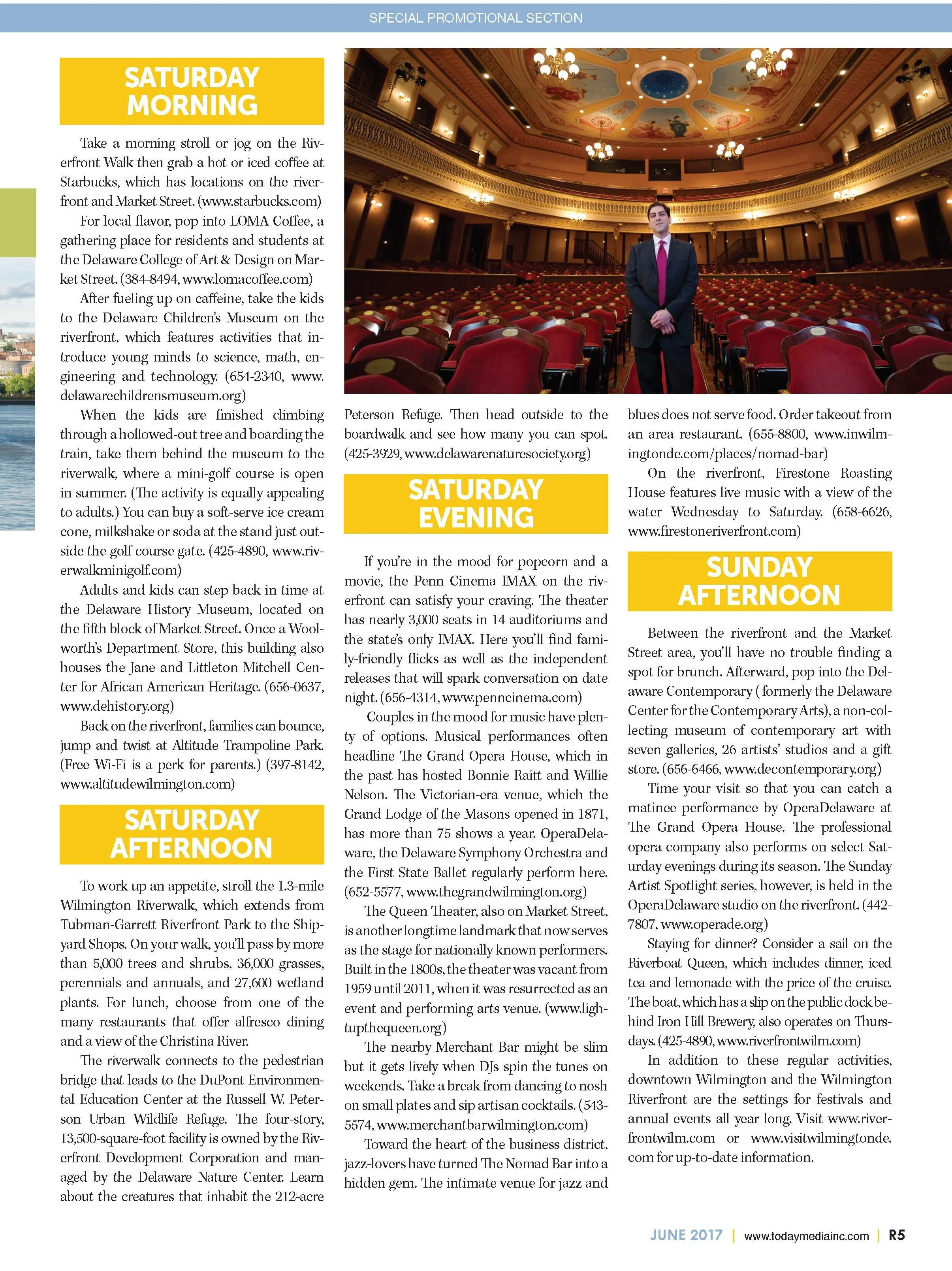
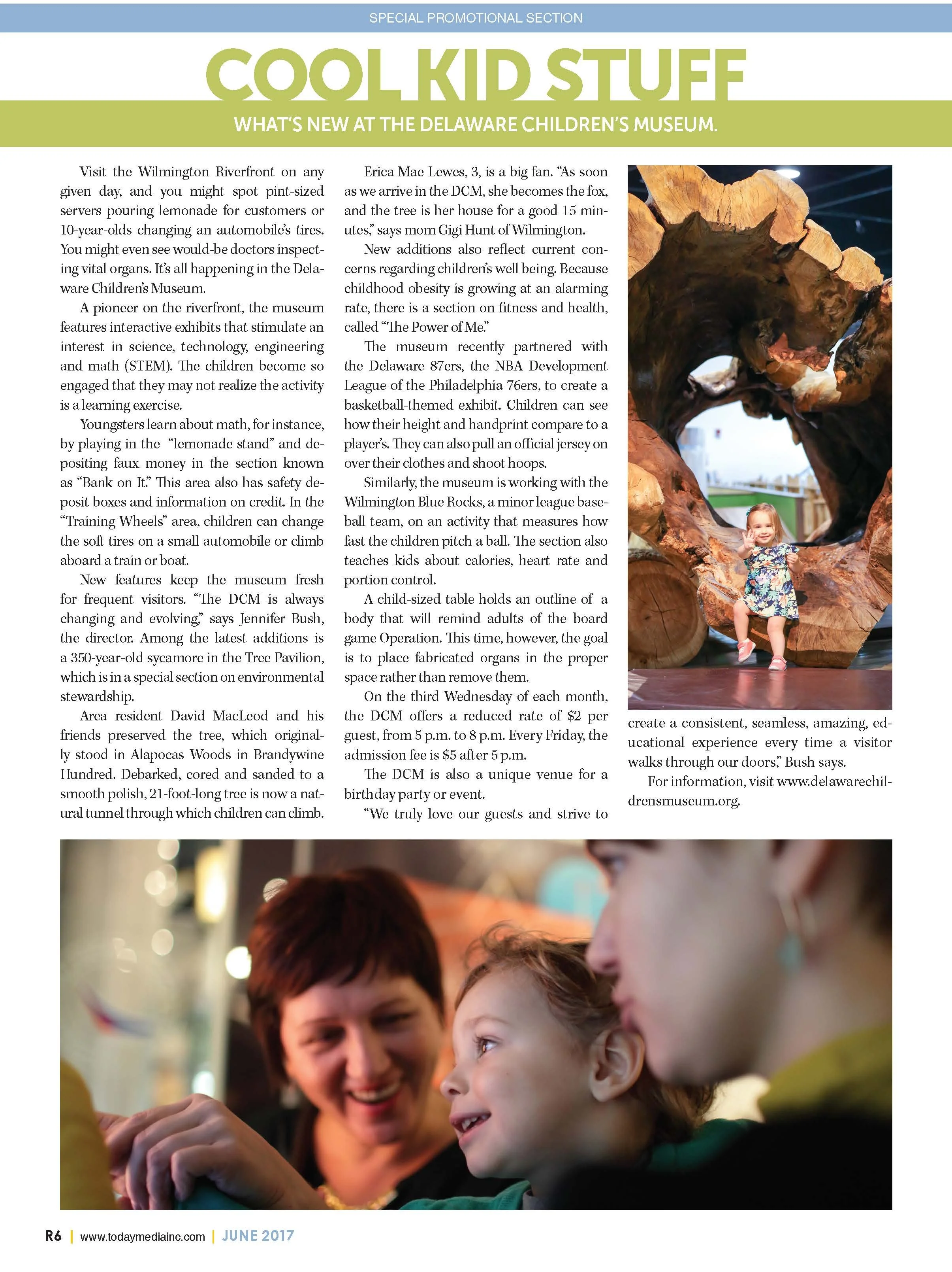
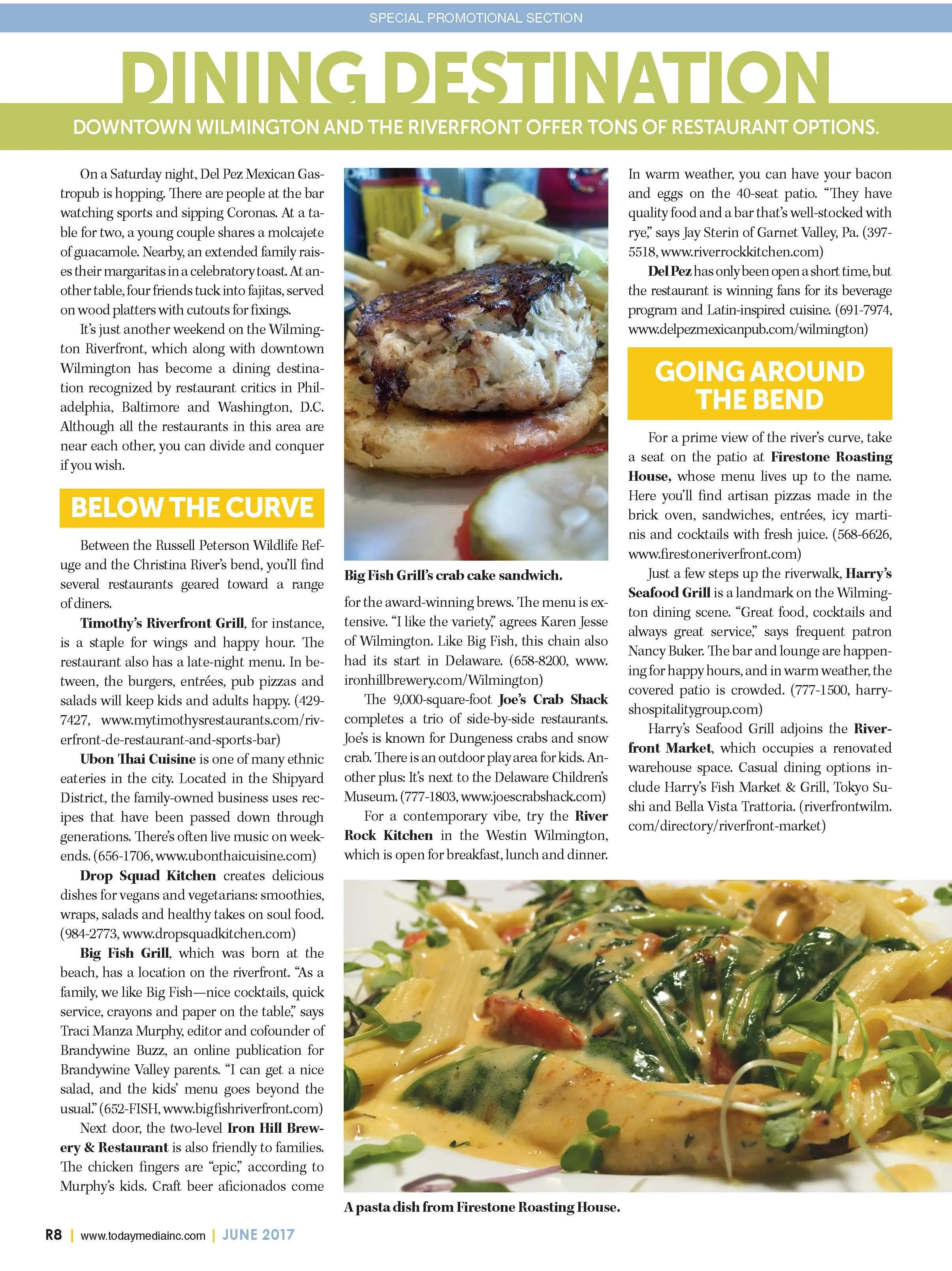
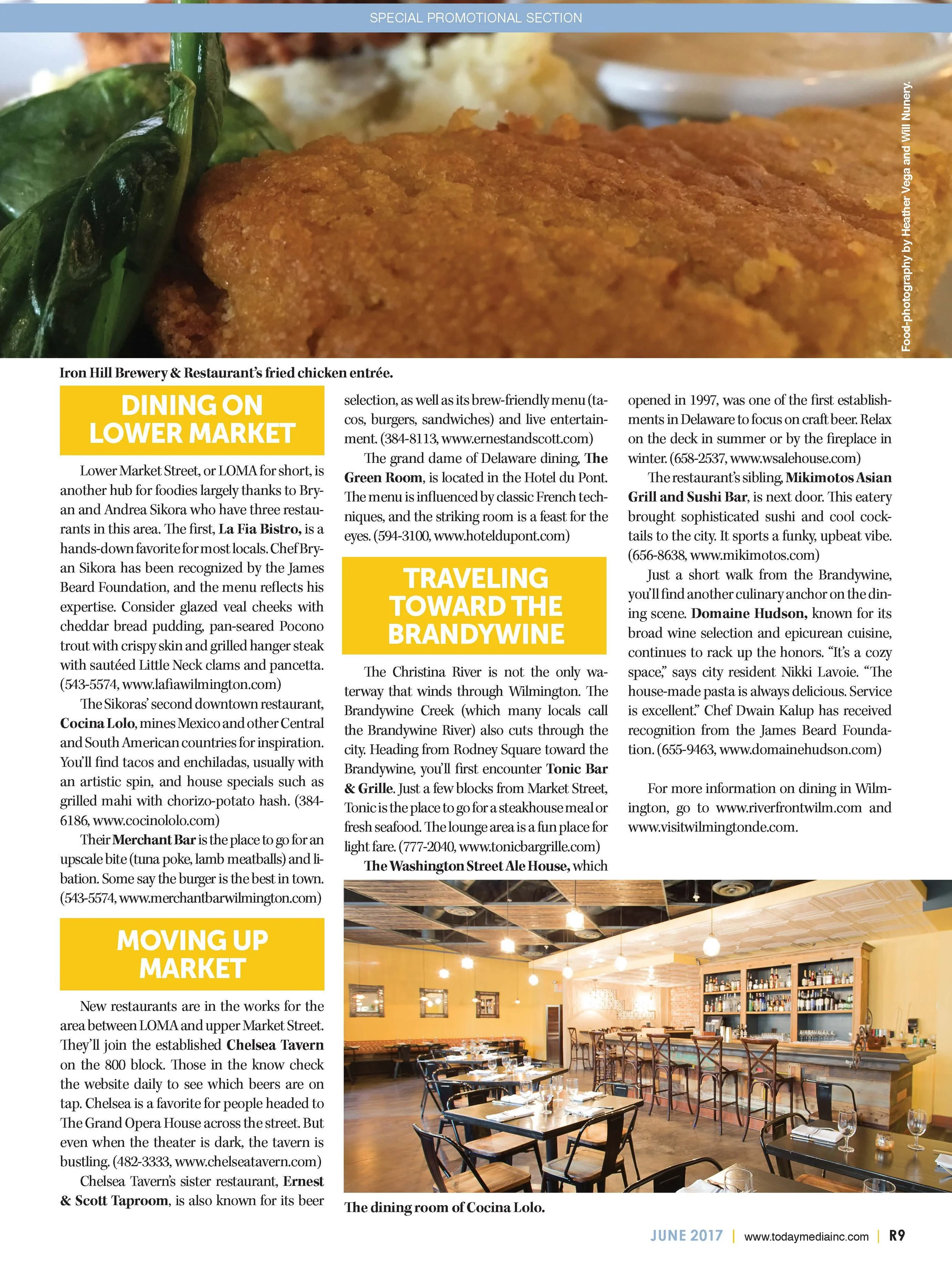
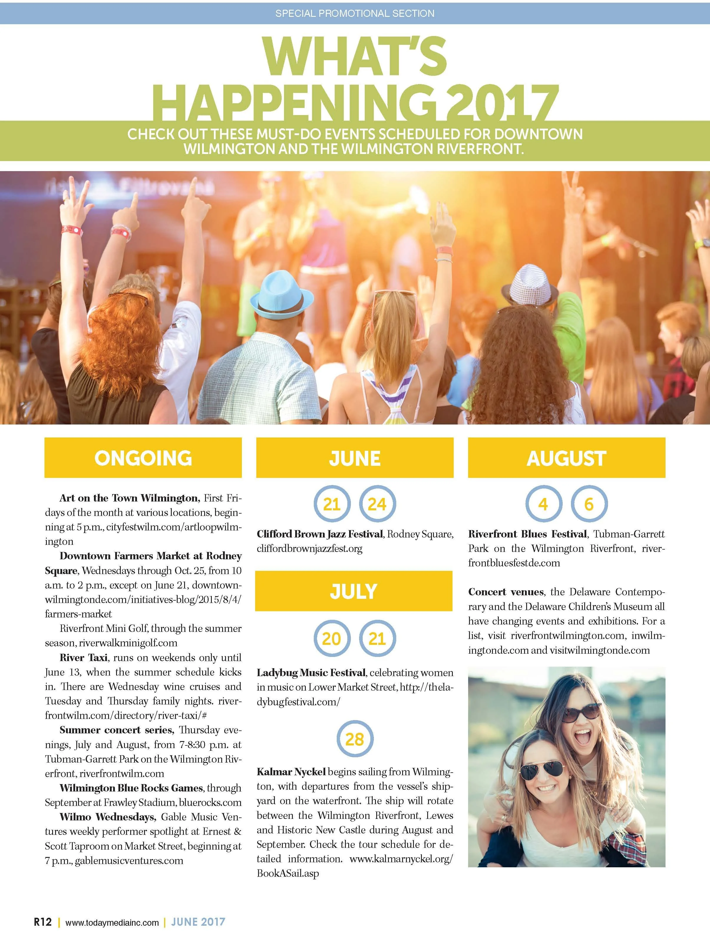
This 16-page special supplement was designed to present Downtown Wilmington and the Riverfront as connected destinations for dining, culture, entertainment, business and everyday city life.
The publication brought together neighborhood stories, visitor information, business profiles, photography and advertising. My role was to turn that varied material into a clear editorial journey that would feel useful to local readers while also communicating the energy and range of the district to visitors.
Creating a Sense of Place
I developed the visual direction around the contrast between Wilmington’s established downtown character and the contemporary activity of the Riverfront. Full-width photography, bold entry points and flexible feature layouts allowed architecture, public spaces, restaurants, attractions and people to carry the story.
Rather than treating the two areas as separate subjects, the layouts created a continuous experience. Repeated typographic cues and consistent page architecture connected the sections while changes in imagery and pacing gave individual destinations room to stand out.
Organizing Diverse Content
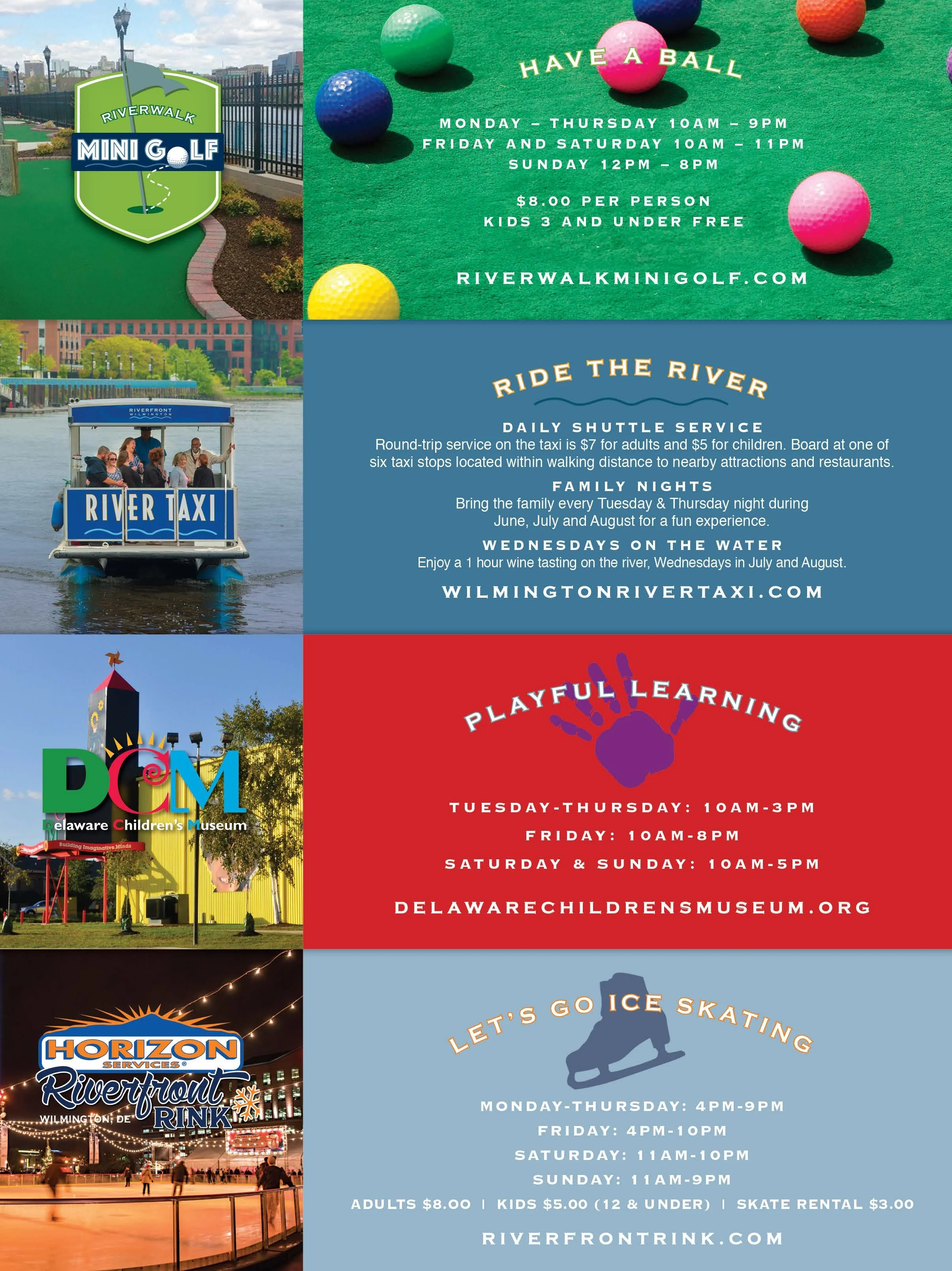
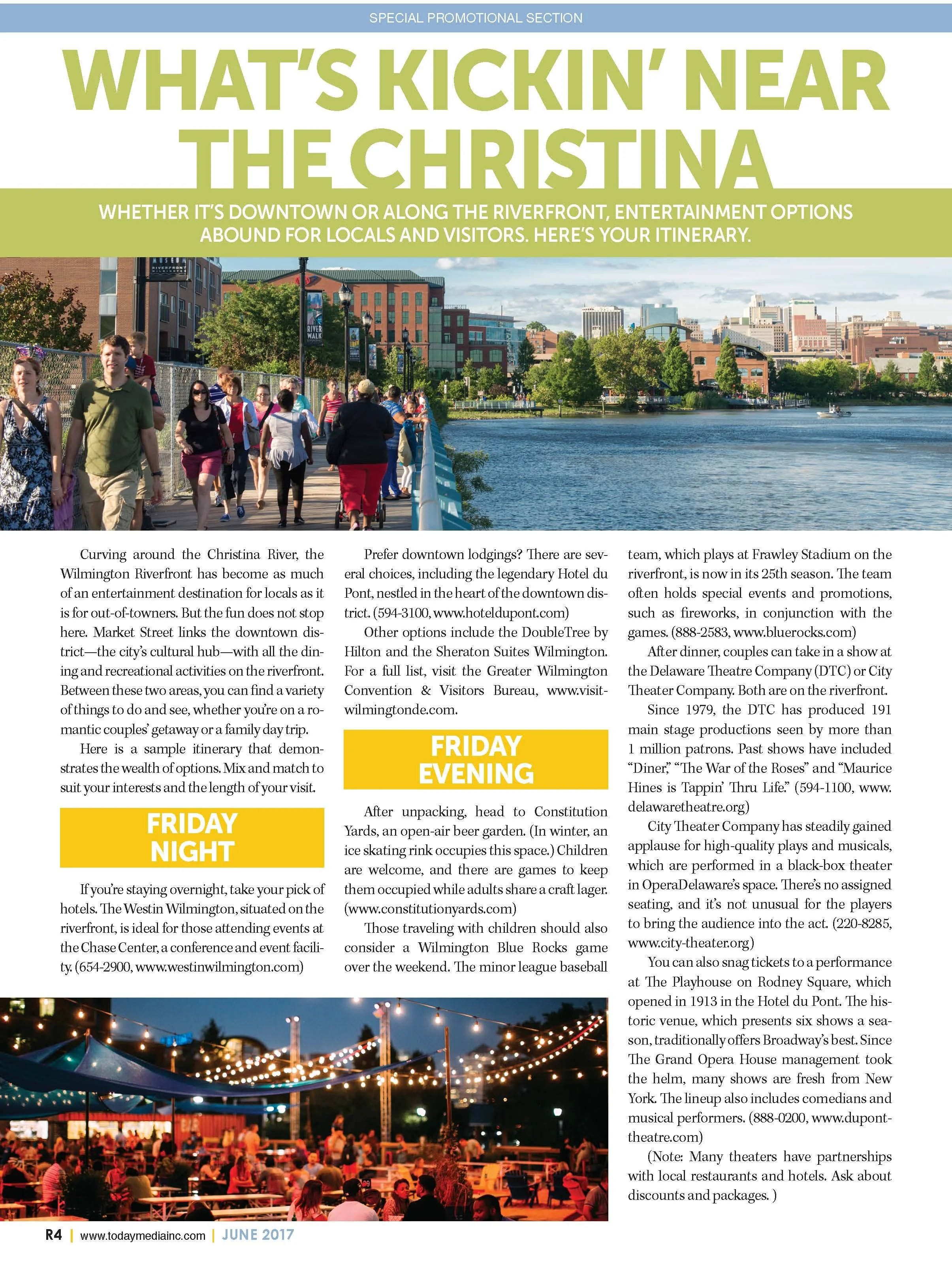
The supplement needed to accommodate feature stories, short recommendations, location information and commercial messaging. I created a modular grid that could expand for image-led stories or tighten for information-rich pages without losing consistency.
Clear hierarchy helped readers quickly identify destinations and key details. Supporting images and shorter text modules added variety, while recurring visual elements made the issue easy to navigate from beginning to end.
Editorial and Advertising Balance
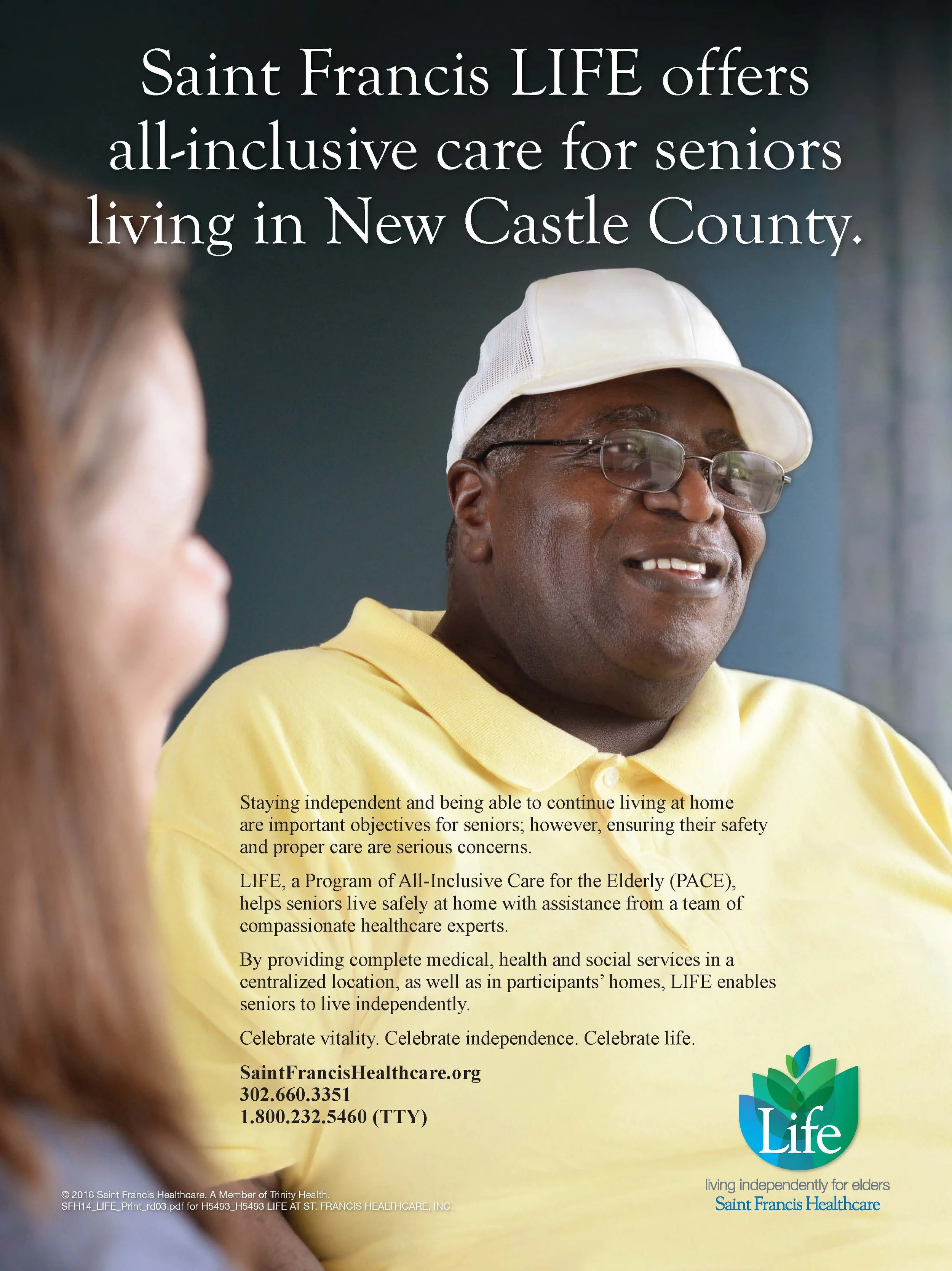
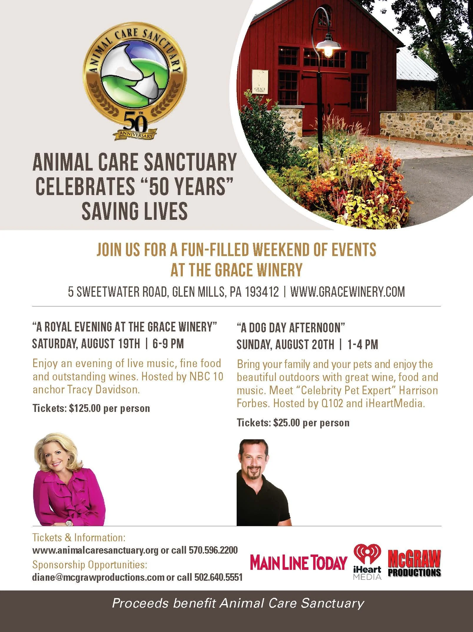
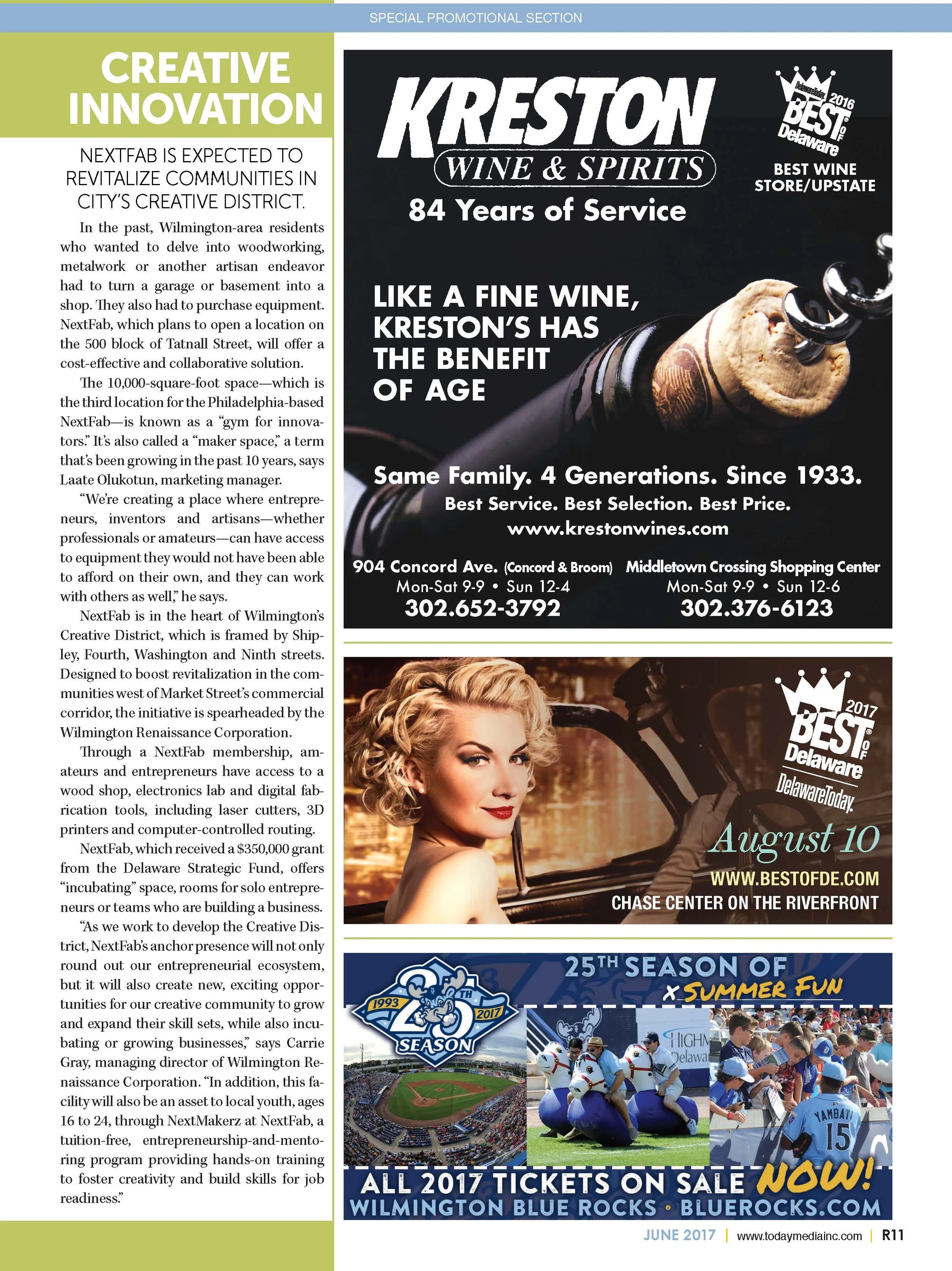
Advertiser participation was an important part of the publication. I integrated sponsor and business content into the overall rhythm so that commercial pages felt compatible with the editorial environment while remaining distinct and effective.
Production
I designed and prepared all 16 pages for print, managing typography, image placement, page sequencing and final production details. Careful pacing prevented the publication from feeling crowded and allowed each spread to contribute to the larger destination story.
The Result
The completed supplement offered readers an attractive, accessible guide to two of Wilmington’s most active districts. It strengthened the connection between place-based editorial storytelling and local business promotion while demonstrating a scalable system for a multi-topic regional publication.
16-page custom destination supplement
Downtown and Riverfront content unified
Editorial, visitor and advertiser information integrated
Complete publication design through final print
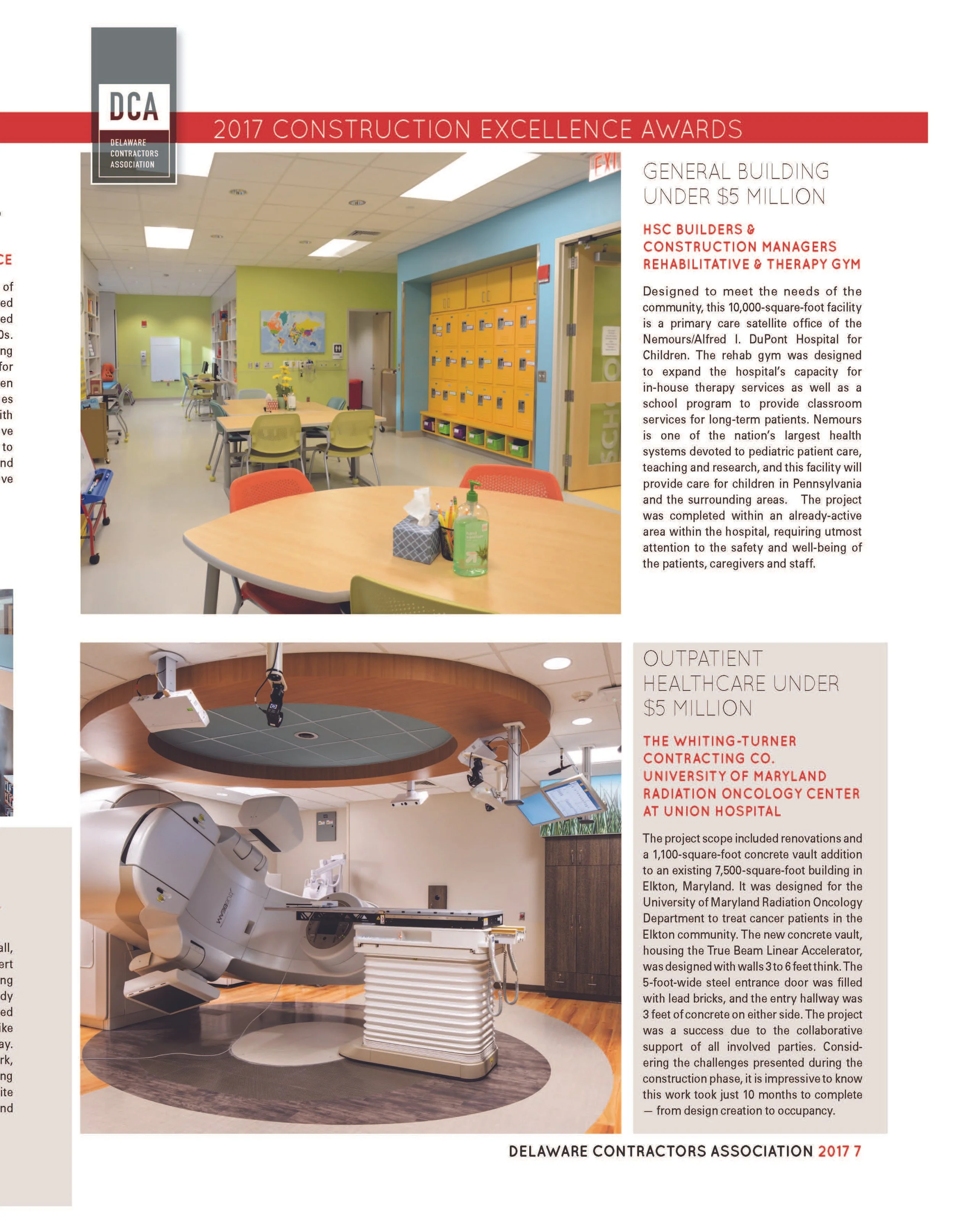
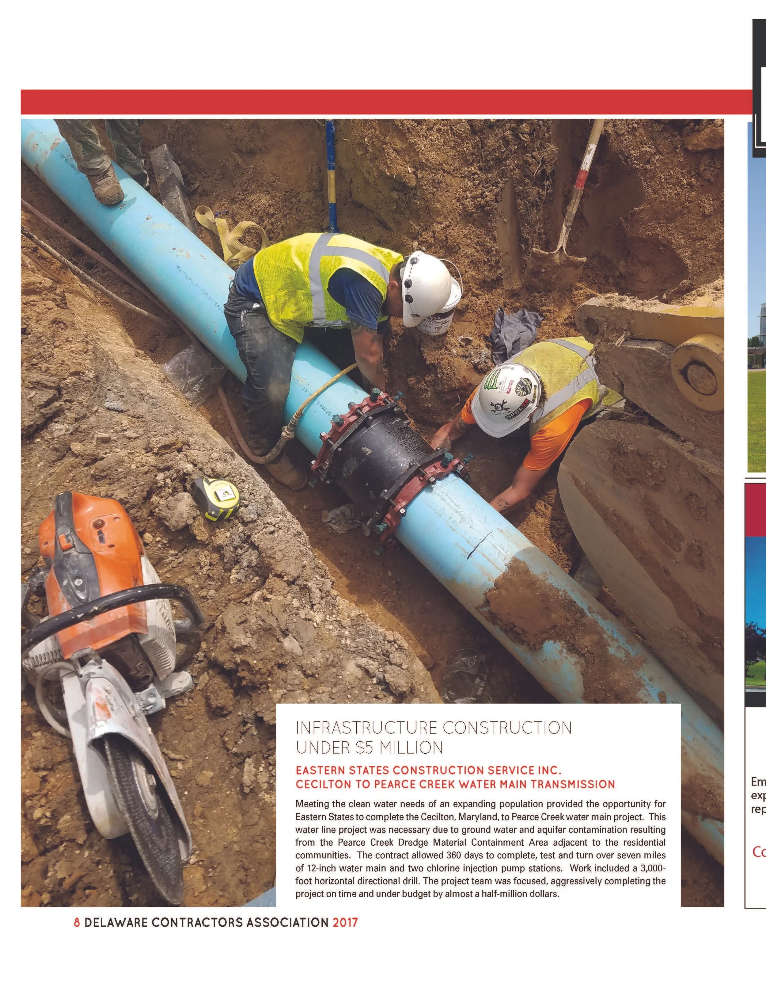
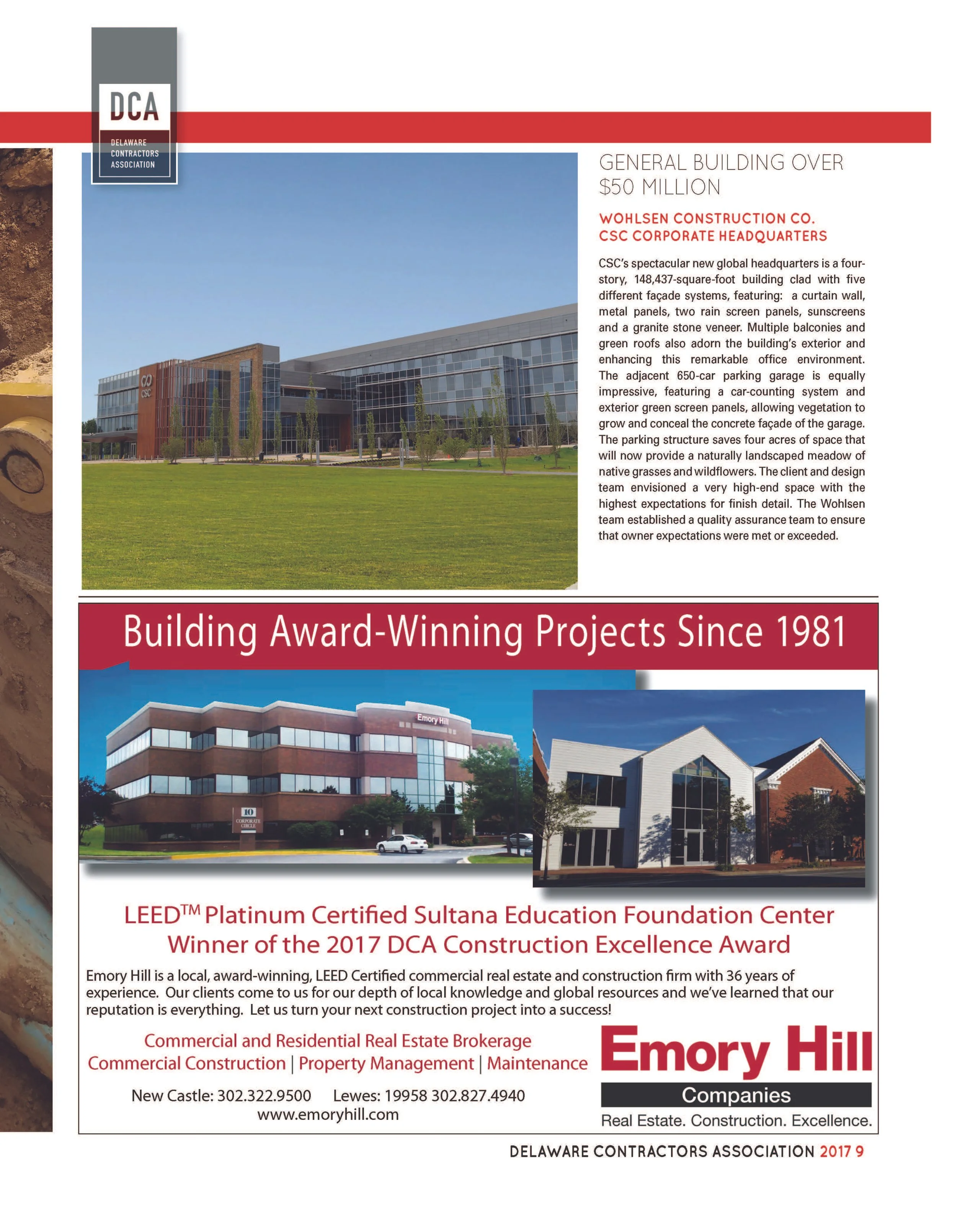
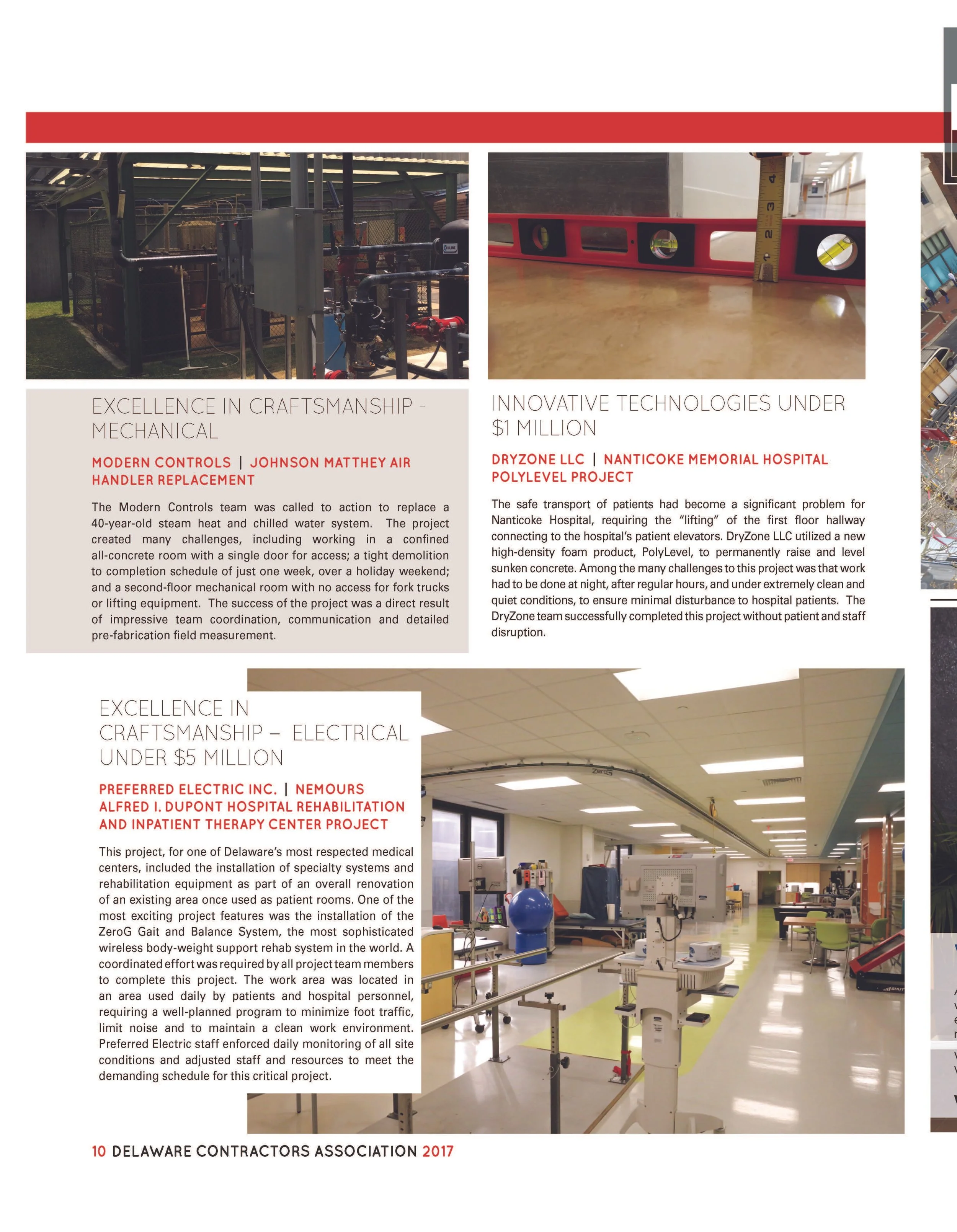
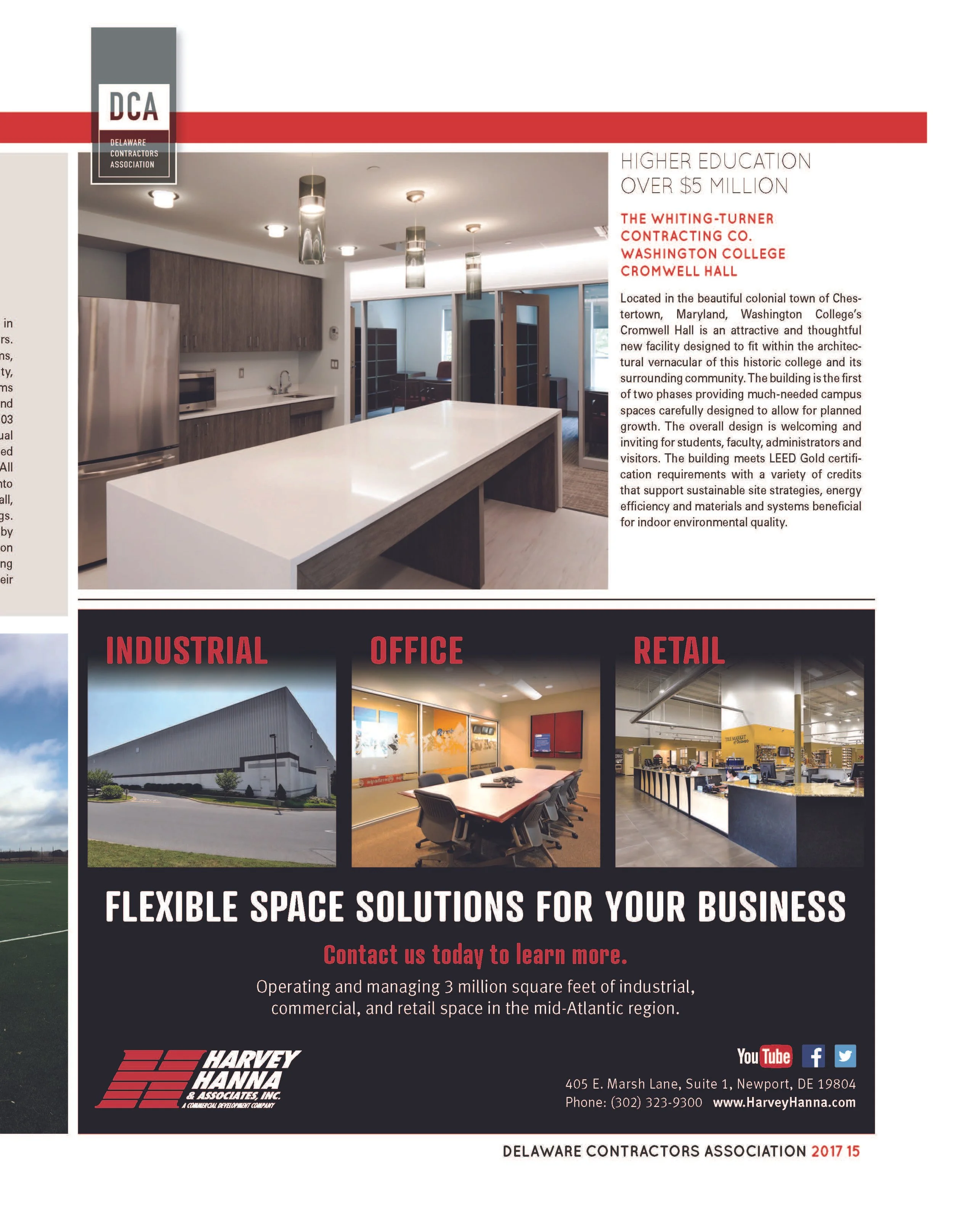
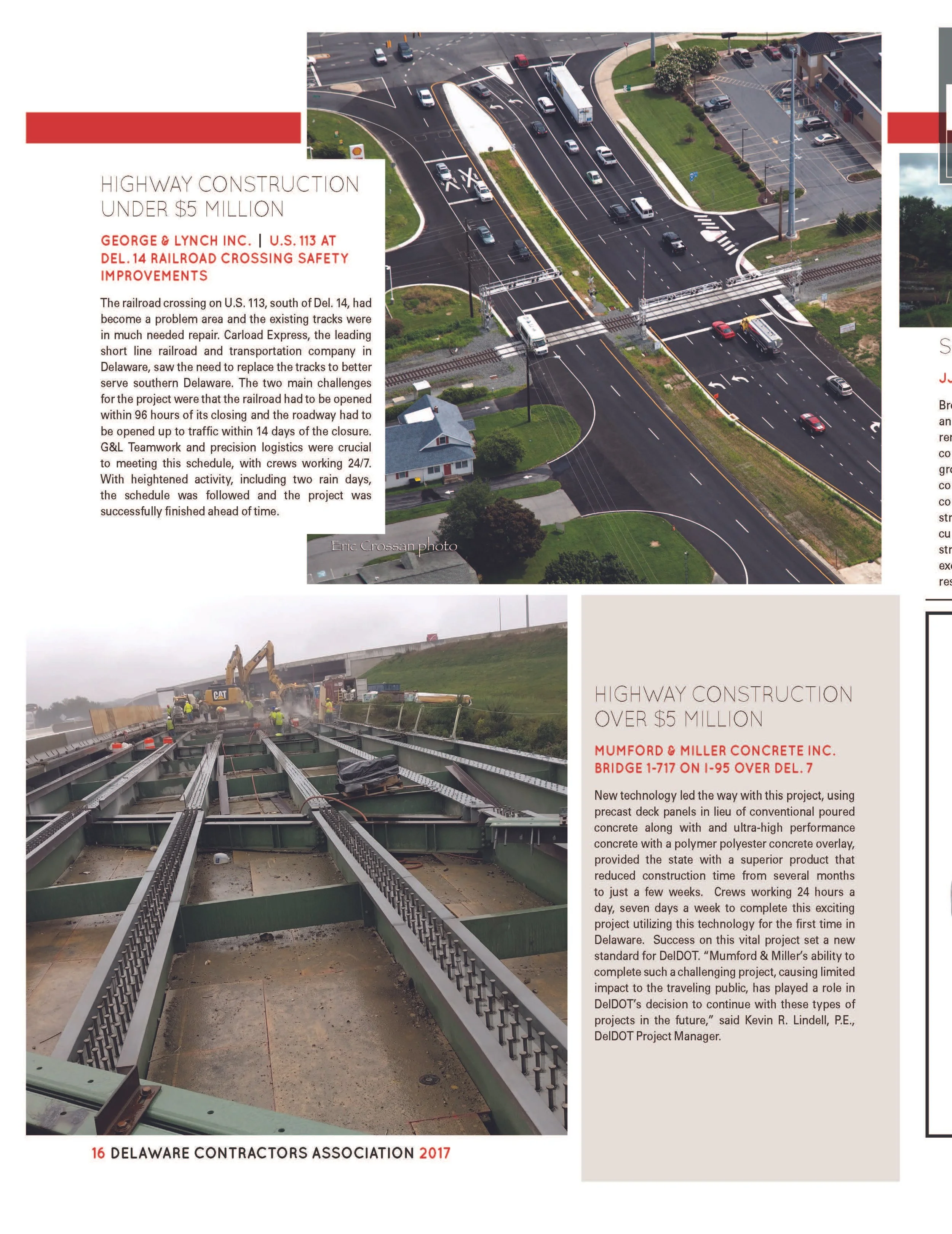
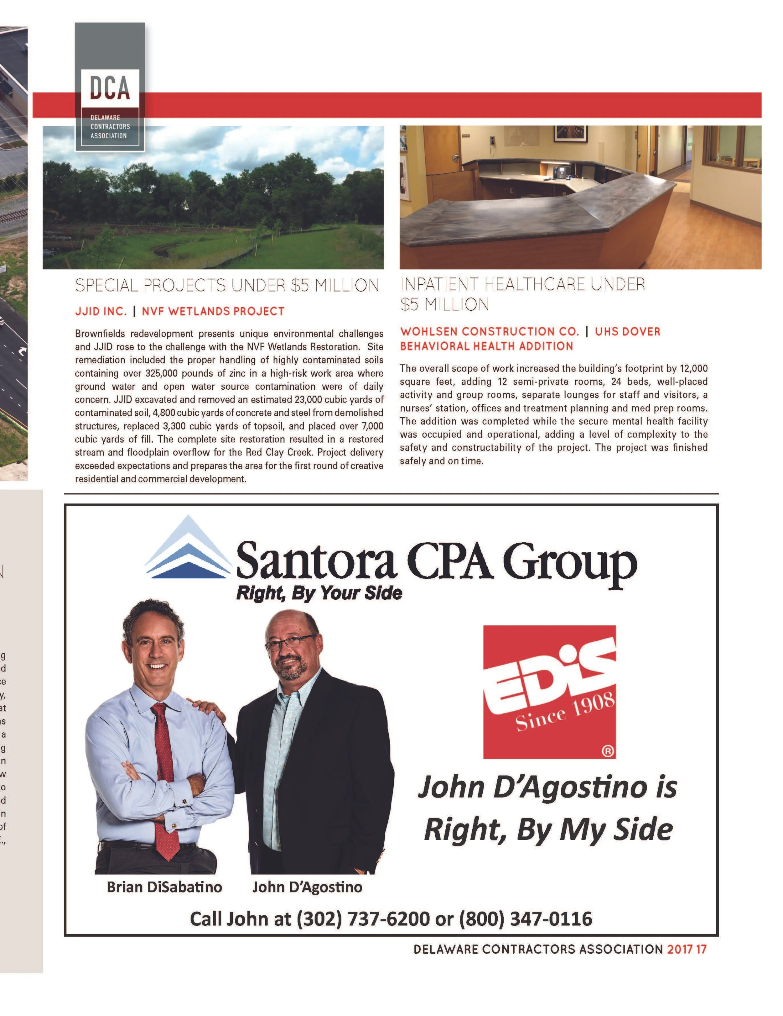
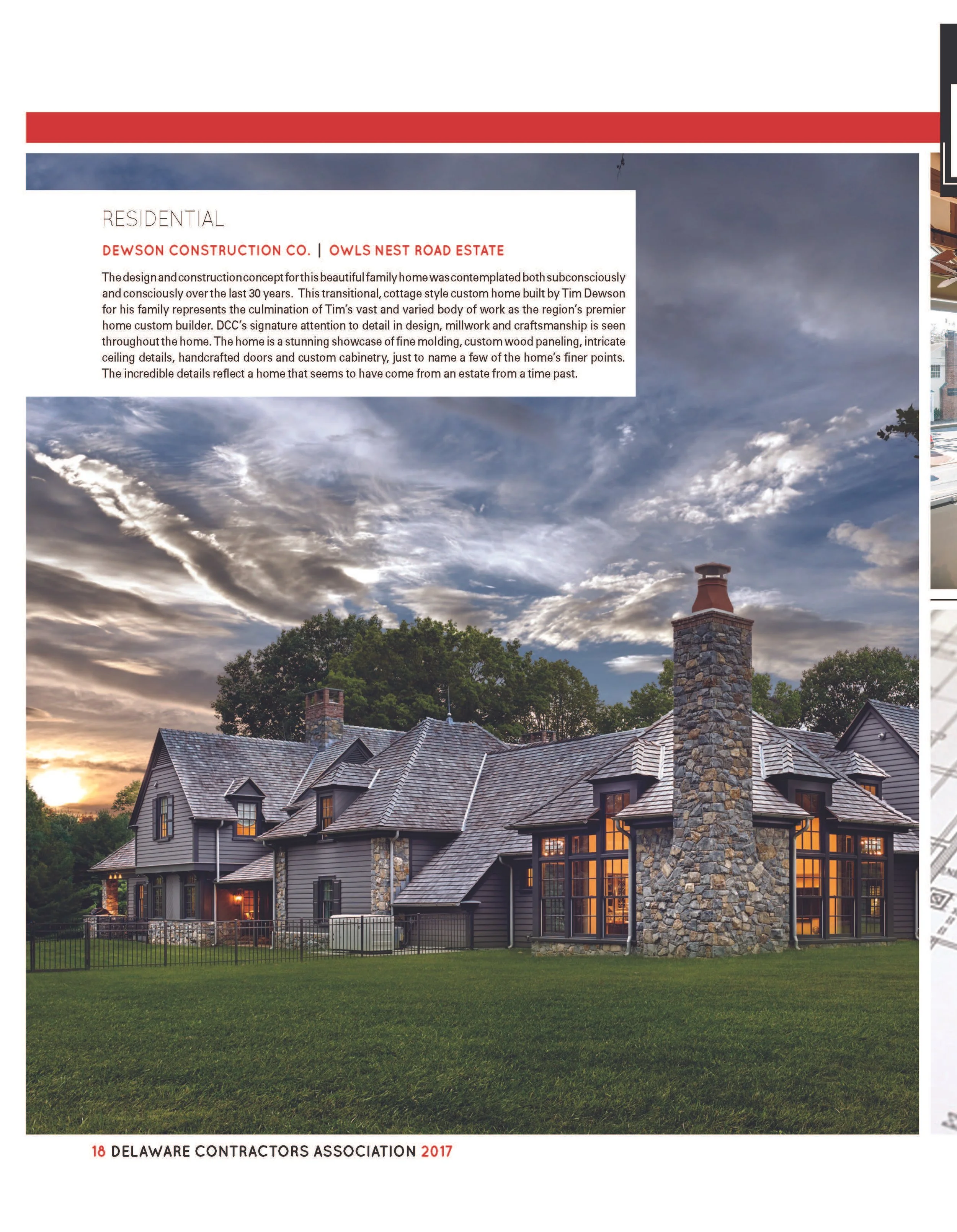
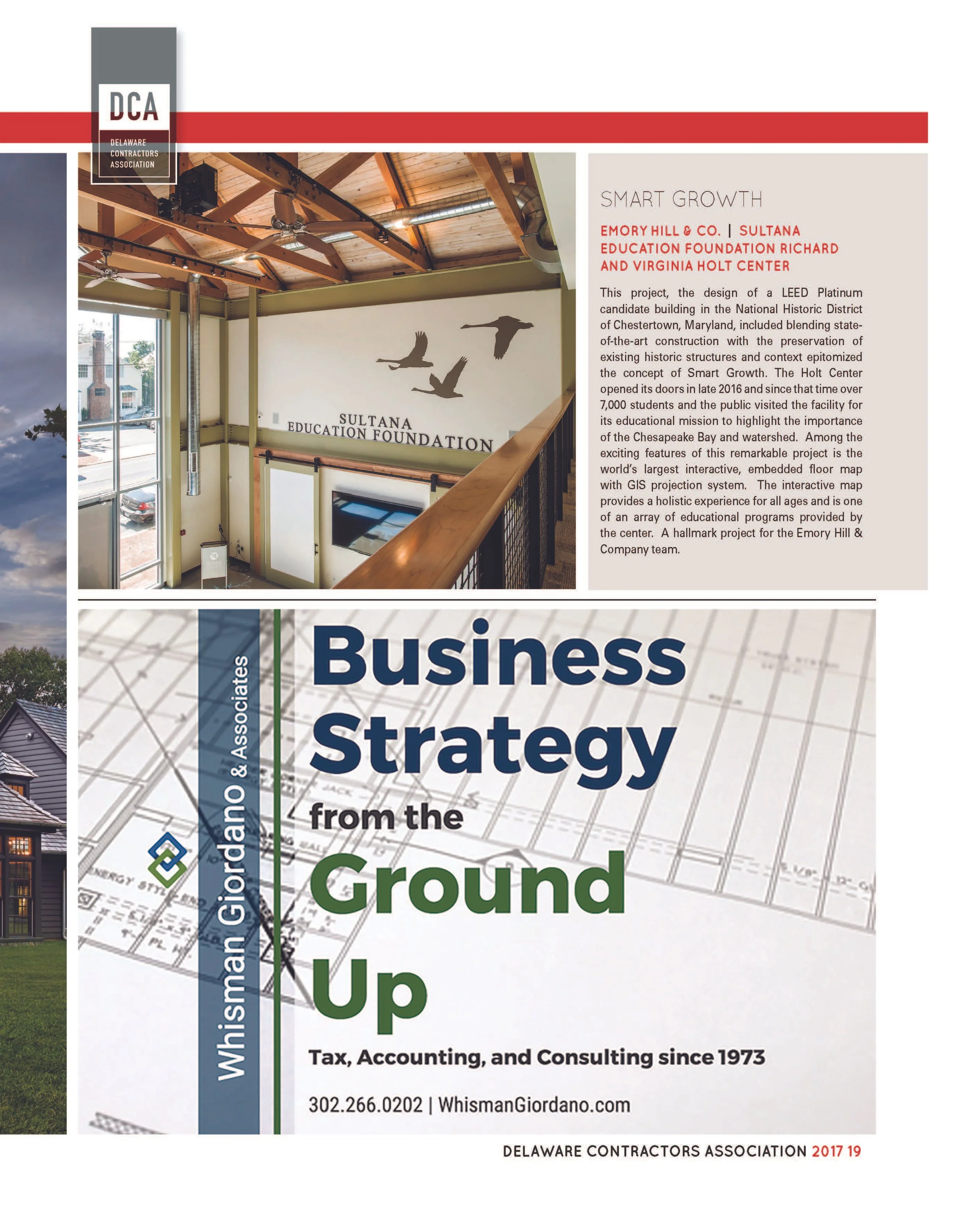
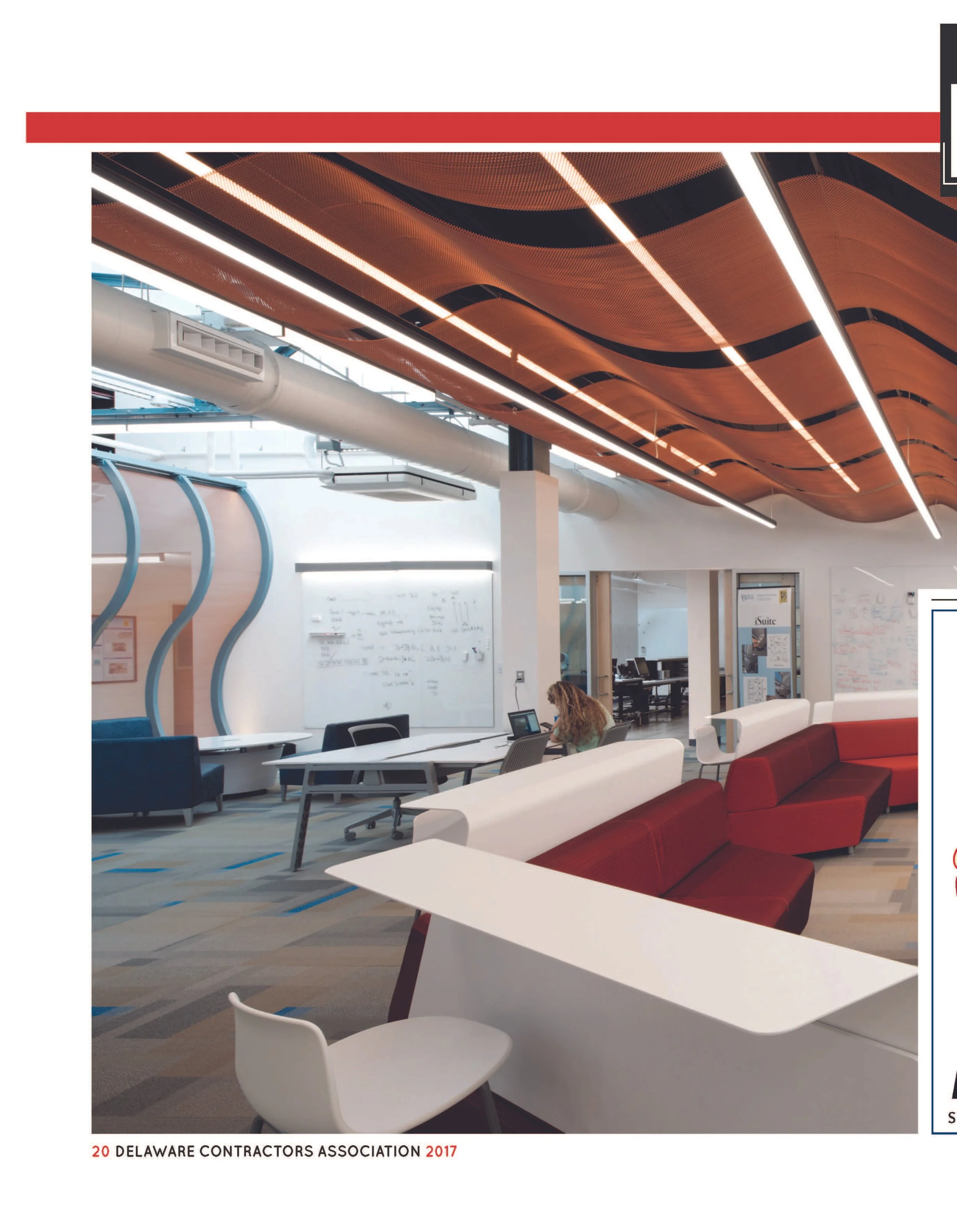
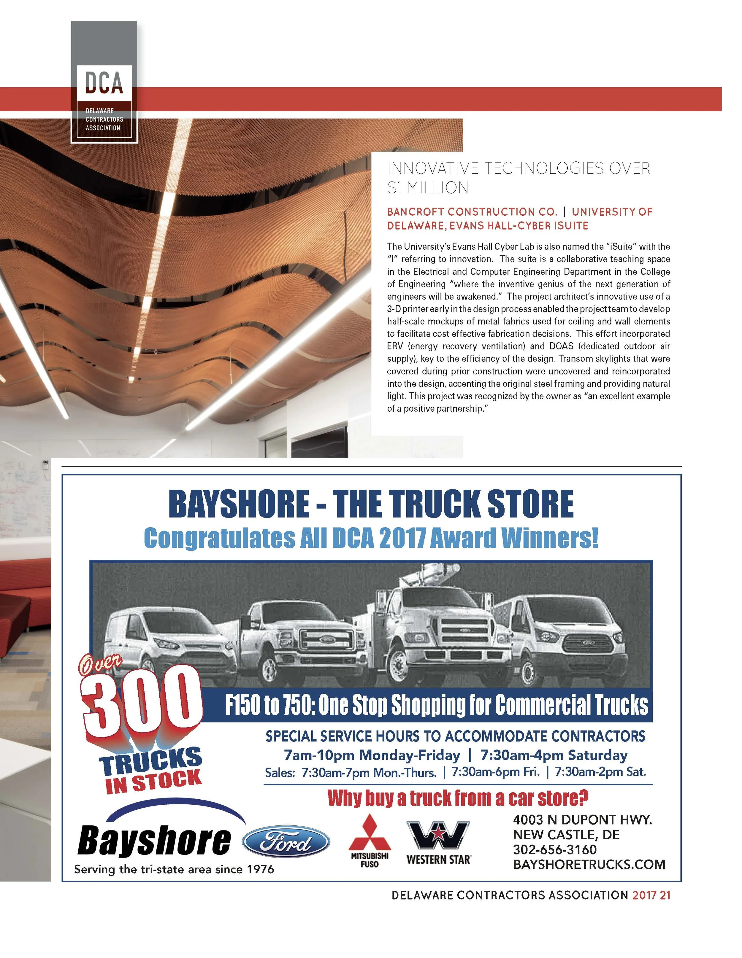
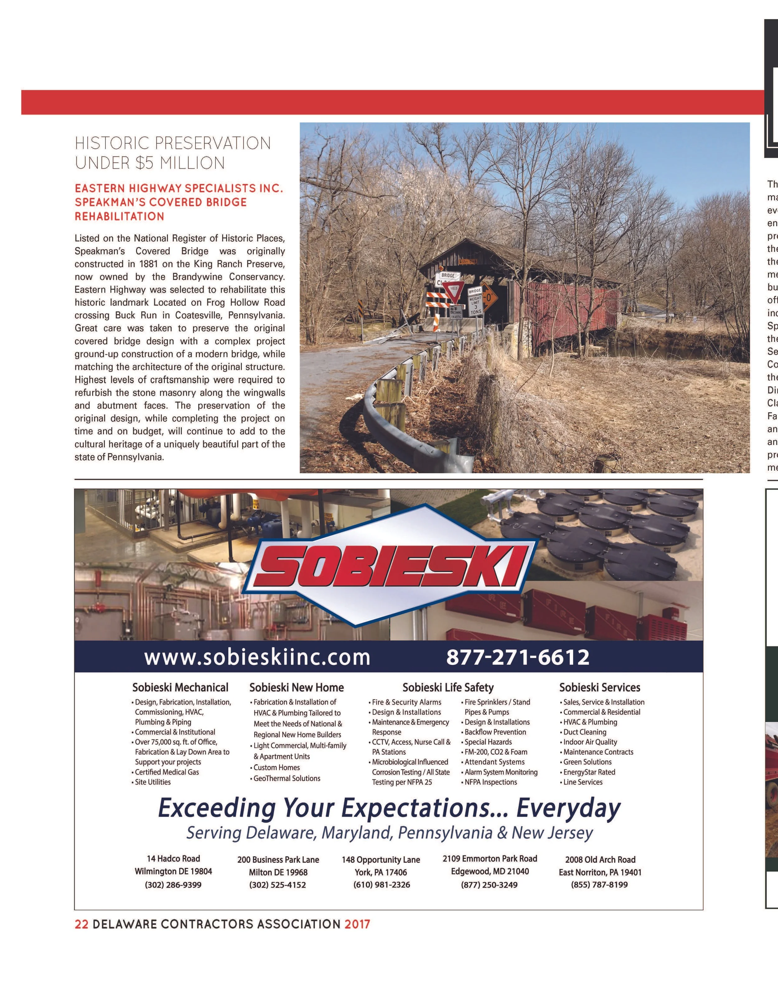
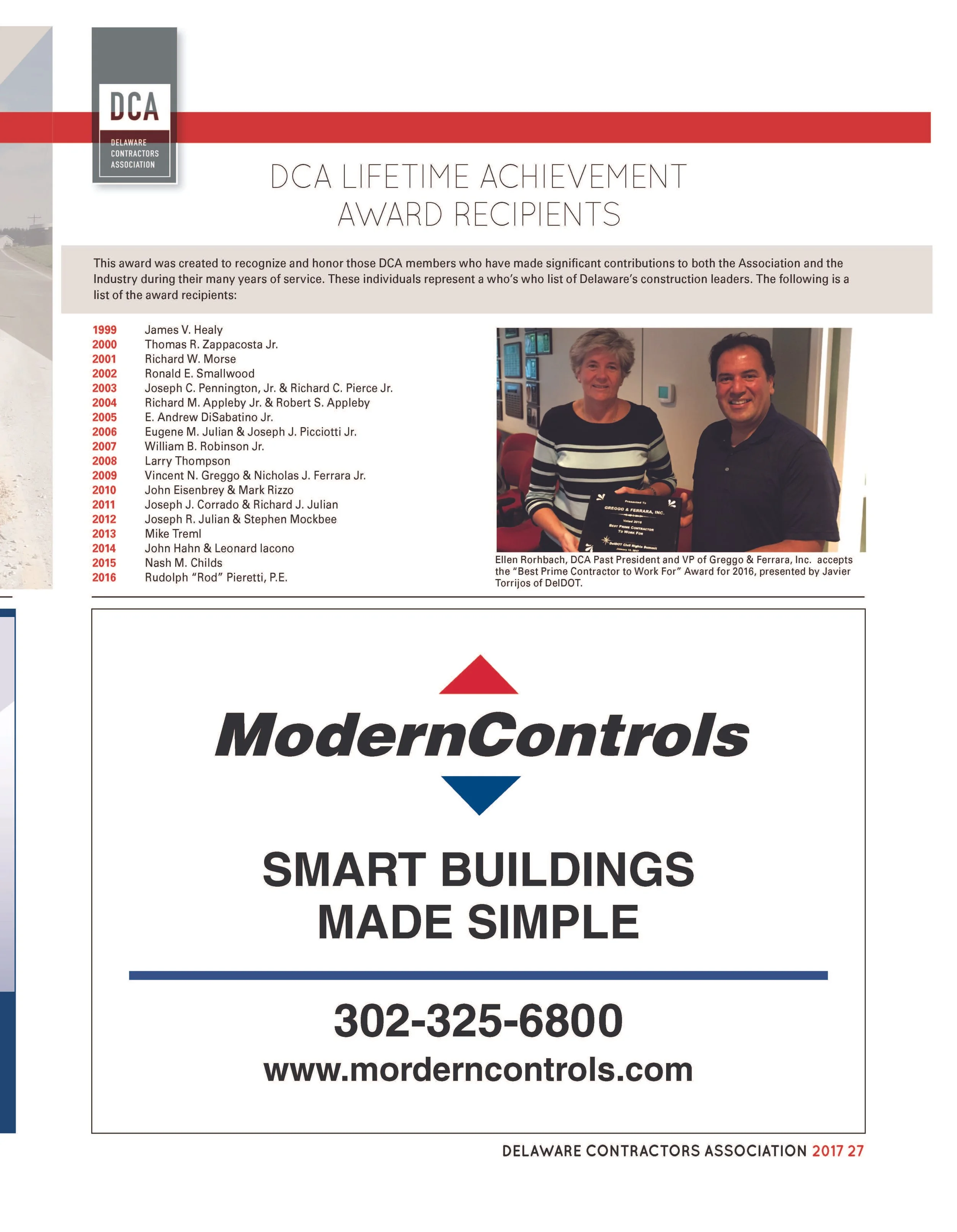
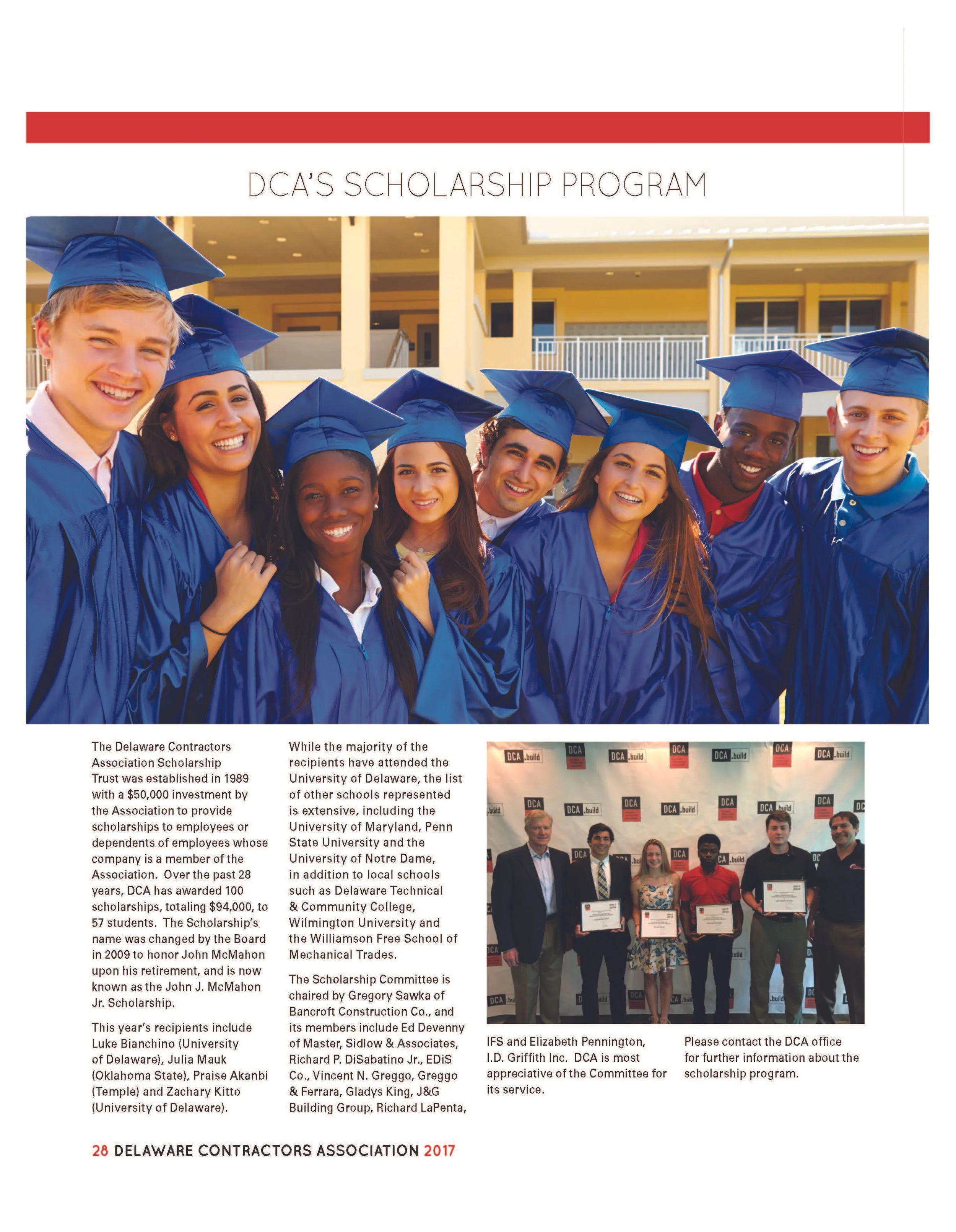
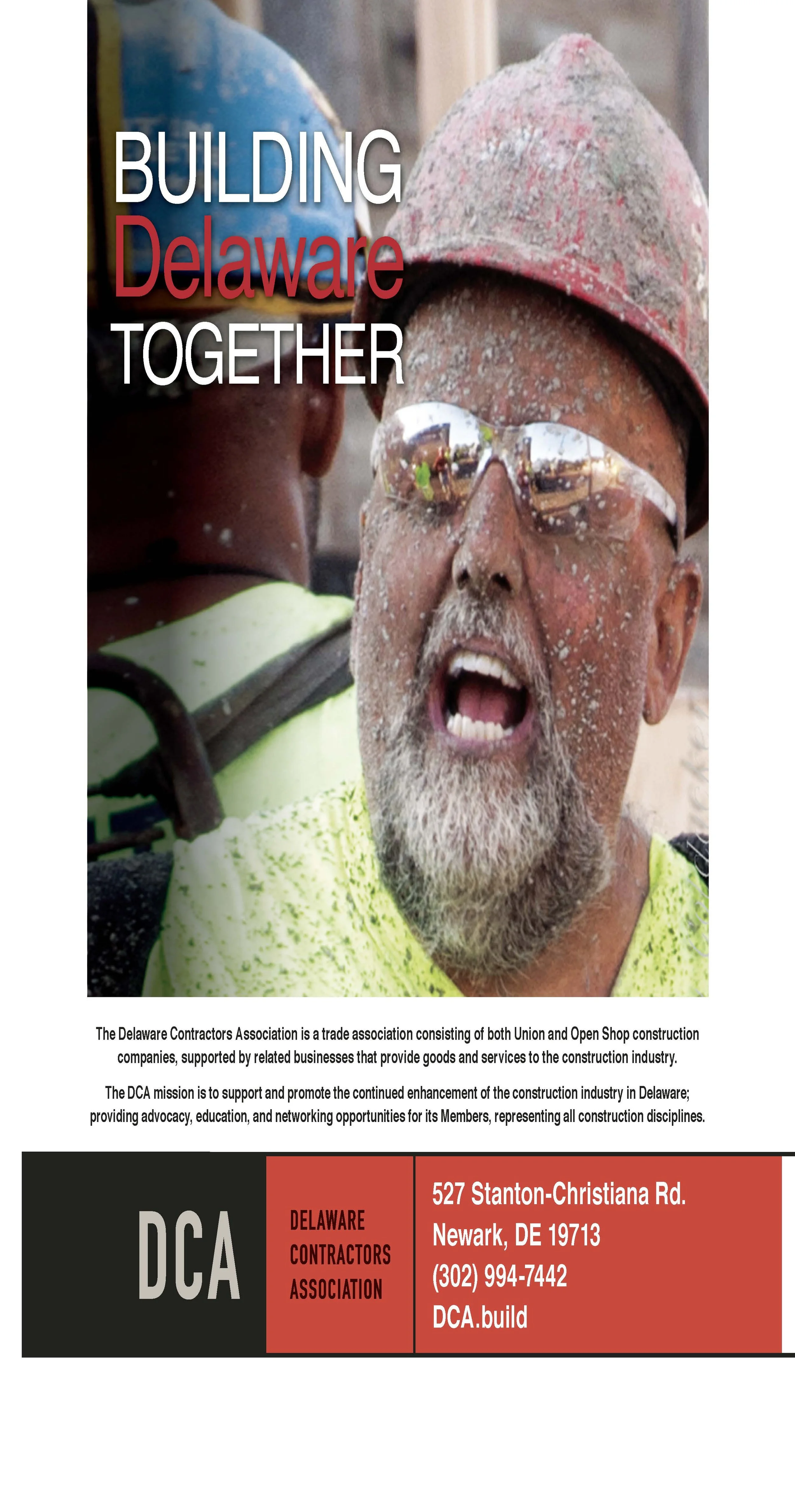
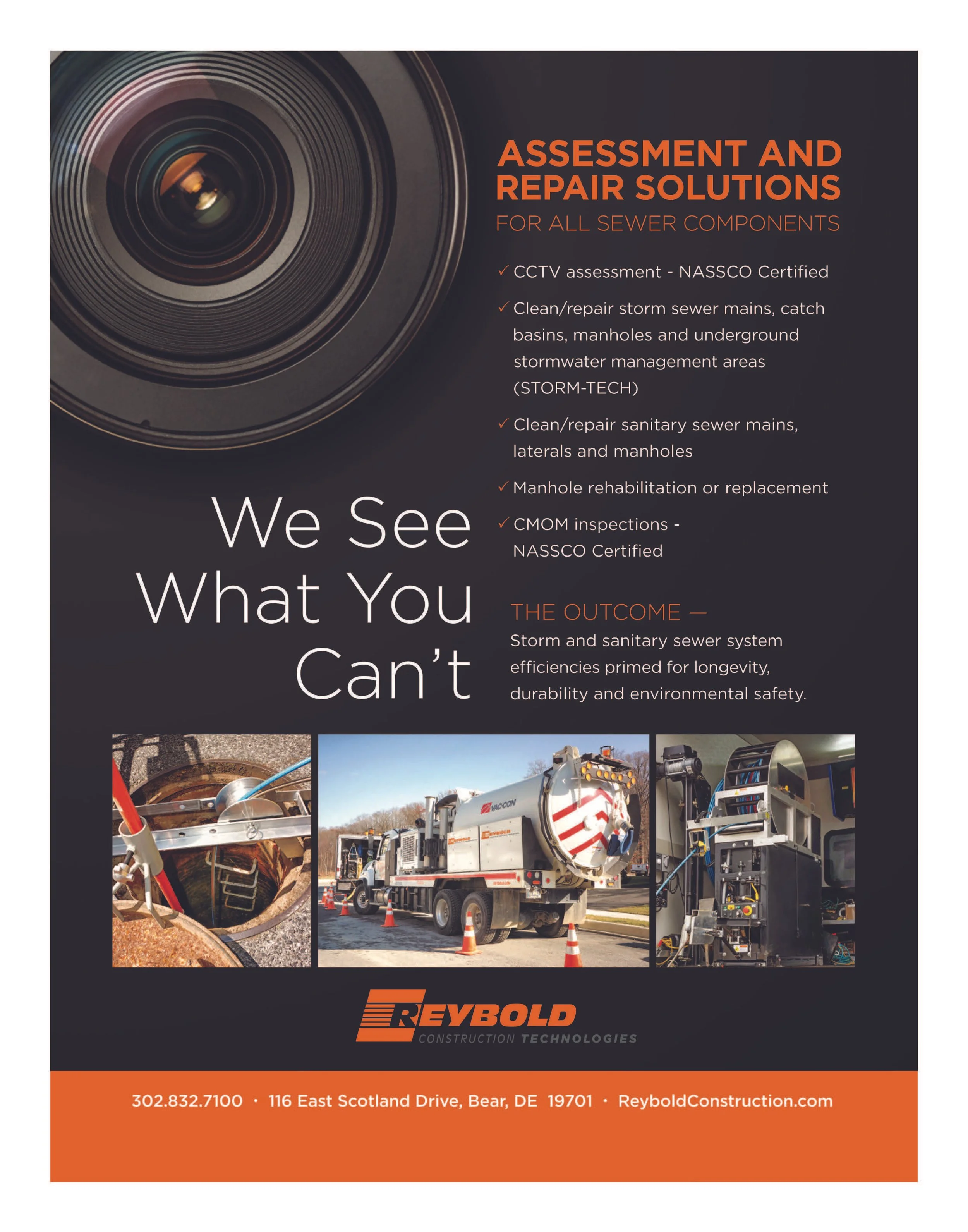
Delaware Construction Association
-
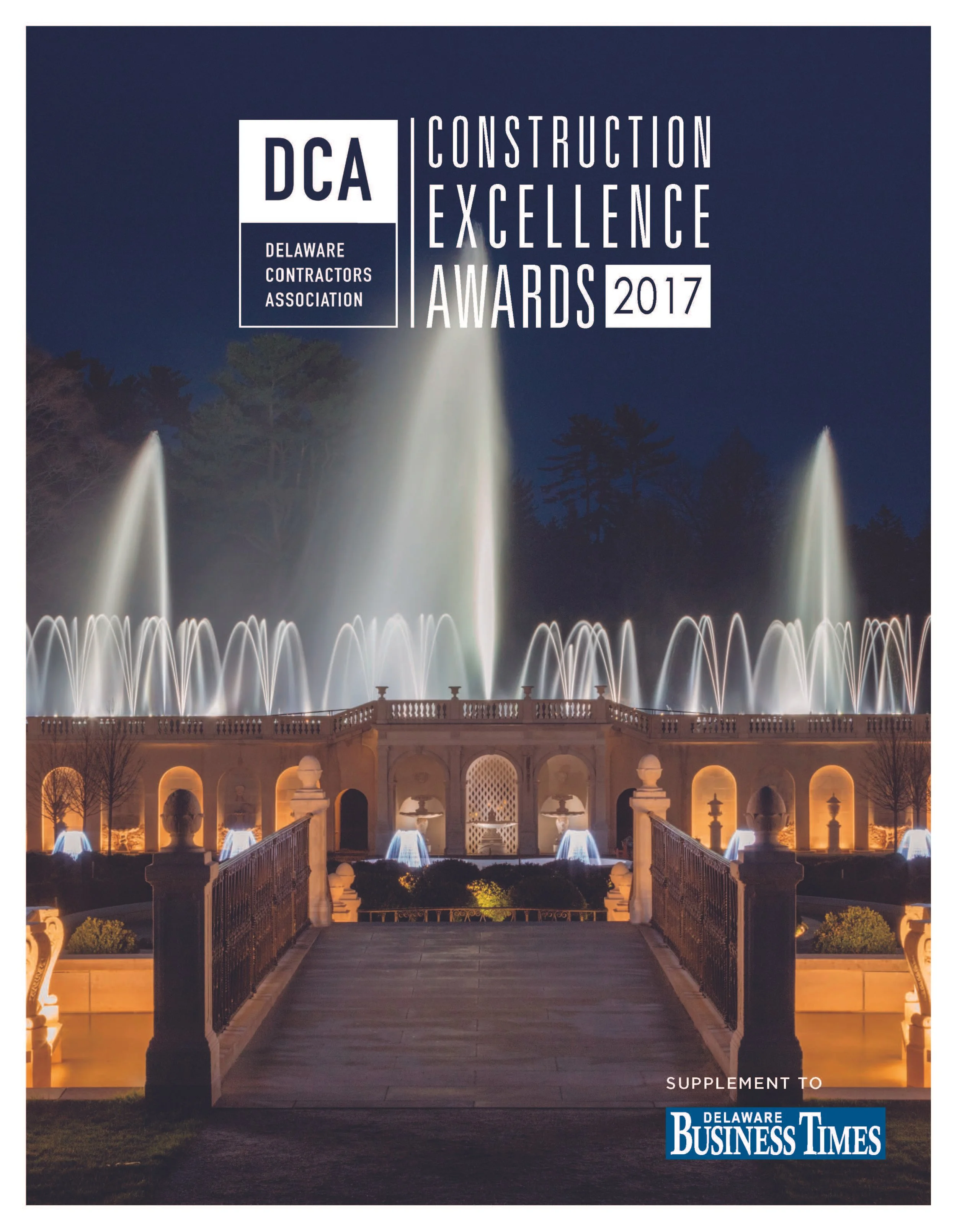
A modern 32-page association publication that organizes industry news, leadership profiles, awards, member programs and project features through a flexible, cohesive editorial system.
-
My Role
Lead Publication Designer
Project Scope
Creative Direction · Publication Design · Editorial Layout · Visual Systems · Art Direction · Typography · Print Production
Project Overview
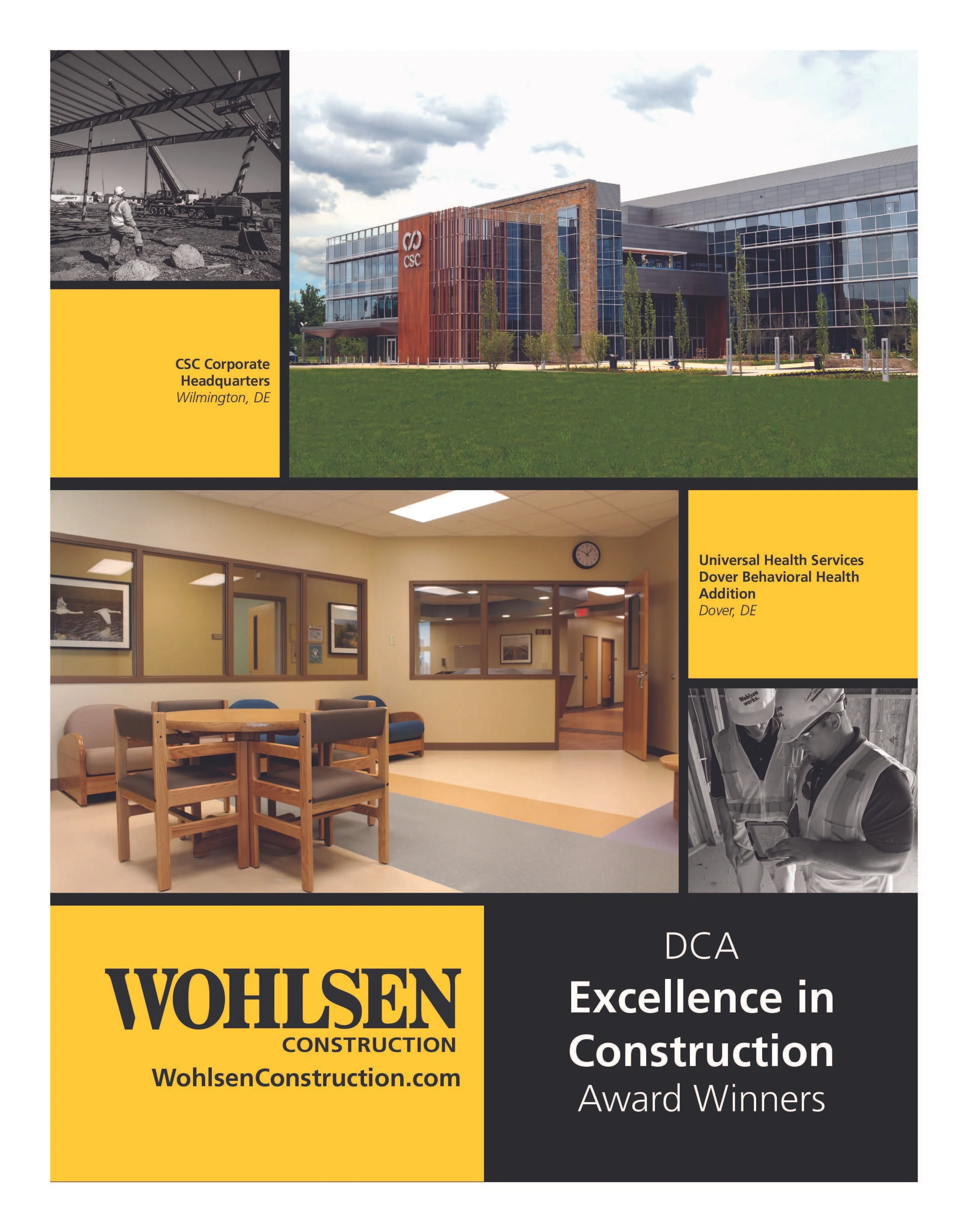
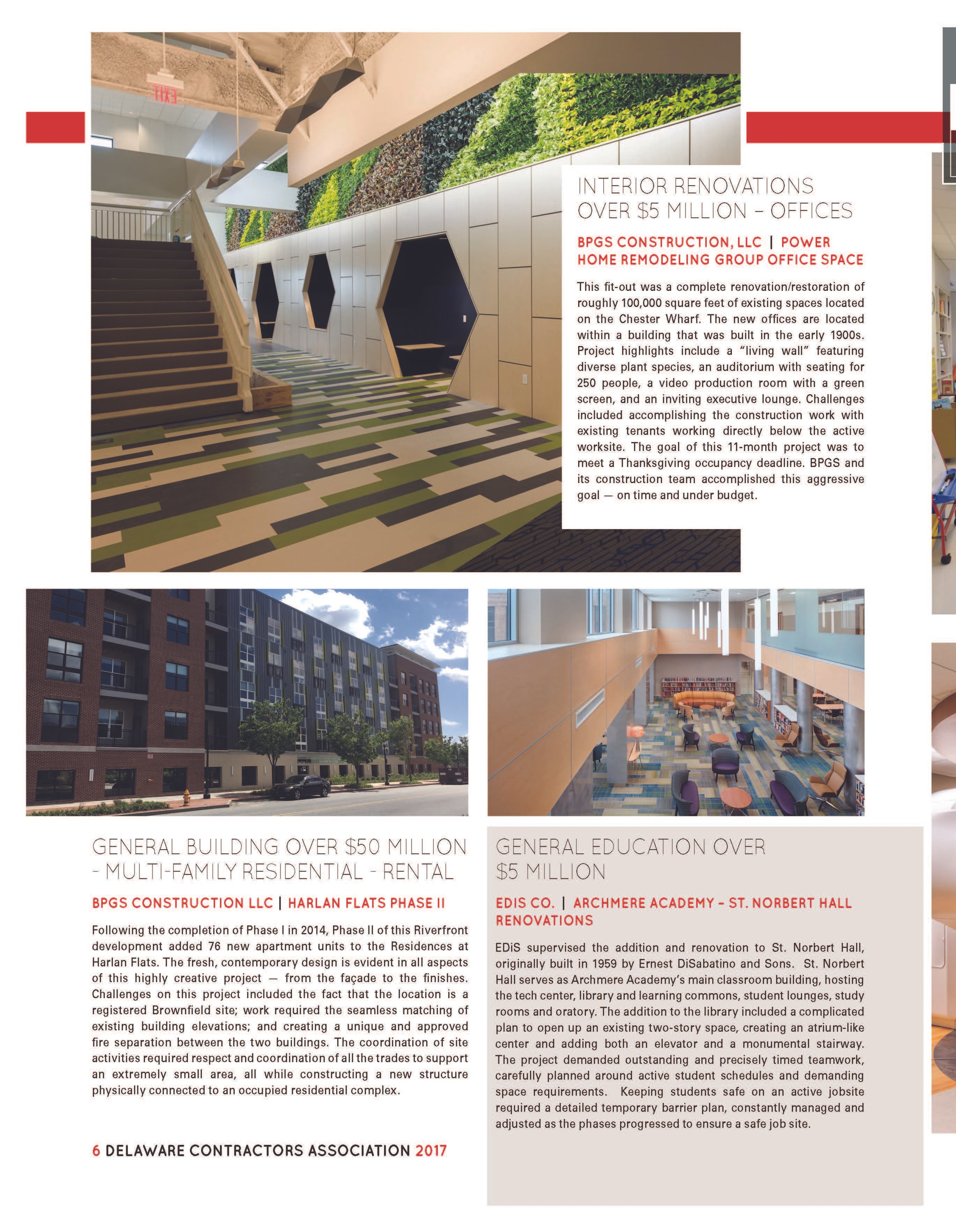
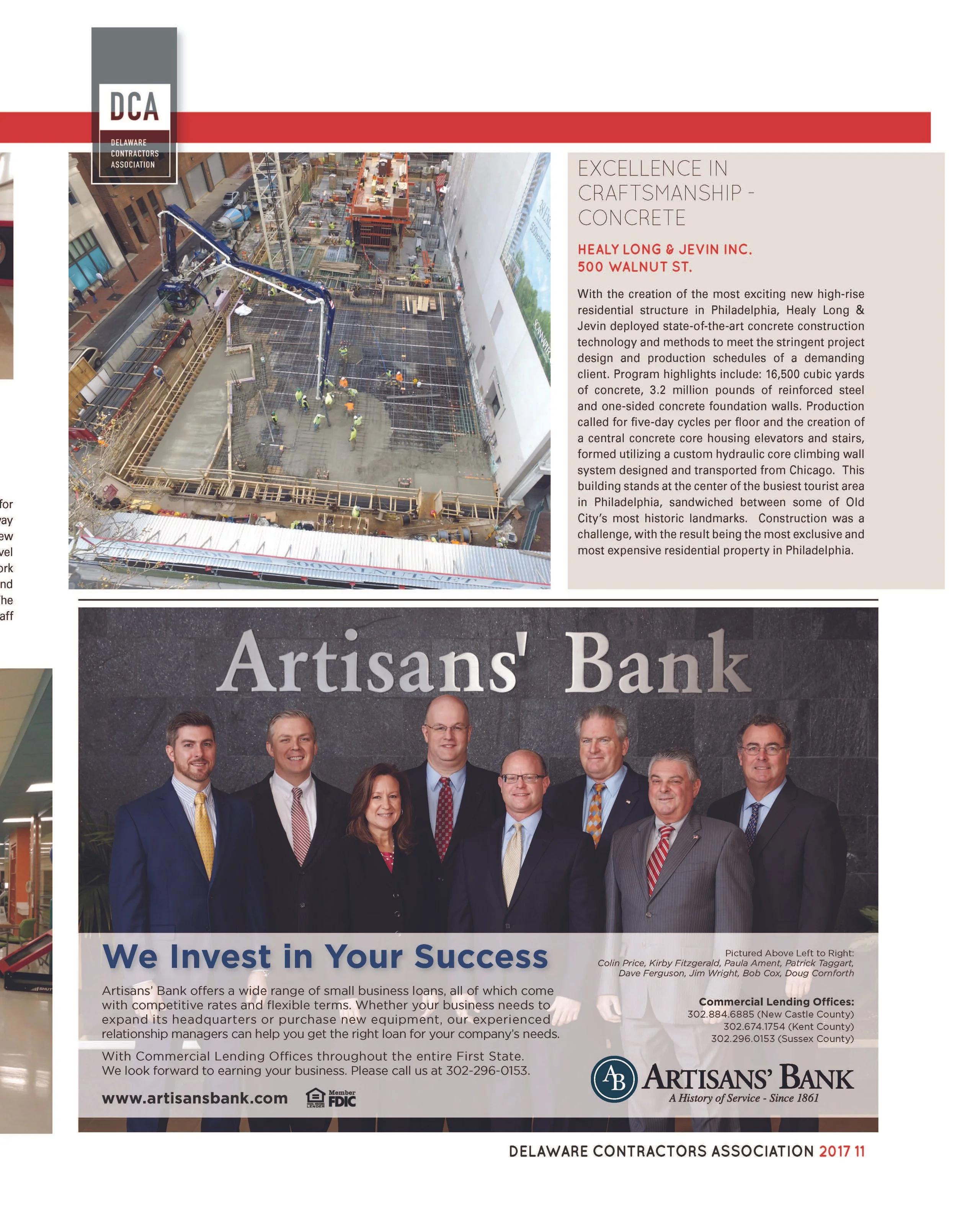
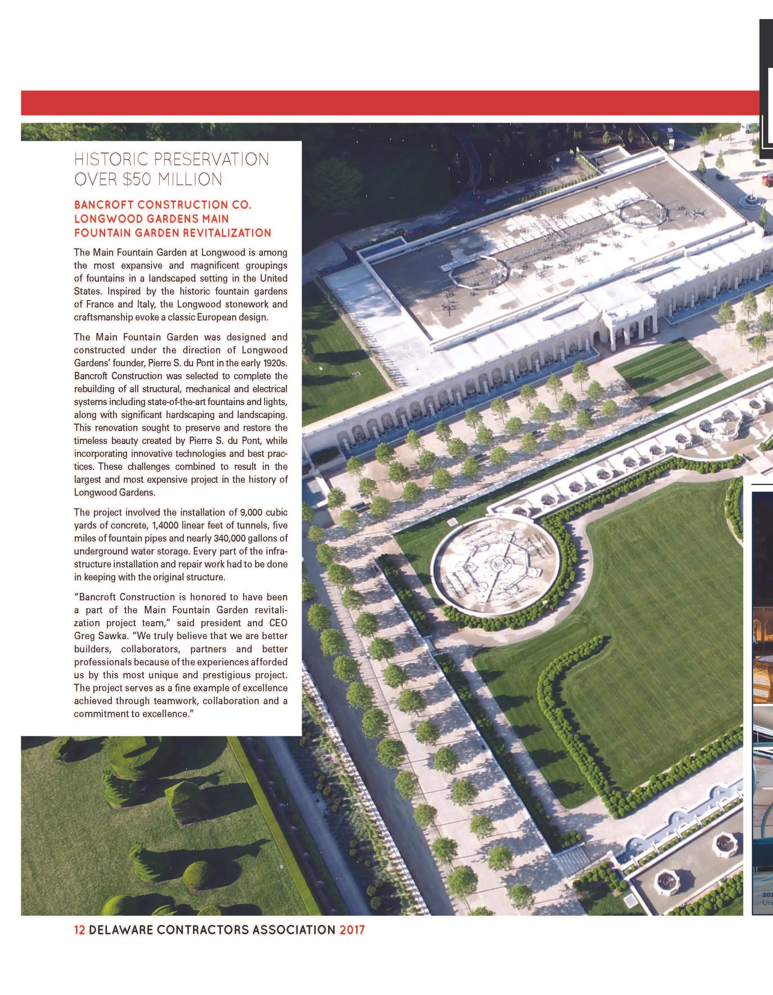
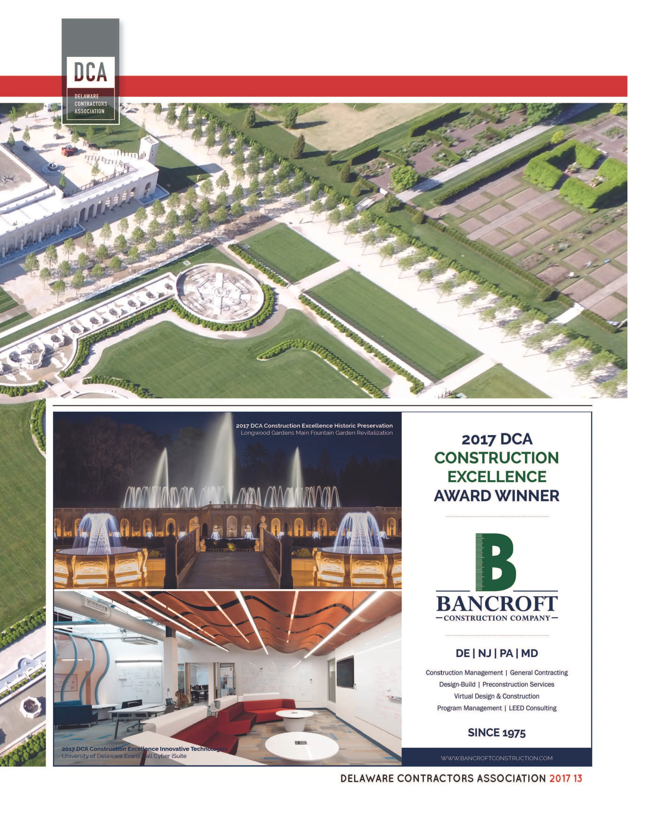
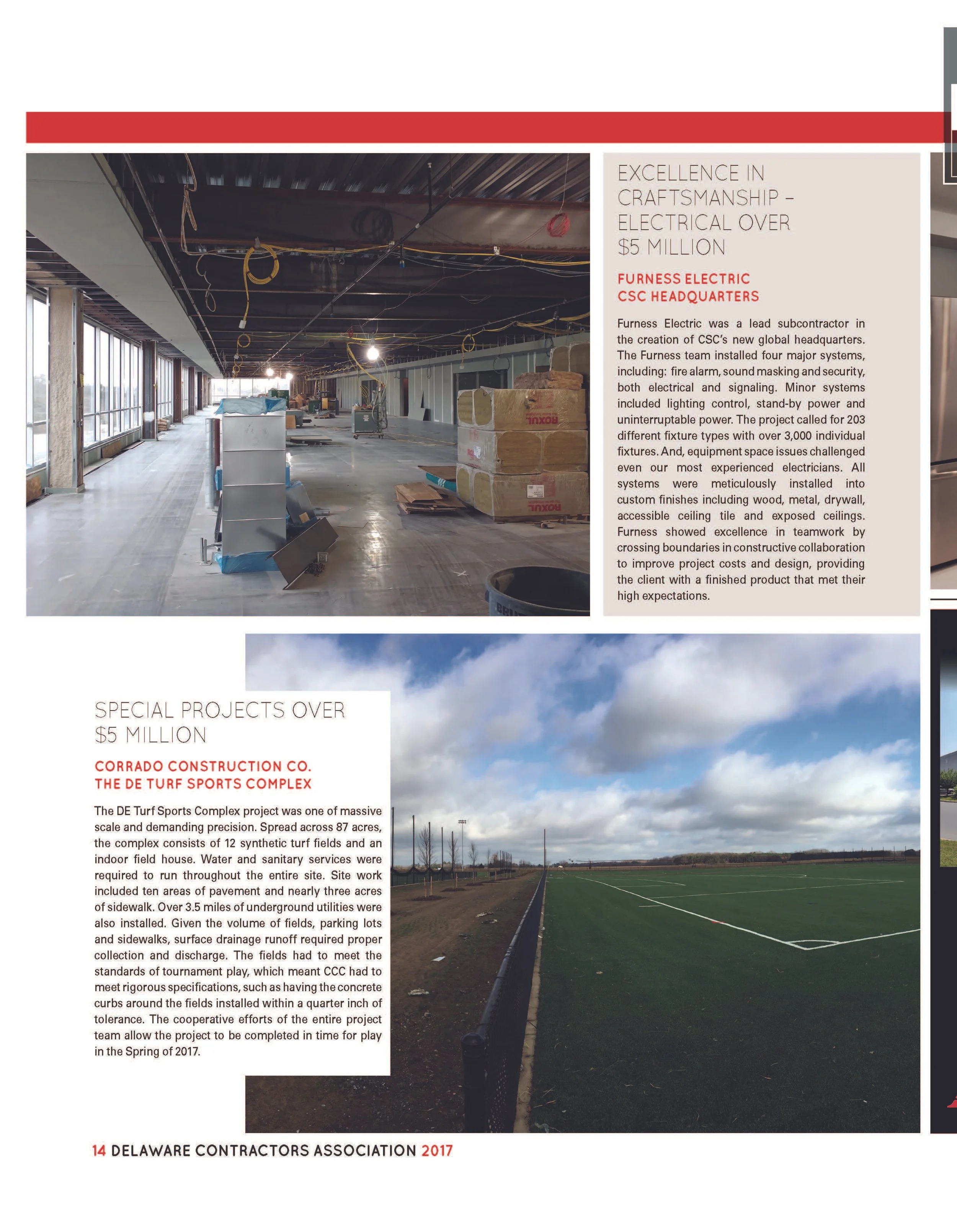
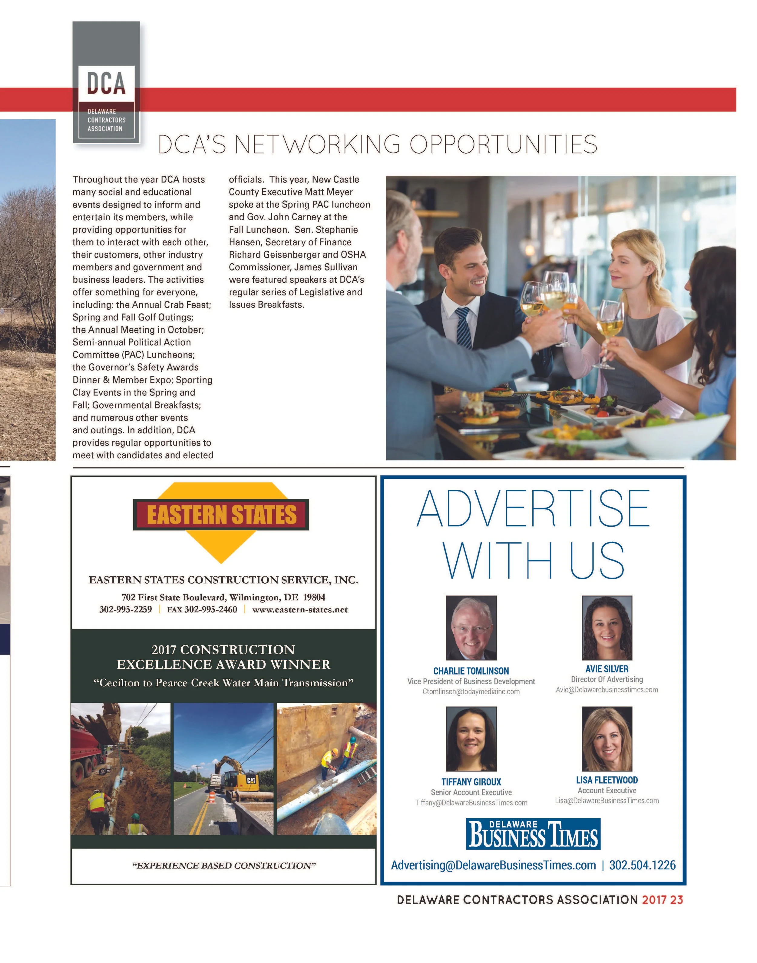
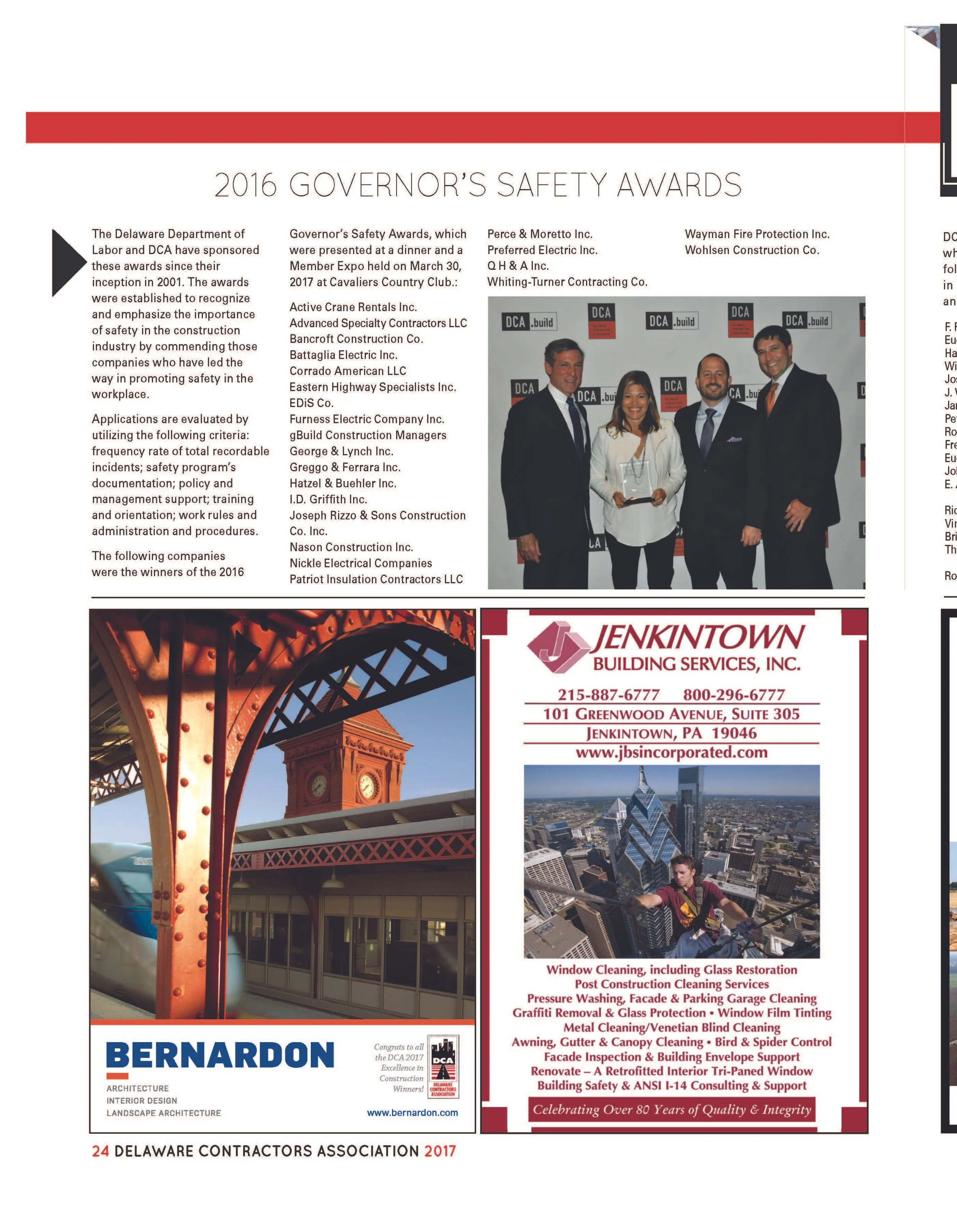
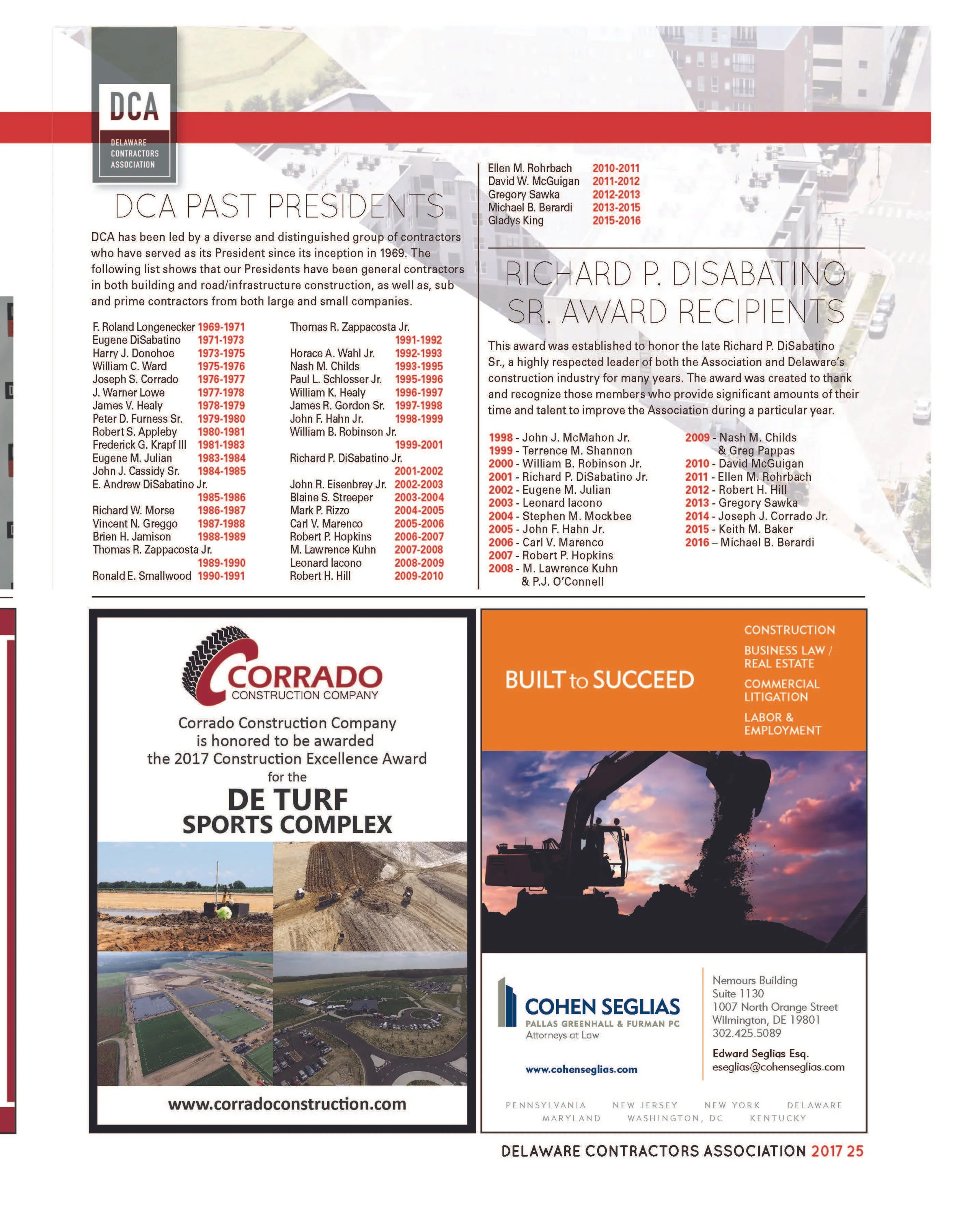
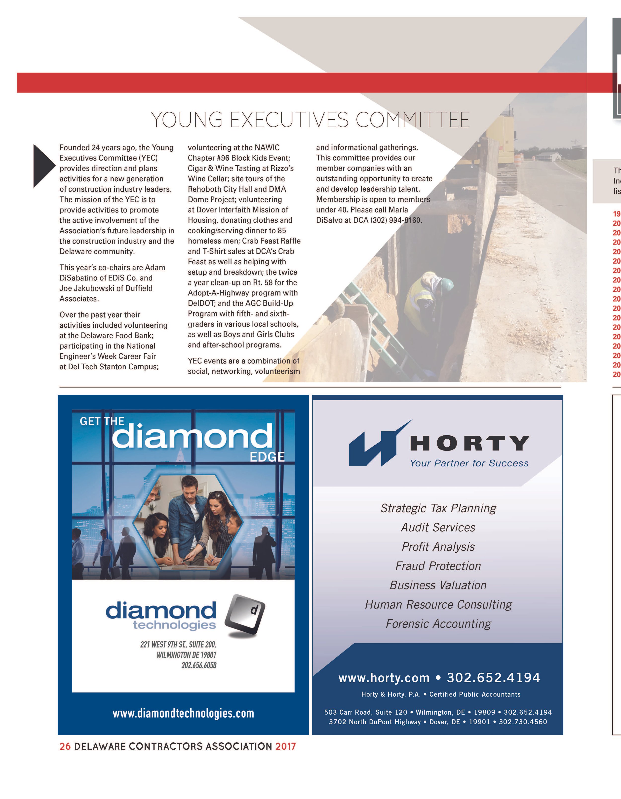
The Delaware Contractors Association needed a modern publication that could promote organizational updates, recognize industry leaders, and showcase award-winning construction projects.
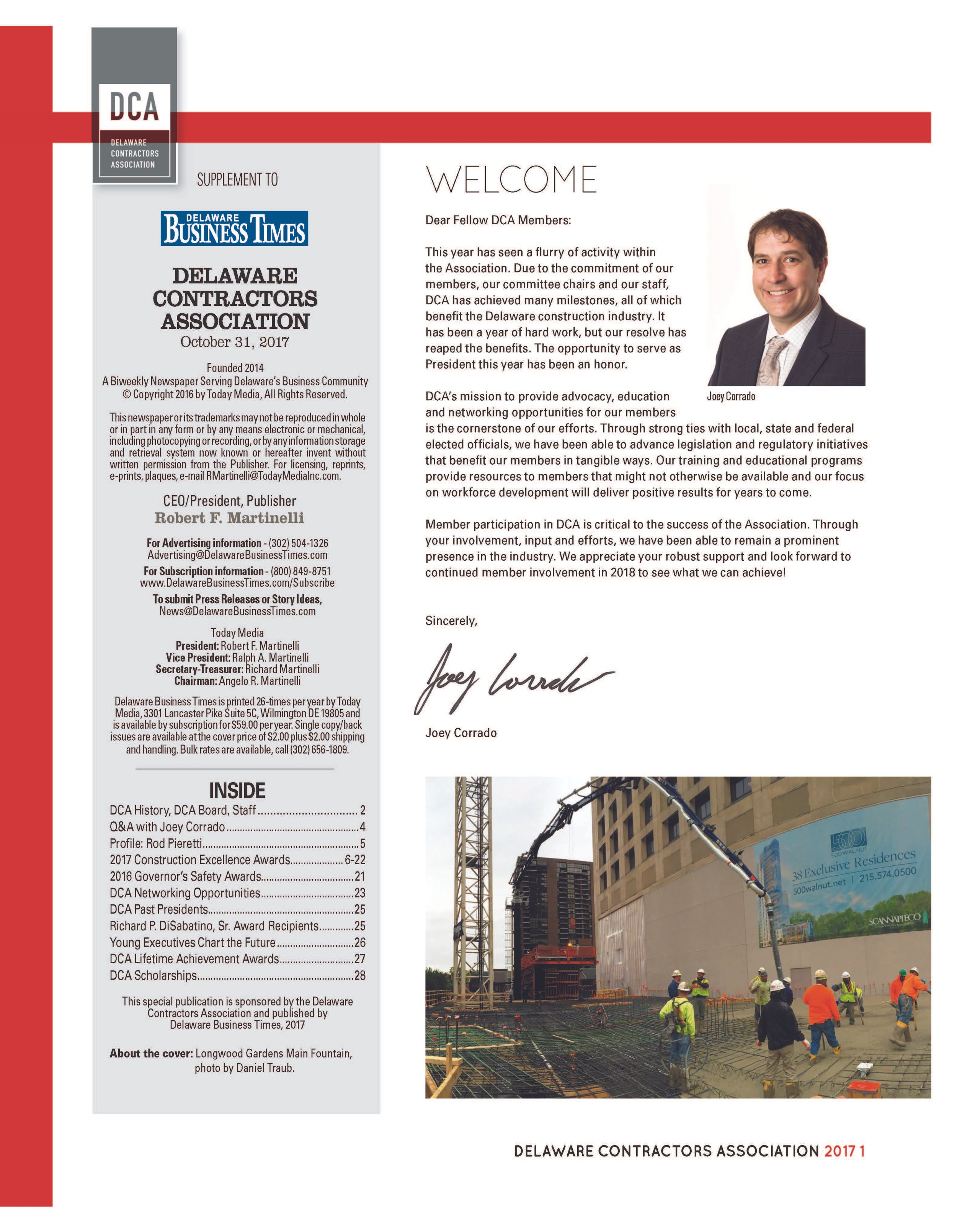
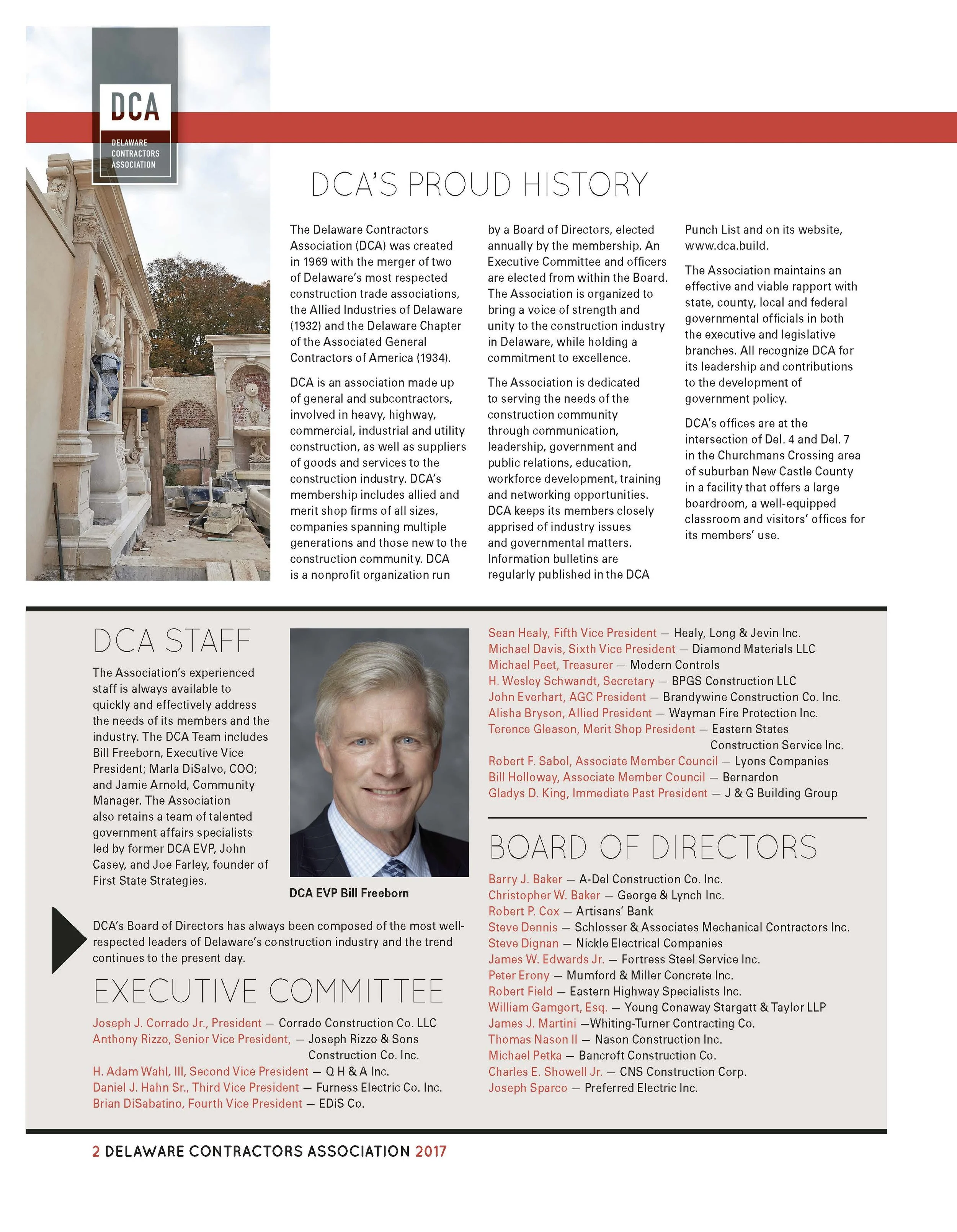
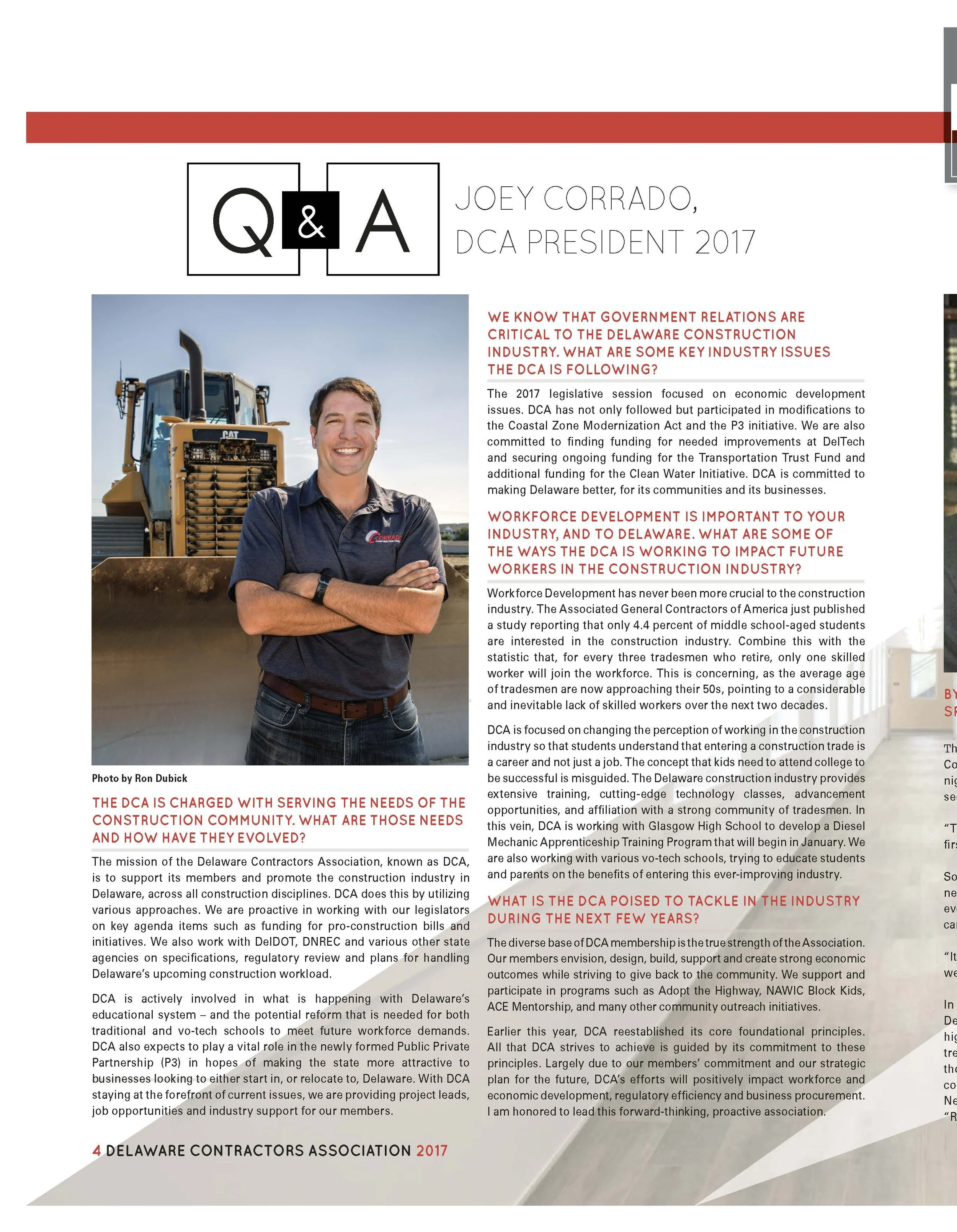
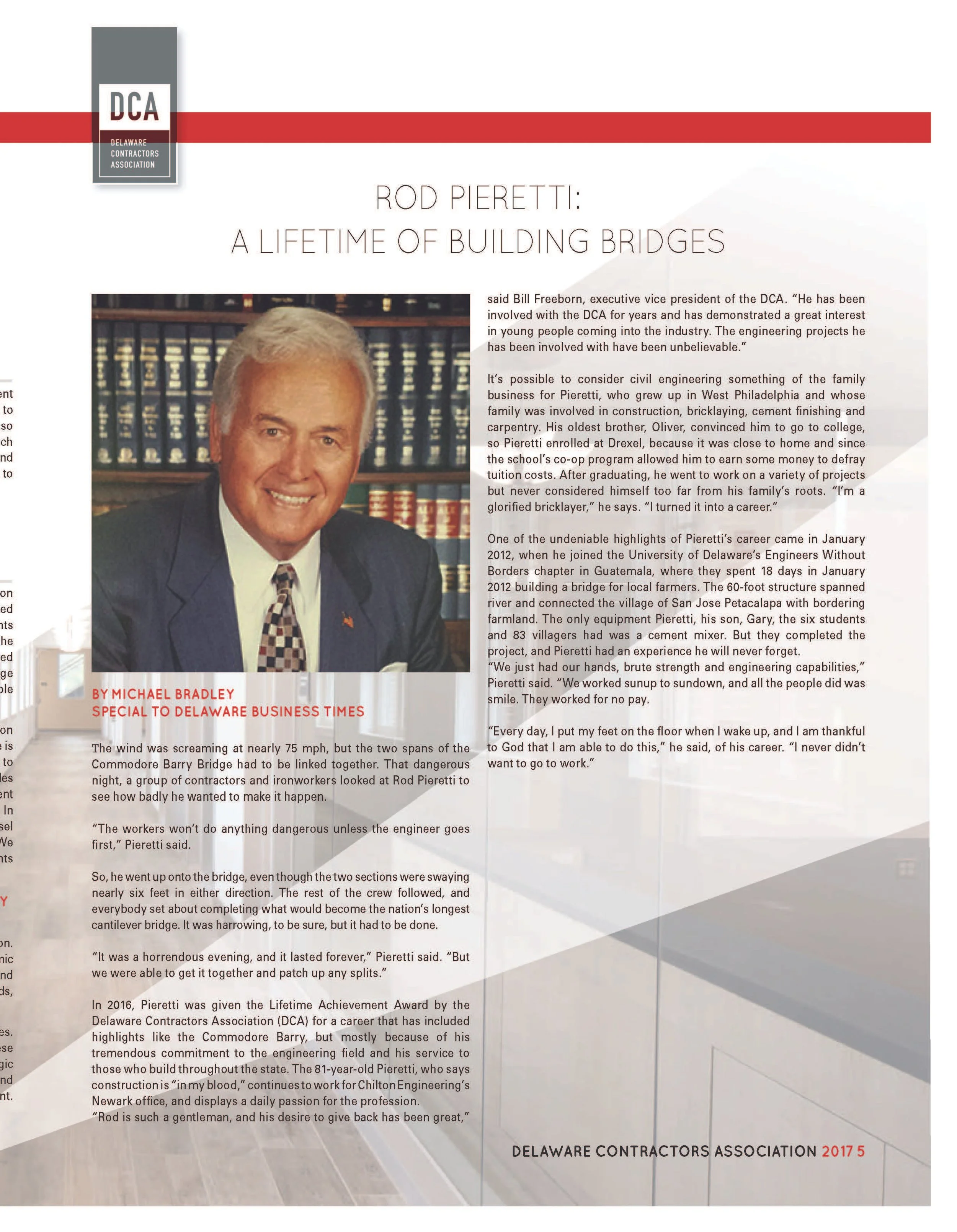
I led the publication’s visual direction and developed a flexible editorial system using clean typography, bold graphic accents, strong photography and modular layouts. The system accommodated a wide range of content, including leadership profiles, association news, awards, member programs and feature stories, while maintaining a cohesive visual identity throughout the 32-page publication.
The finished piece transformed dense industry information into an engaging, easy-to-navigate experience that celebrated both the organization and the people shaping Delaware’s construction community.
Editorial Challenge
The publication needed to represent a broad professional community that included contractors, suppliers, service providers and industry leaders. Content ranged from association news and technical information to member profiles and sponsor messages, requiring a system that could make dense material approachable without sacrificing authority.
Creative Direction
I developed a structured visual language informed by the construction industry. Strong grids, confident typography and purposeful image placement created a professional tone, while variations in scale and page rhythm kept the issue from feeling overly rigid. The design supported both large project imagery and detailed informational content.
Information Design
Many pages contained multiple levels of information, including headlines, summaries, body copy, captions and organizational details. I established a clear hierarchy that helped readers quickly understand each page and locate relevant material. Modular layouts allowed the publication to adapt to different story lengths while maintaining consistency across the issue.
Member and Advertiser Integration
Member visibility was central to the project. I coordinated editorial and commercial content so that participating organizations received meaningful exposure within a publication that continued to feel cohesive and reader-focused. Consistent spacing, typography and sequencing helped the transition between features, association information and advertising feel intentional.
Production and Result
I led the design through final print production, reviewing imagery, typography, alignment, page order and technical specifications. The finished publication provided the Delaware Construction Association with a credible, polished communications tool that strengthened its professional presence and highlighted the people and businesses supporting the industry.
Delaware Breast Cancer Coalition
-
A 12-page promotional publication created with Delaware Today to raise awareness, celebrate survivors and make statewide programs, resources and health information approachable.
-
My Role
Publication Designer
Project Scope
Cover Design · Publication Design · Editorial Layout · Visual Storytelling · Information Design · Typography · Advertiser Integration · Print Production
Project Overview
The Delaware Breast Cancer Coalition partnered with Delaware Today to create a special publication that would raise awareness of its mission, celebrate survivors and help readers better understand the programs and resources available throughout Delaware.
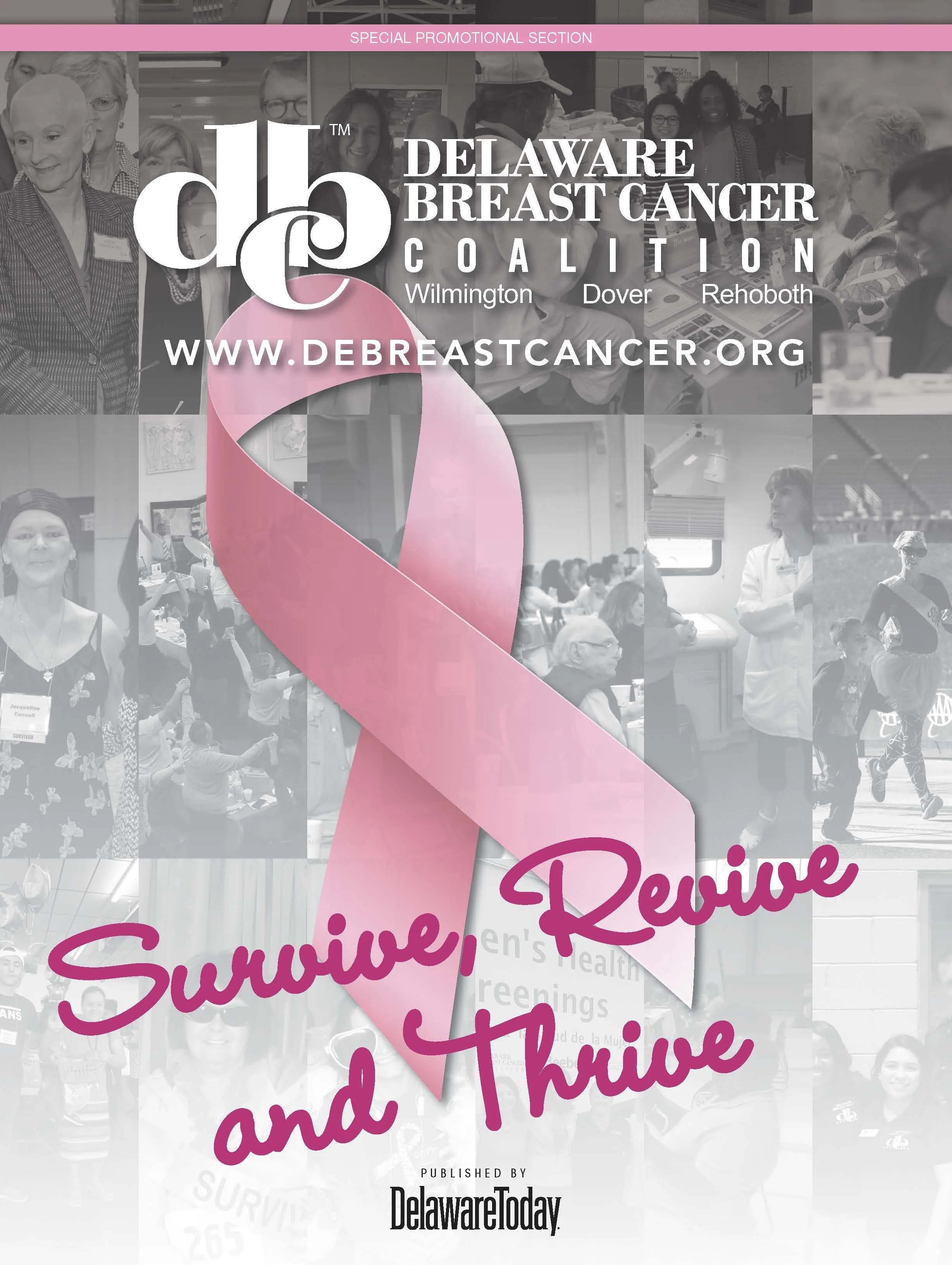
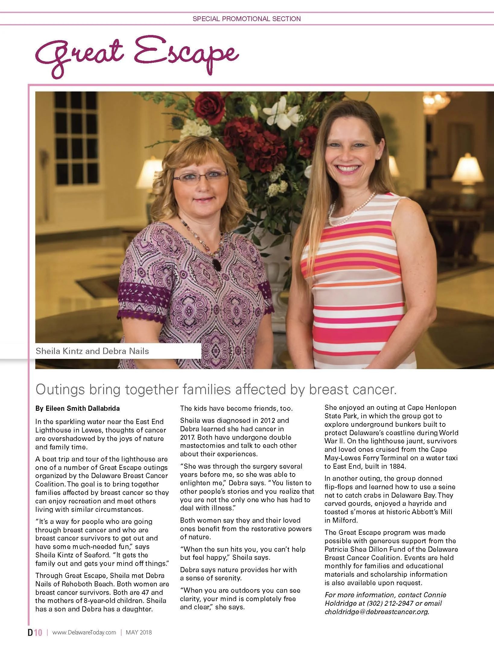
I designed the 12-page promotional section, developing a compassionate editorial direction that balanced emotionally powerful stories with practical health information. The cover combined a monochromatic photo collage with an oversized pink ribbon and the message “Survive, Revive and Thrive,” creating an immediate connection to the organization’s community, purpose and impact.
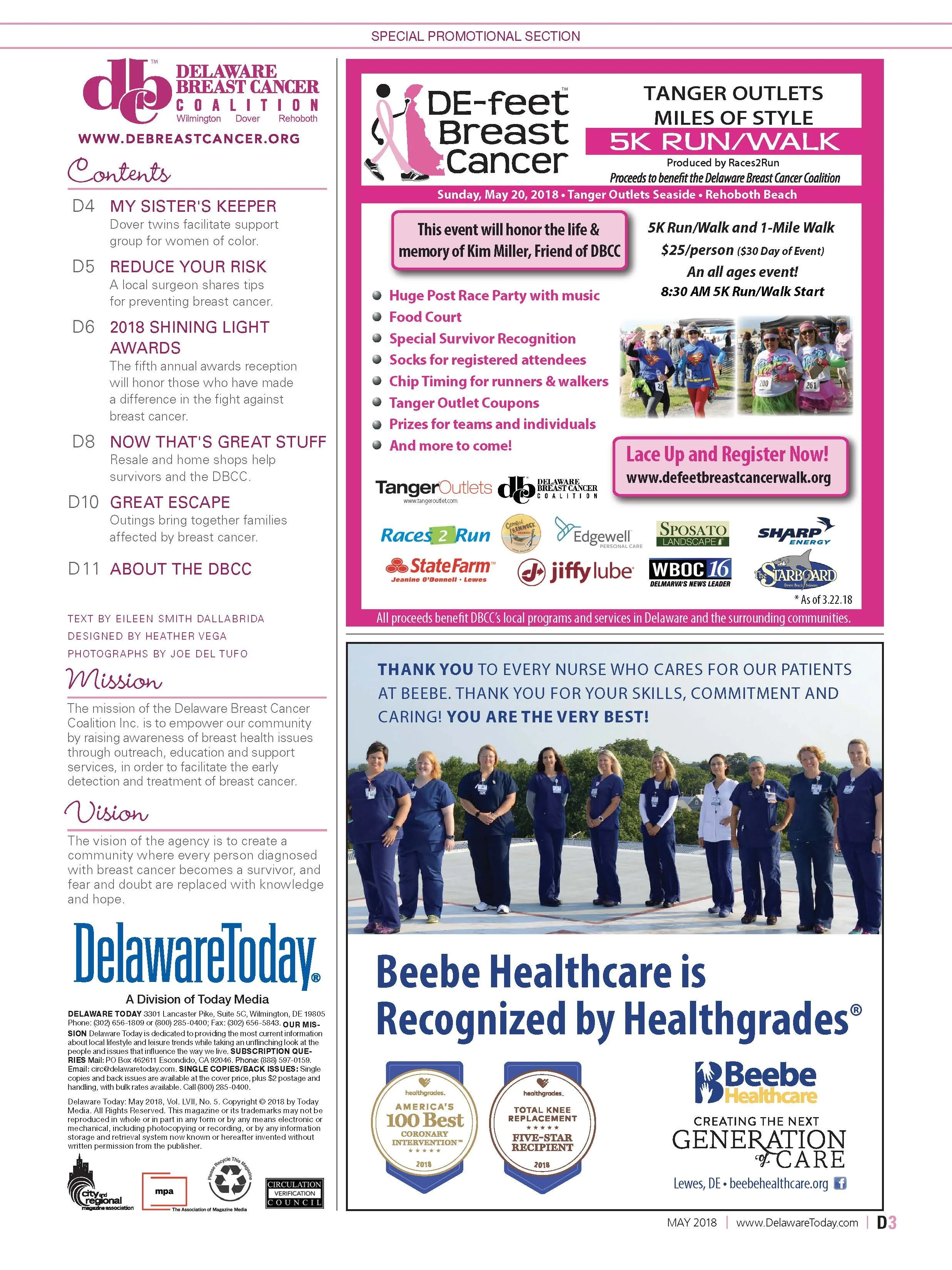
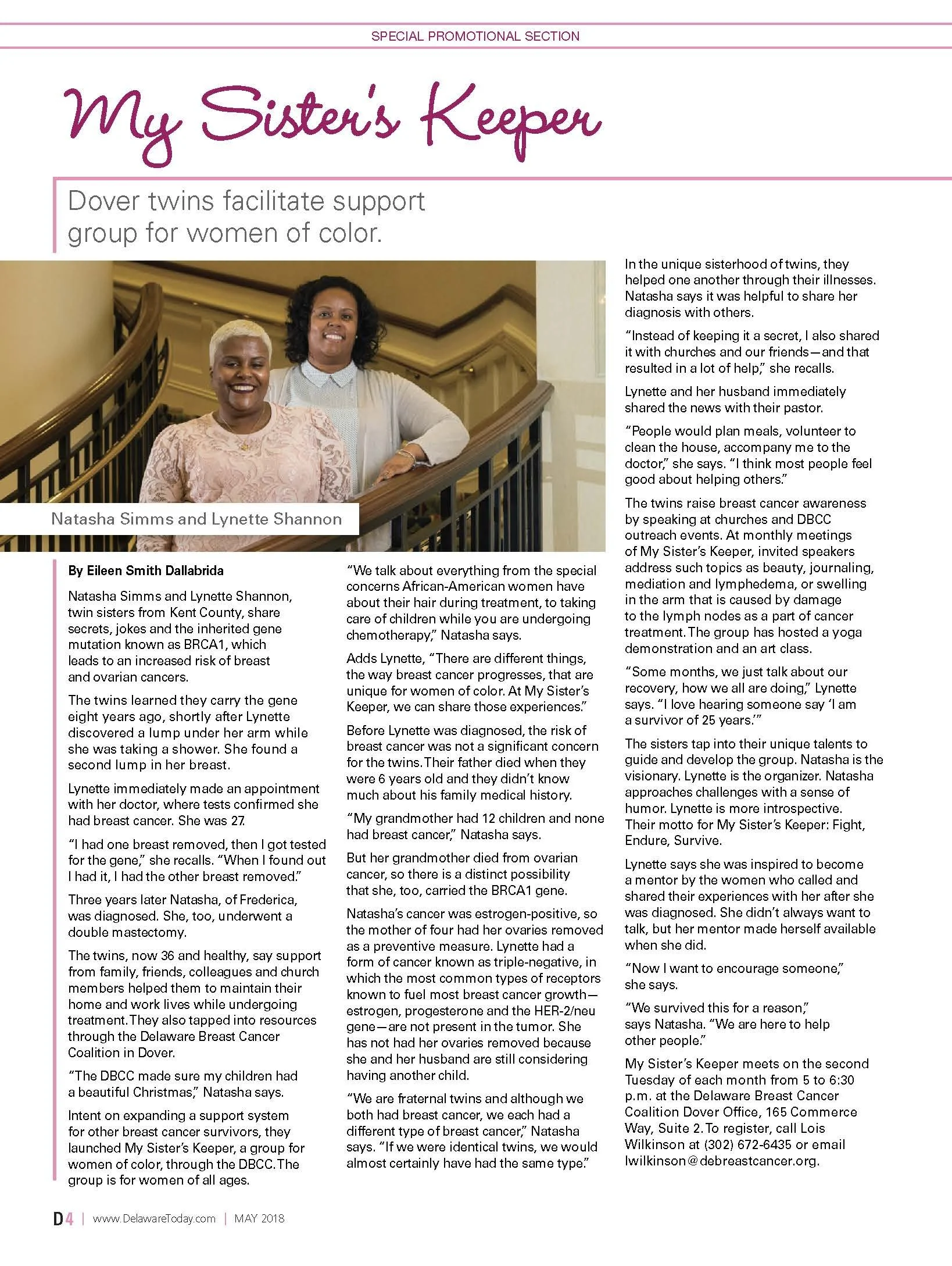
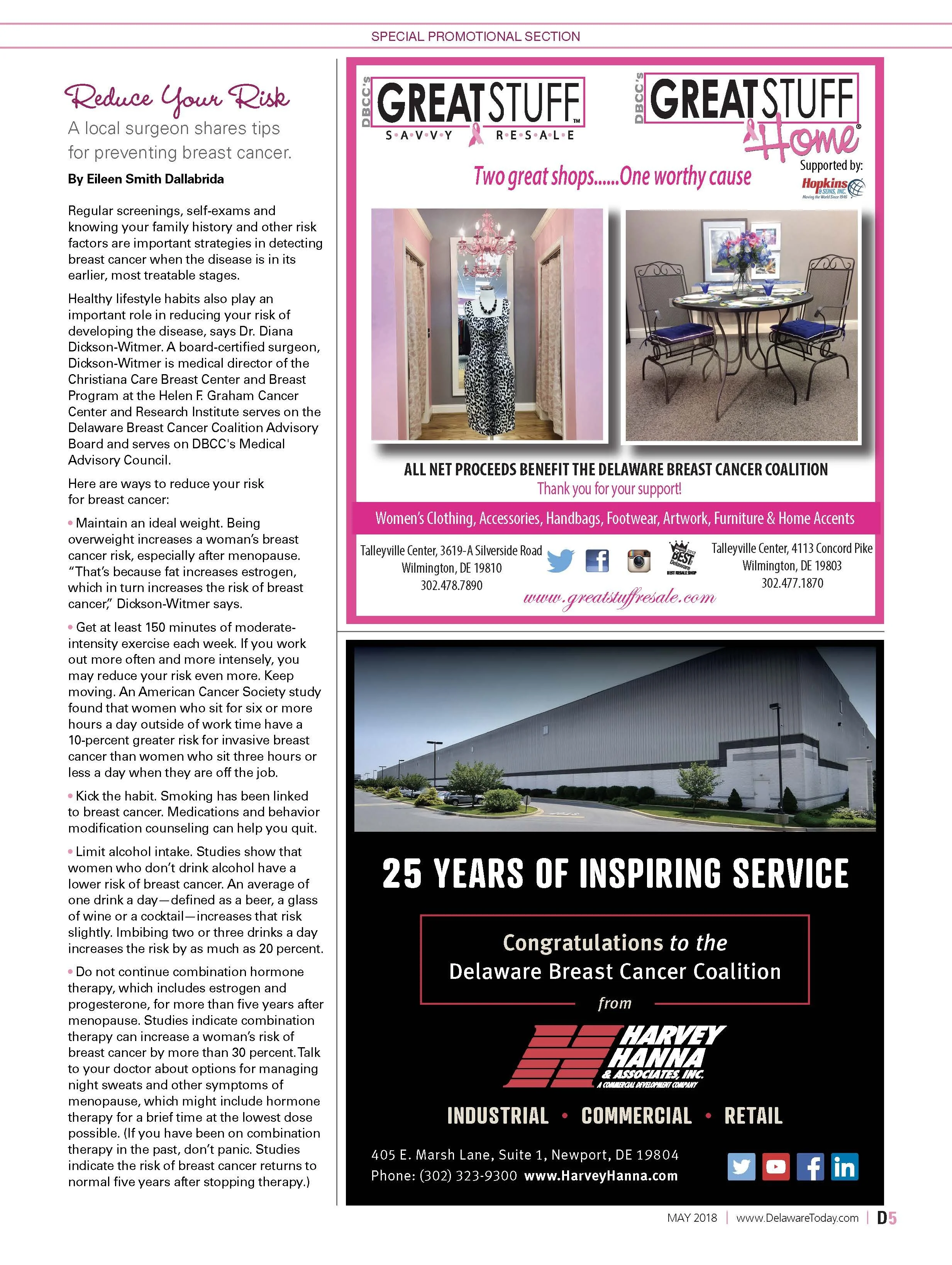
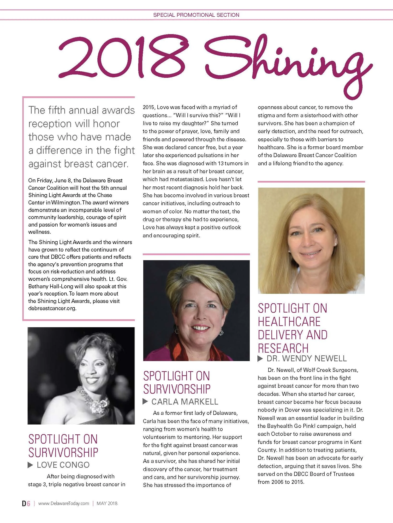
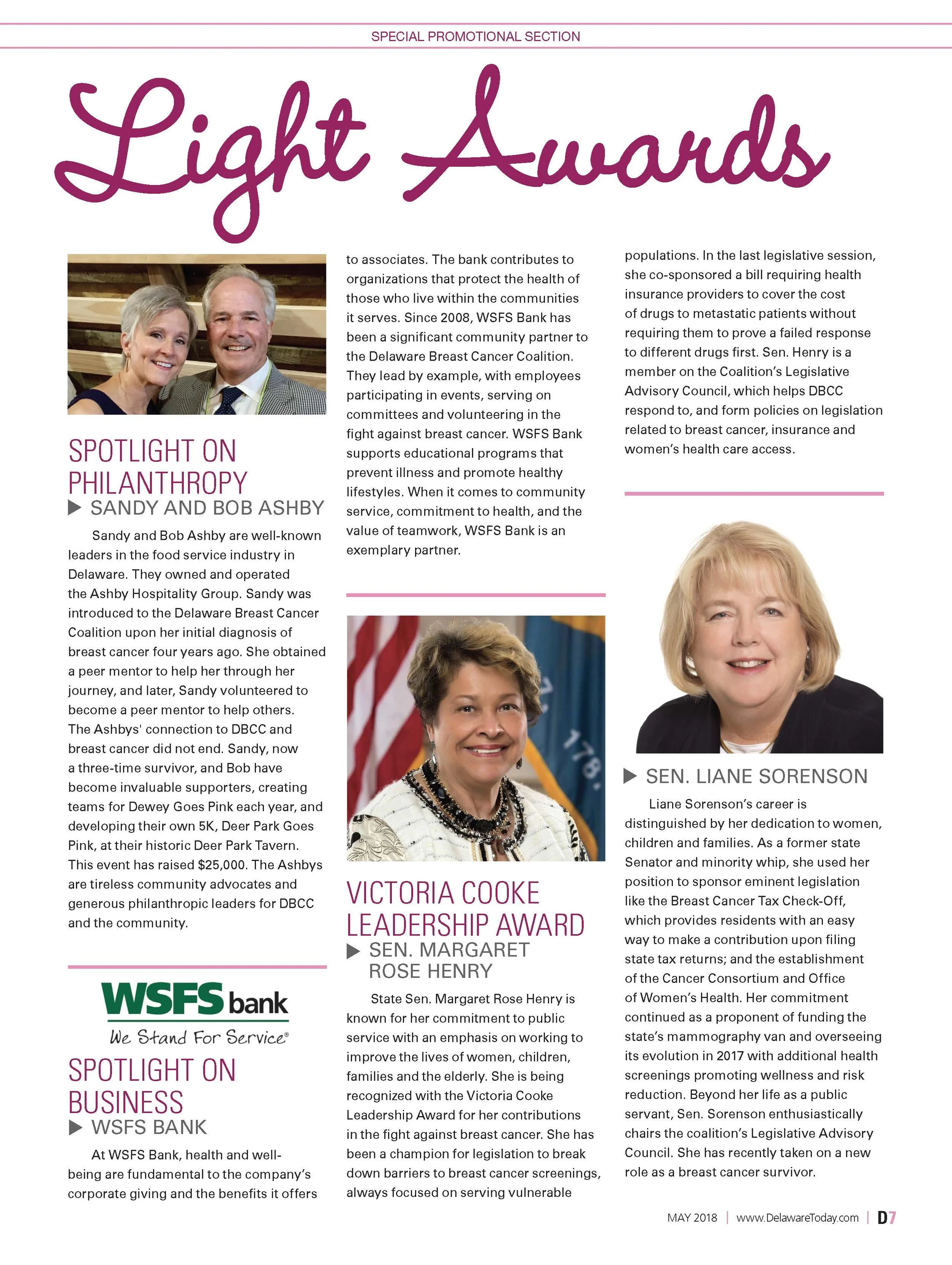
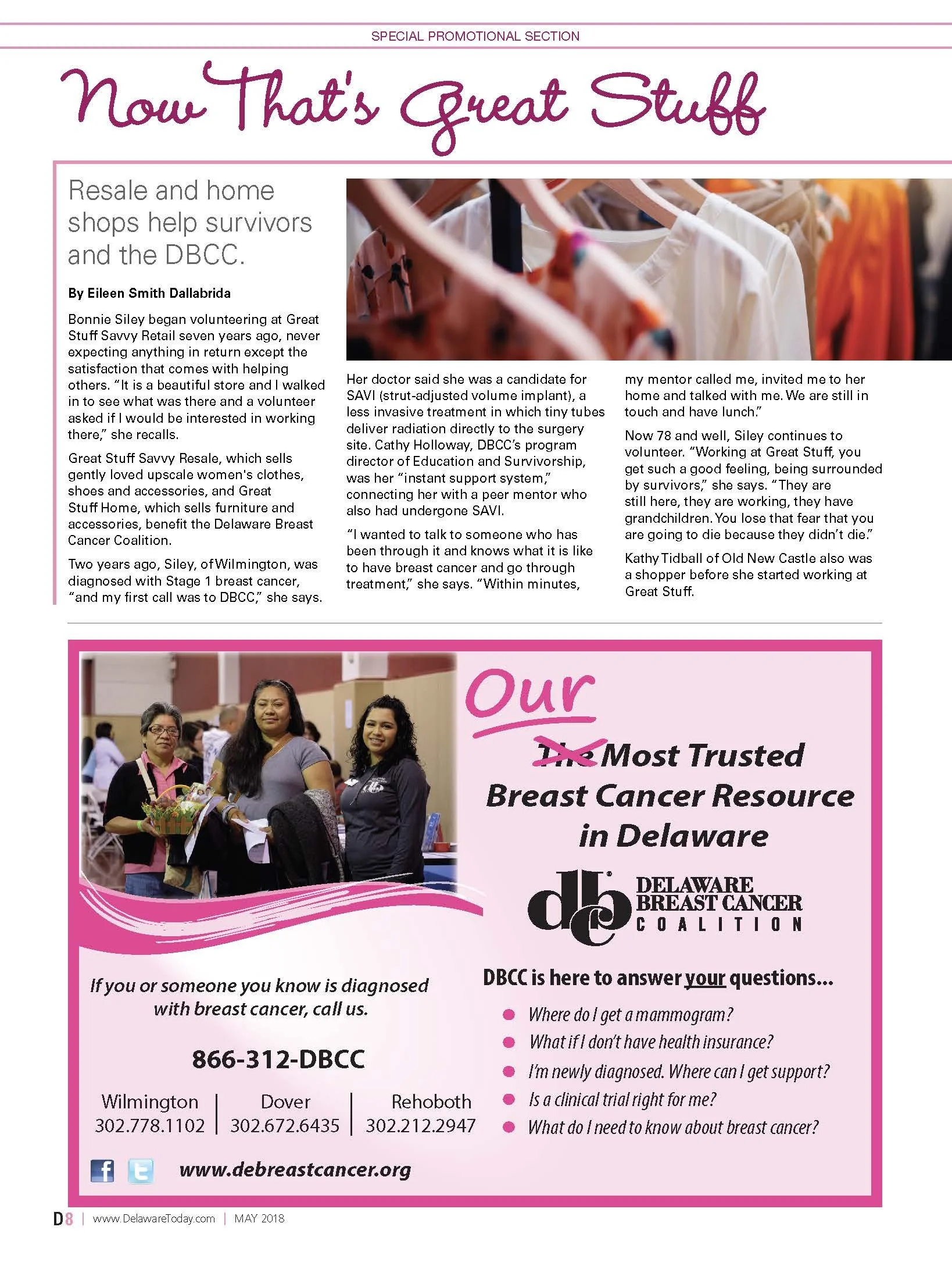
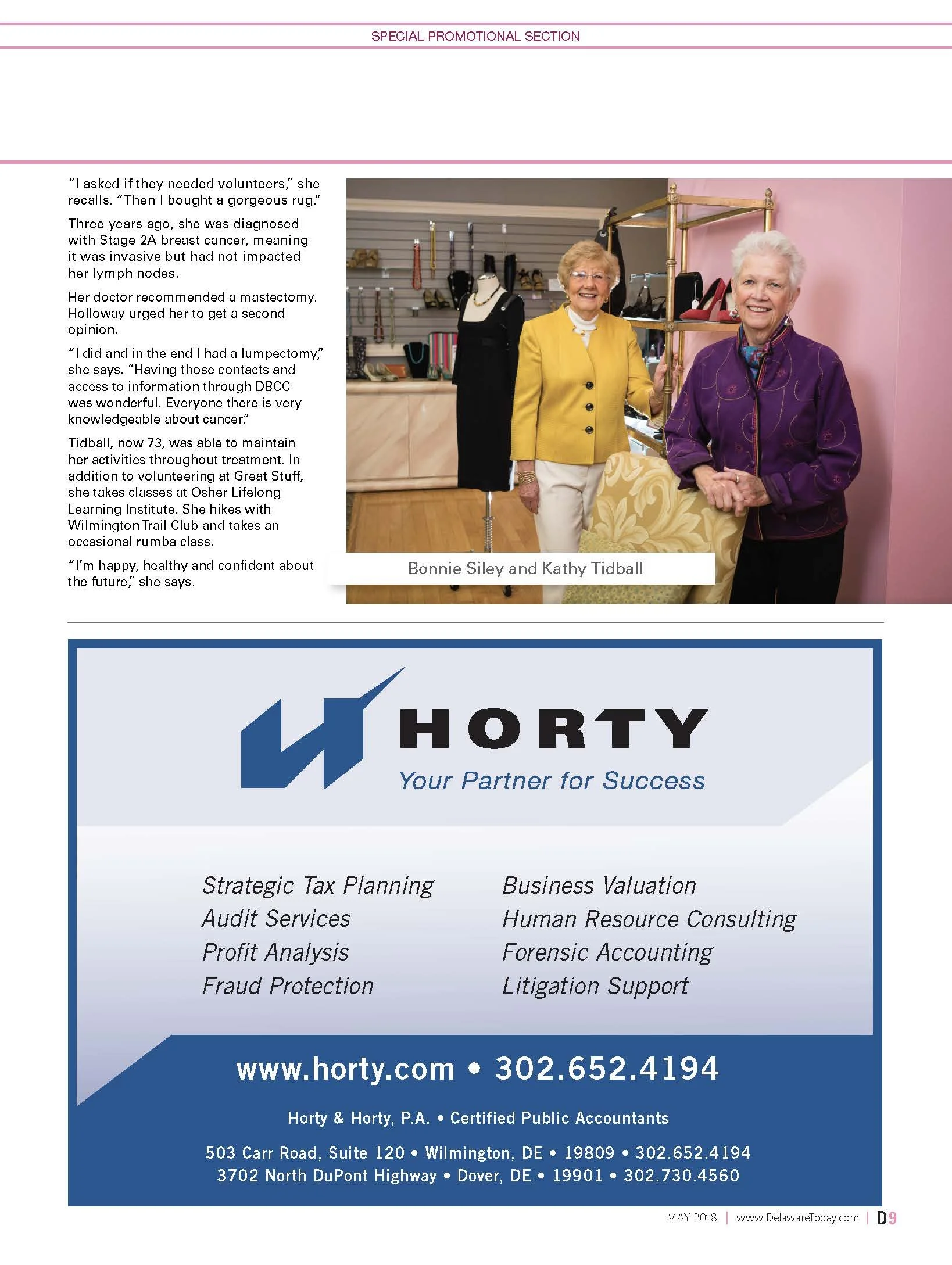
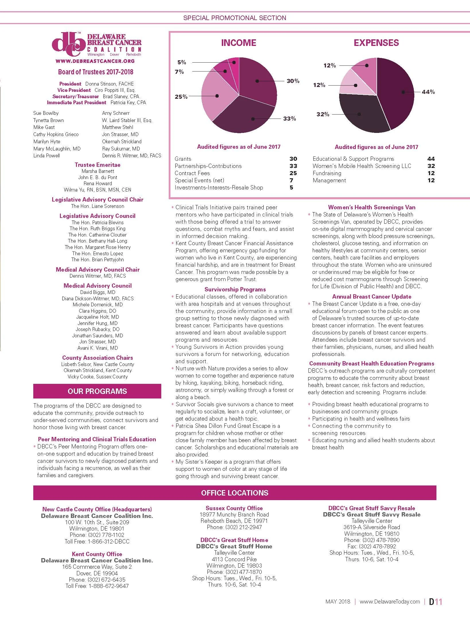
Inside the publication, I created a flexible layout system for survivor profiles, prevention guidance, community programs, awards, organizational information and sponsor content. Script typography and pink accents added warmth and continuity, while clean columns, strong photography and clear hierarchy helped make sensitive and information-heavy content approachable and easy to navigate.
The final publication highlighted the Coalition’s statewide work while giving survivors, advocates, health care professionals and community partners a unified platform. It transformed a wide range of educational and organizational content into a cohesive story centered on hope, connection and support.
Editorial Challenge
The publication addressed subjects that were both emotionally sensitive and information-heavy. Survivor stories, prevention guidance, program details, organizational information and sponsor content all needed to coexist in a way that felt compassionate, credible and easy to navigate.
Creative Direction
I developed a warm editorial direction centered on hope, connection and statewide impact. The visual language used strong photography, pink accents and a clear typographic hierarchy to support the Coalition’s identity without overwhelming the stories. The cover established the tone immediately, while the interior system carried that sense of purpose throughout the publication.
Story and Information Balance
Personal narratives required space and emotional presence, while educational material needed clarity and structure. I created flexible layouts that could accommodate profiles, quotations, health information, community programs and recognition content. This allowed the publication to move naturally between human stories and practical resources.
Community and Sponsor Integration
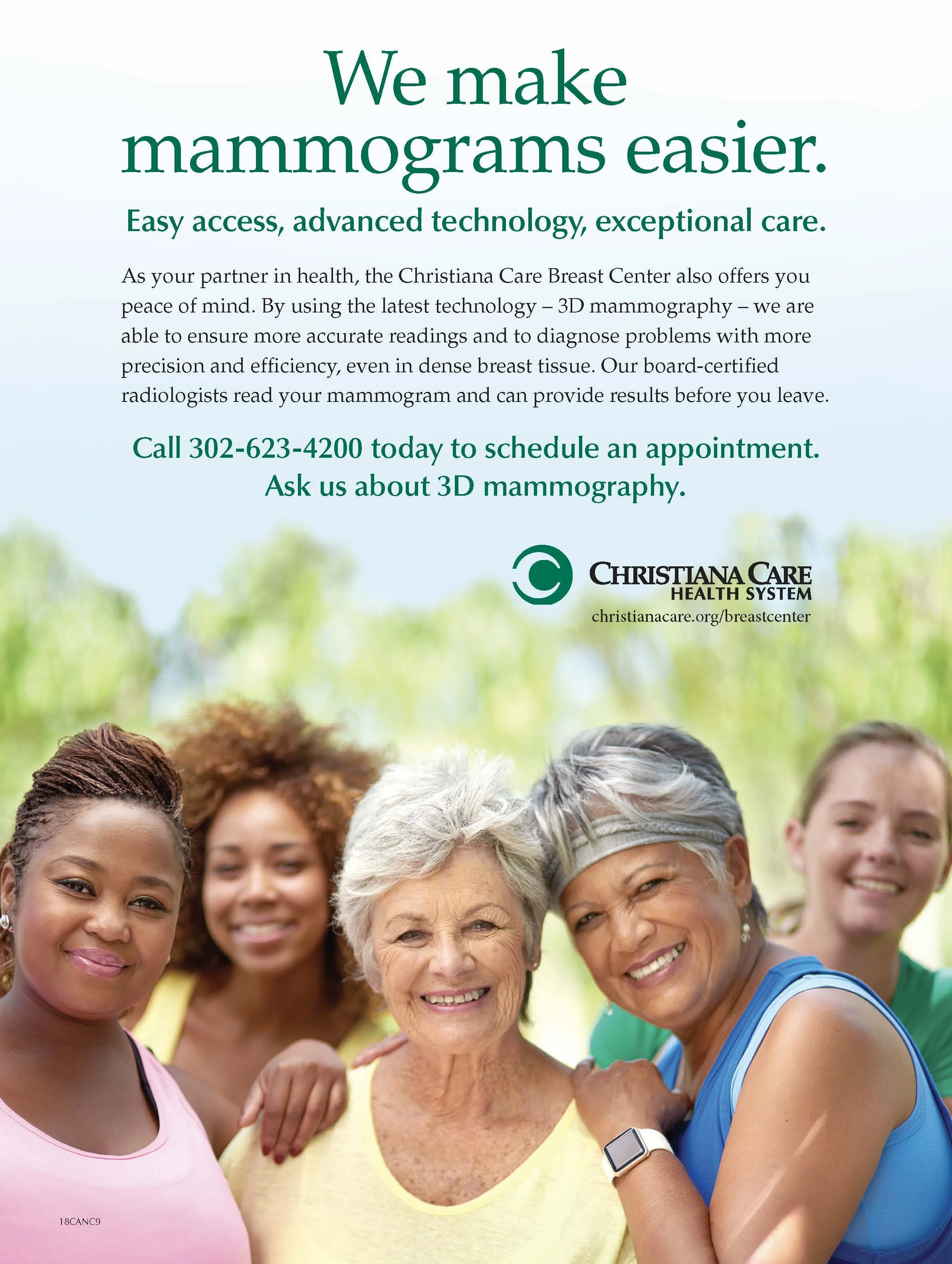
The project also recognized health care partners, supporters and sponsors. I planned the page sequence so that organizational and commercial content contributed to the larger story rather than feeling separate from it. Consistent typography and visual pacing helped every participant feel connected to the Coalition’s mission.
Production and Result
I managed the complete publication through final print production, coordinating image quality, typography, page order and technical preparation. The finished piece gave the Coalition a unified platform for education, advocacy and recognition while making complex and sensitive content approachable.
The publication was recognized with a 2024 GDUSA American Graphic Design Award, validating the strength of the concept, editorial system and final execution.

90 Ideas in 90 Minutes | Inaugural Edition
-
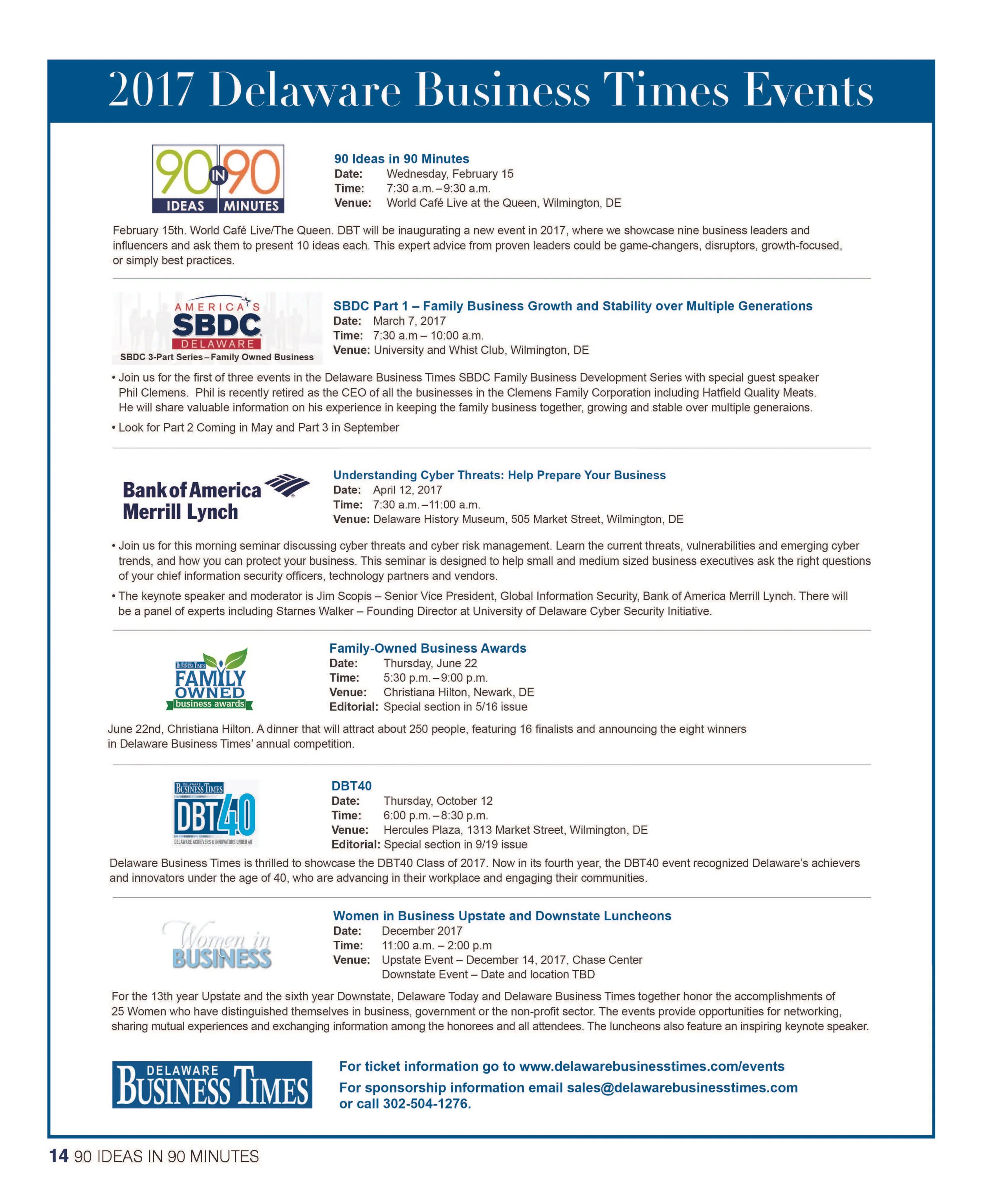
A 16-page inaugural business supplement built from the ground up—identity, logo, cover, editorial system, advertising and final production—to present 90 ideas from nine Delaware leaders.
-
Client
Delaware Business Times / Today Media
My Role
Lead Designer & Art Director
Project Scope
Brand Identity · Logo Design · Creative Direction · Art Direction · Publication Design · Editorial Layout · Visual Systems · Typography · Advertising Design · Photography Integration · Print Production
Project Overview
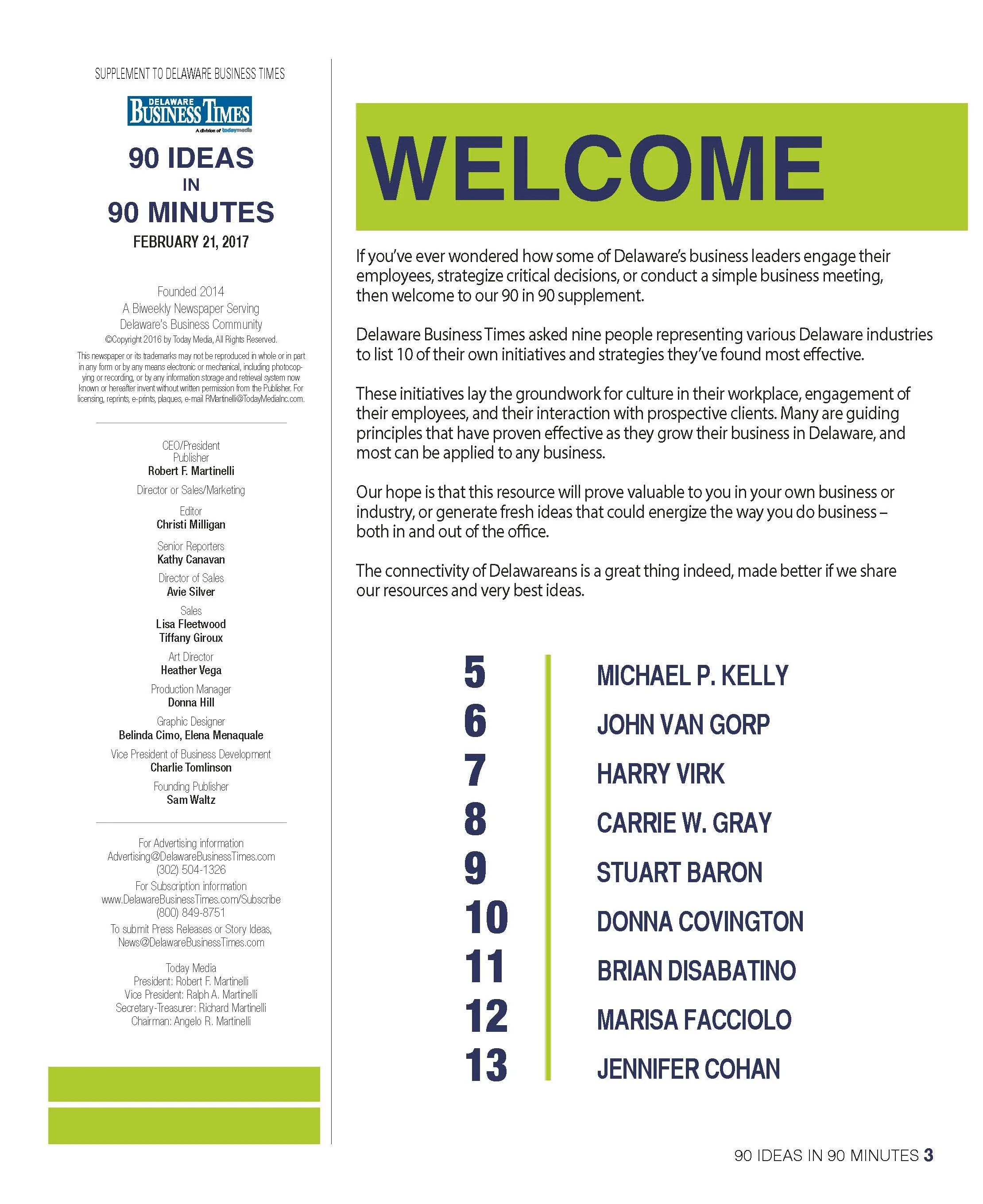
For the inaugural 90 Ideas in 90 Minutes supplement, Delaware Business Times needed a distinct visual identity and editorial system that could turn insight from nine Delaware business leaders into an engaging, easy-to-navigate publication.
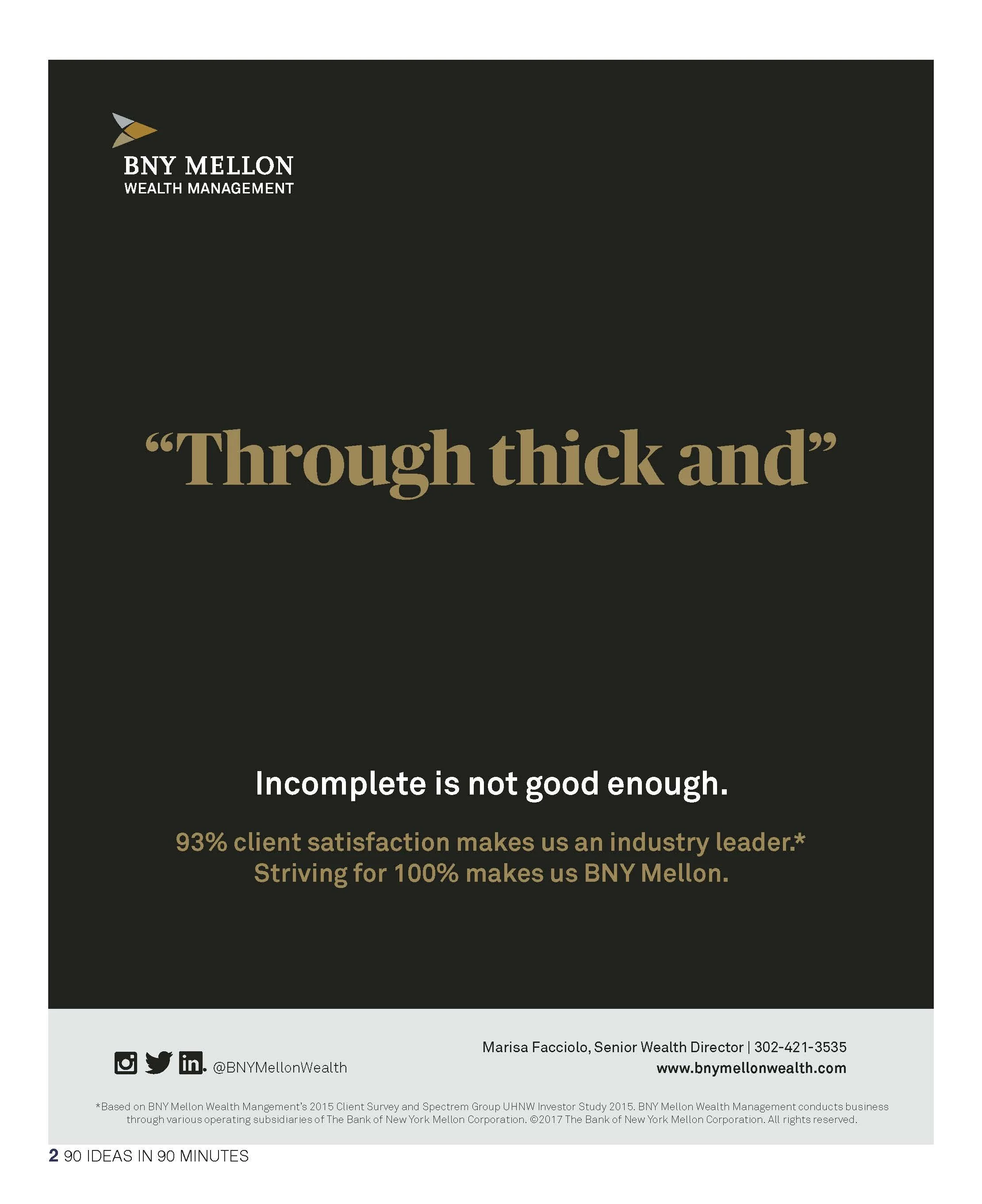
I designed the project from the ground up, creating the 90 in 90 logo, cover design, visual identity, editorial system, interior layouts, advertising and full publication design.
The concept centered on a simple structure: nine leaders, each sharing ten practical ideas drawn from their own professional experience. The challenge was to transform a large amount of advice-driven content into a publication that felt energetic, cohesive and approachable for a business audience.
Creating the 90 in 90 Identity
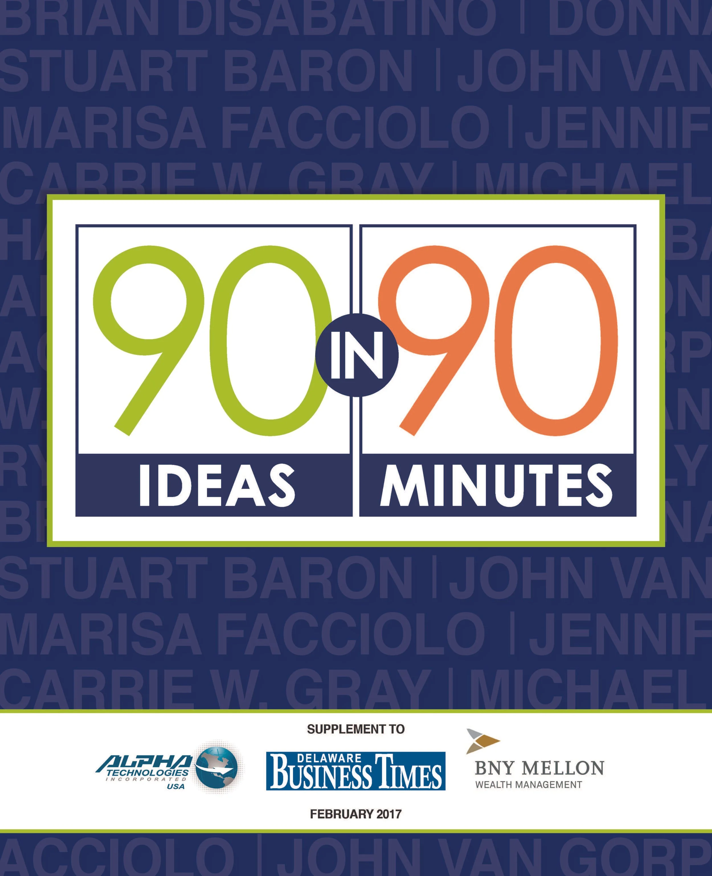
I developed the 90 in 90 logo around the event’s core idea: 90 ideas shared in 90 minutes. Oversized numerals, a bold navy frame and contrasting lime and orange accents created a visual identity that was immediate, memorable and flexible enough to work across editorial, event and promotional applications. The cover introduced that identity against a typographic background featuring the names of the participating leaders, creating a strong first impression while emphasizing the collaborative nature of the publication.
Building the Editorial System
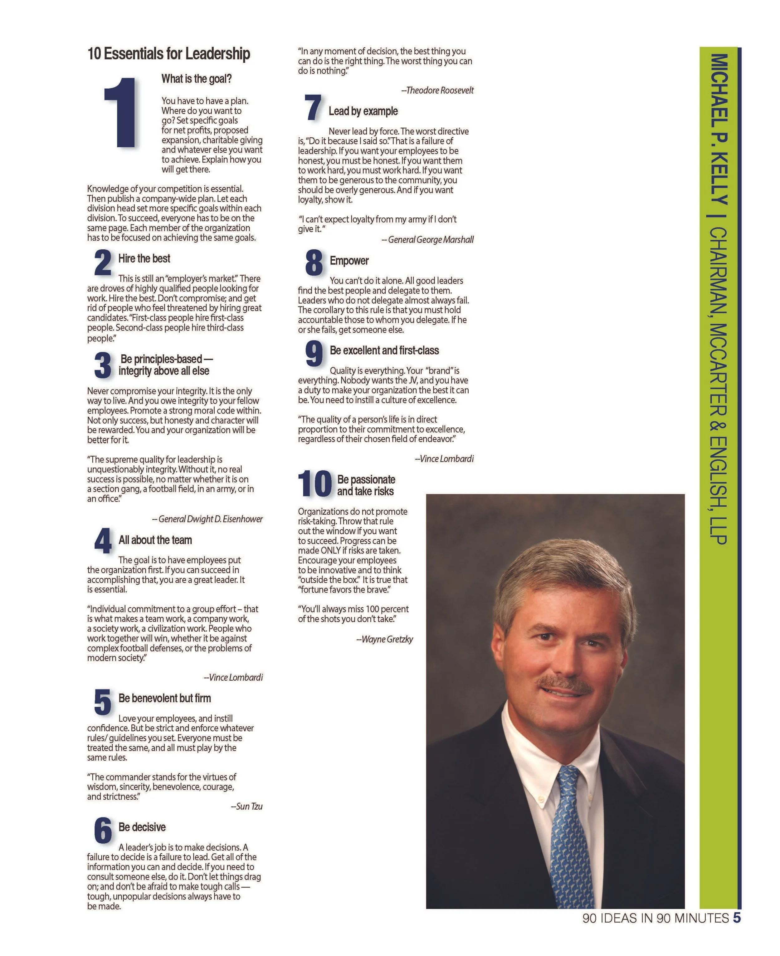
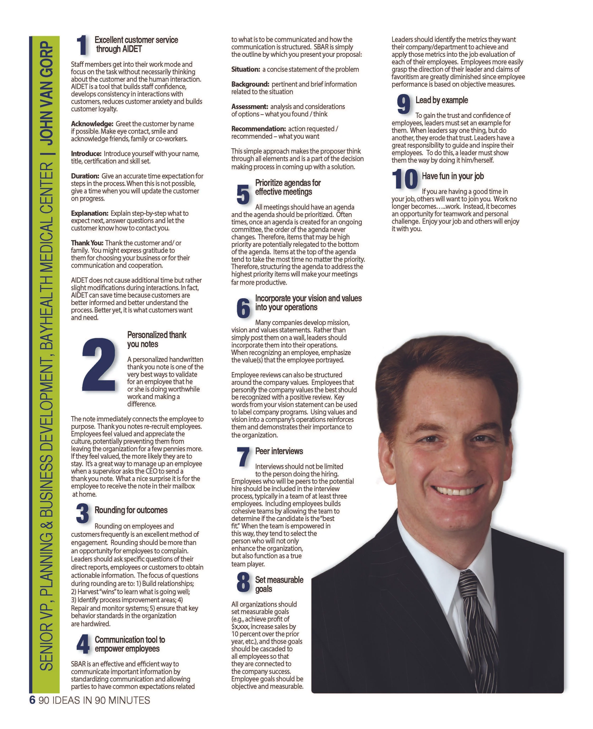
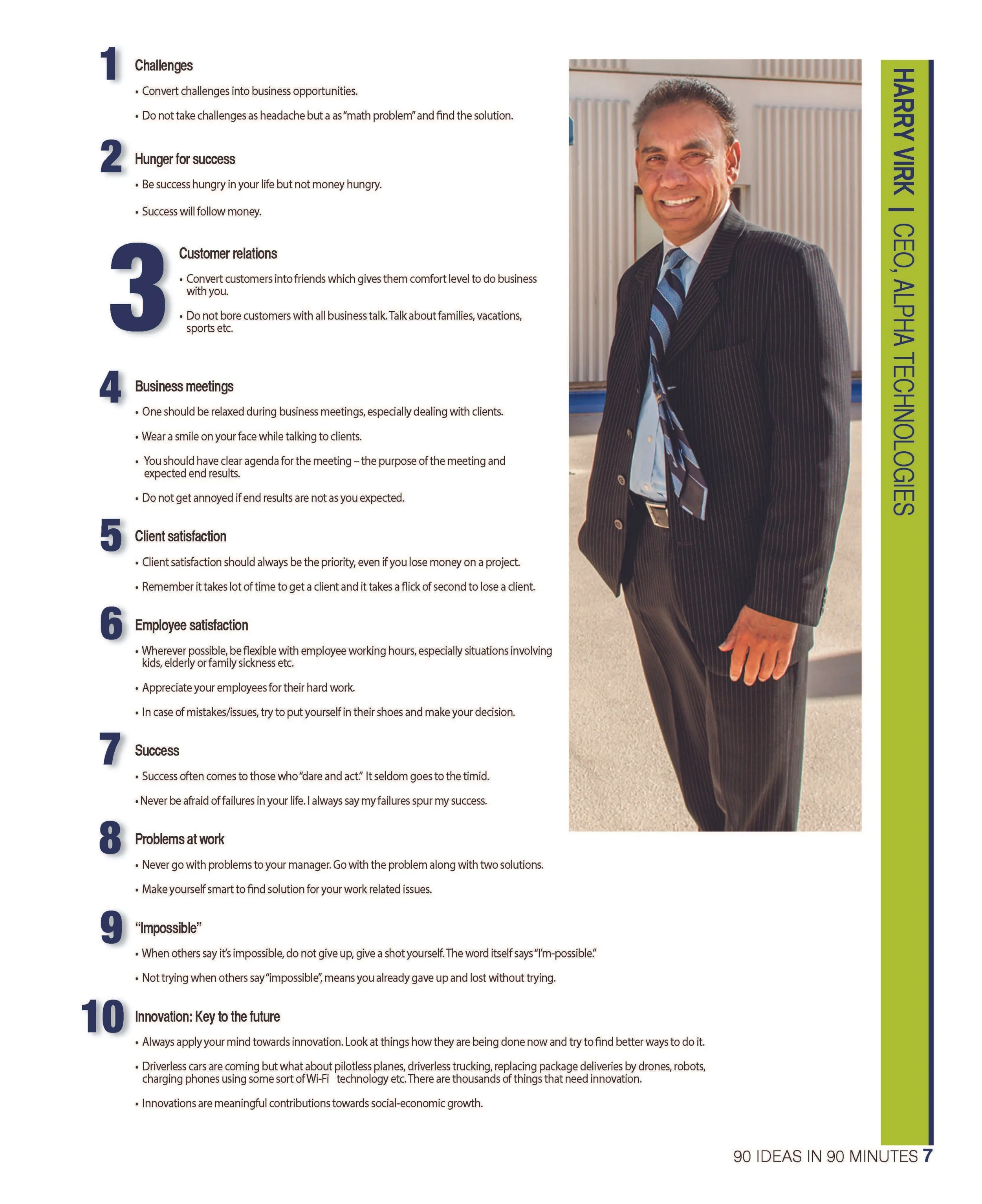
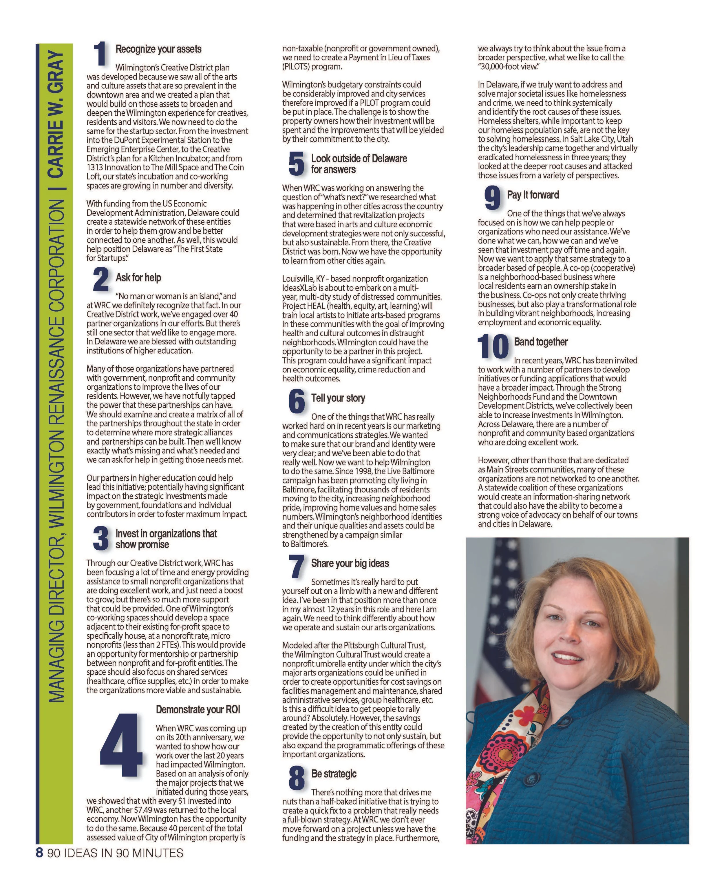
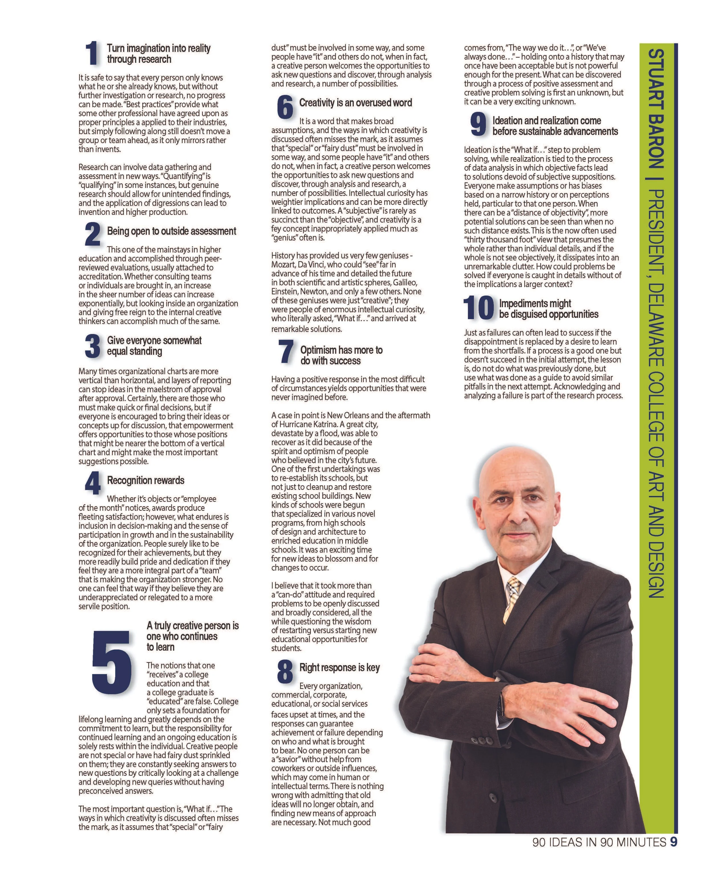
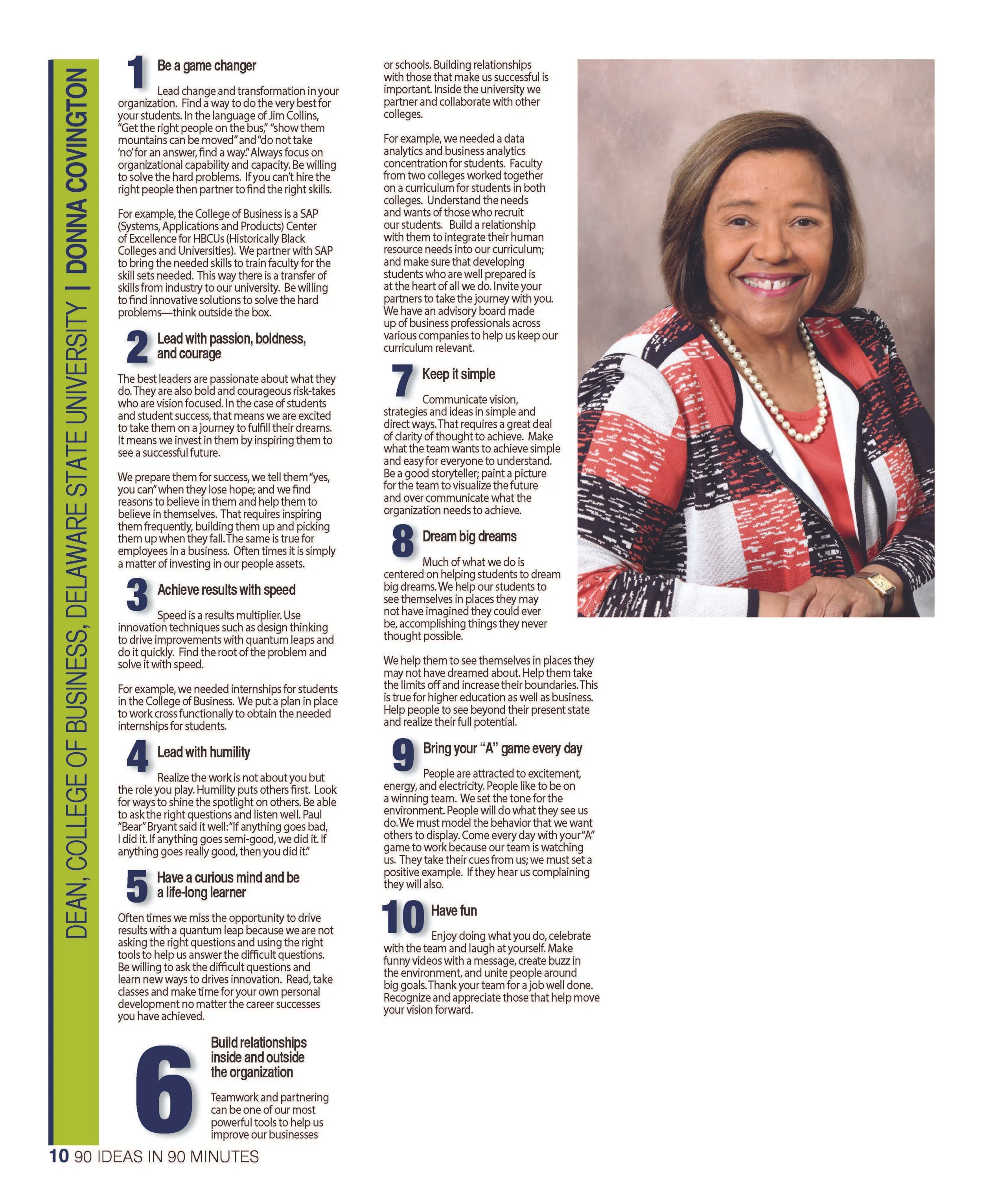
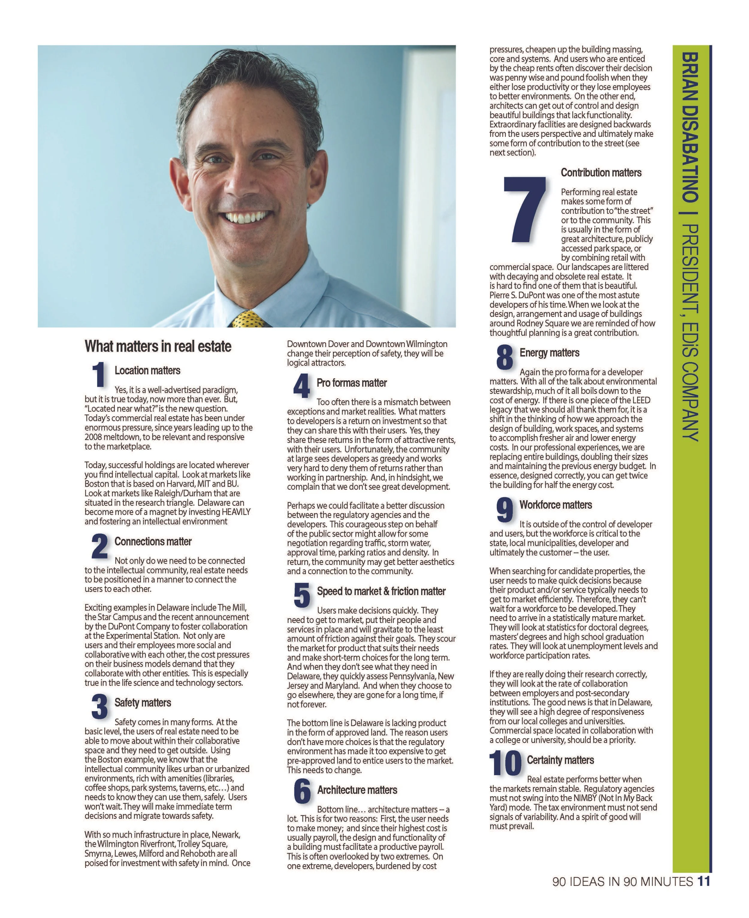
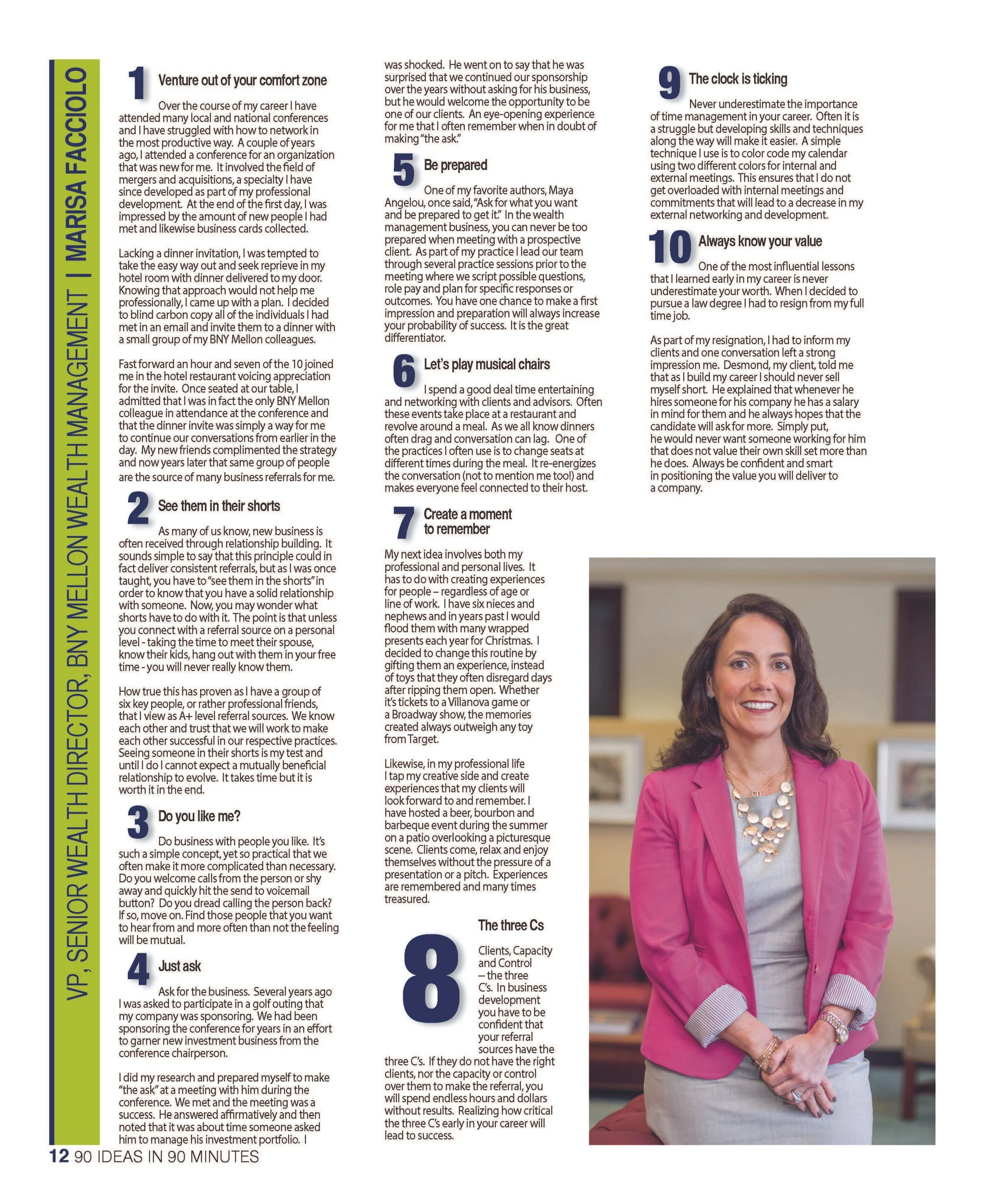
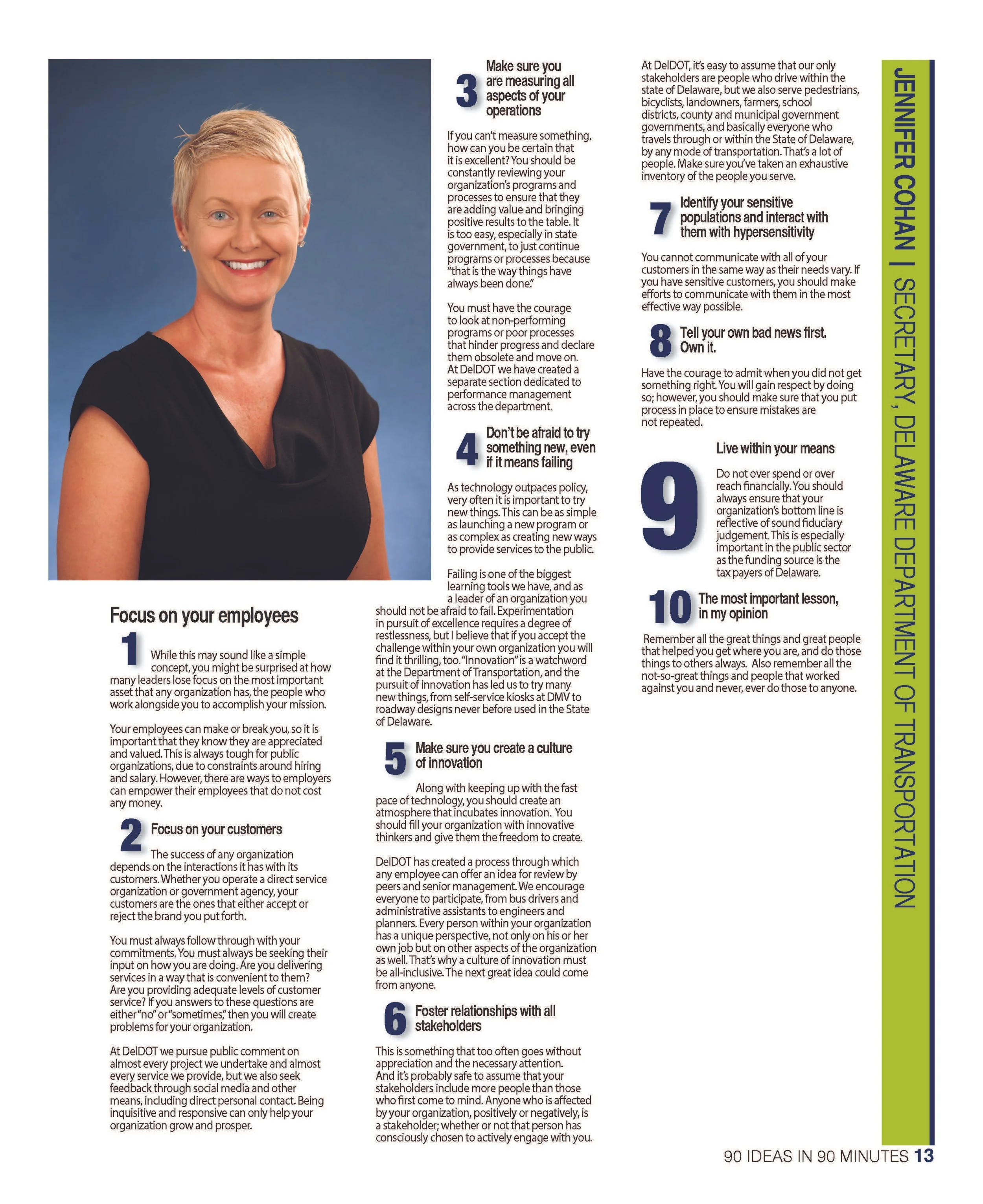
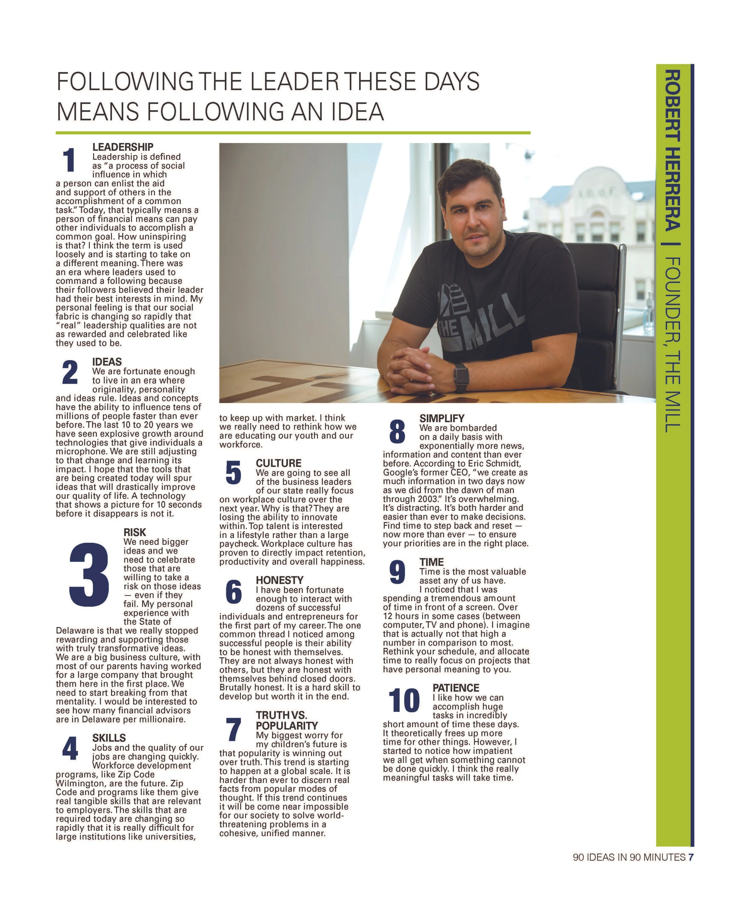
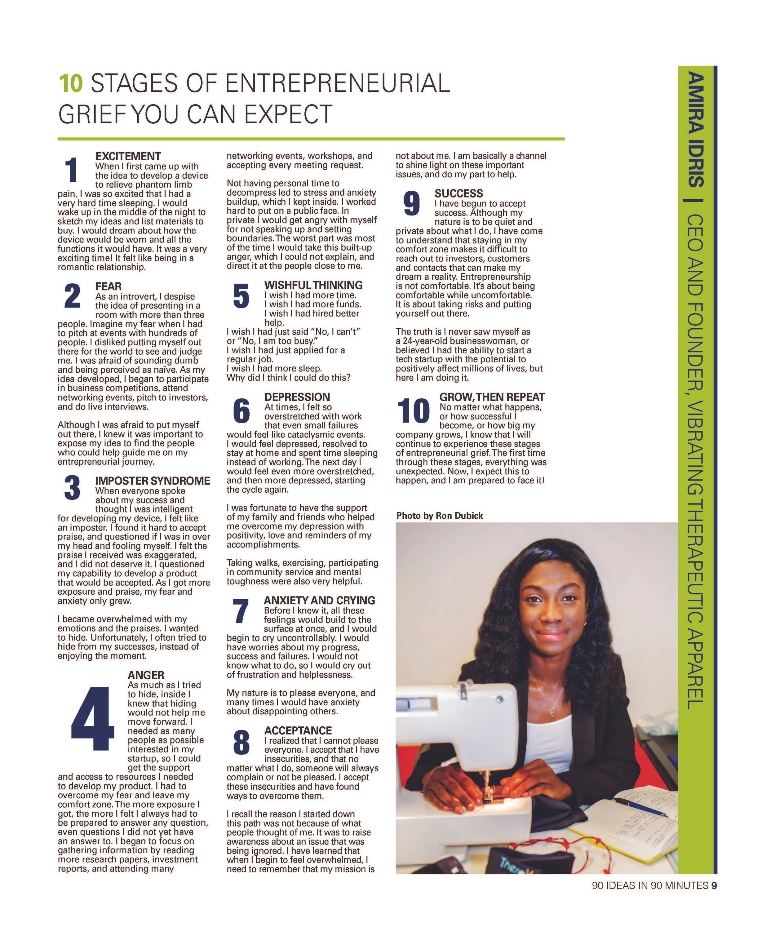
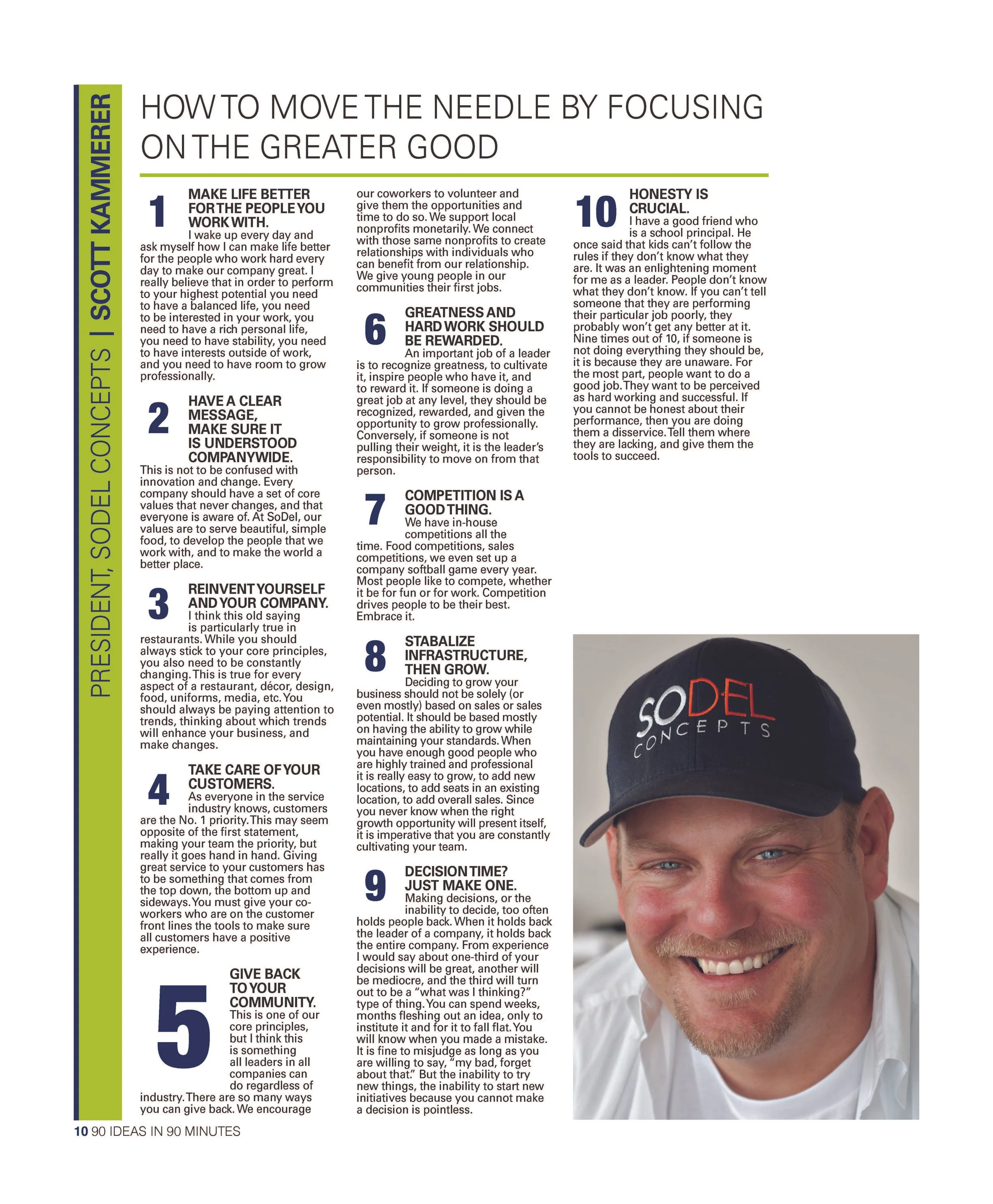
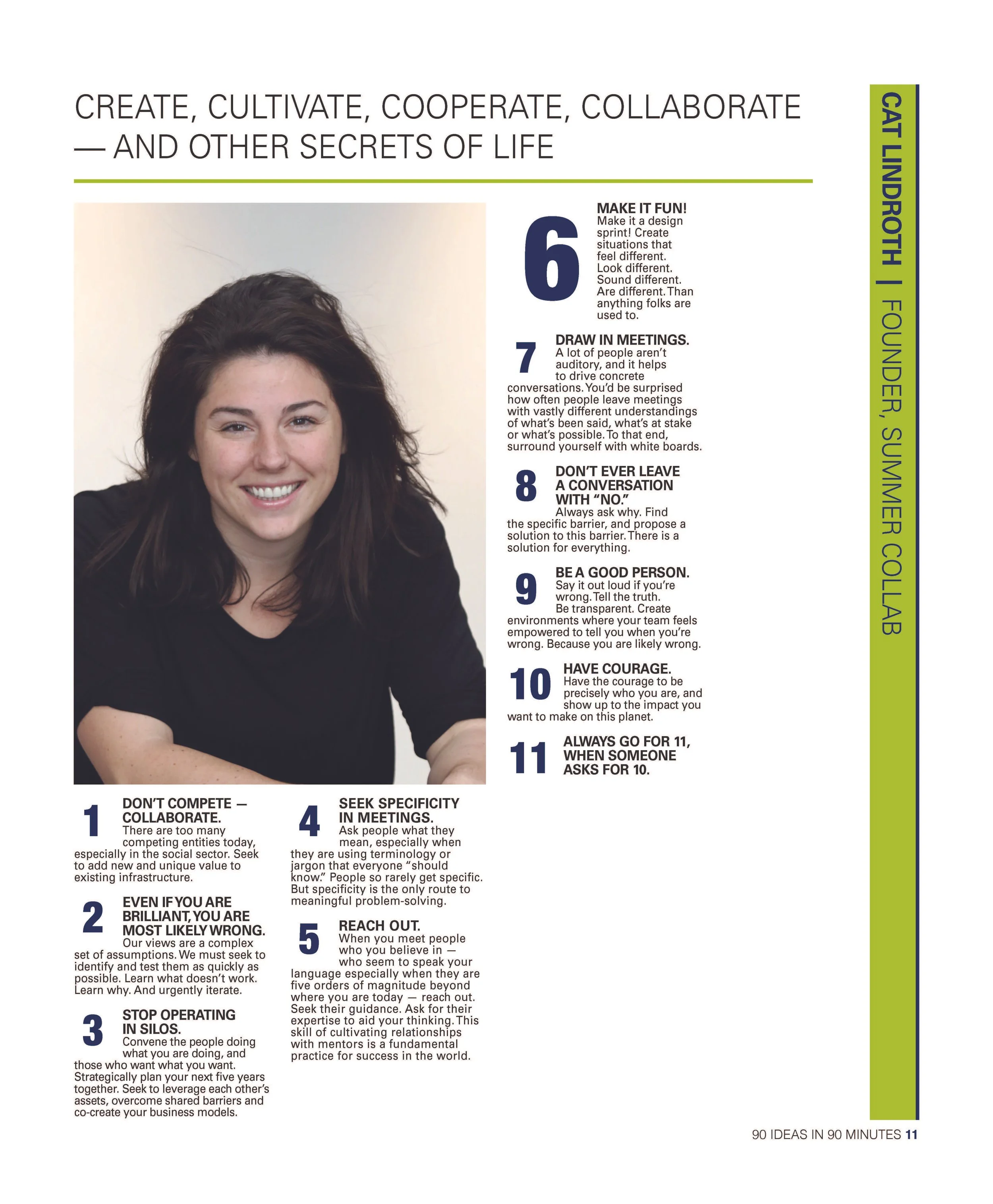
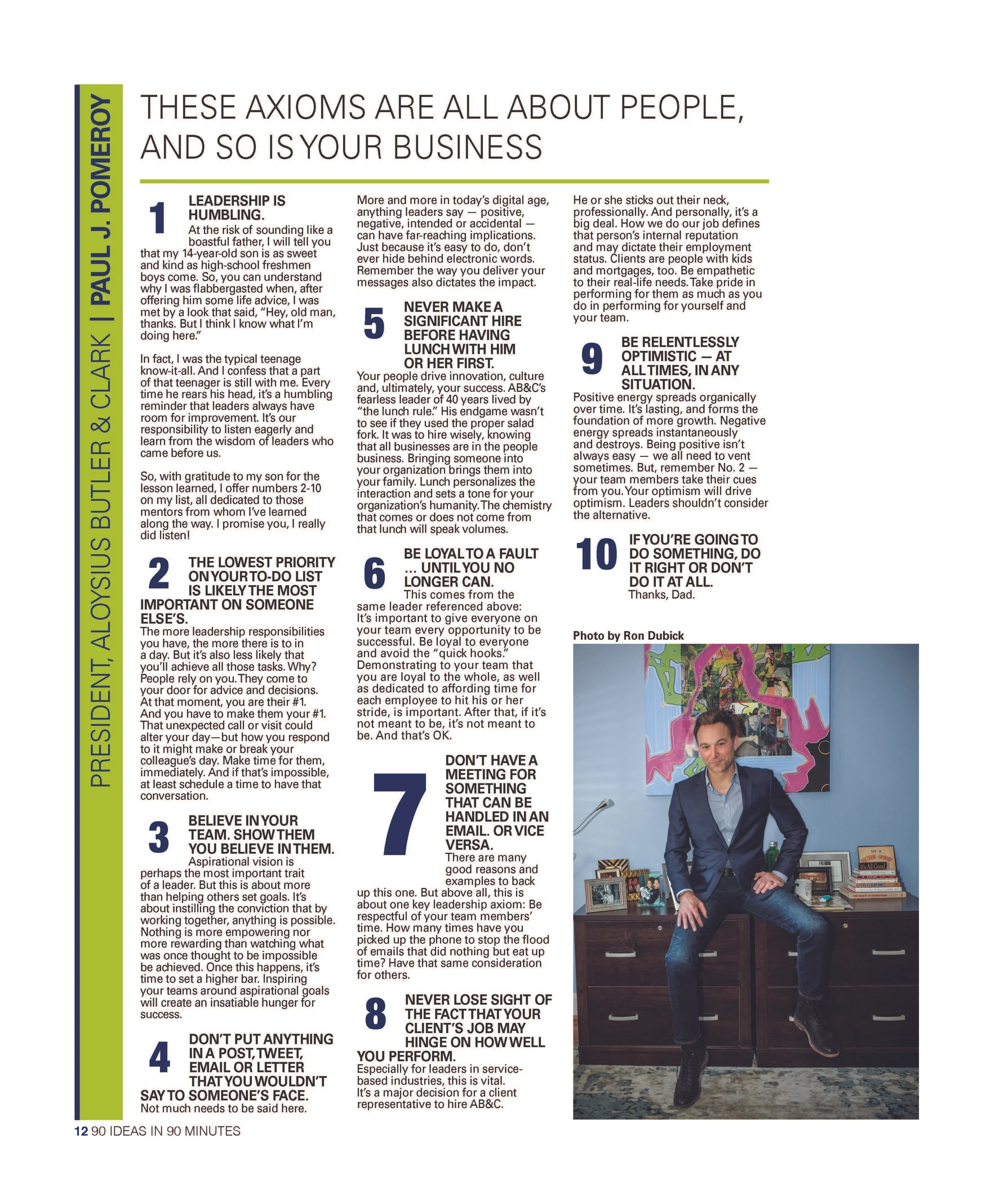
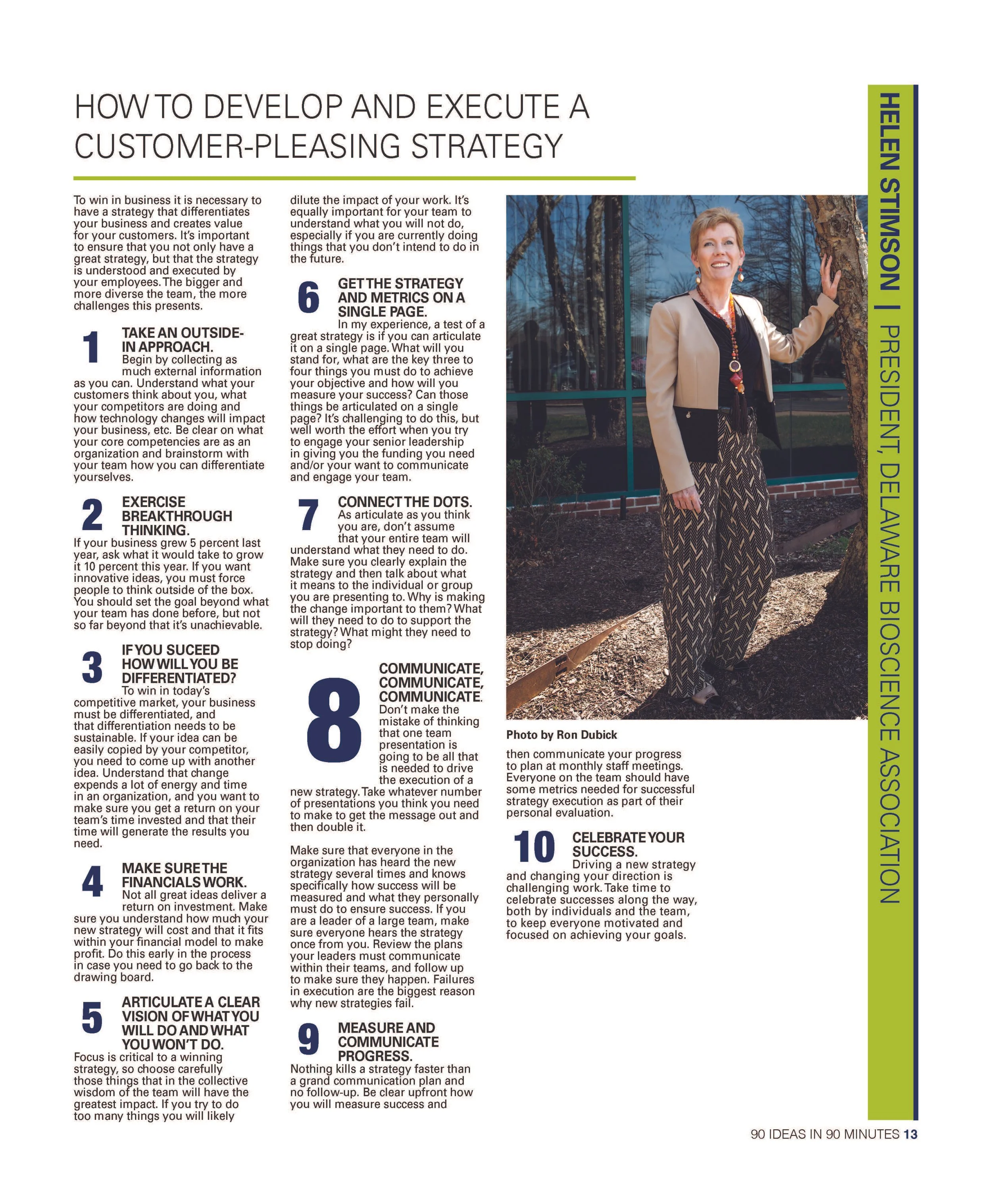
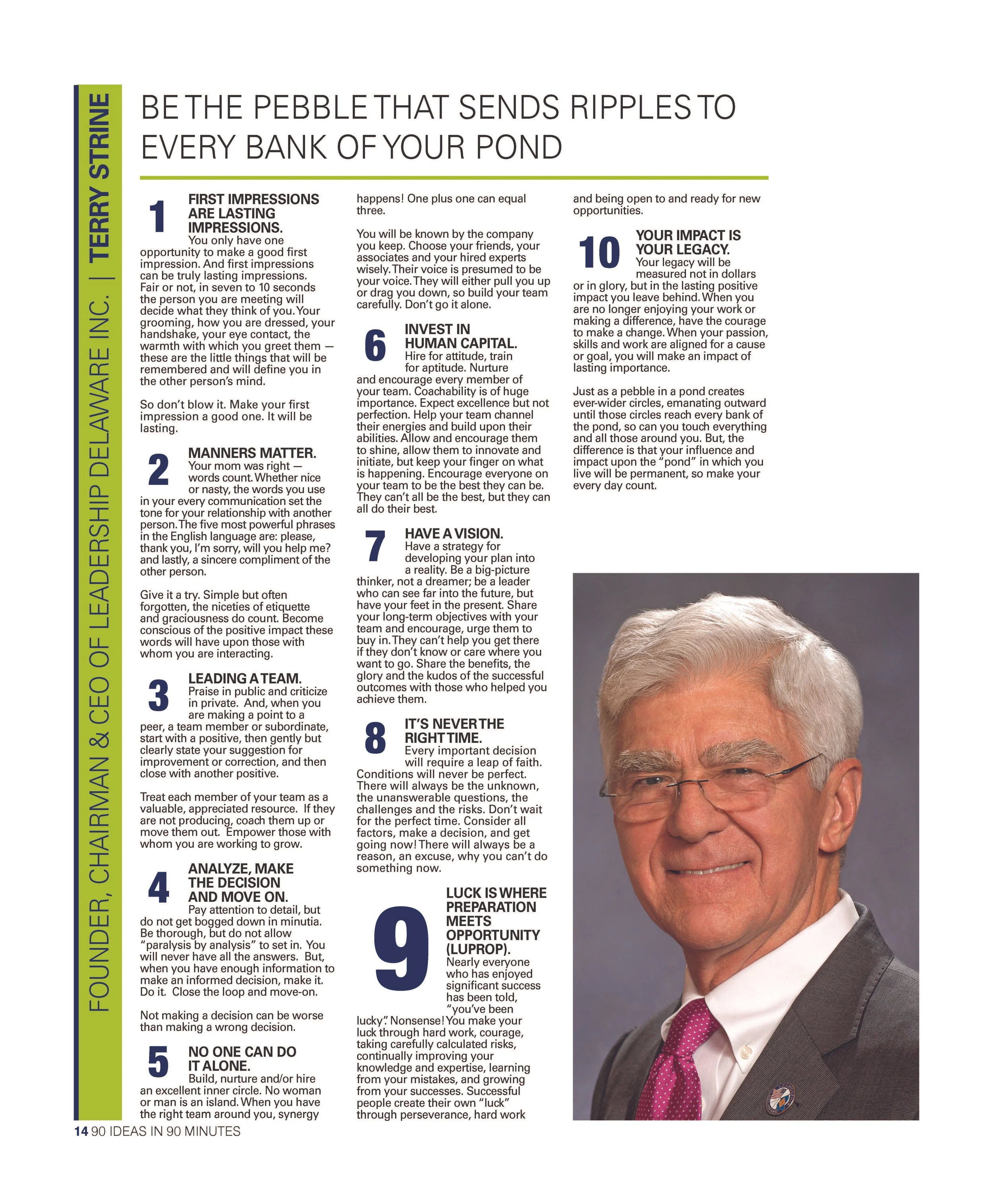
Each contributor provided ten ideas, which meant the publication needed to handle dense copy while still allowing readers to quickly scan and move through the content. I created a flexible editorial system built around large numbered callouts, strong typographic hierarchy, vertical contributor nameplates, multi-column layouts, consistent lime and navy accents, flexible portrait placement and clear separation between ideas and supporting copy. The system gave every featured leader a recognizable page structure while allowing enough flexibility to accommodate differences in photography, copy length and content.
Designing for Multiple Leaders
The publication featured leaders from business, government, education, health care, technology and economic development. Each feature required a slightly different layout approach, from full-body portraits to environmental imagery and studio headshots. Rather than forcing each story into an identical template, I designed a modular system that allowed the pages to adapt while still maintaining a consistent visual language throughout the issue.
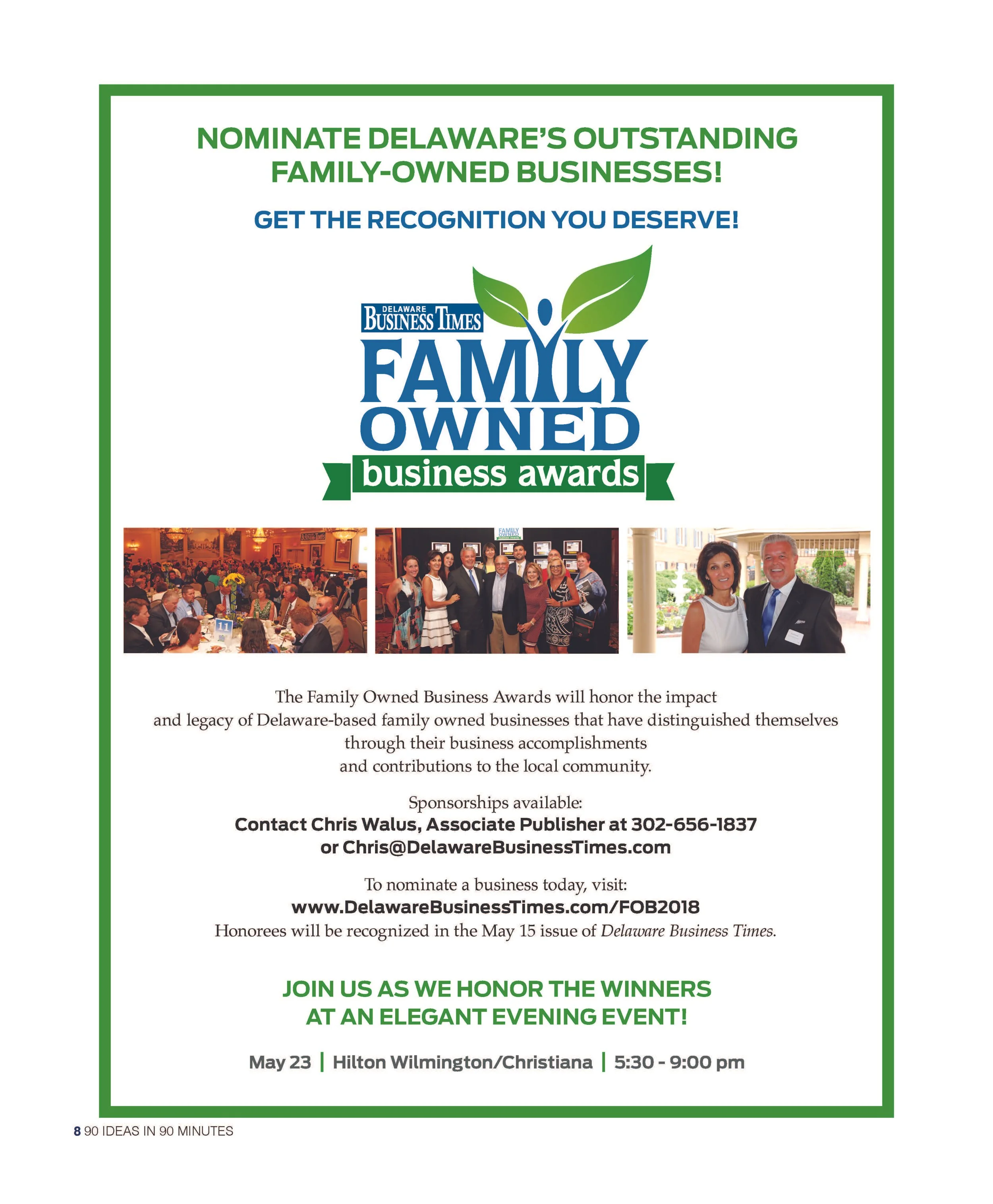
Advertising + Supporting Content
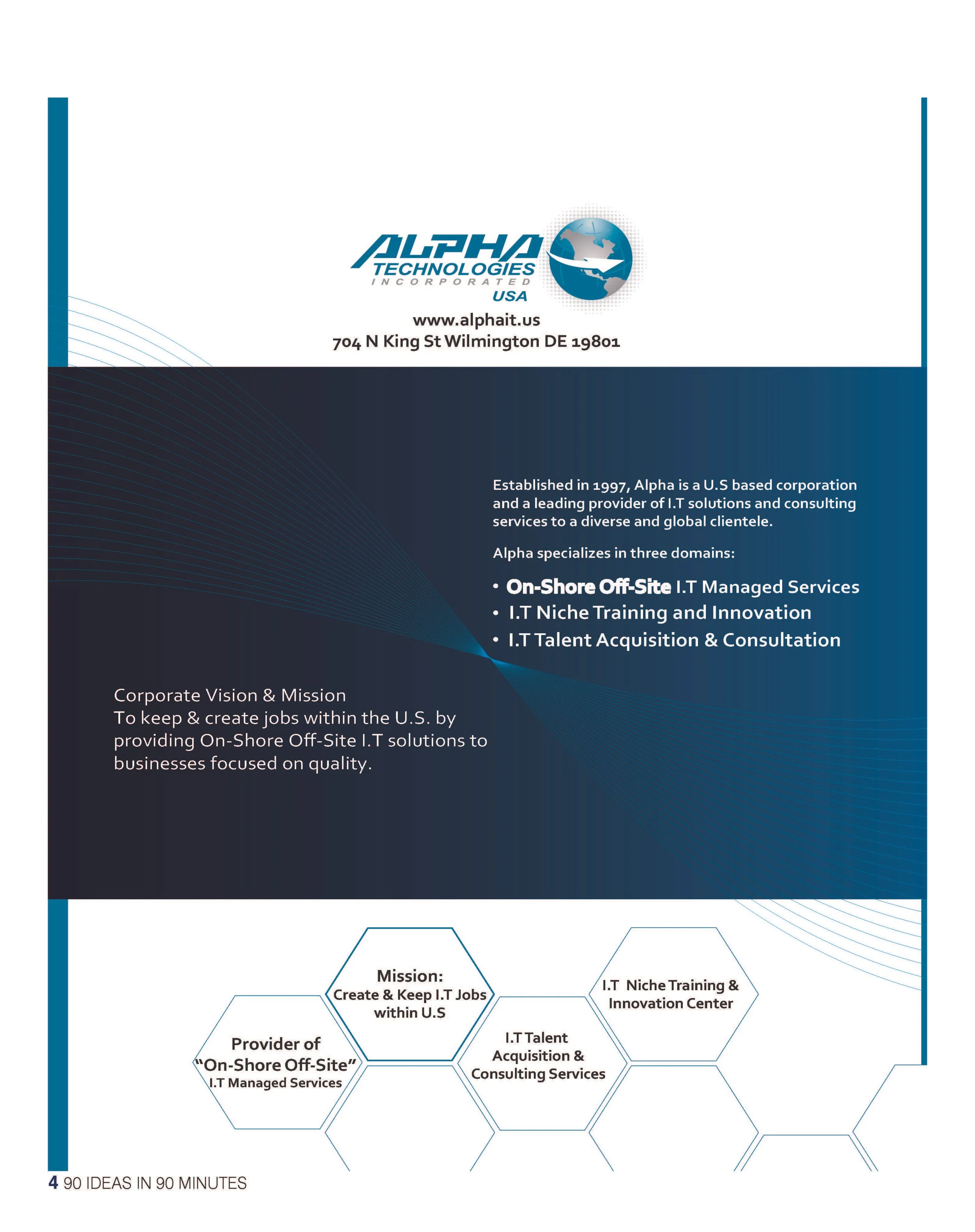
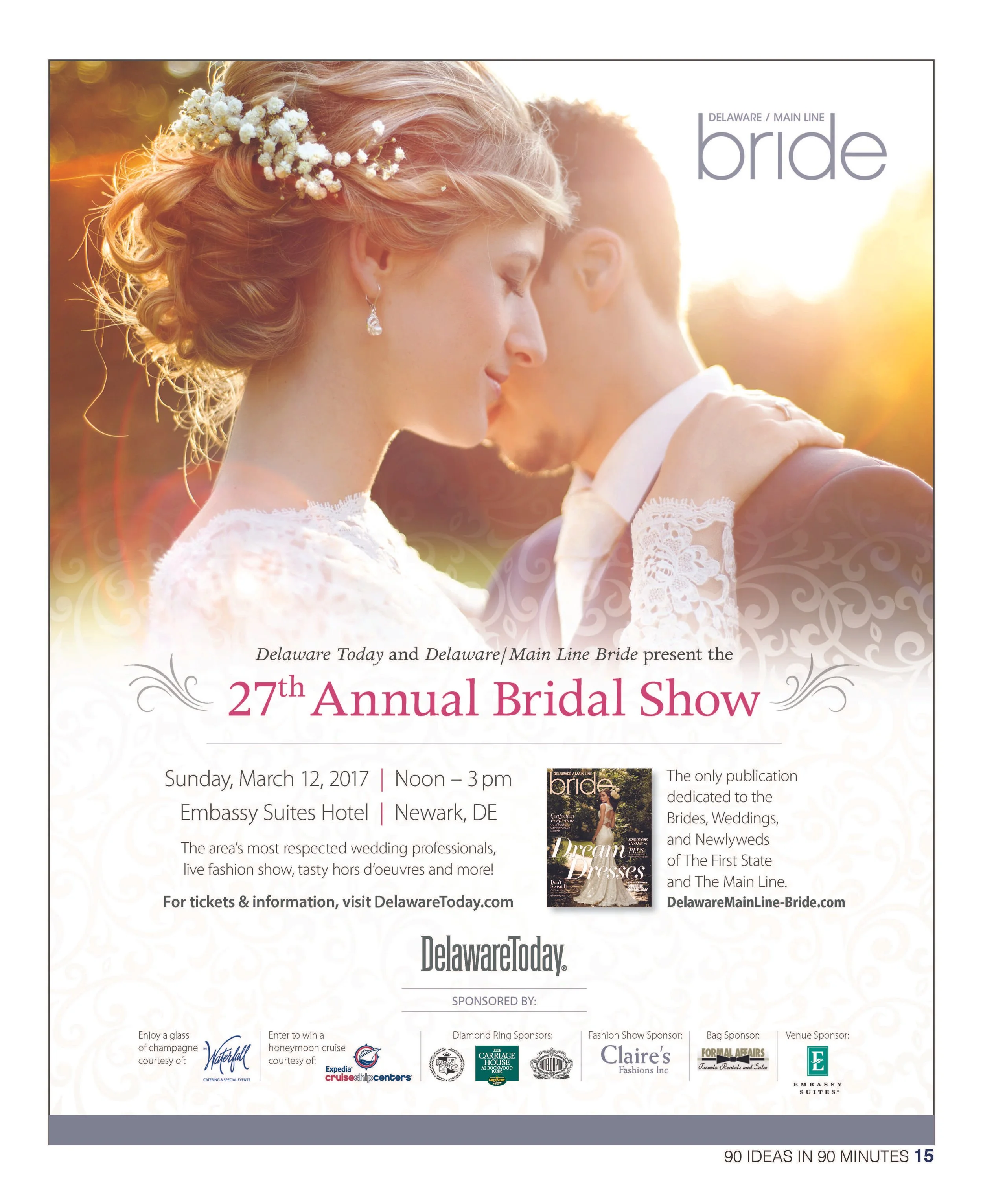
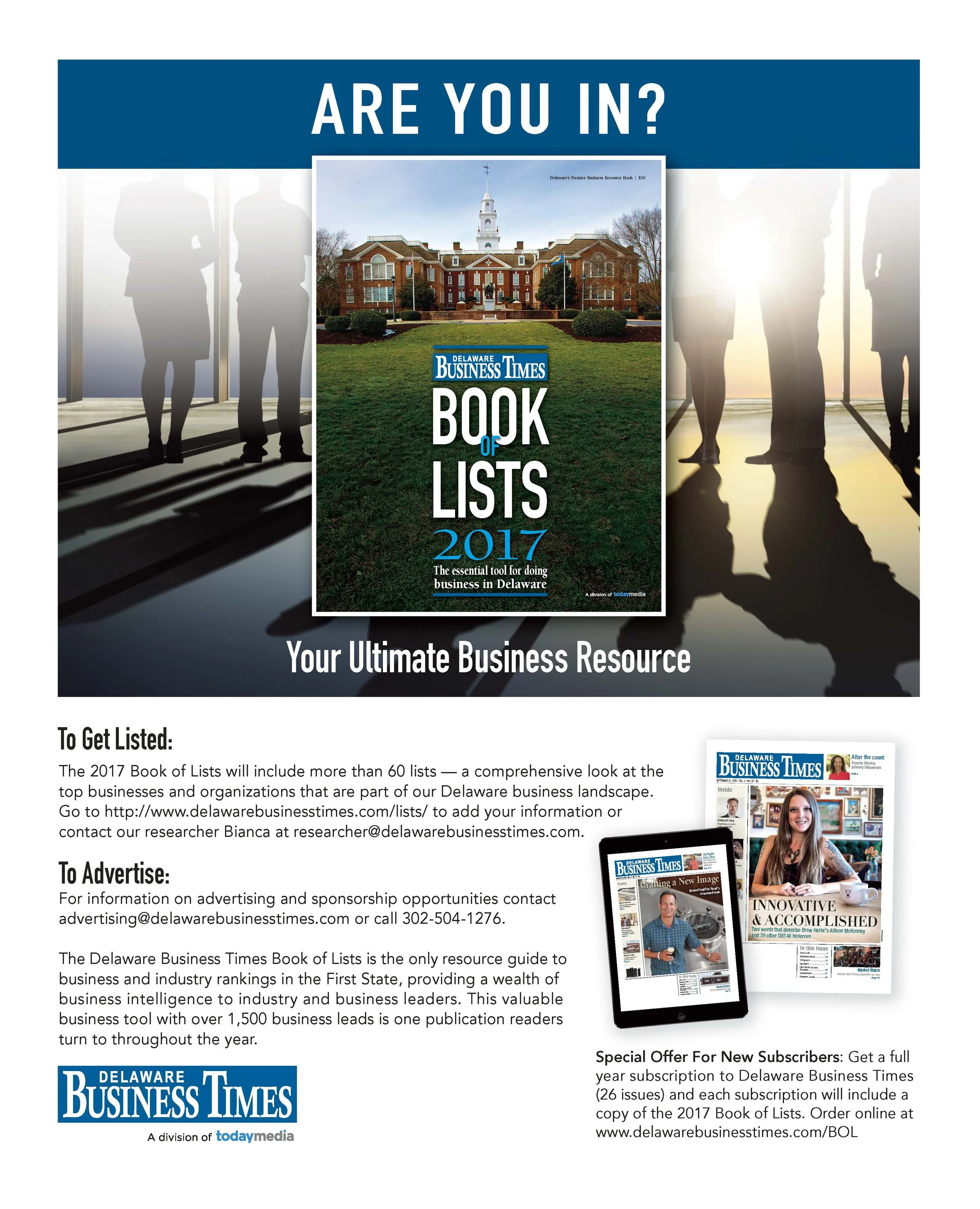
The 16-page supplement also incorporated sponsor advertising, event promotion and Delaware Business Times marketing content. I designed and integrated these elements so the publication maintained a clear editorial rhythm while supporting the commercial needs of the special section. The result was a cohesive publication that balanced editorial storytelling, business insight, advertising and promotional content within one unified system.
The Result
The inaugural edition established the 90 in 90 visual identity and publication framework that would continue into future editions. The project demonstrates my ability to take a publication from concept through production, including brand identity, logo development, art direction, editorial design, advertising and final print execution.
16-page inaugural publication
9 featured Delaware business leaders
90 business ideas presented through one cohesive editorial system
Complete identity and publication design from logo through final print
90 in 90 Supplement | Generations Edition
-
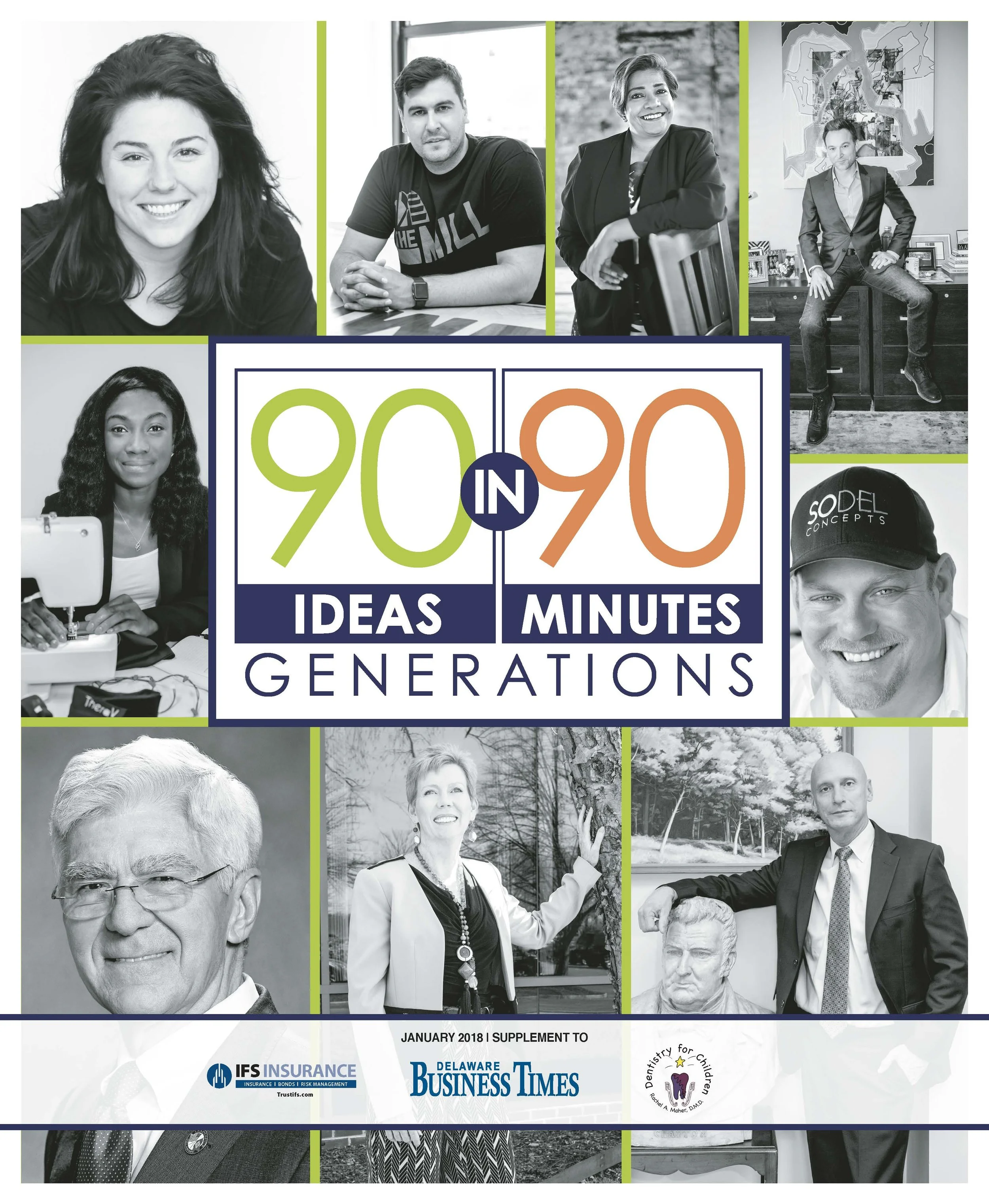
A 16-page business supplement for Delaware Business Times’ 90 Ideas in 90 Minutes, built from the ground up: logo, cover, editorial system and advertising, featuring nine Delaware business leaders across generations.
-
Client
Delaware Business Times / Today MediaMy Role
Lead Designer & Art DirectorProject Scope
Brand Identity · Logo Design · Creative Direction · Art Direction · Publication Design · Editorial Layout · Visual Systems · Typography · Photography Direction · Advertising Design · Print ProductionProject Overview
For the second annual 90 Ideas in 90 Minutes supplement, Delaware Business Times needed a complete visual identity and publication system that could bring together advice from nine Delaware business leaders while giving the special edition a recognizable identity of its own.
I designed the project from the ground up, creating the 90 in 90 logo, cover concept, editorial design system, interior layouts, advertising, and full publication.
The 2018 edition, themed “Generations,” featured leaders at different stages of their careers and required a design system flexible enough to support nine distinct personalities while keeping the publication cohesive from cover to cover.
Building the Visual Identity
I developed the 90 in 90 identity around the structure of the event itself: 90 ideas shared in 90 minutes.
The bold numerical logo became the foundation of the publication’s visual language, pairing oversized typography with a vibrant lime, orange and navy palette that felt energetic, modern and appropriate for a business audience.
That identity extended throughout the supplement, creating a recognizable system that connected the cover, editorial pages, advertising and promotional content.
Editorial Design
One of the primary challenges was organizing a large amount of advice-driven content without making the publication feel overwhelming.
Each featured leader contributed multiple ideas, resulting in text-heavy pages with varying copy lengths and photography.
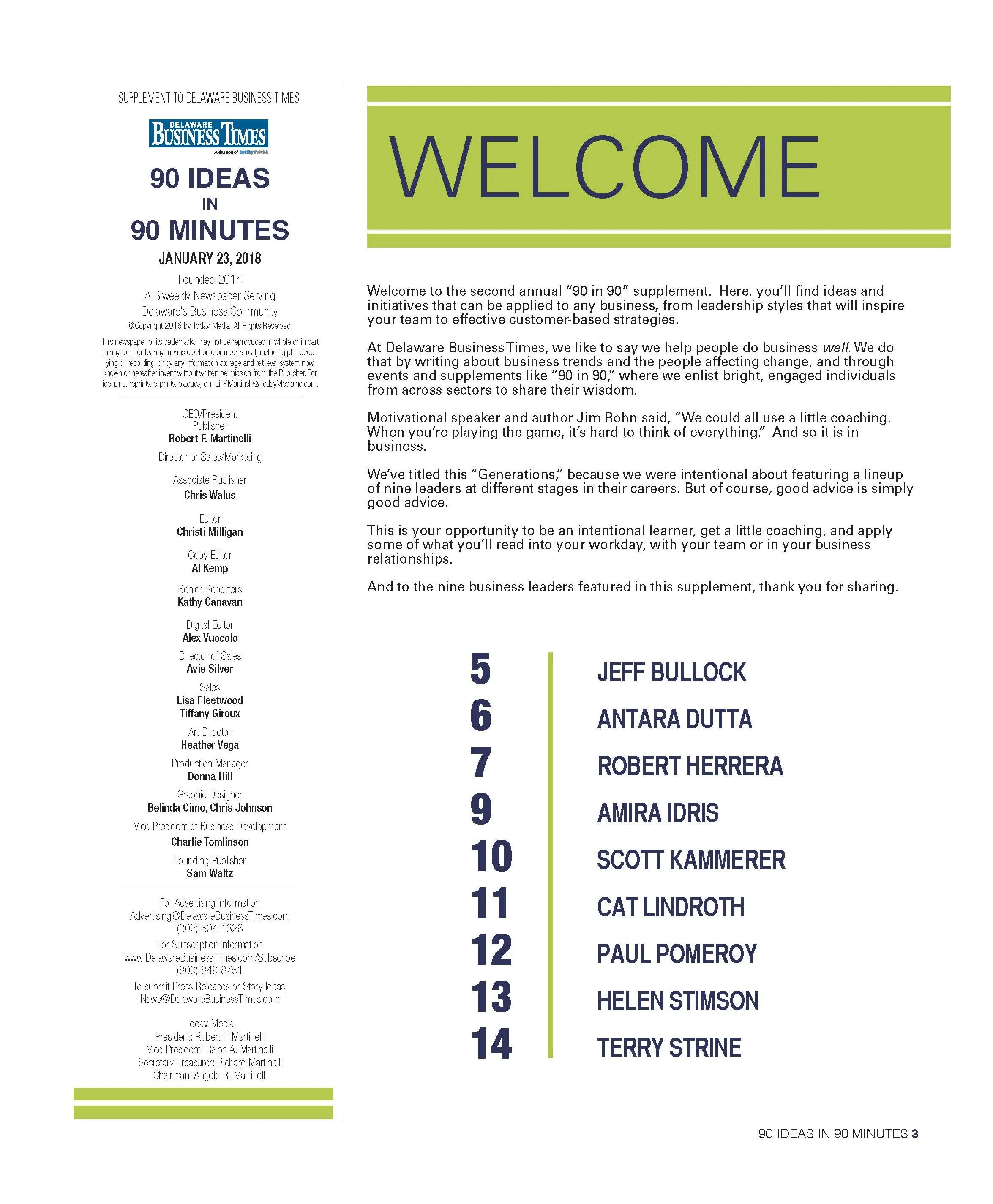
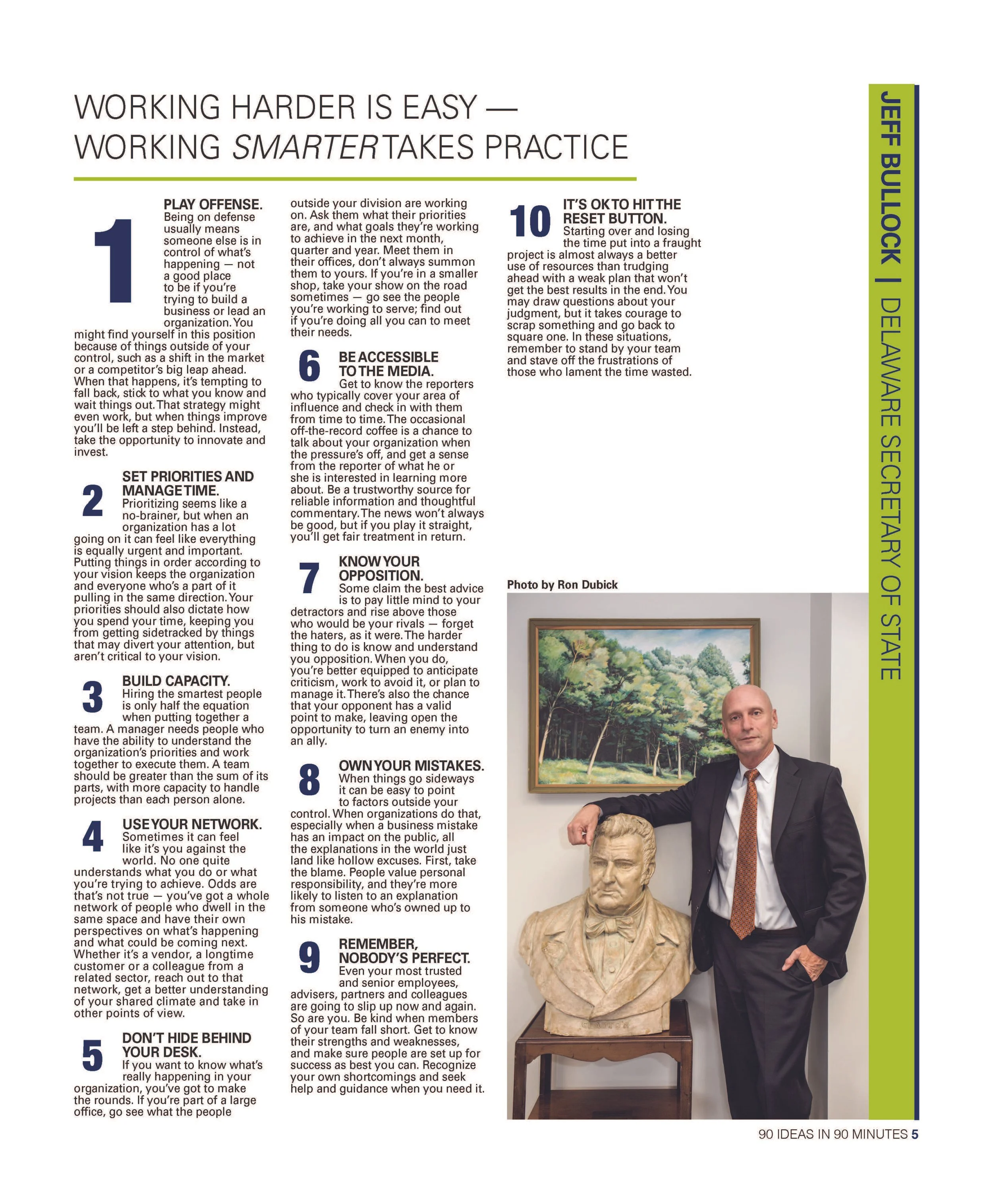
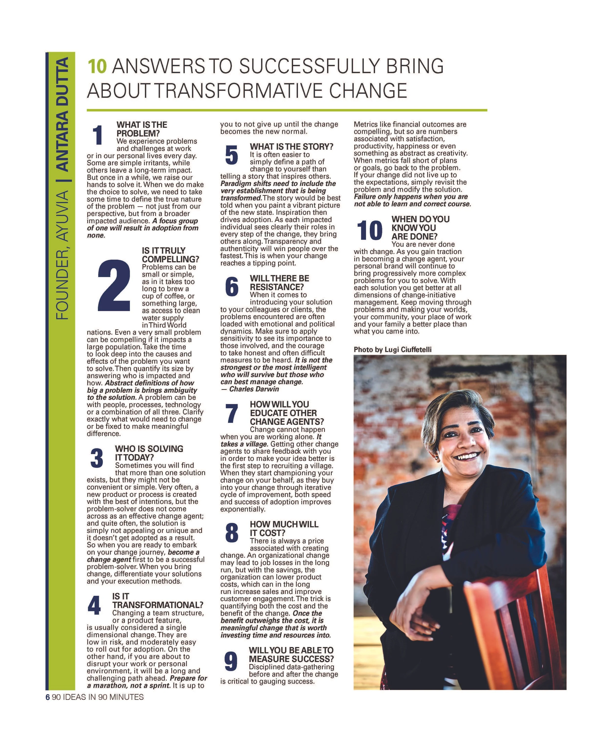
I developed a modular editorial system using:
Oversized numbered callouts
Bold section headlines
Vertical nameplates
Structured multi-column layouts
Consistent color accents
Flexible photography placement
Strong typographic hierarchy
These elements made dense information easier to scan while giving every featured leader a distinct presence within the same overall publication system.
Designing for Multiple Voices
The photography ranged from environmental portraits to studio-style headshots, and each contributor’s content required a slightly different layout approach.
Rather than forcing every feature into an identical template, I created a flexible system that could adapt to the content while maintaining visual consistency.
This allowed each spread to feel individual while still clearly belonging to the 90 in 90 brand.
Advertising + Promotional Design
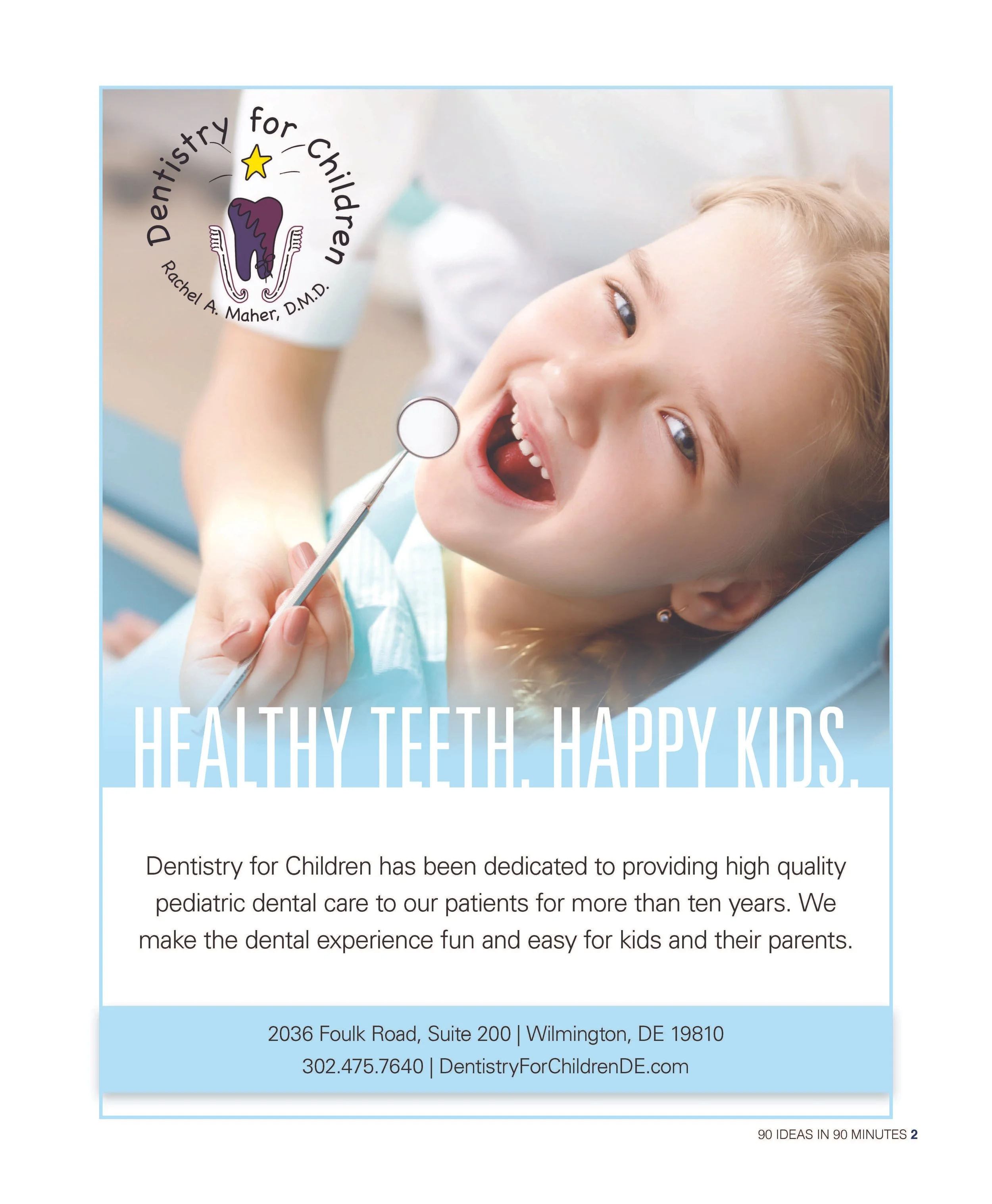
In addition to the editorial content, I designed the advertising and promotional pages integrated throughout the supplement.
These pieces needed to support sponsor and advertiser messaging while remaining visually compatible with the larger publication.
By carrying consistent typography, spacing and visual hierarchy across editorial and advertising content, I created a cohesive reader experience from the opening cover through the final page.
The Result
The finished 16-page publication brought together brand identity, editorial storytelling, advertising and business content within one unified visual system.
The project demonstrates my ability to build a publication from concept through production, including identity development, art direction, editorial design, advertising and final print execution.
16-page custom publication
9 featured Delaware business leaders
Complete identity and publication design from logo through final print

Delaware Today & The Hunt Magazine Holiday Look Book
-
A 32-page seasonal editorial publication that connected Delaware readers with local businesses, curated gifts, holiday experiences and events through a cohesive, elevated visual system.
-
Client
Delaware Today / Today Media
My Role
Lead Designer & Art Director
Project Scope
Creative Direction · Art Direction · Publication Design · Editorial Design · Cover Design · Visual Identity · Gift Guide Design · Business Features · Advertising Design · Typography · Image Direction · Print Production
Project Overview
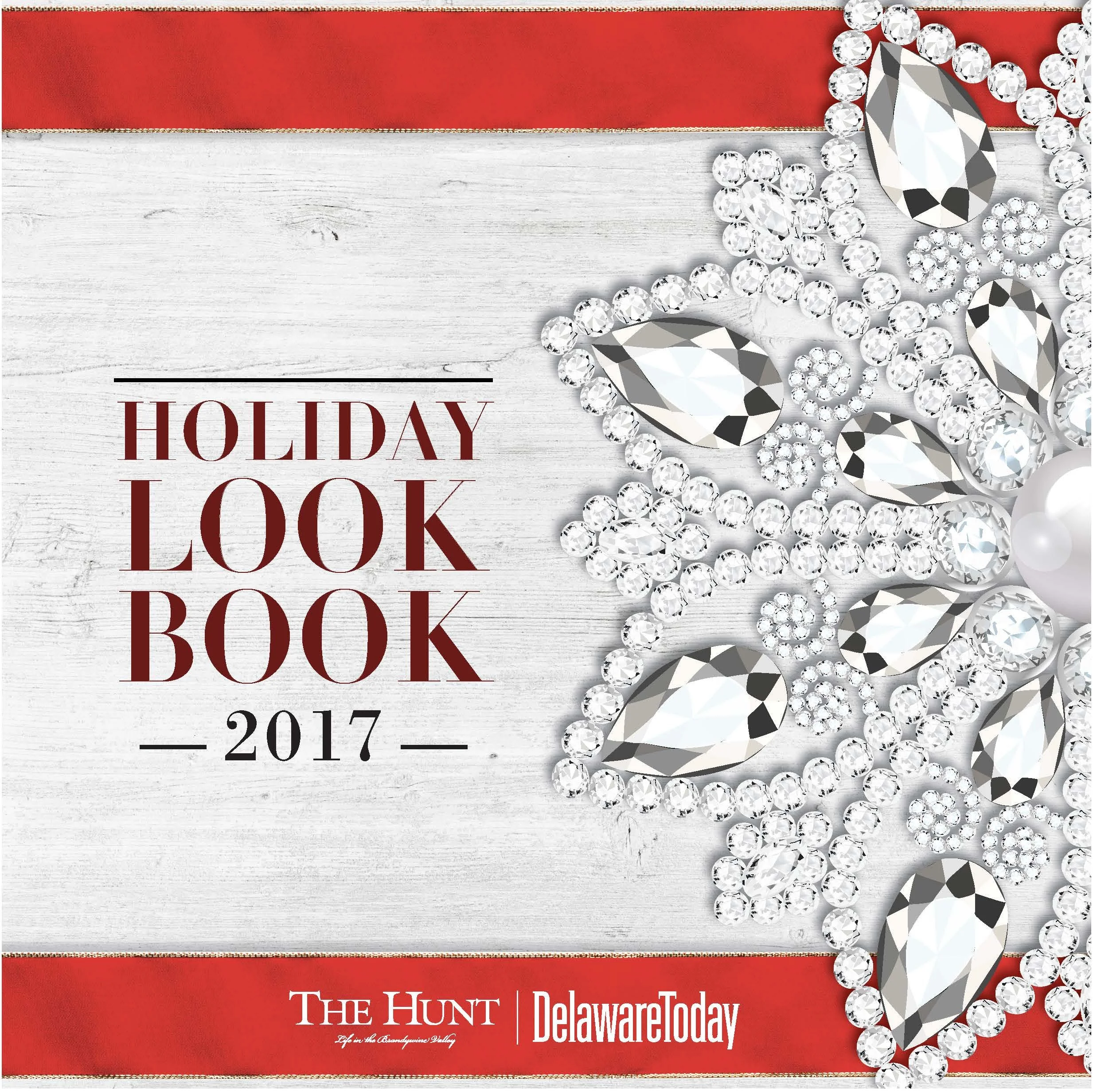
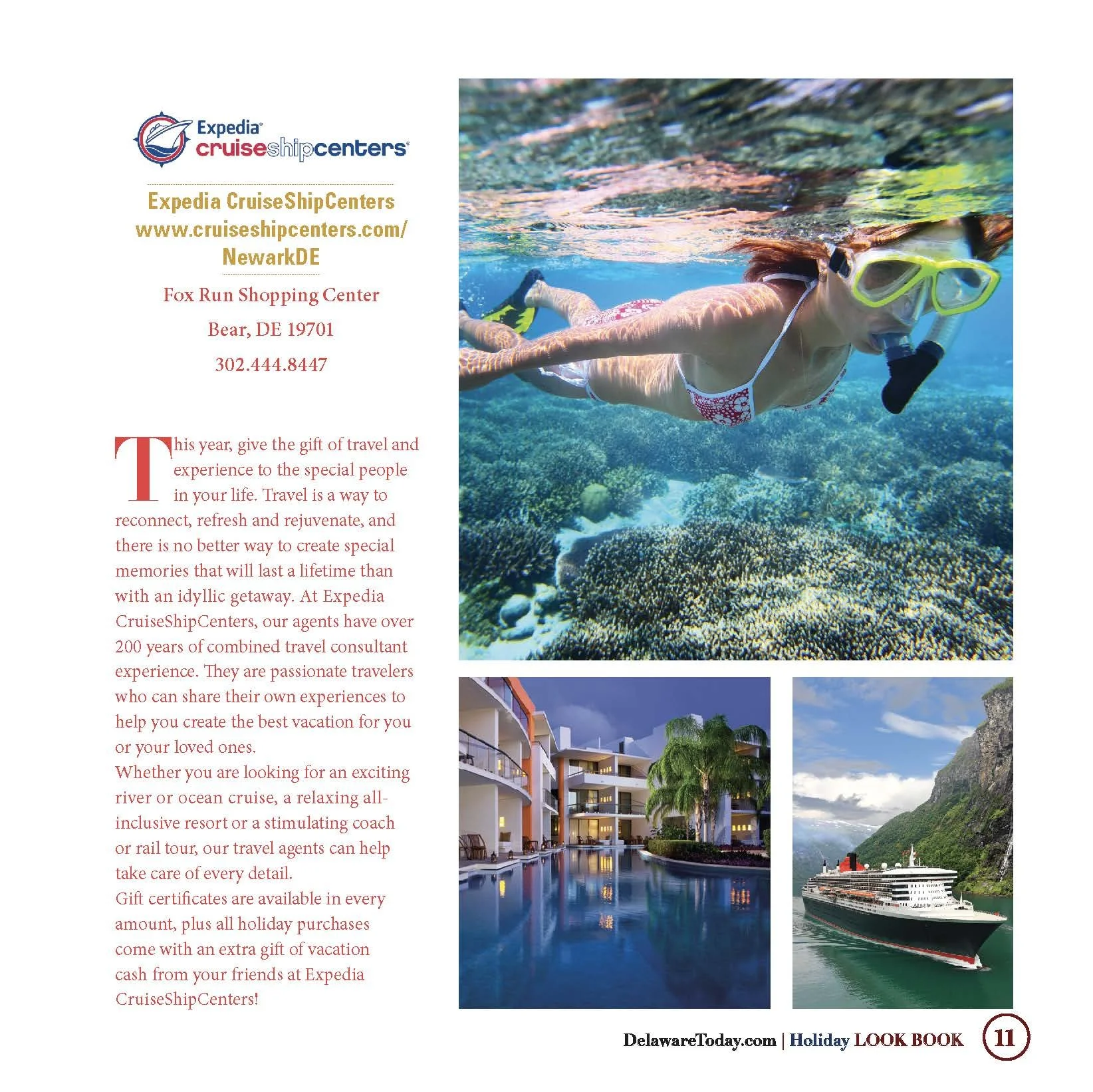
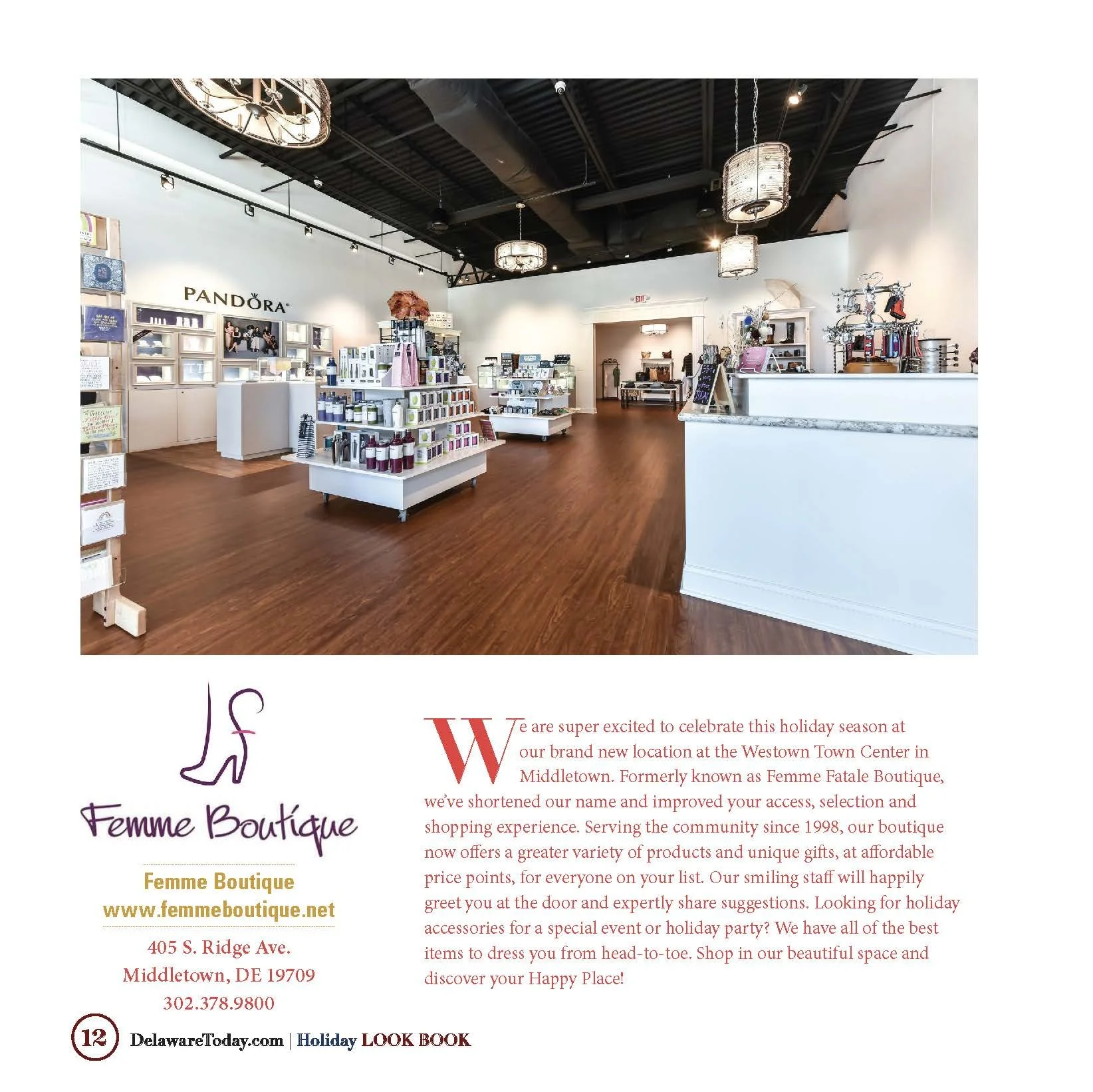
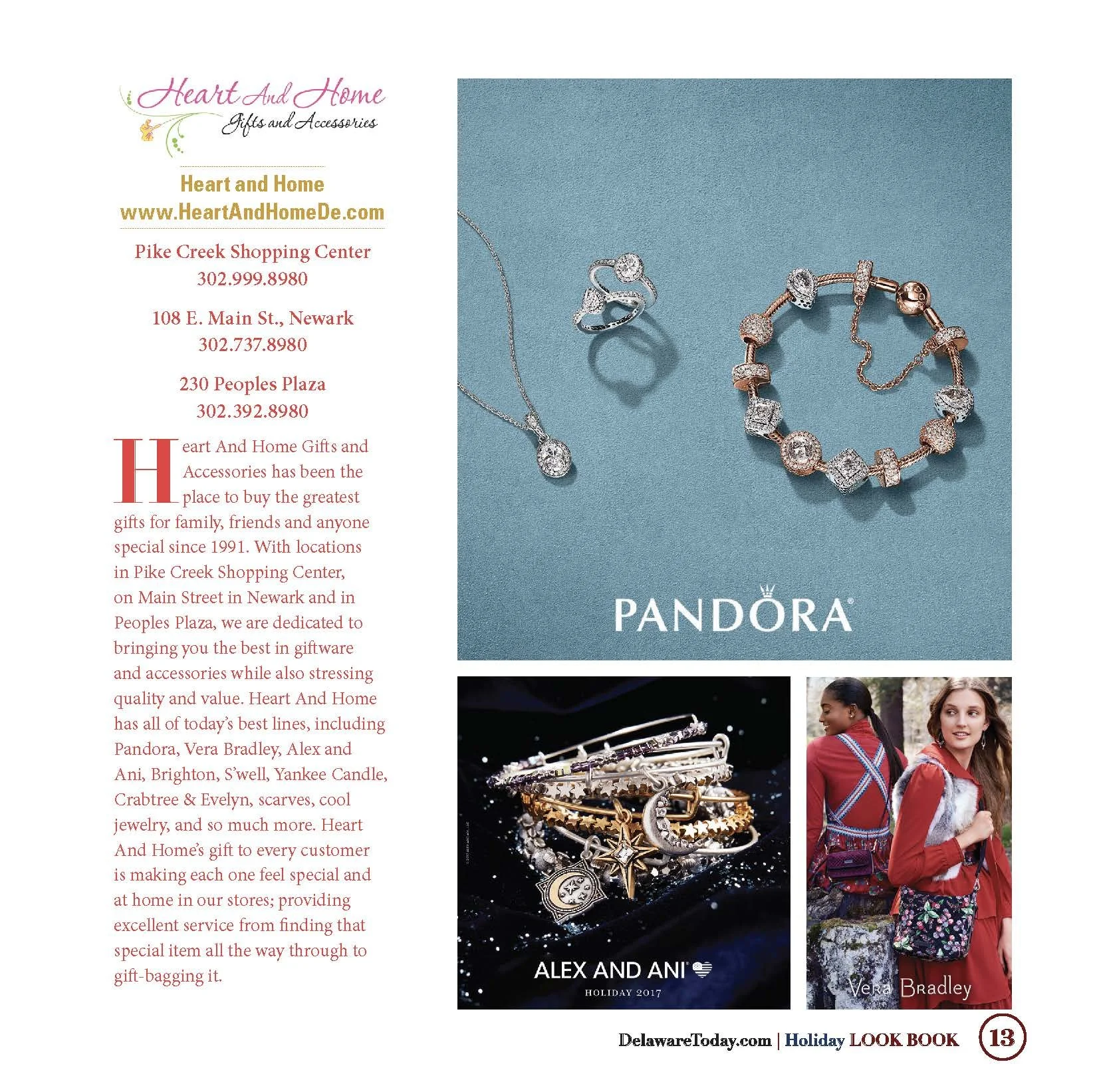
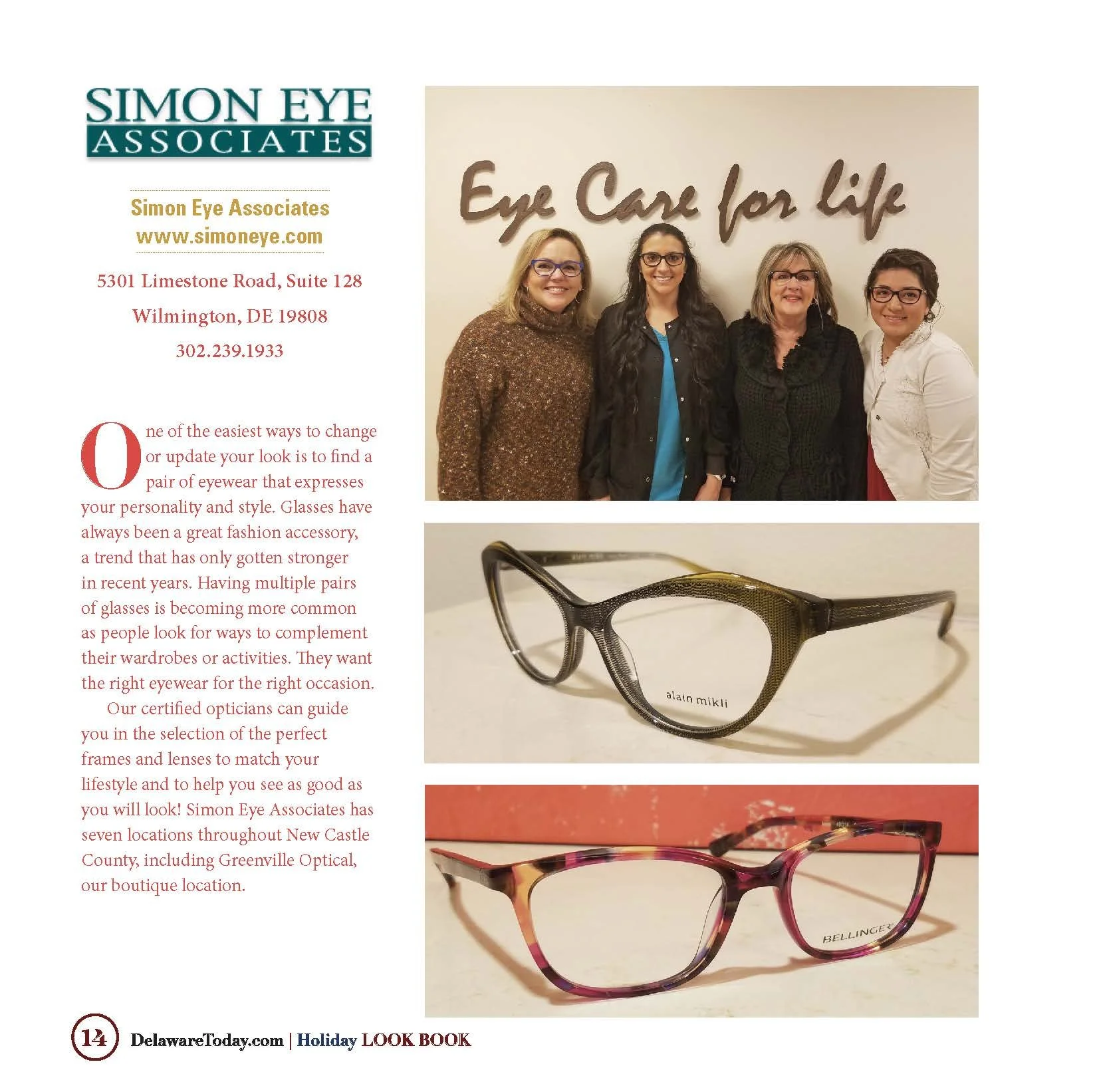
For Delaware Today’s 2017 Holiday Look Book, I developed and designed the complete seasonal publication from cover through final production.
The goal was to create a visually engaging holiday shopping and lifestyle guide that connected Delaware readers with local businesses, gift ideas, seasonal experiences and events while giving participating advertisers a polished editorial environment in which to showcase their products and services.
The finished publication brought together featured businesses, a curated gift guide, local holiday events, lifestyle content and advertising within one cohesive 32-page visual system.
Creating the Holiday Identity
I developed a classic holiday visual direction built around rich red, crisp white and warm gold accents.
A jeweled snowflake, ribbon-inspired graphic elements and elegant typography established a festive identity without relying on a heavily decorative or novelty-driven aesthetic.
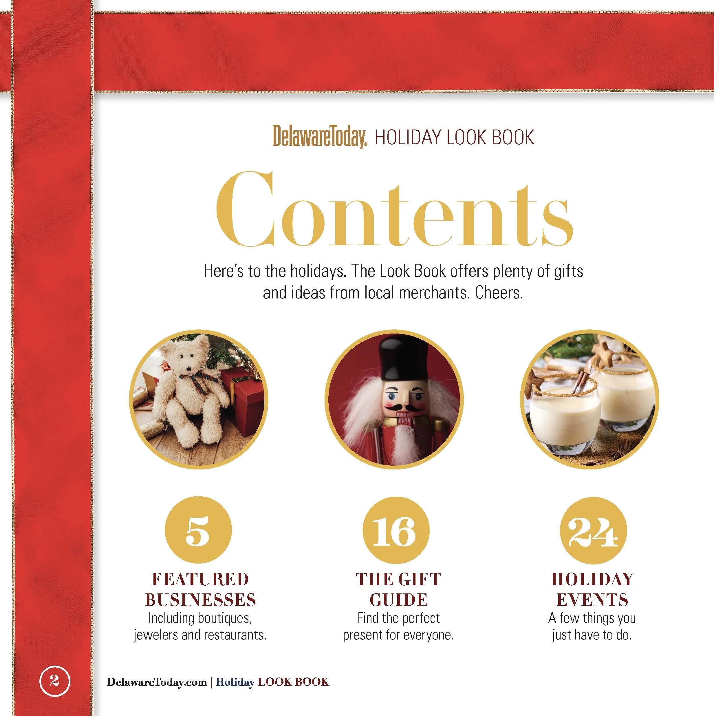
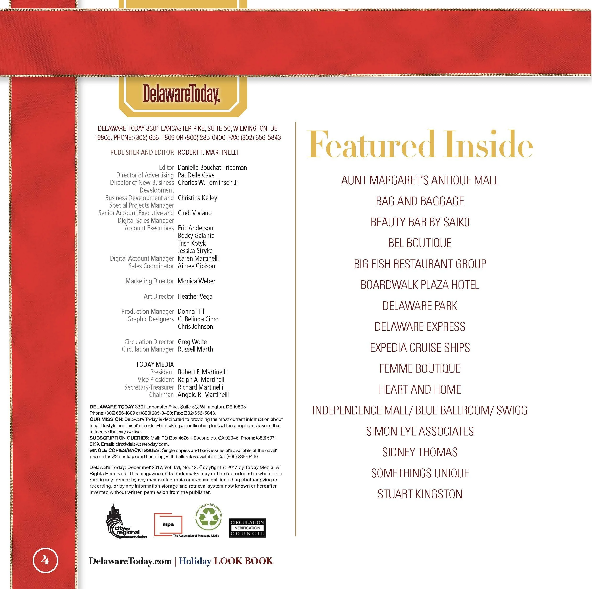
The cover introduced that visual language immediately, and the same system carried through the contents page, gift guide and events section to create continuity across the publication.
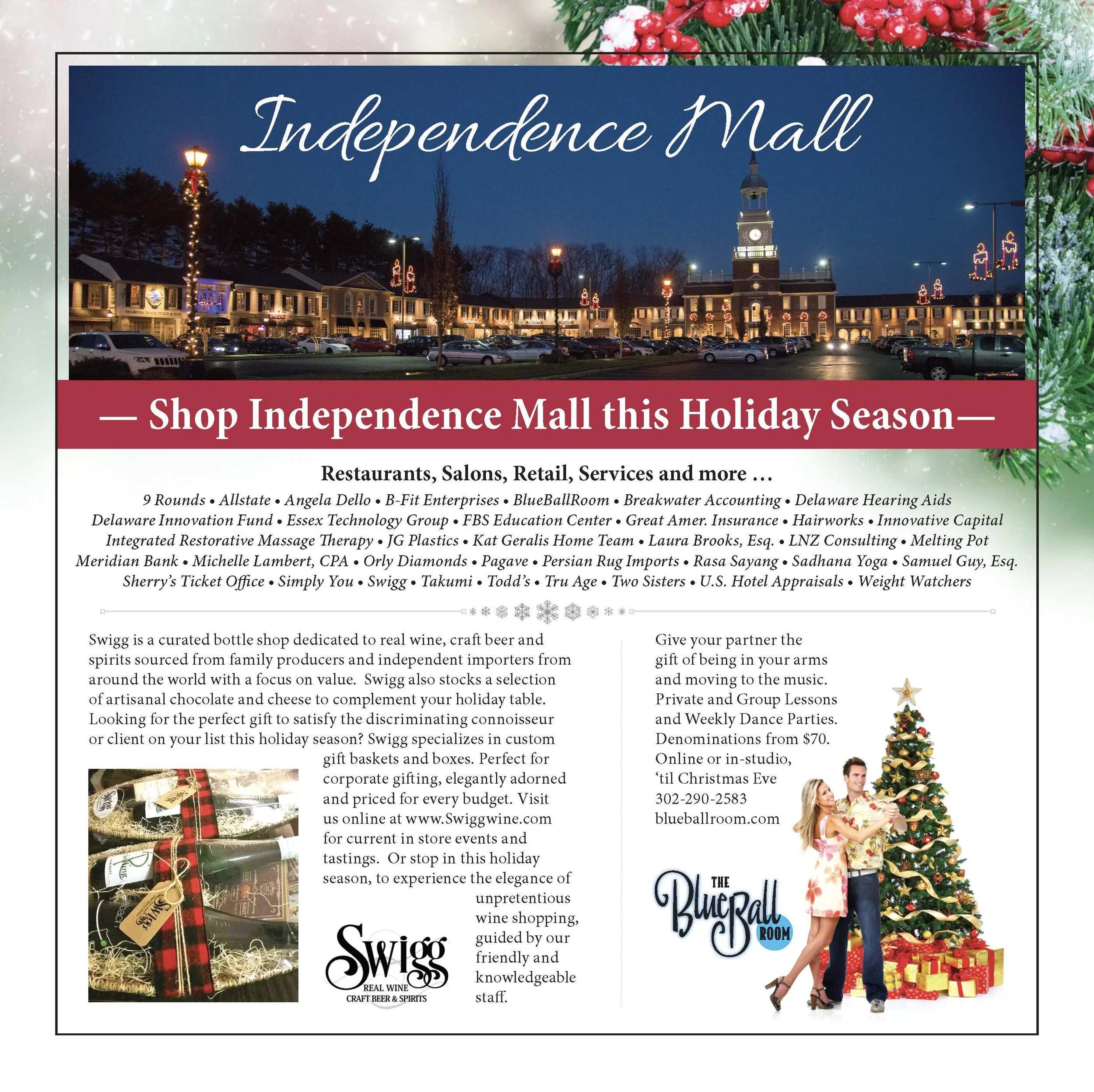
Featured Business Editorial
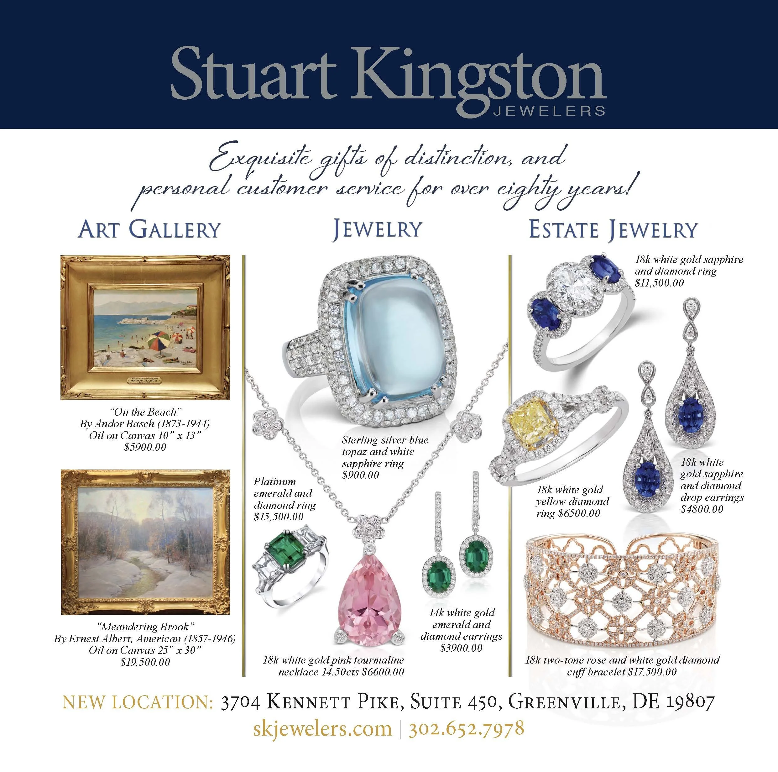
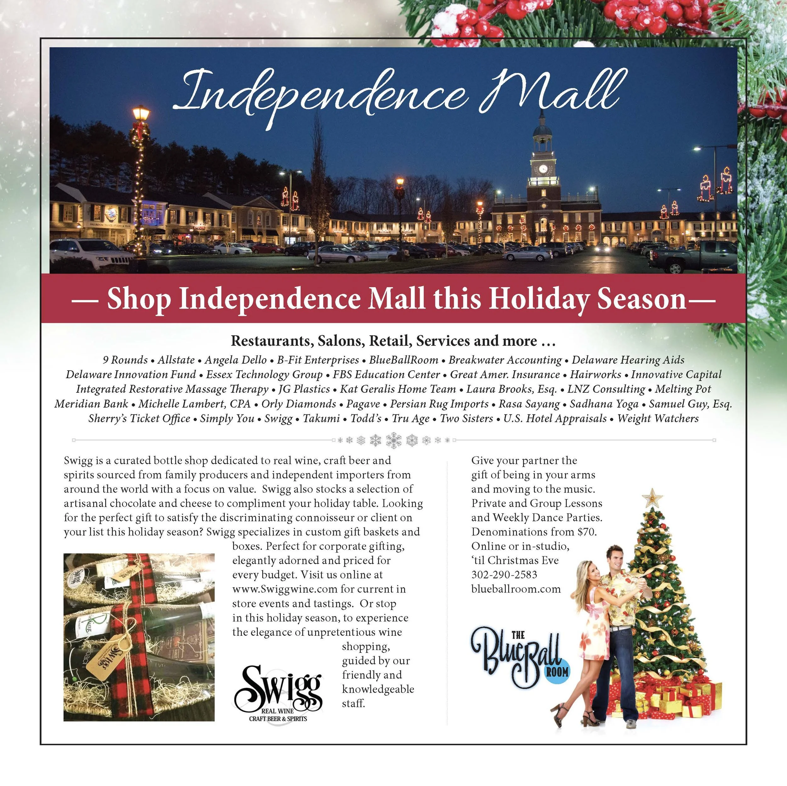
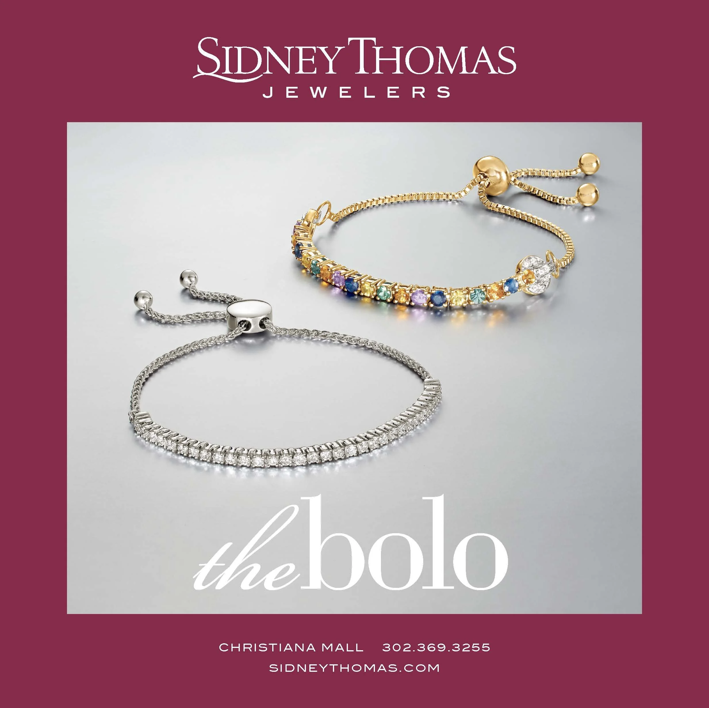
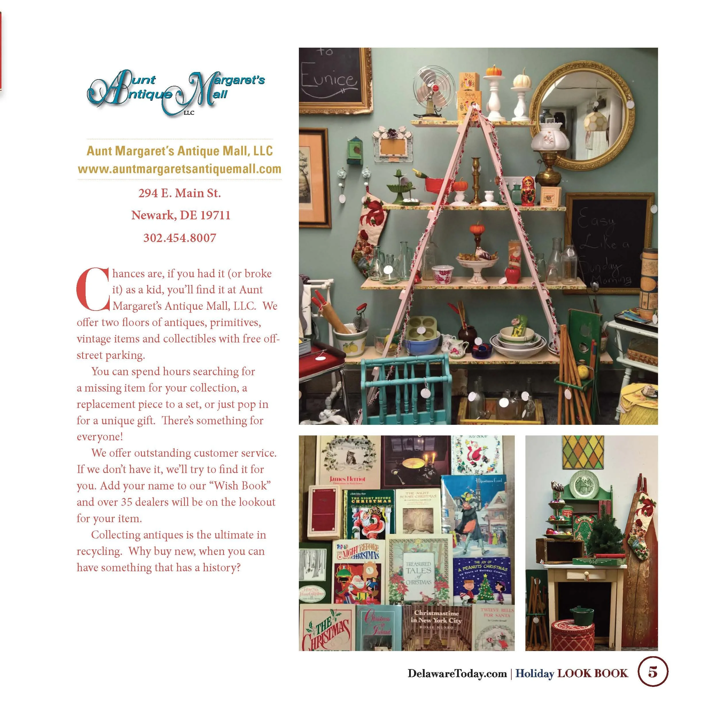
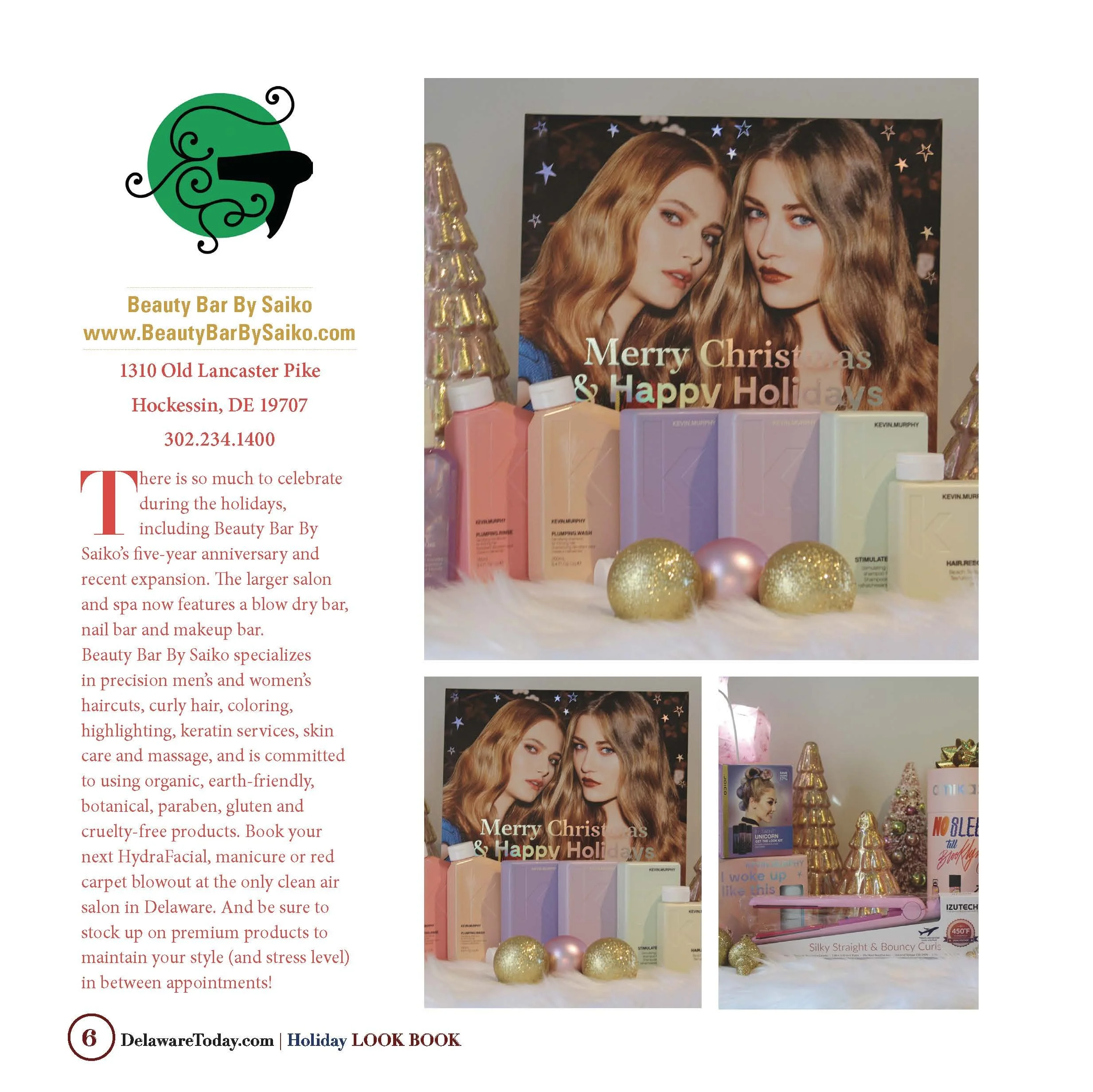
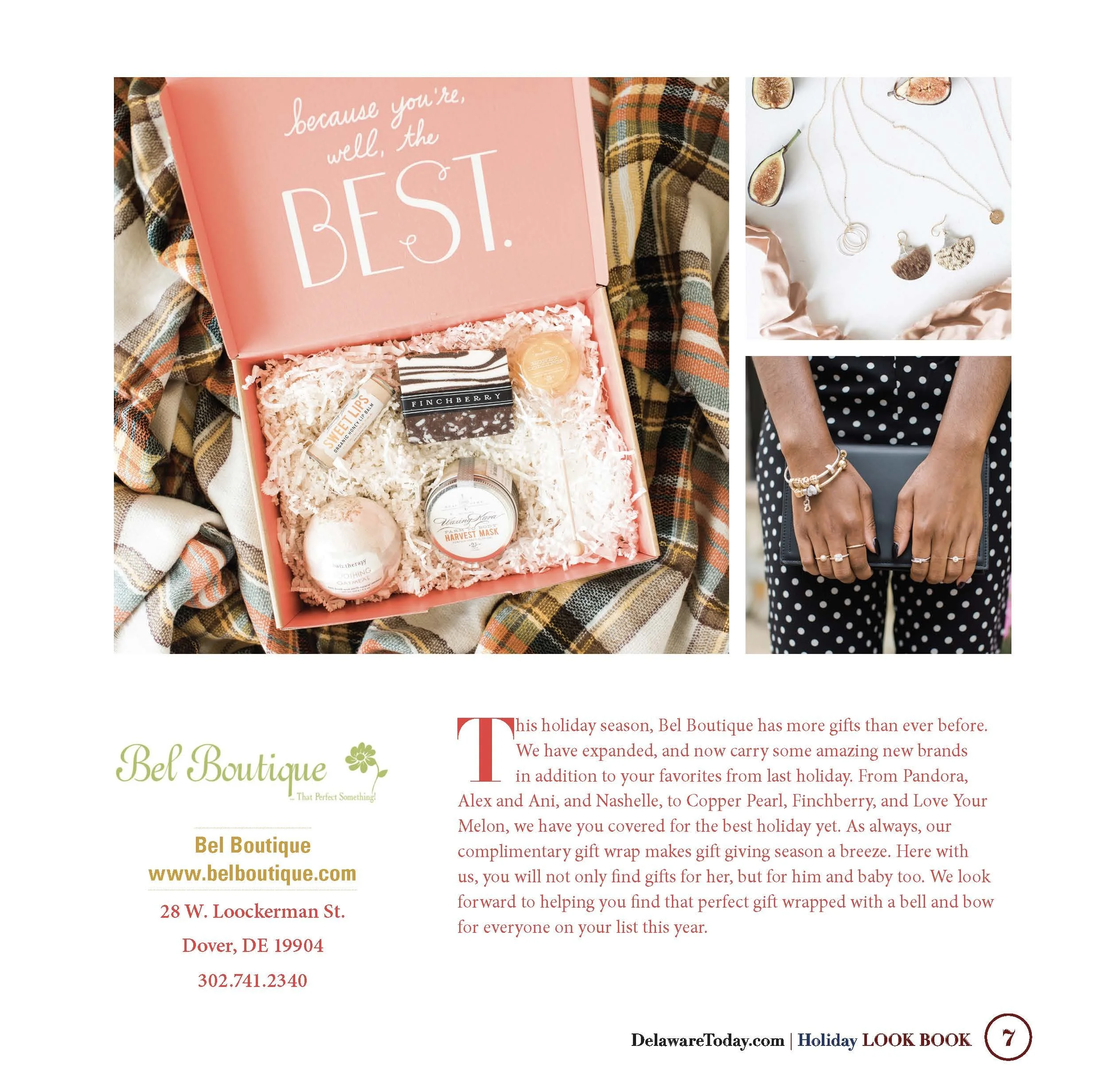
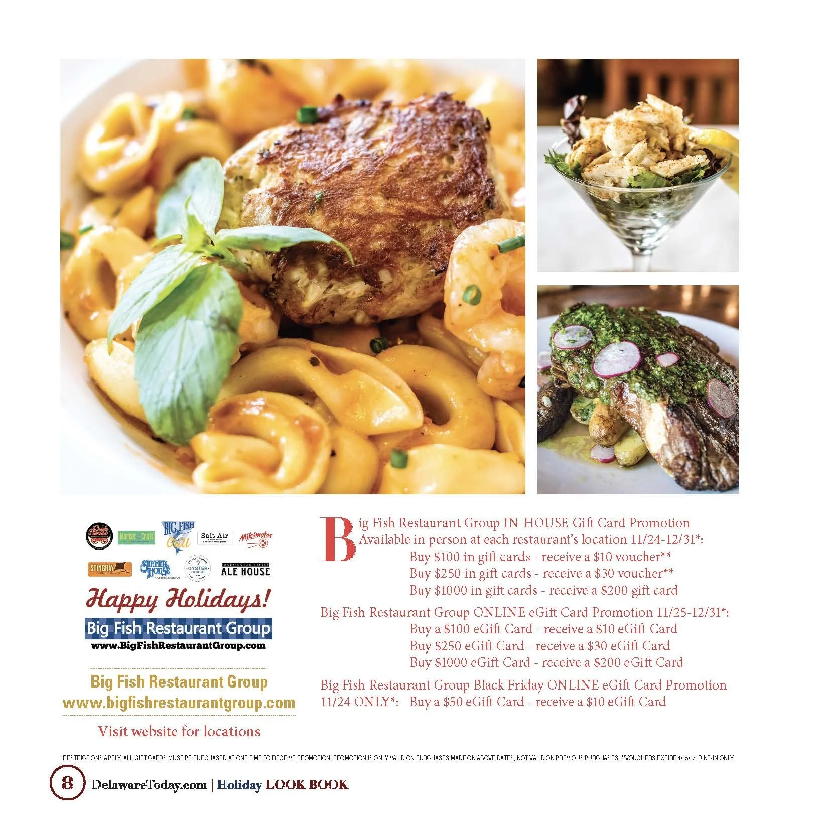
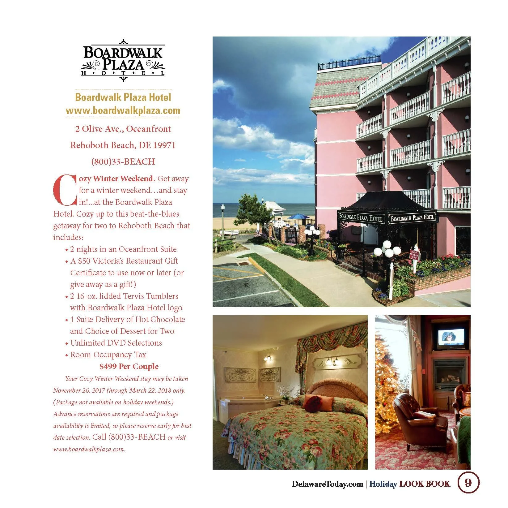
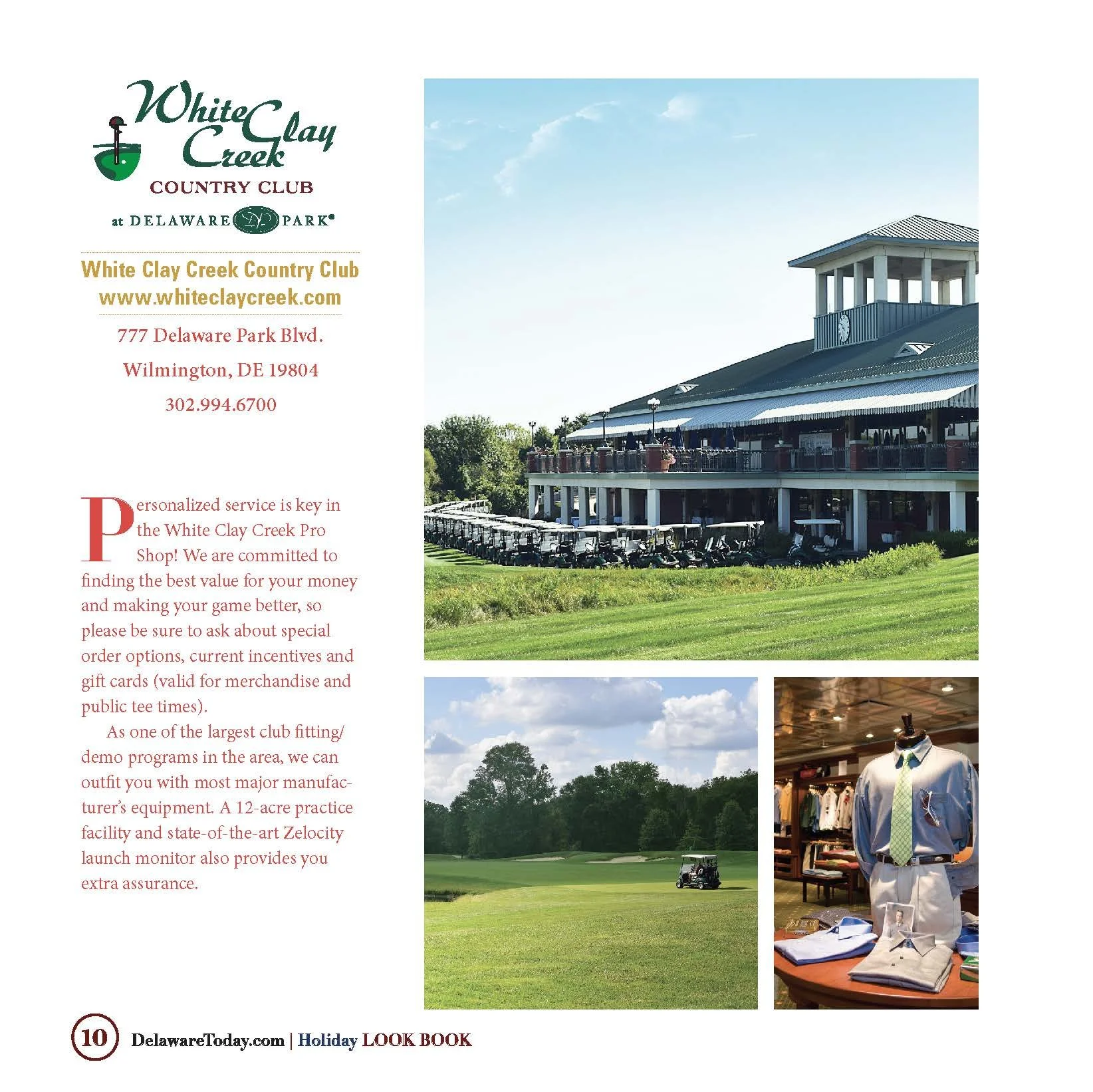
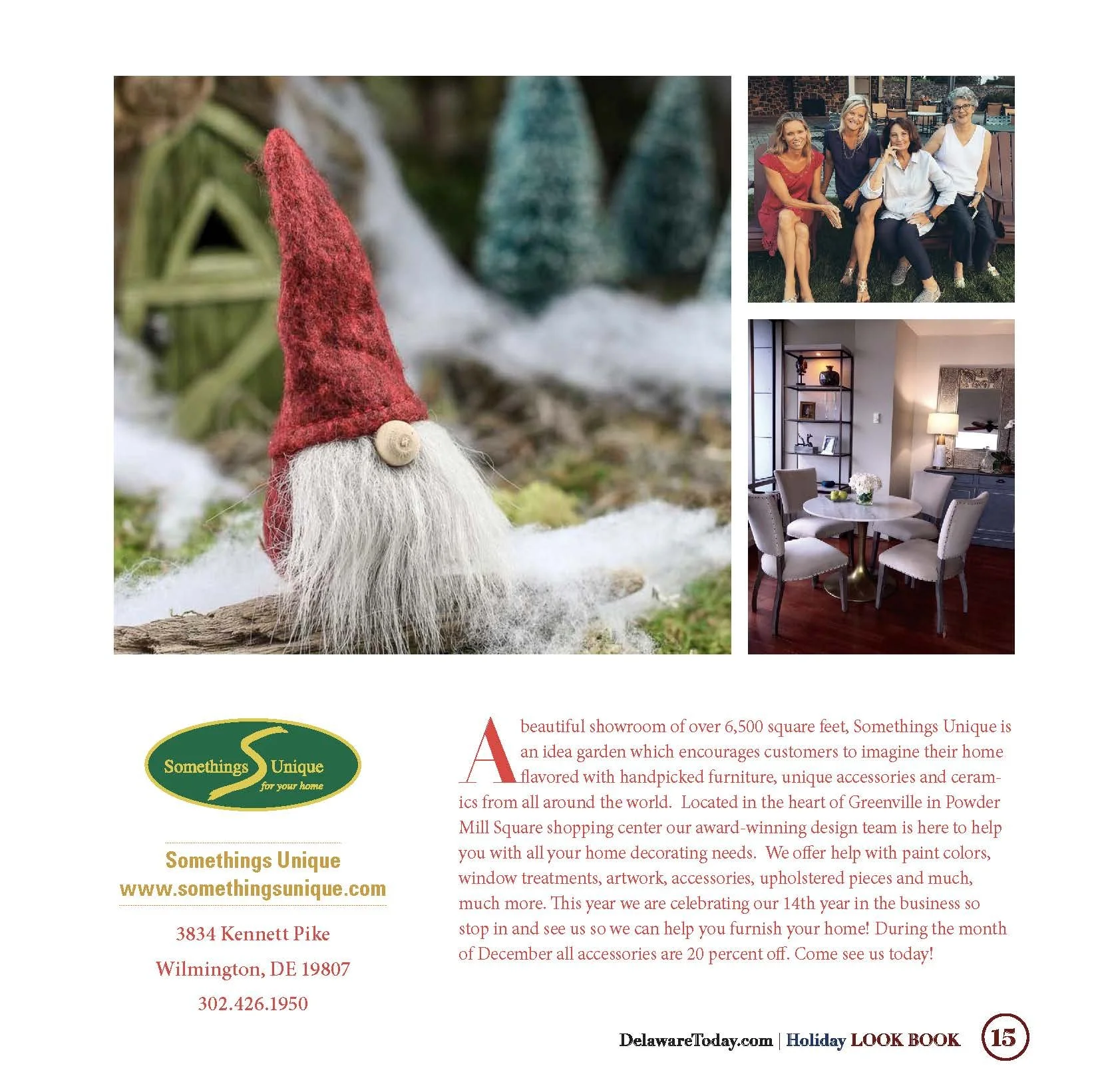
A major portion of the publication highlighted local retailers, restaurants, hotels, service providers and lifestyle businesses.
Each business had different photography, brand assets and amounts of copy, so the challenge was creating pages that felt individual while still clearly belonging to the same publication.
I developed flexible layouts using:
Branded business information
Large product and lifestyle photography
Supporting image grids
Editorial copy
Consistent typography
Seasonal color accents
Clear contact and location information
The layouts were designed to feel more like editorial profiles than traditional advertisements, helping each business tell a stronger visual story.
Designing the Holiday Gift Guide
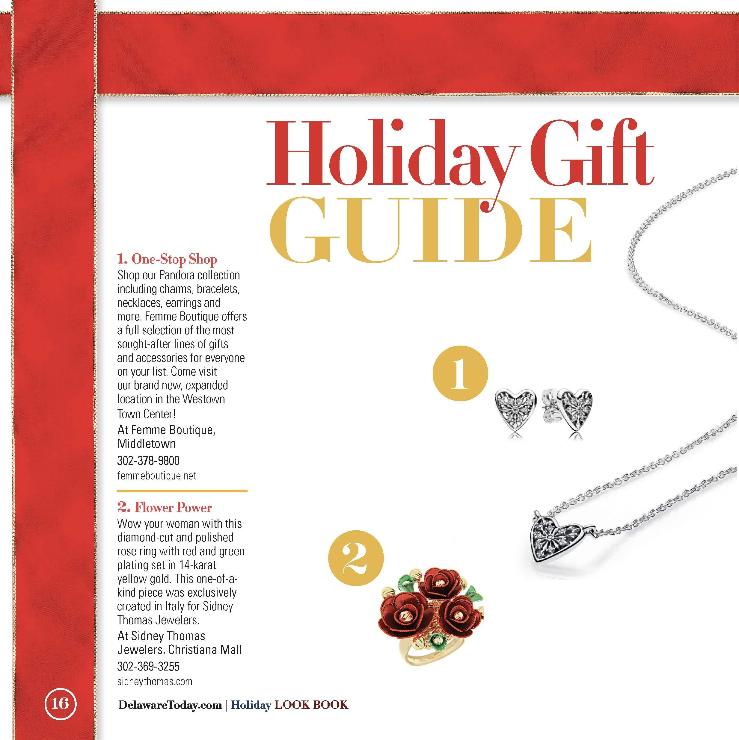
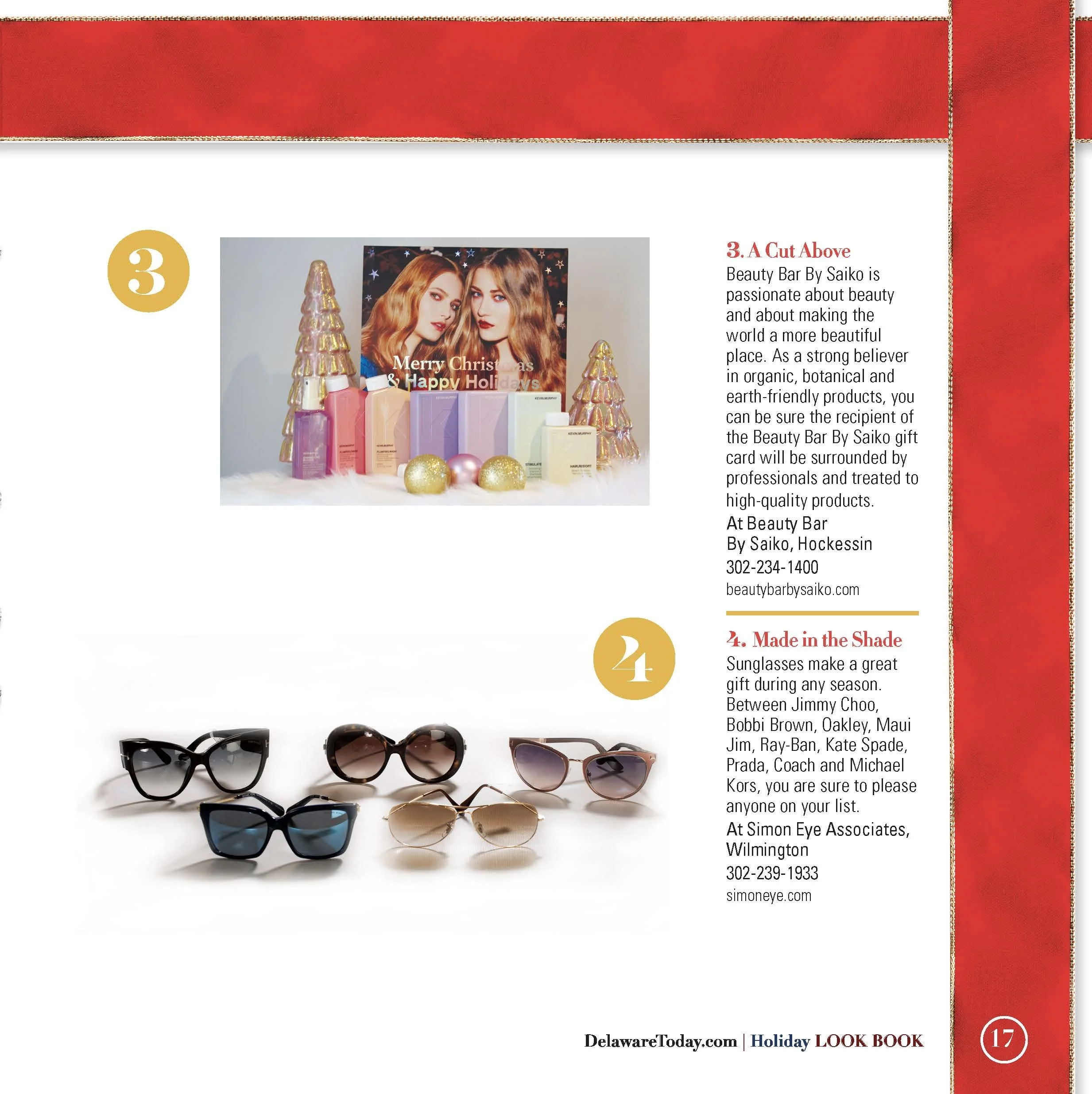
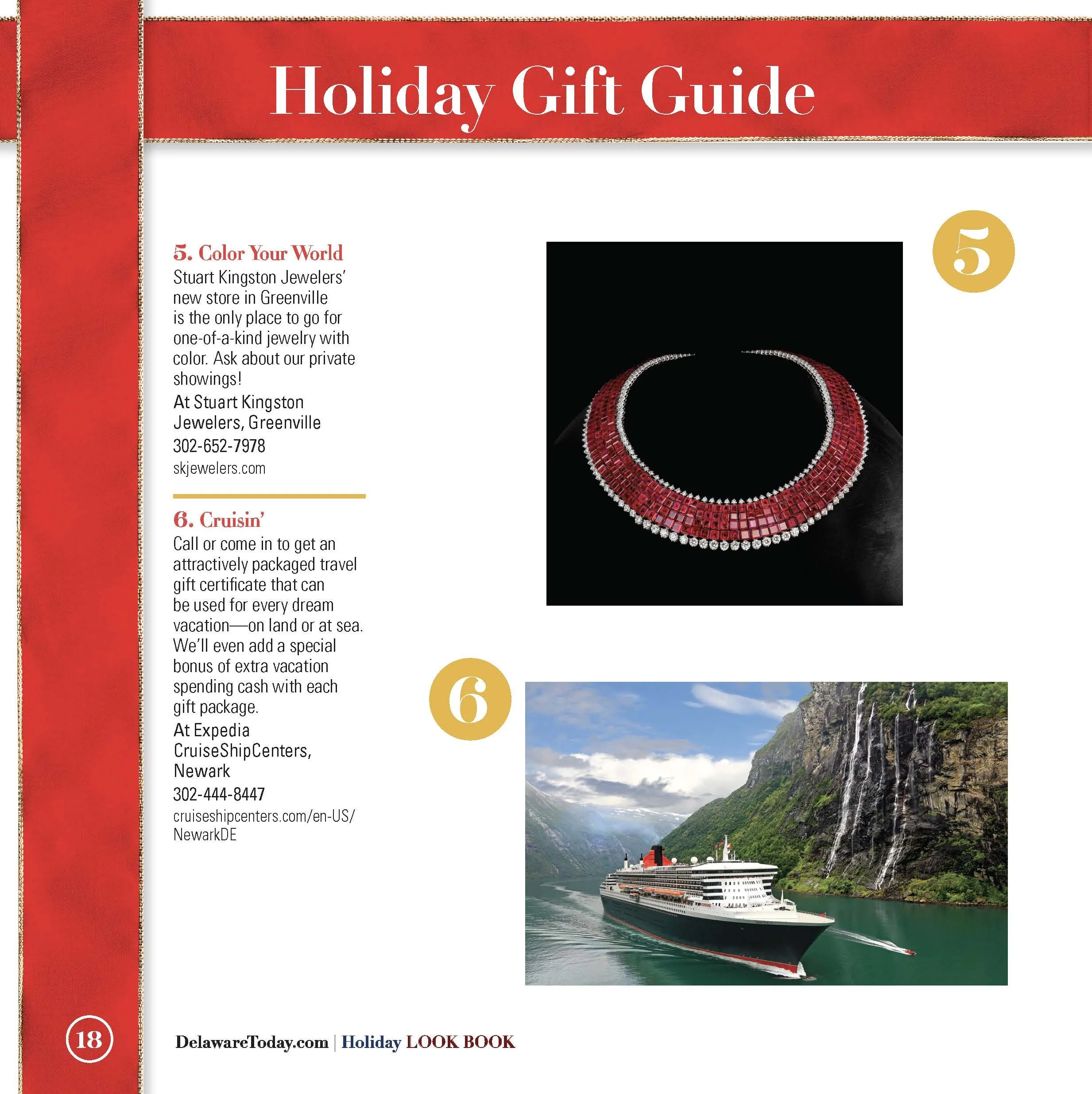
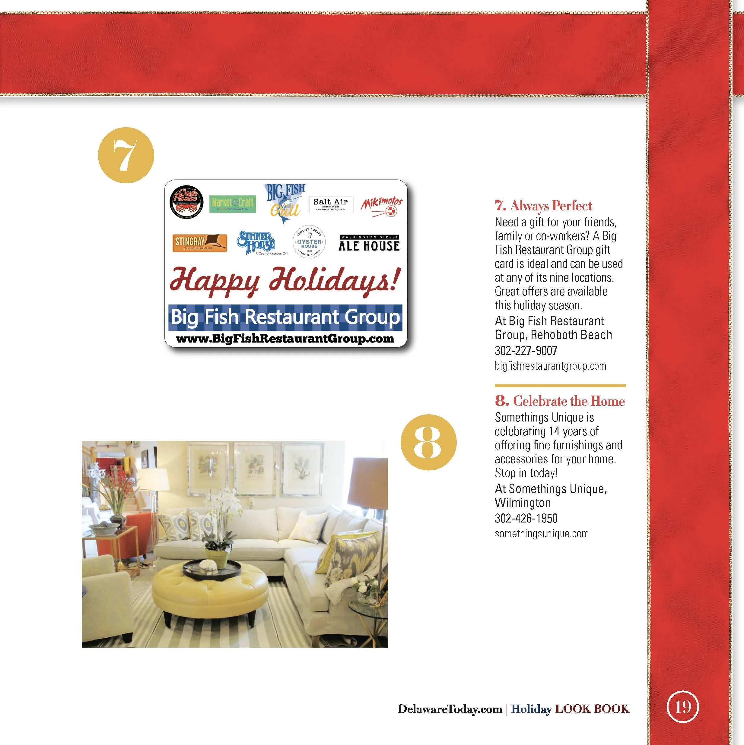
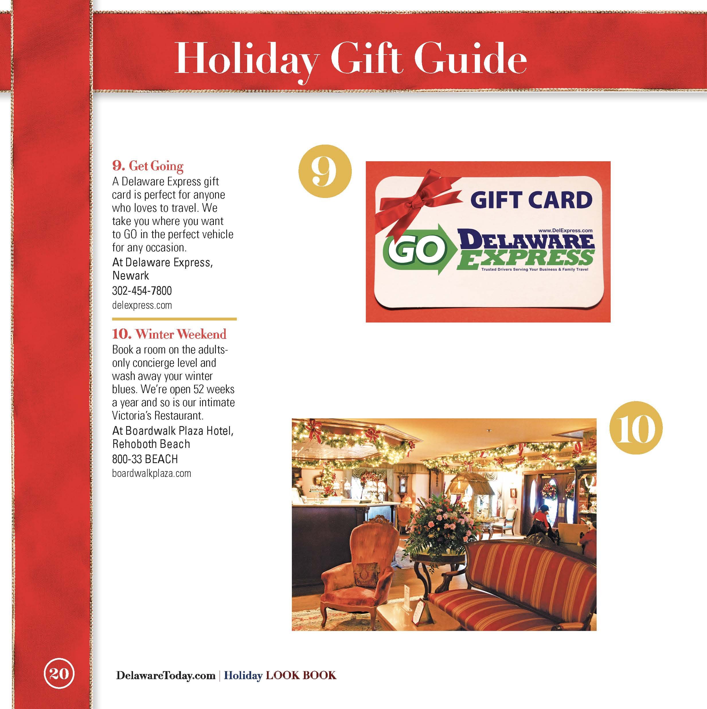
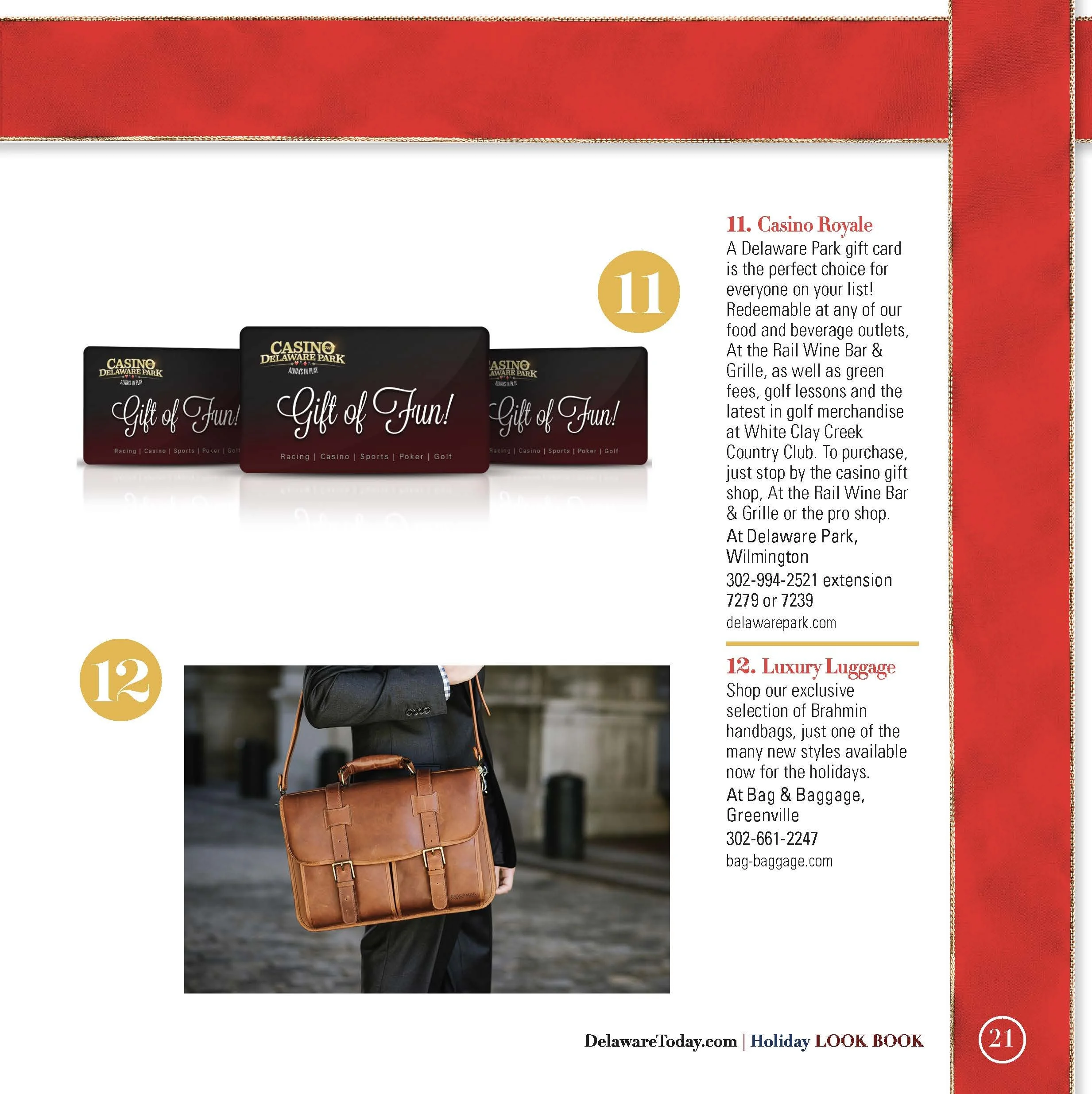
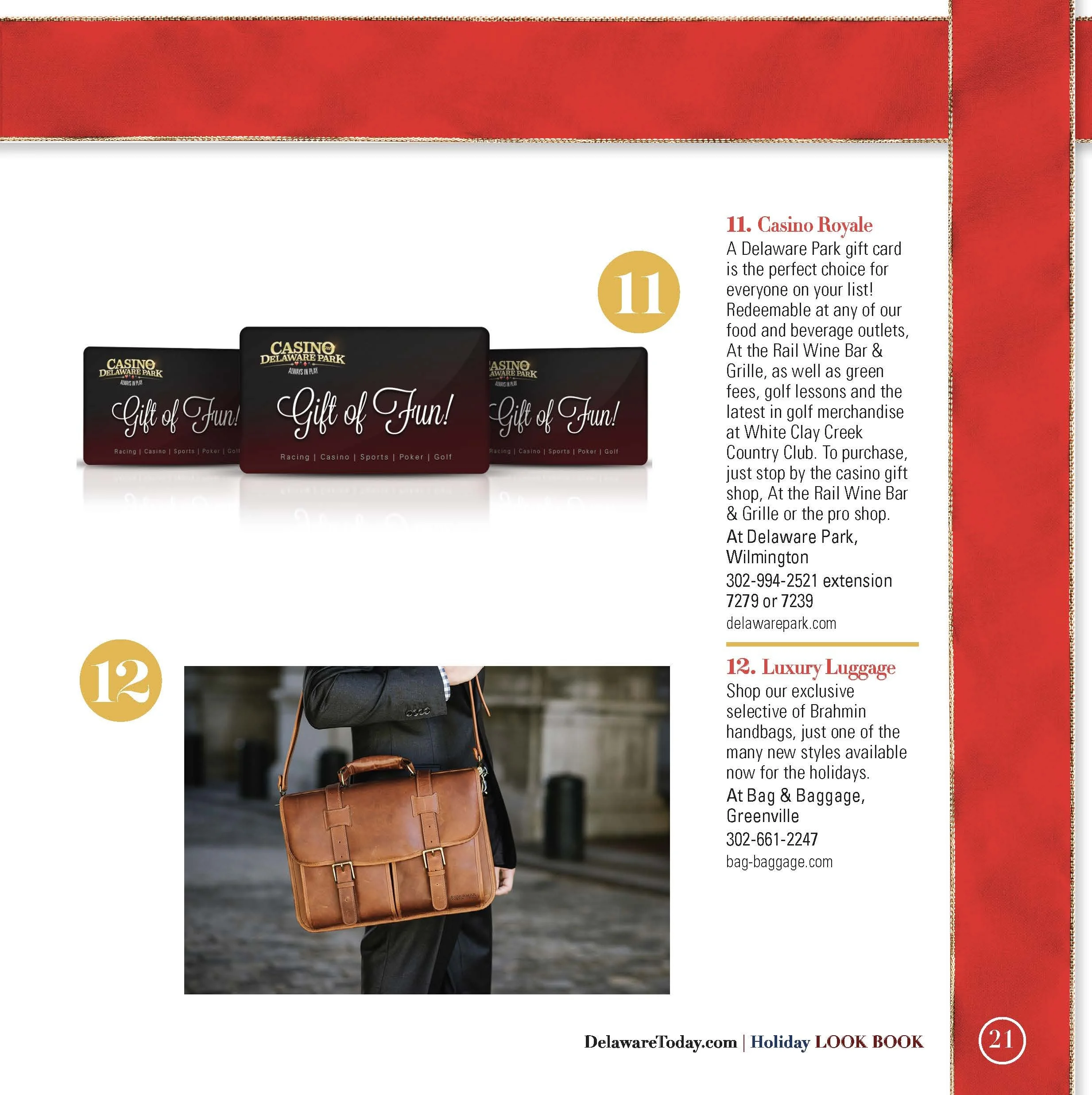
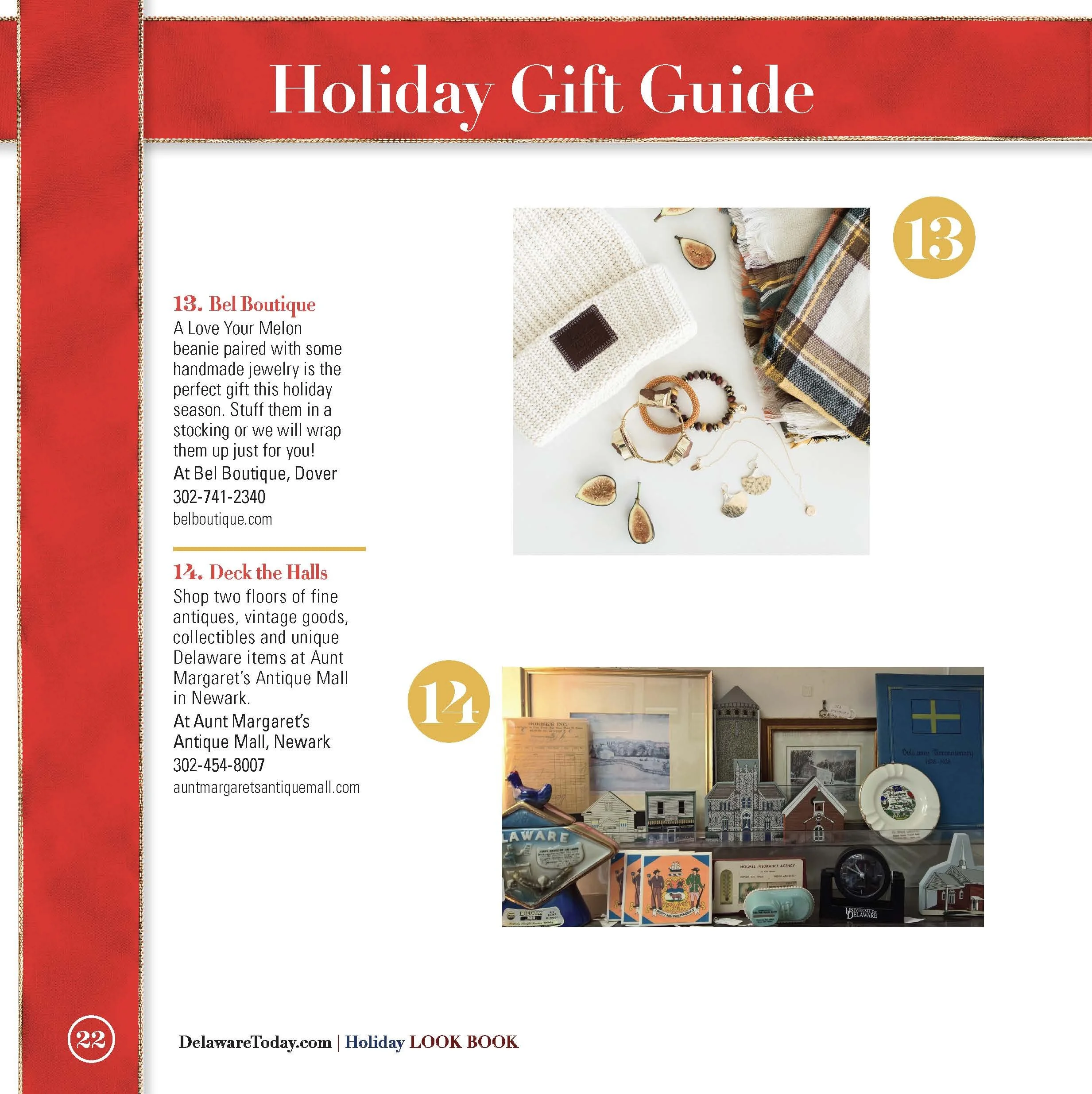
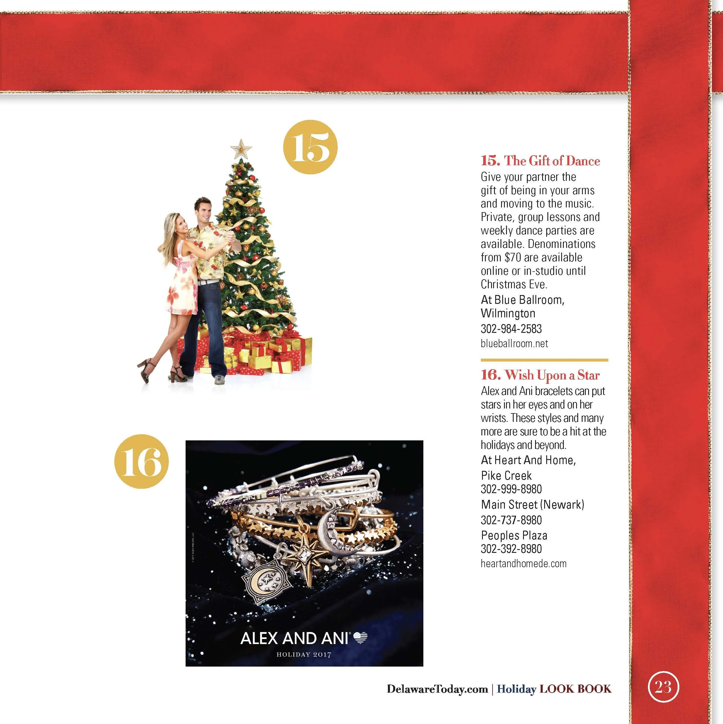
The center of the publication featured a multi-page Holiday Gift Guide showcasing products and experiences from participating businesses.
I created a numbered visual system that allowed readers to quickly browse each recommendation while still giving products enough space to feel aspirational.
The gift guide included jewelry, travel experiences, restaurant gift cards, fashion, home décor, beauty services and other local offerings.
The design balanced product photography with short editorial descriptions, creating a highly scannable section that functioned both as content and as a promotional platform for local businesses.
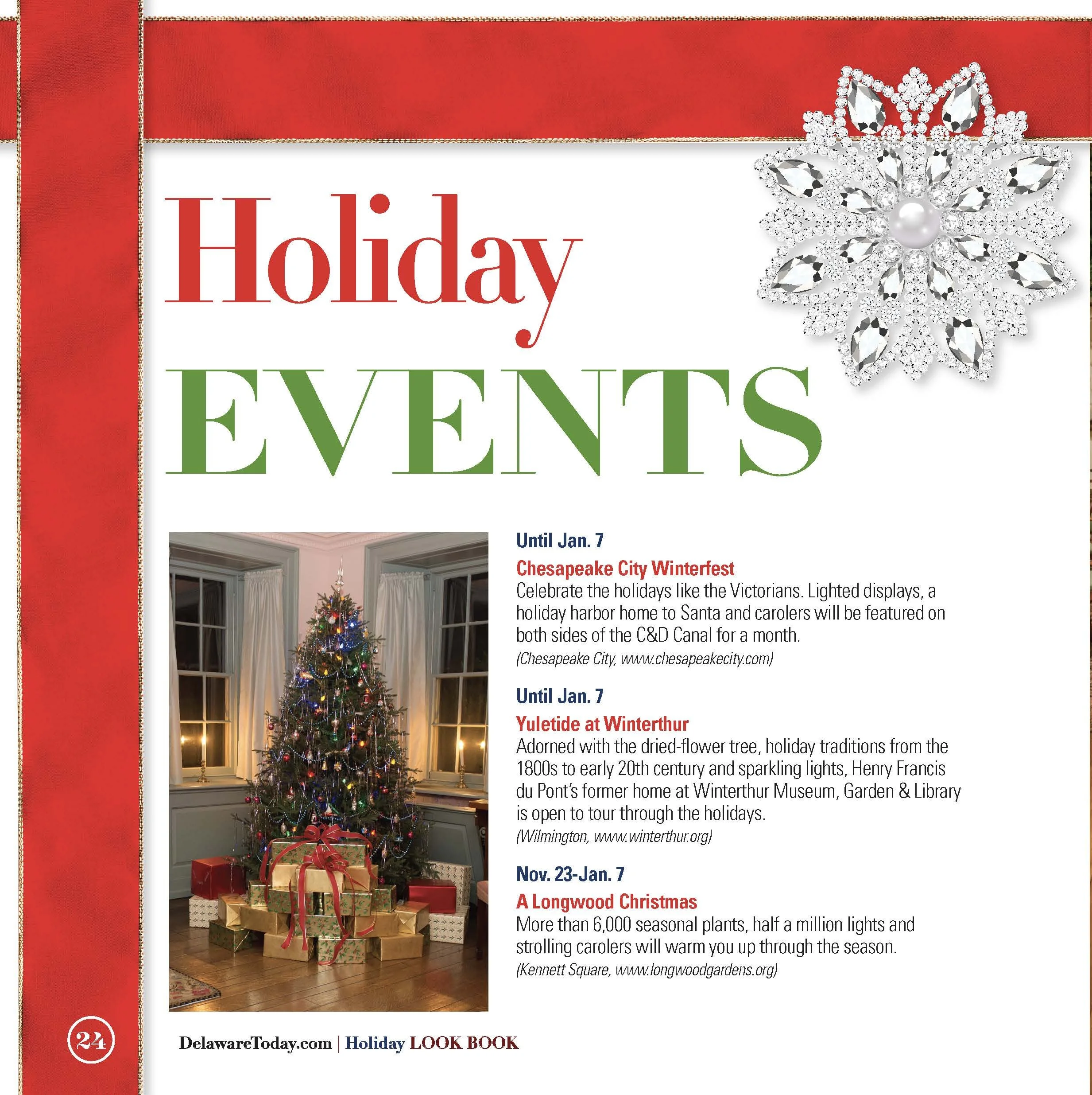
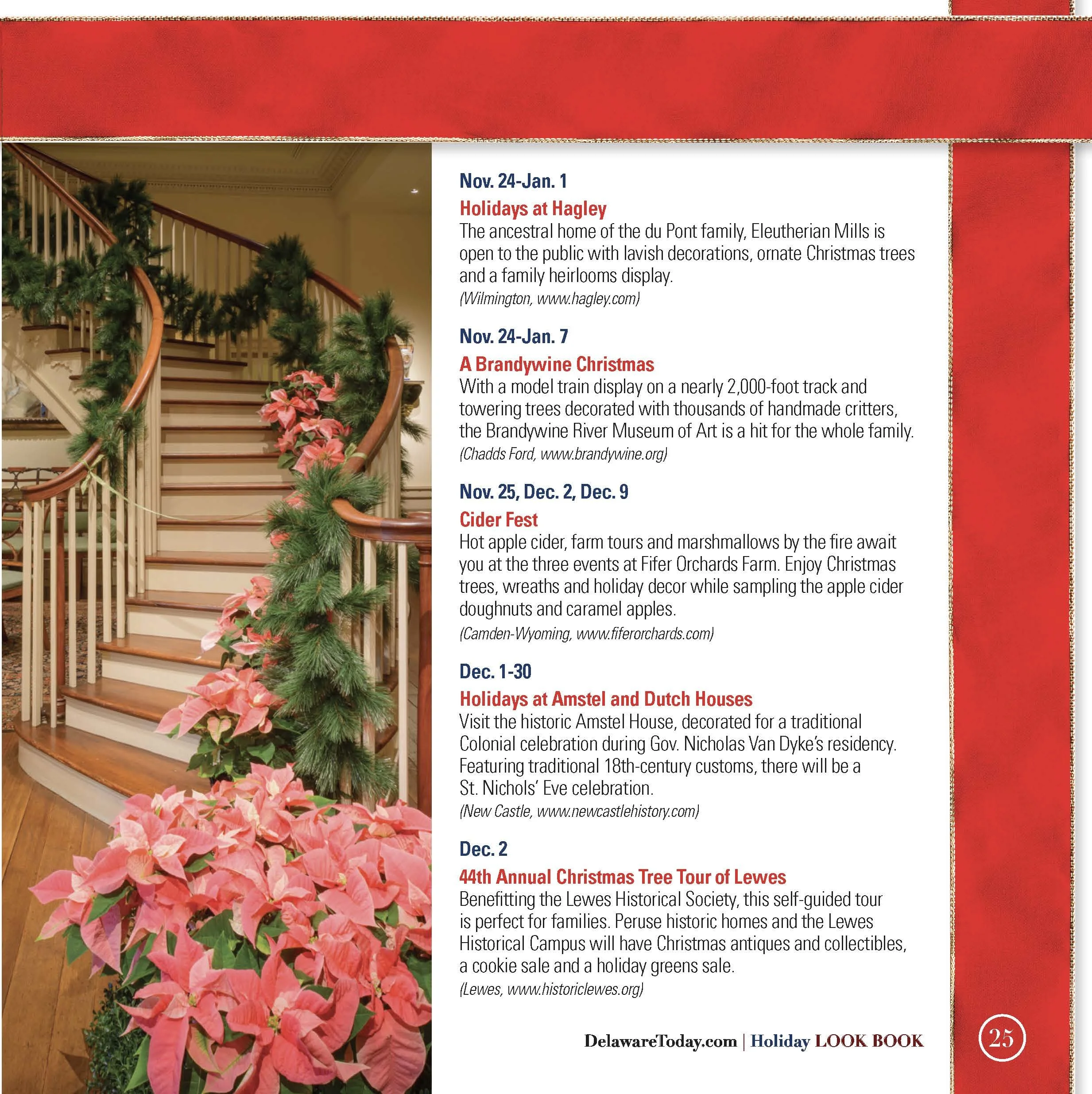
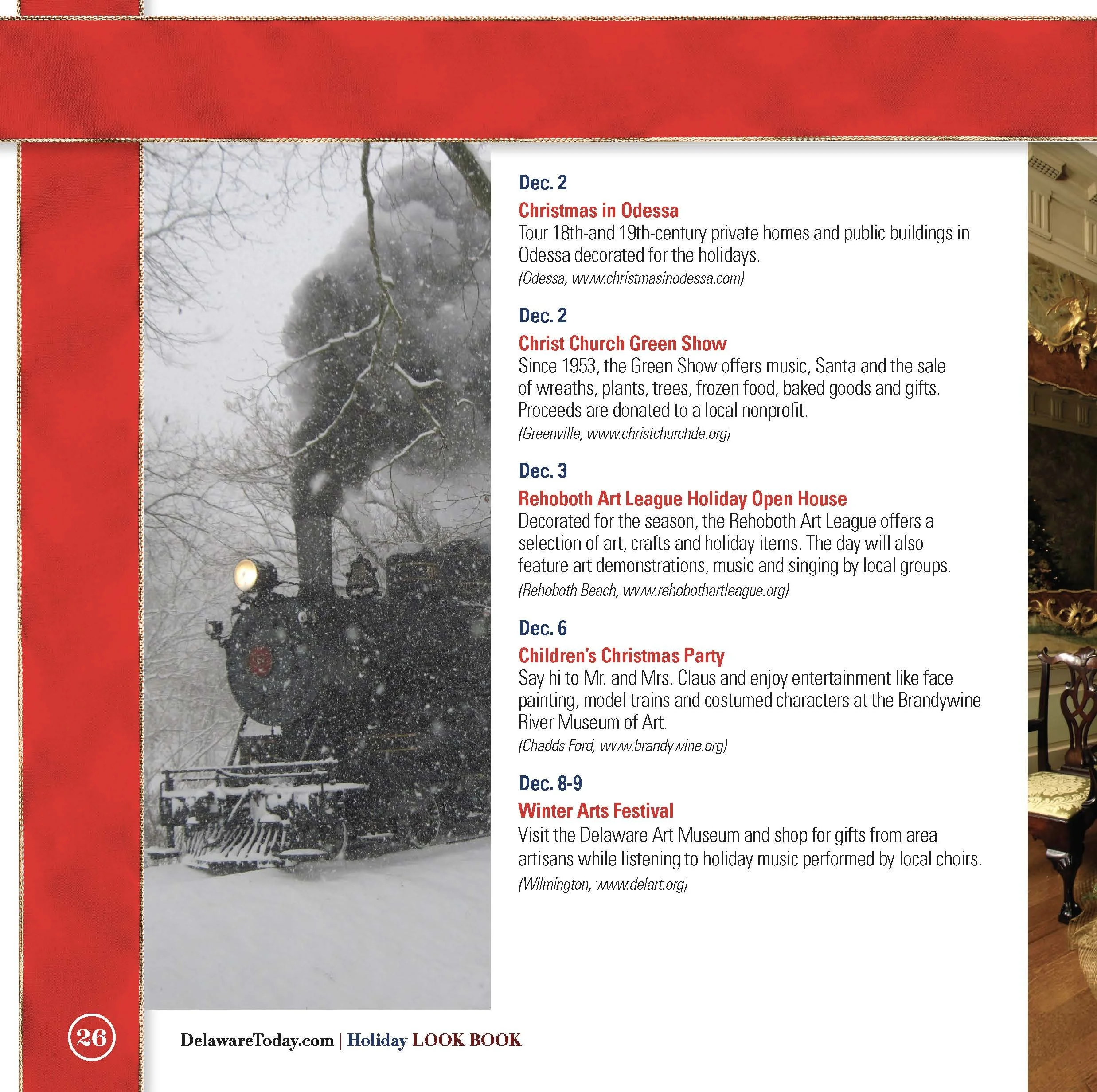
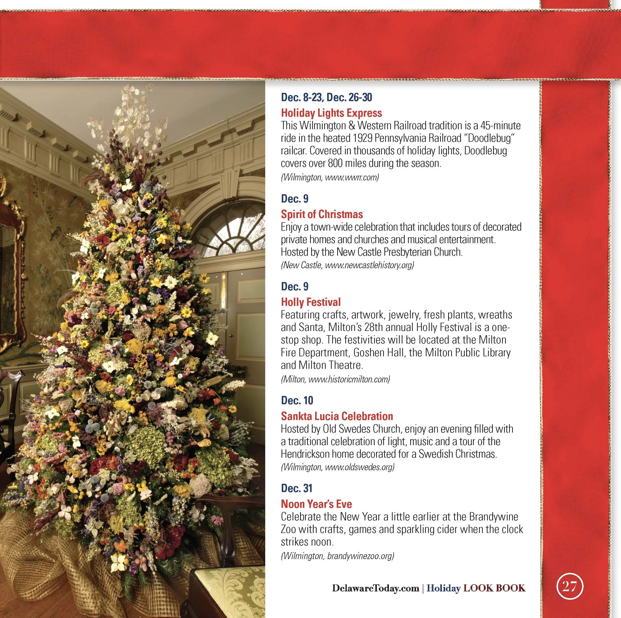
Holiday Events
The publication concluded with a dedicated Holiday Events section featuring seasonal experiences throughout Delaware and the surrounding region.
I shifted the layout slightly to accommodate longer lists of dates, event descriptions and locations while maintaining the same overarching visual identity.
The result was a useful editorial resource that extended the publication beyond shopping and positioned the Look Book as a broader seasonal guide.
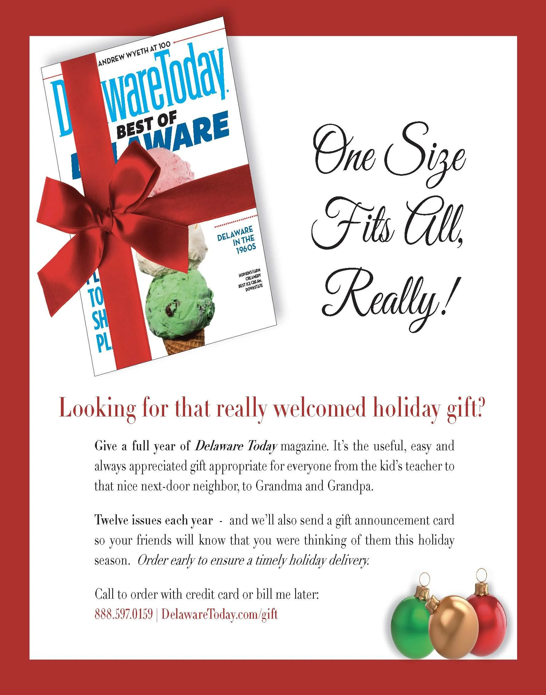
Balancing Editorial and Advertising
Because the publication served both readers and participating businesses, I needed to balance editorial storytelling with commercial content.
The issue incorporated standalone advertiser pages alongside custom-designed editorial features and promotional sections.
I maintained visual pacing throughout so that the reader could move naturally between business profiles, gift recommendations, event content and advertisements without the issue feeling fragmented.
The Result
The completed 32-page Holiday Look Book functioned as a seasonal editorial product, local shopping guide and advertiser showcase in one cohesive publication.
The project demonstrates my ability to lead a large-format special publication from concept to completion, including creative direction, editorial design, commercial integration, information hierarchy and final print production.
32-page custom seasonal publication
16+ featured local businesses and brands
Multi-page holiday gift guide
Regional holiday events section
Complete publication design from concept through final print