Visit Rehoboth
Designing the Delaware Beach Guide, Summer 2024 (award-winning) + Fall 2024
Visit Rehoboth Summer Issue


-
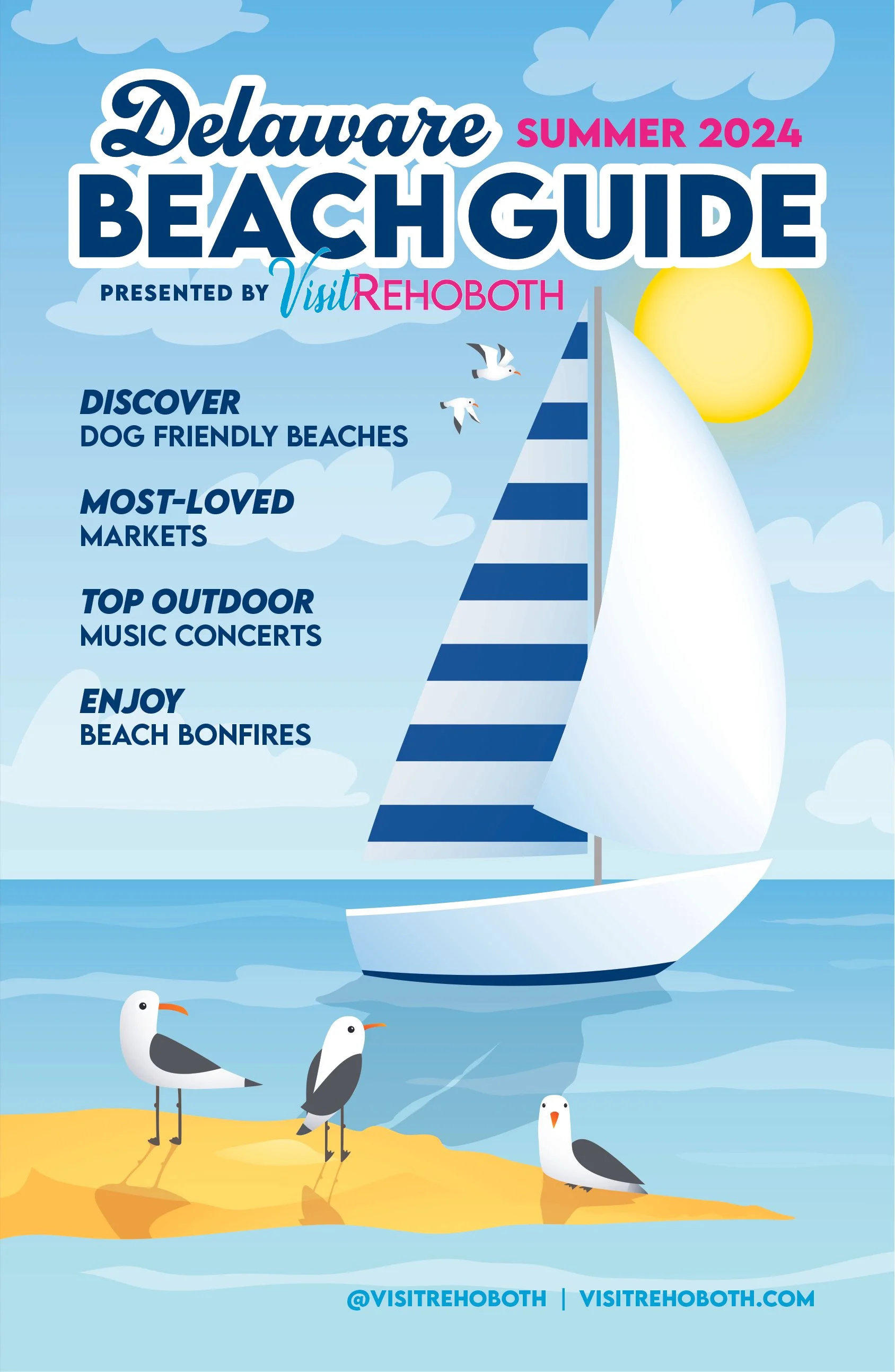
A 48-page seasonal visitor guide combining custom cover illustration, editorial storytelling, local resources and advertiser content in a cohesive, easy-to-navigate publication.
-
My Role
Lead Publication Designer & Art DirectorProject Scope
Creative Direction · Cover Design & Illustration · Publication Design · Editorial Layout · Visual Systems · Typography · Image Art Direction · Advertiser Integration · Digital ProductionProject Overview
Visit Rehoboth’s Summer Guide is a 48-page seasonal publication designed to help visitors discover the restaurants, accommodations, attractions, shopping and experiences that define Delaware’s coastal communities.
For the Summer 2024 edition, I led the complete visual development of the publication, from the original illustrated cover through the design and production of the interior pages. The goal was to create a guide that felt energetic and distinctly coastal while functioning as both an editorial resource for visitors and a valuable promotional platform for local businesses.
The Challenge
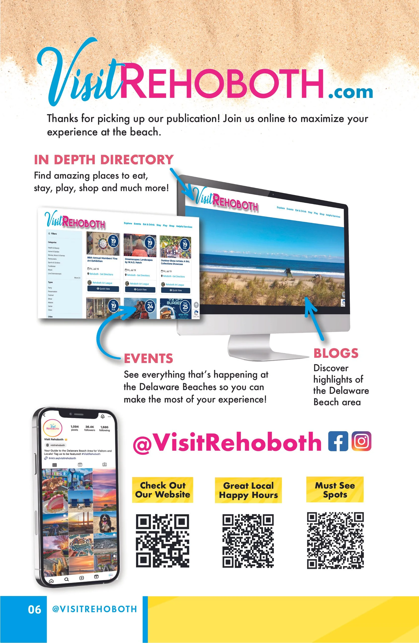
The publication needed to organize a significant amount of information within one cohesive experience. Feature stories, visitor resources, photography, business listings and advertiser content all competed for attention, while readers needed to be able to quickly navigate the guide and find relevant information.
The design also needed enough flexibility to accommodate dramatically different types and quantities of content without making the publication feel repetitive or disconnected.
The Approach
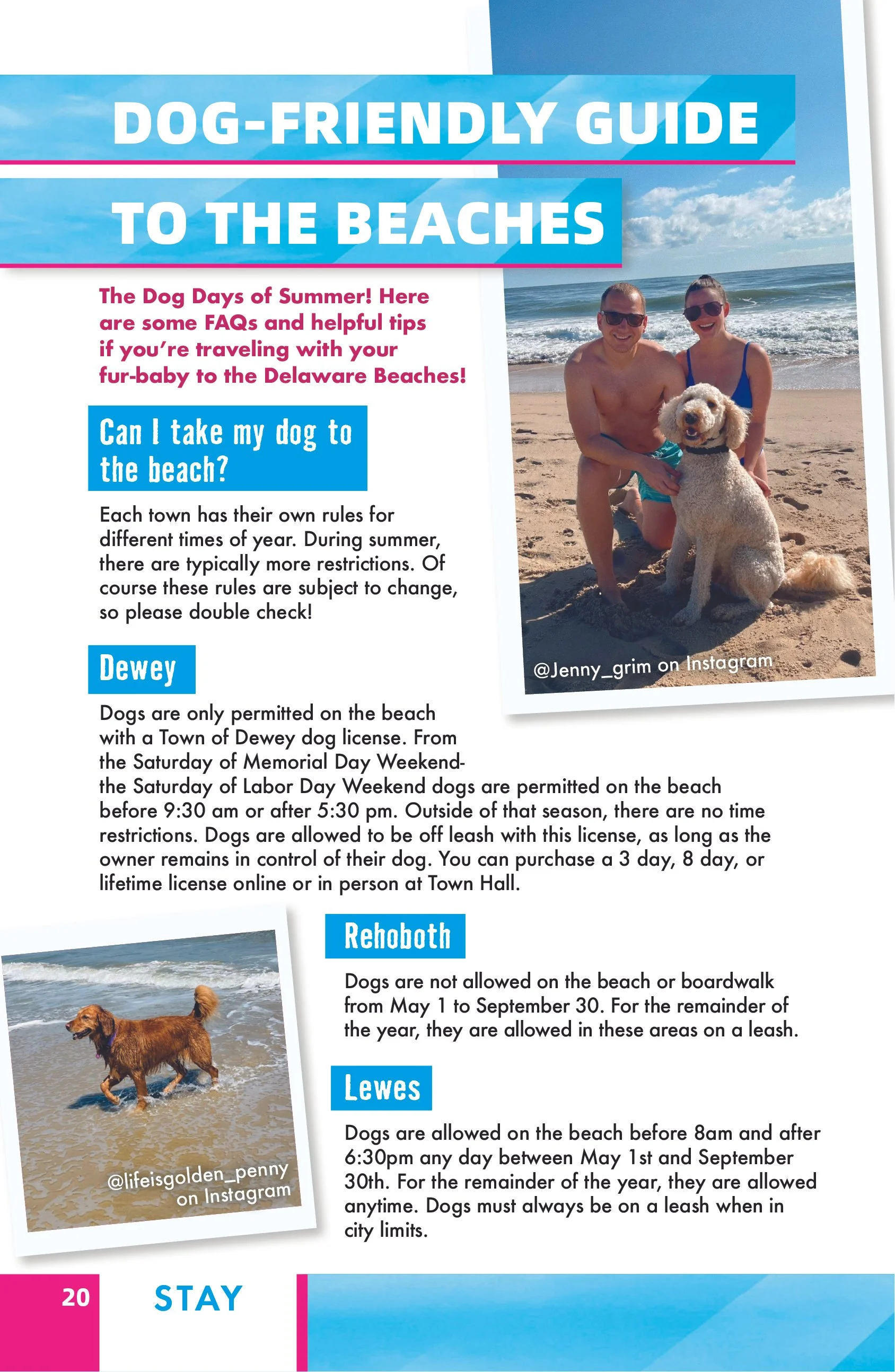
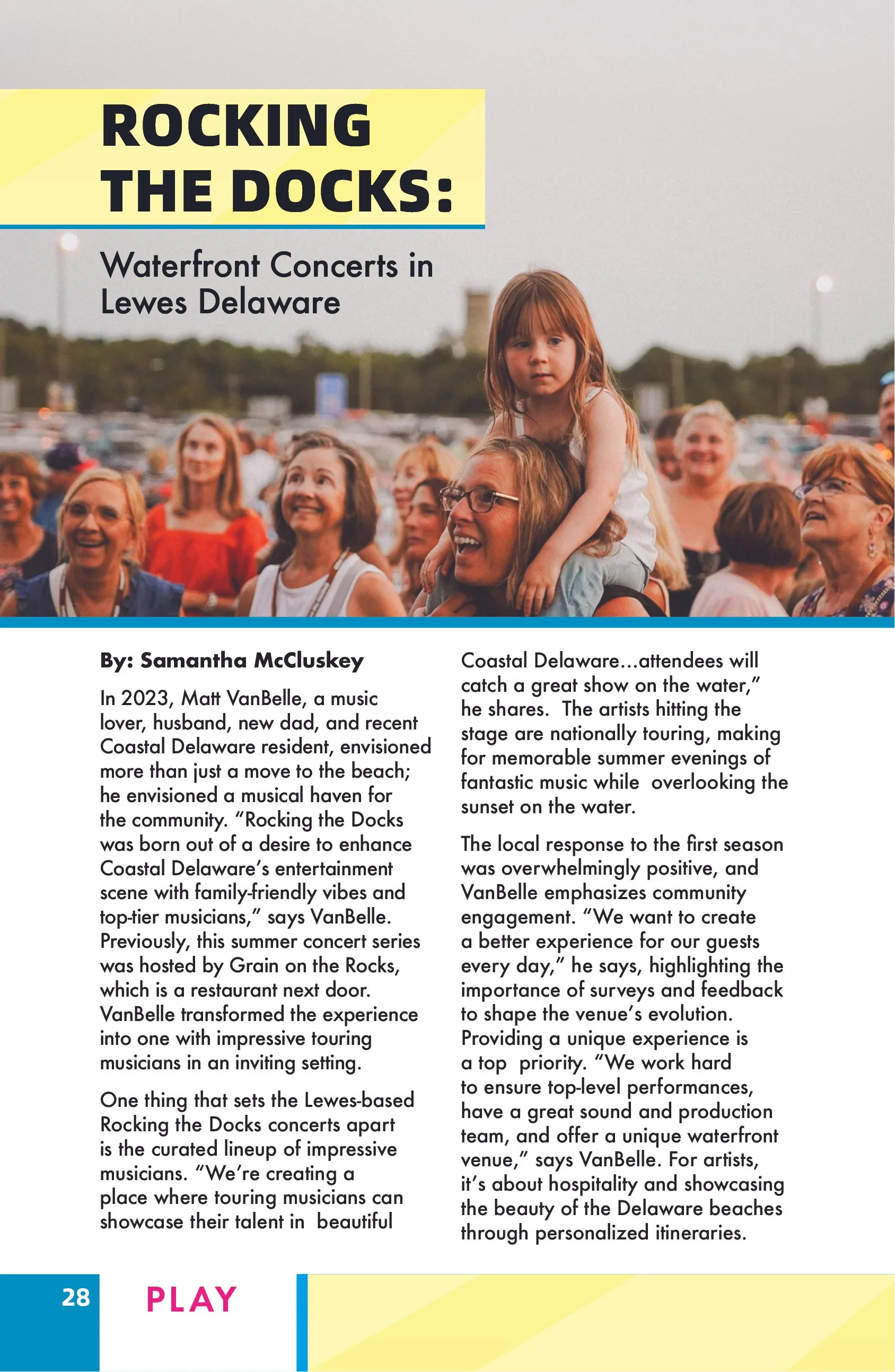
I developed a visual system built around bold typography, vibrant color and flexible editorial layouts that reflected the energy of summer at the Delaware beaches.
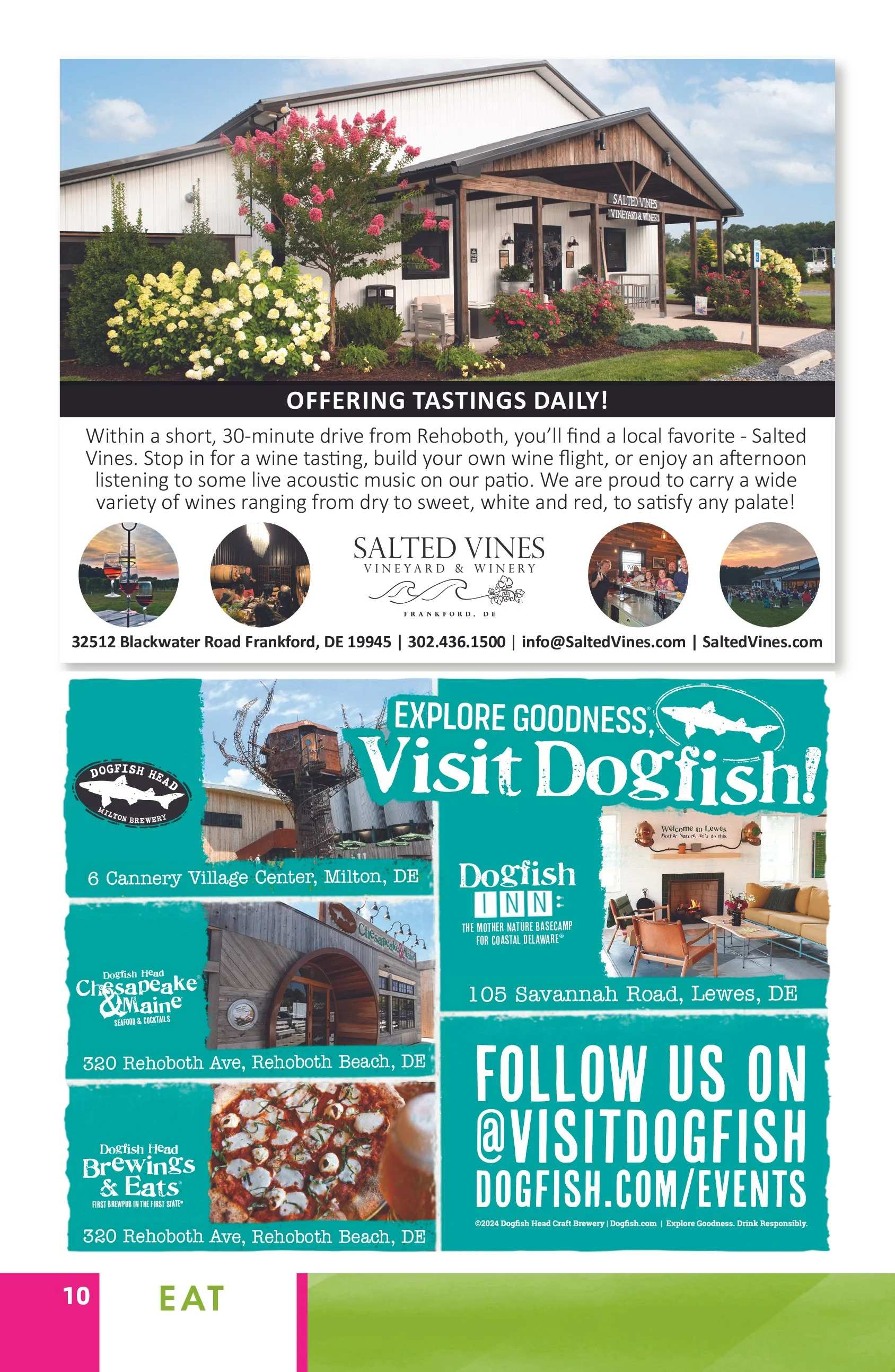
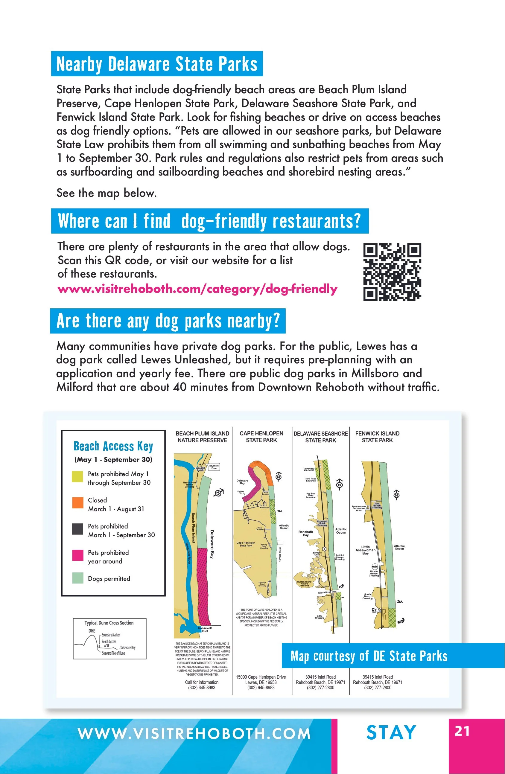
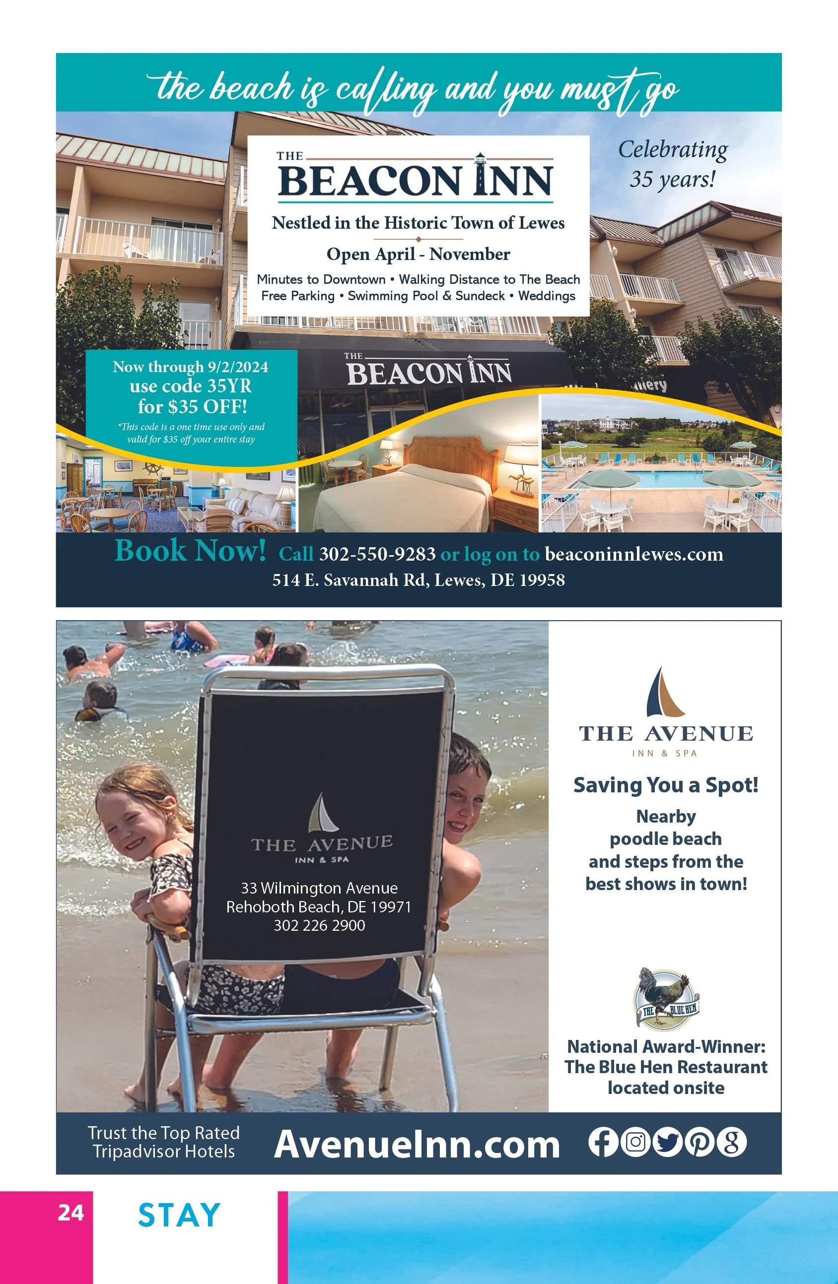
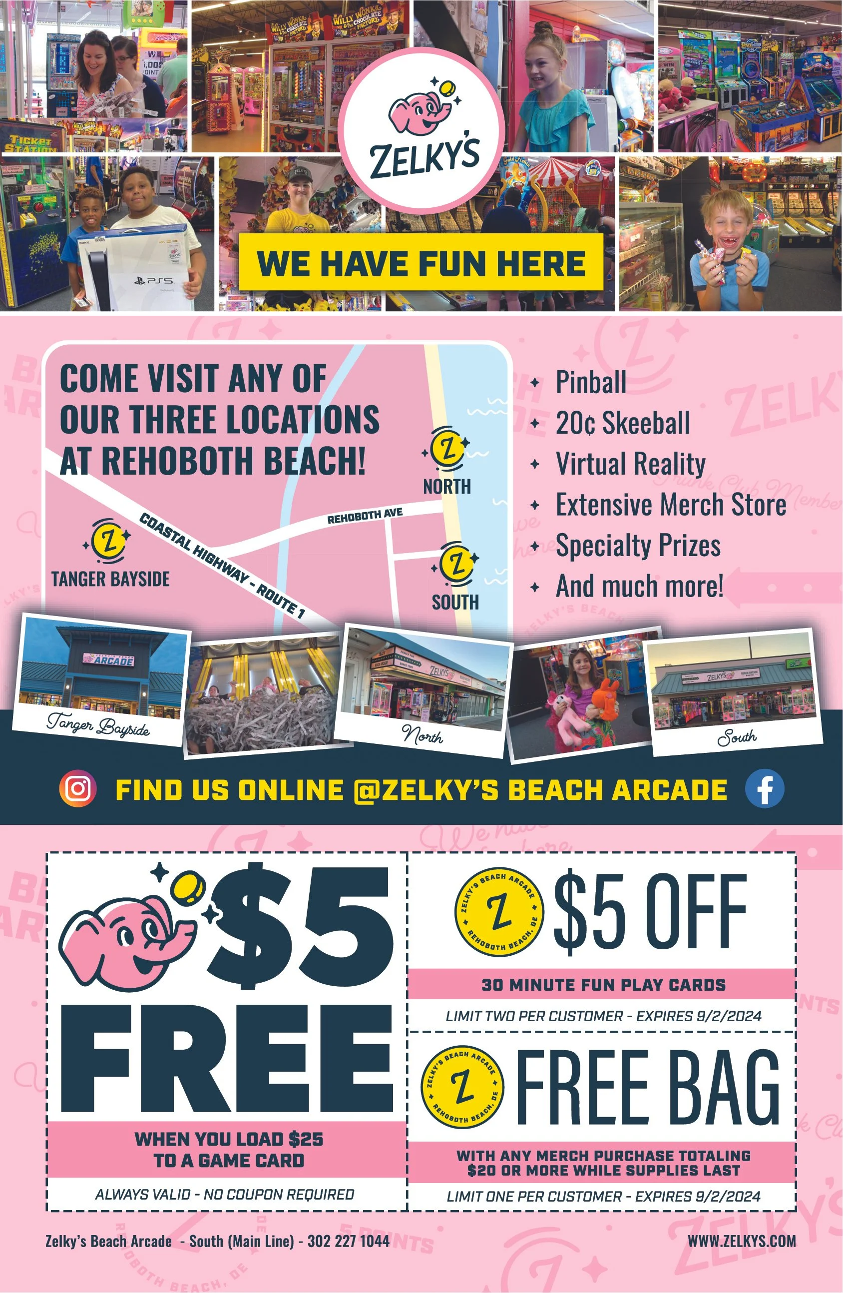
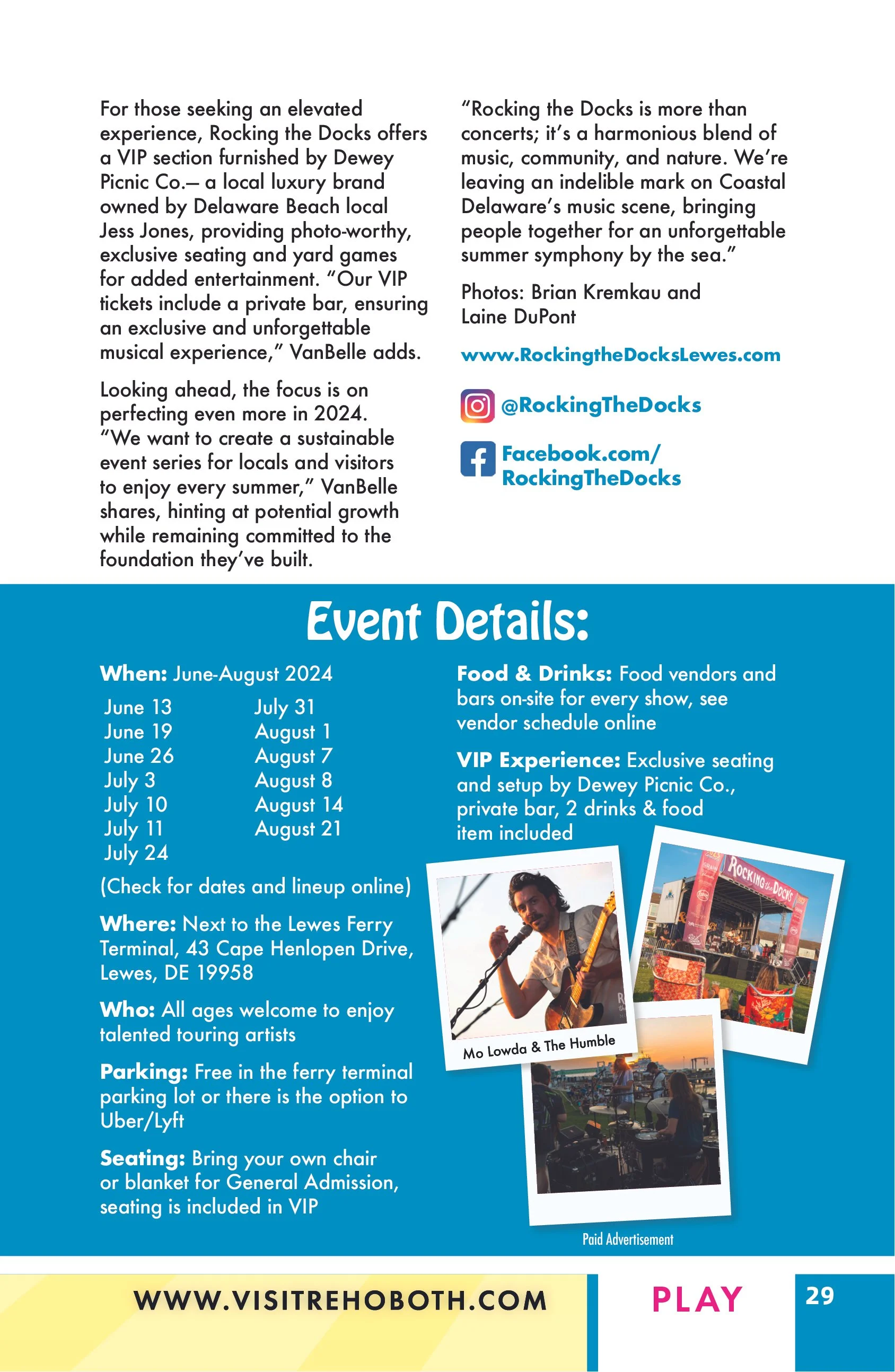
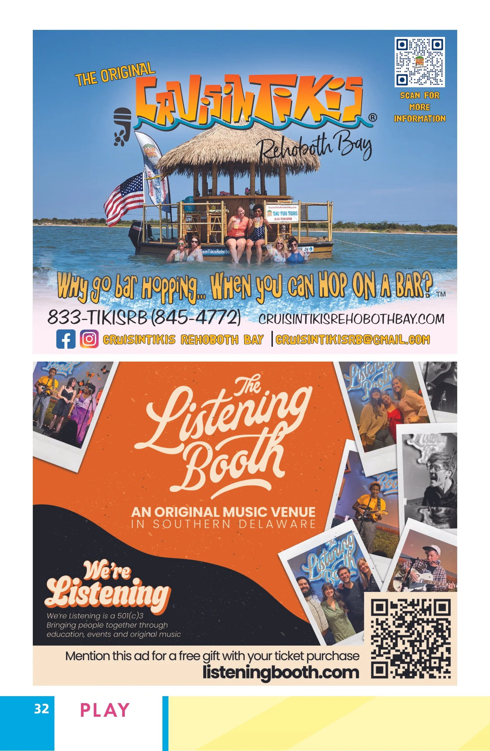
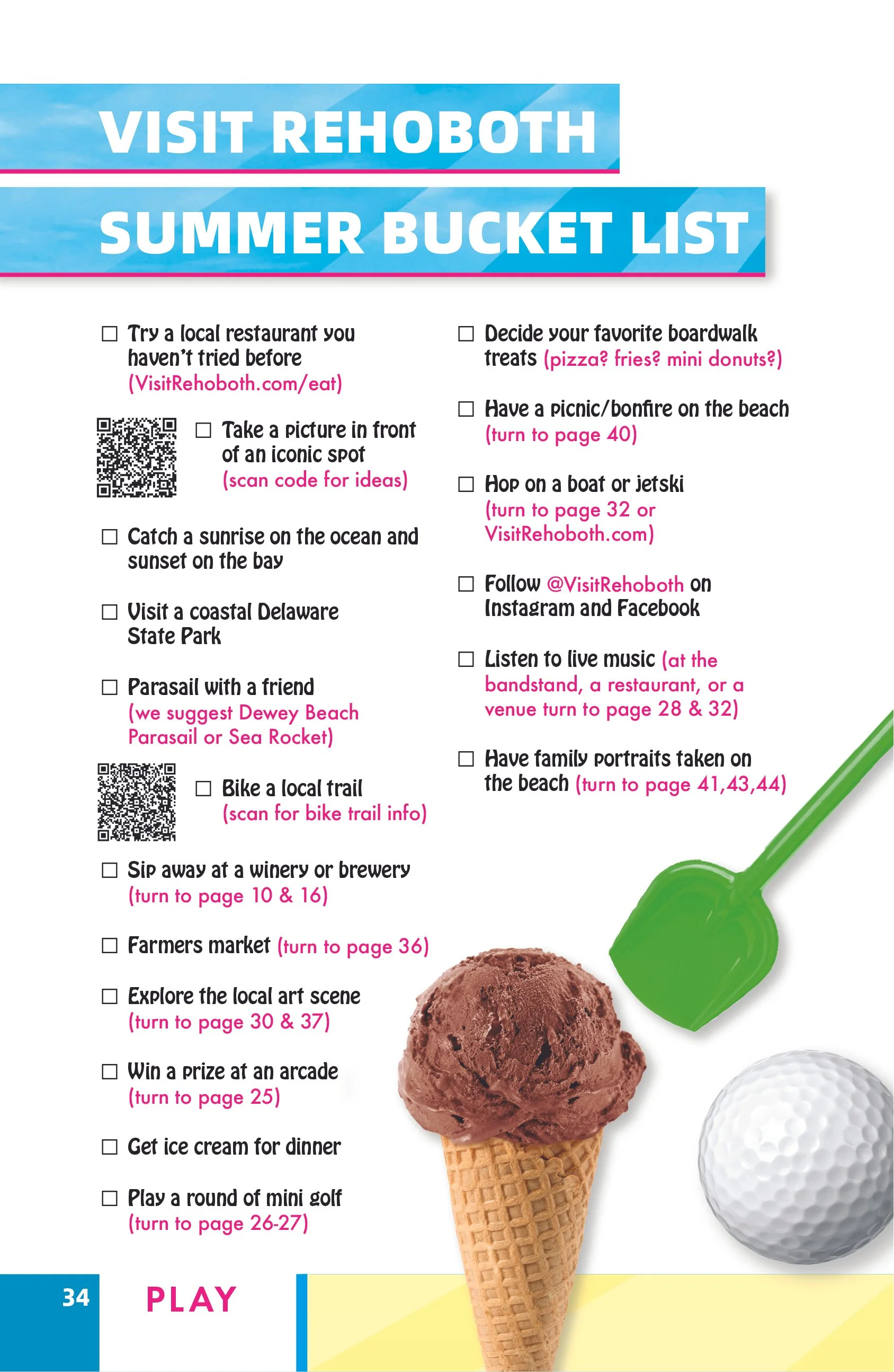
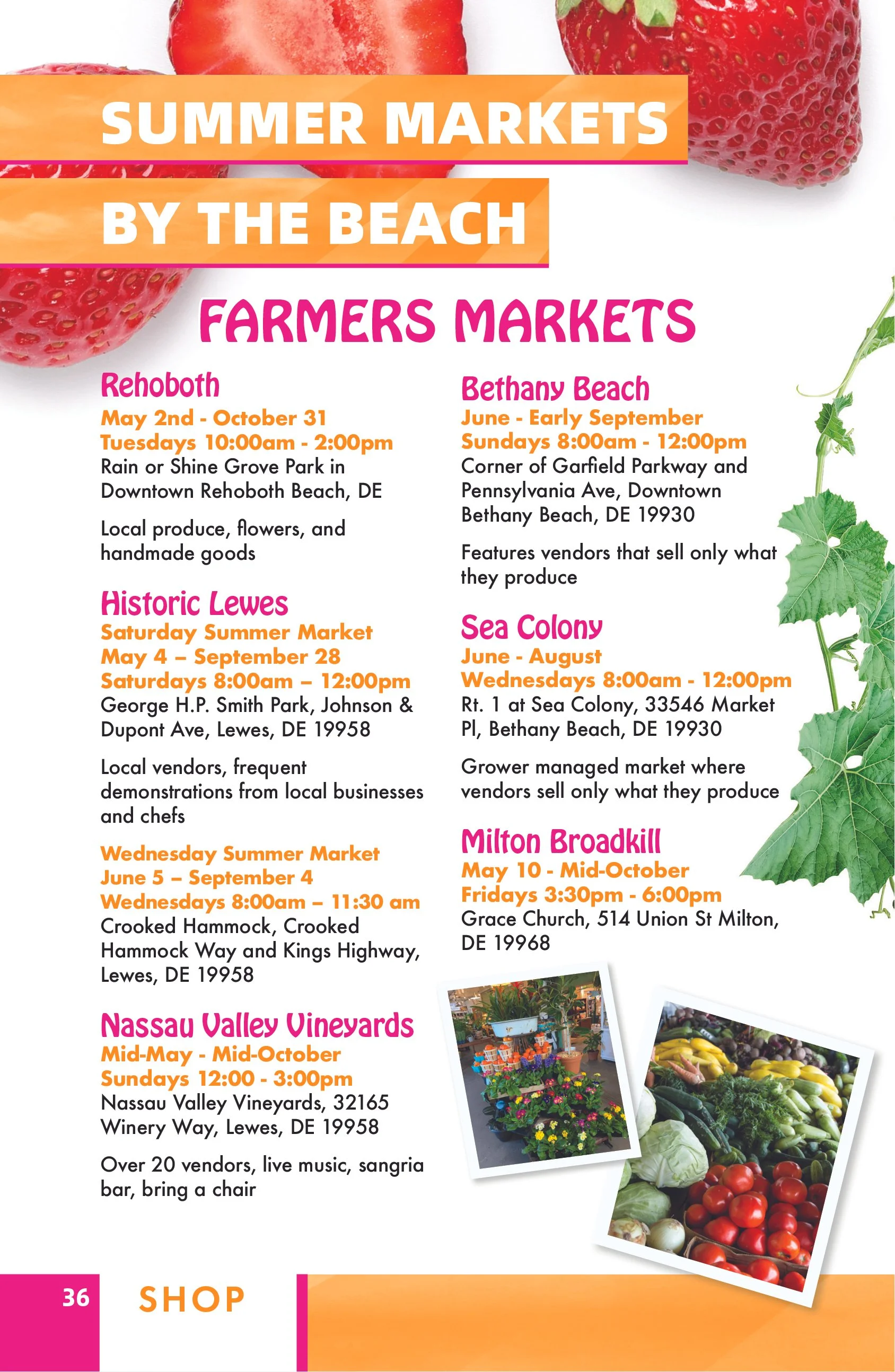
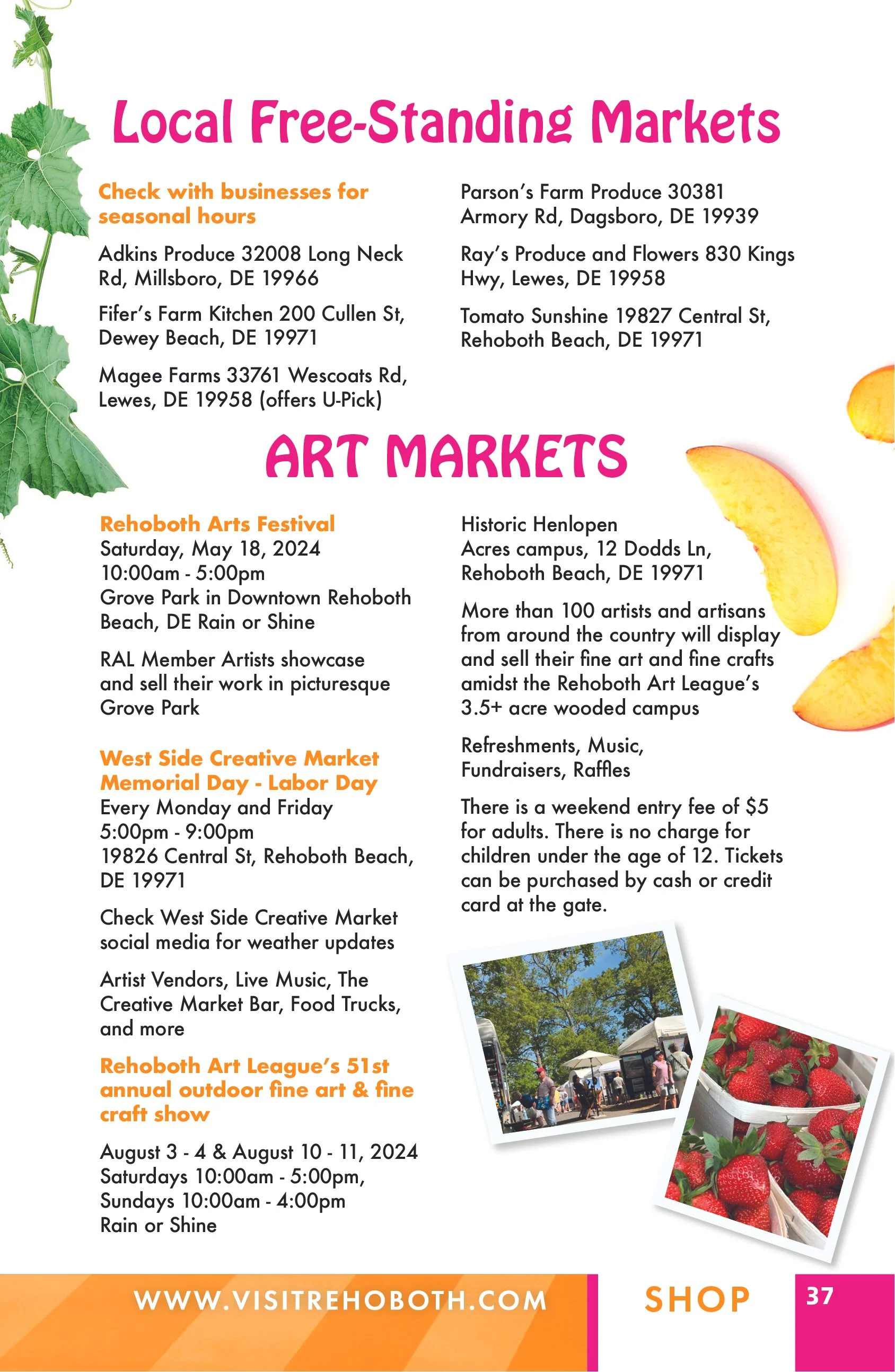
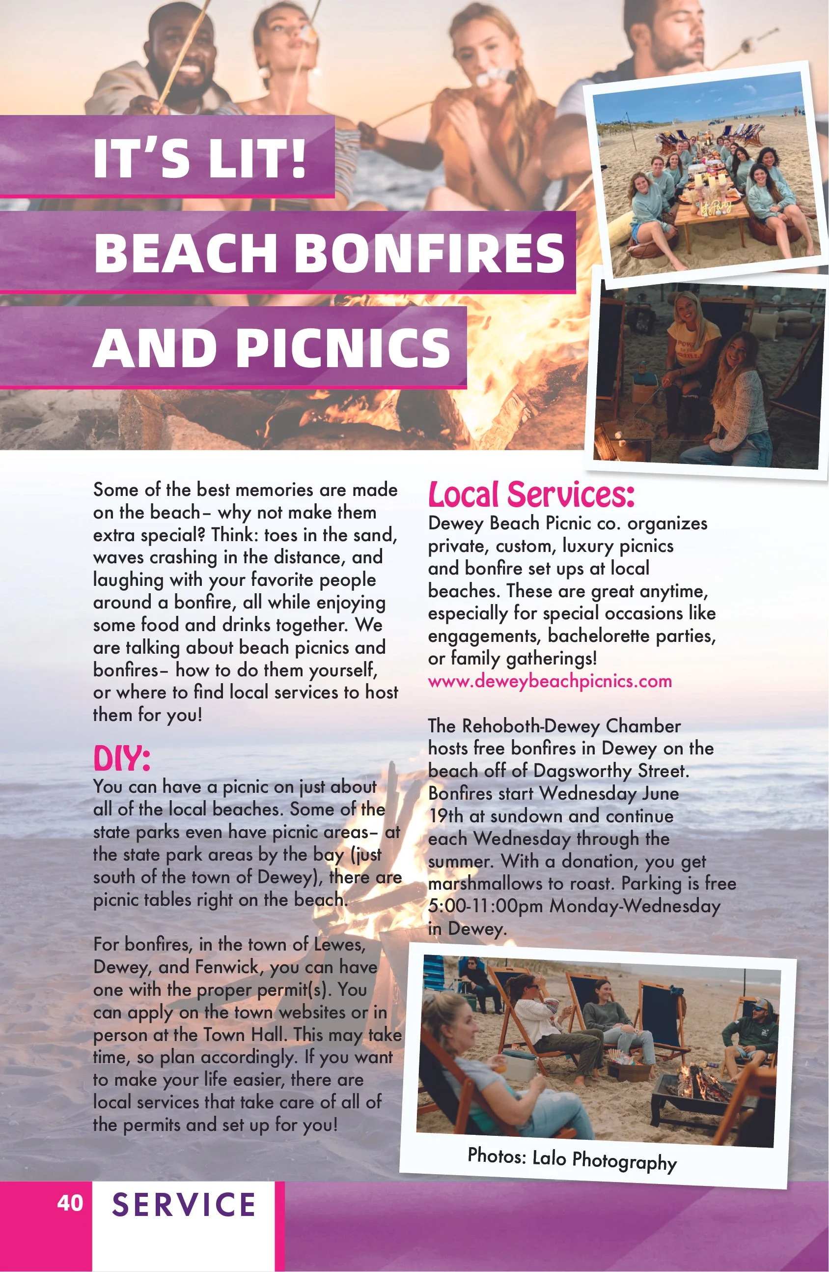
Color-coded sections created clear navigation across categories including dining, accommodations, entertainment, shopping and local services. Rather than relying on a single rigid page template, I created an adaptable layout system that allowed individual stories and features to develop their own visual personality while remaining connected to the larger publication.
This balance between consistency and variation helped maintain visual interest throughout all 48 pages while making a content-heavy guide easier to explore.
Cover Design & Illustration
The cover provided an opportunity to establish a distinctive identity for the issue before readers even opened the publication.
I created the cover artwork from scratch, developing an original illustration that captured the personality and atmosphere of a Delaware beach summer. The illustration, typography and overall composition were designed together as a unified visual concept rather than treating the cover as a separate decorative element.
That visual language then helped inform the color, energy, and design decisions carried throughout the interior.
Editorial Design
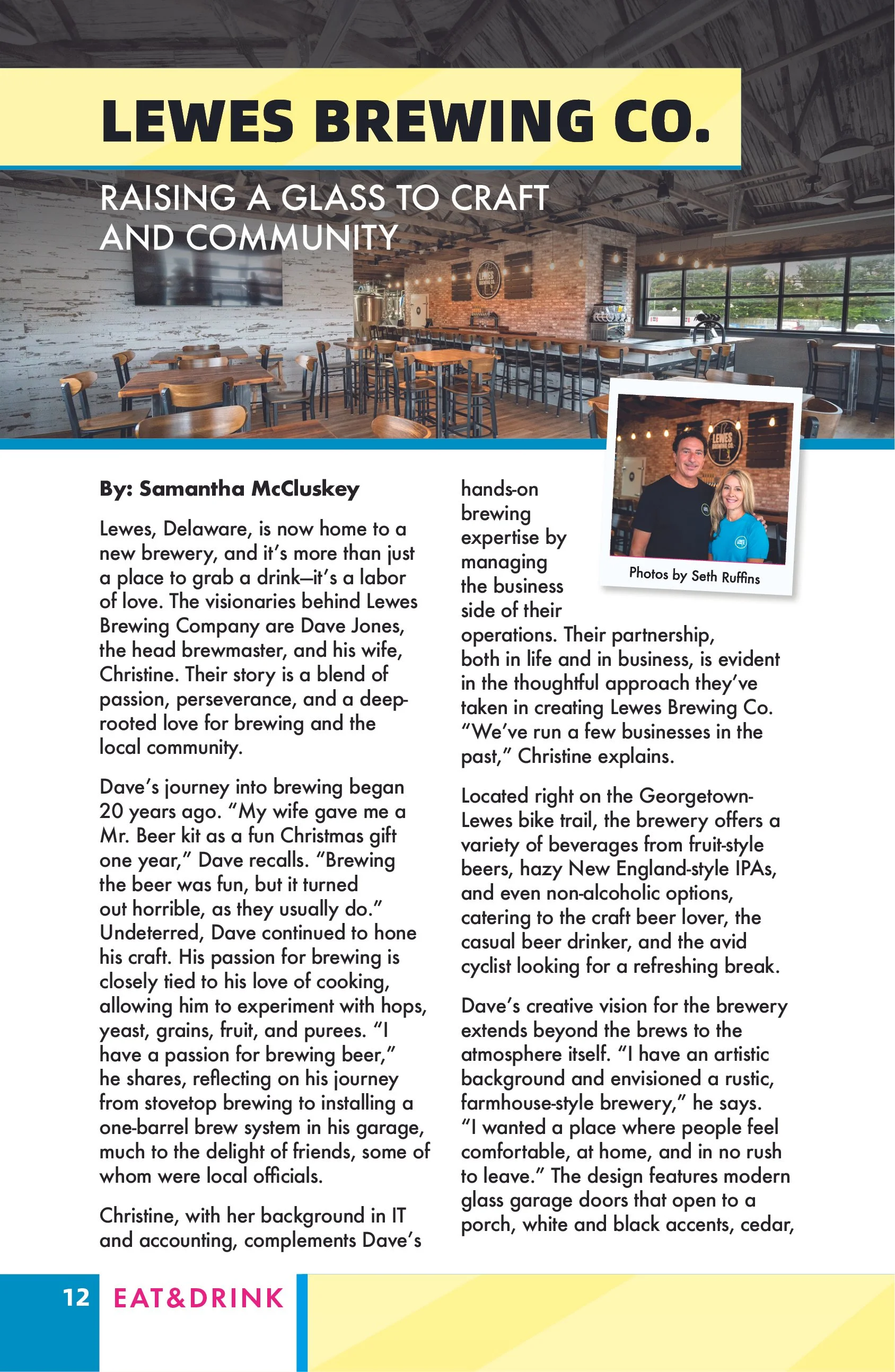
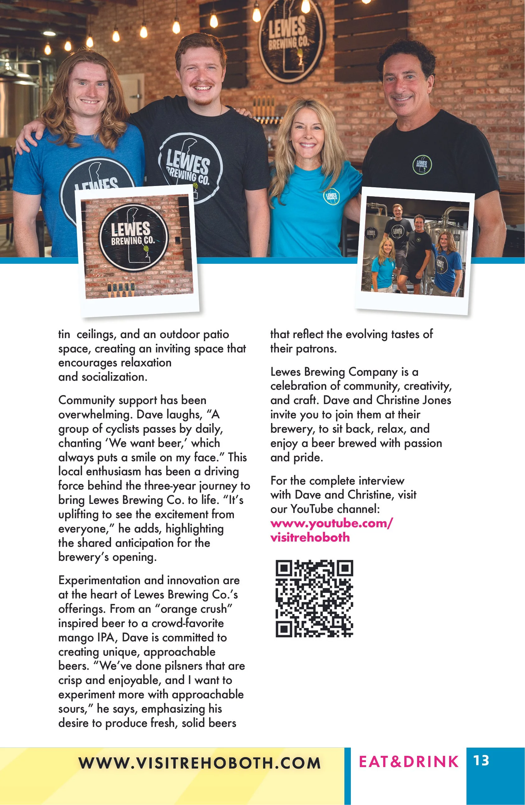
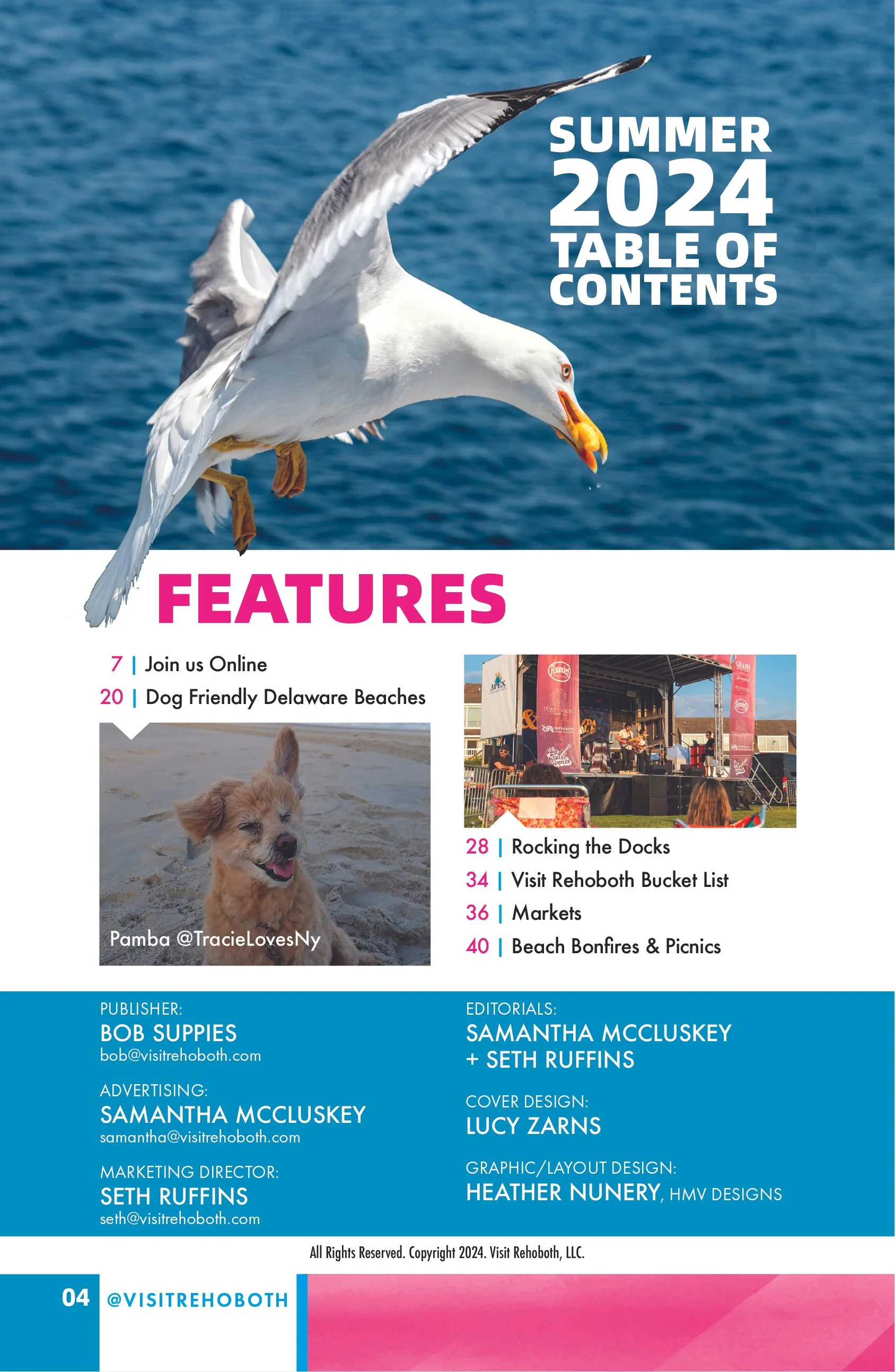
Inside the publication, I art directed and designed layouts around the needs of each story while maintaining consistent typography, spacing, hierarchy and visual cues.
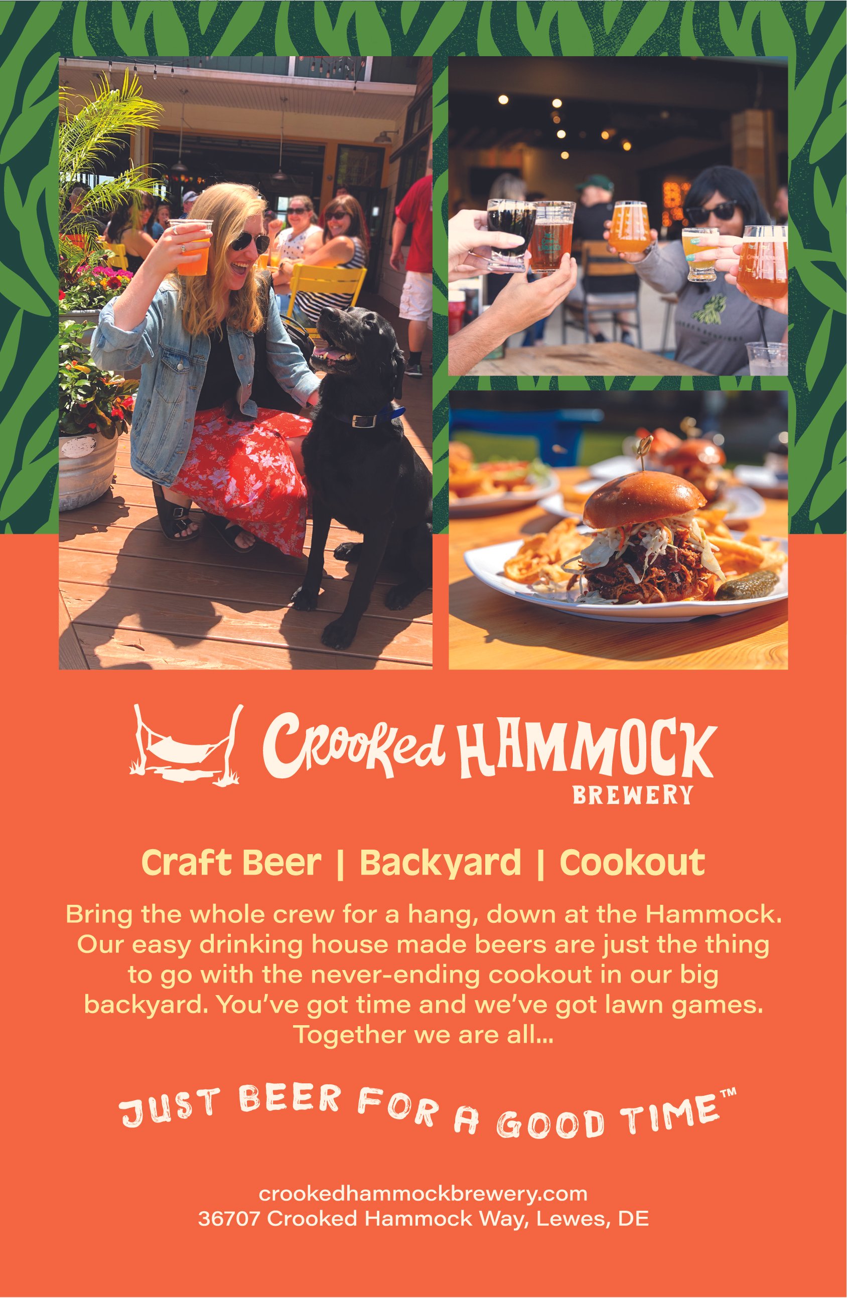
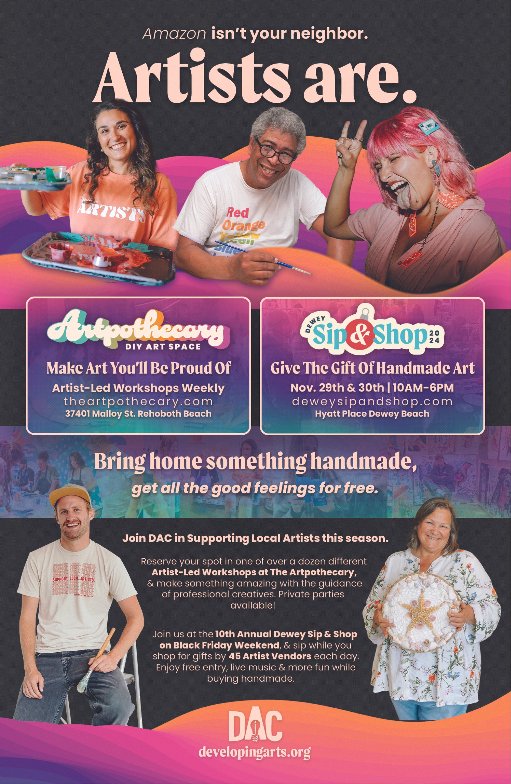
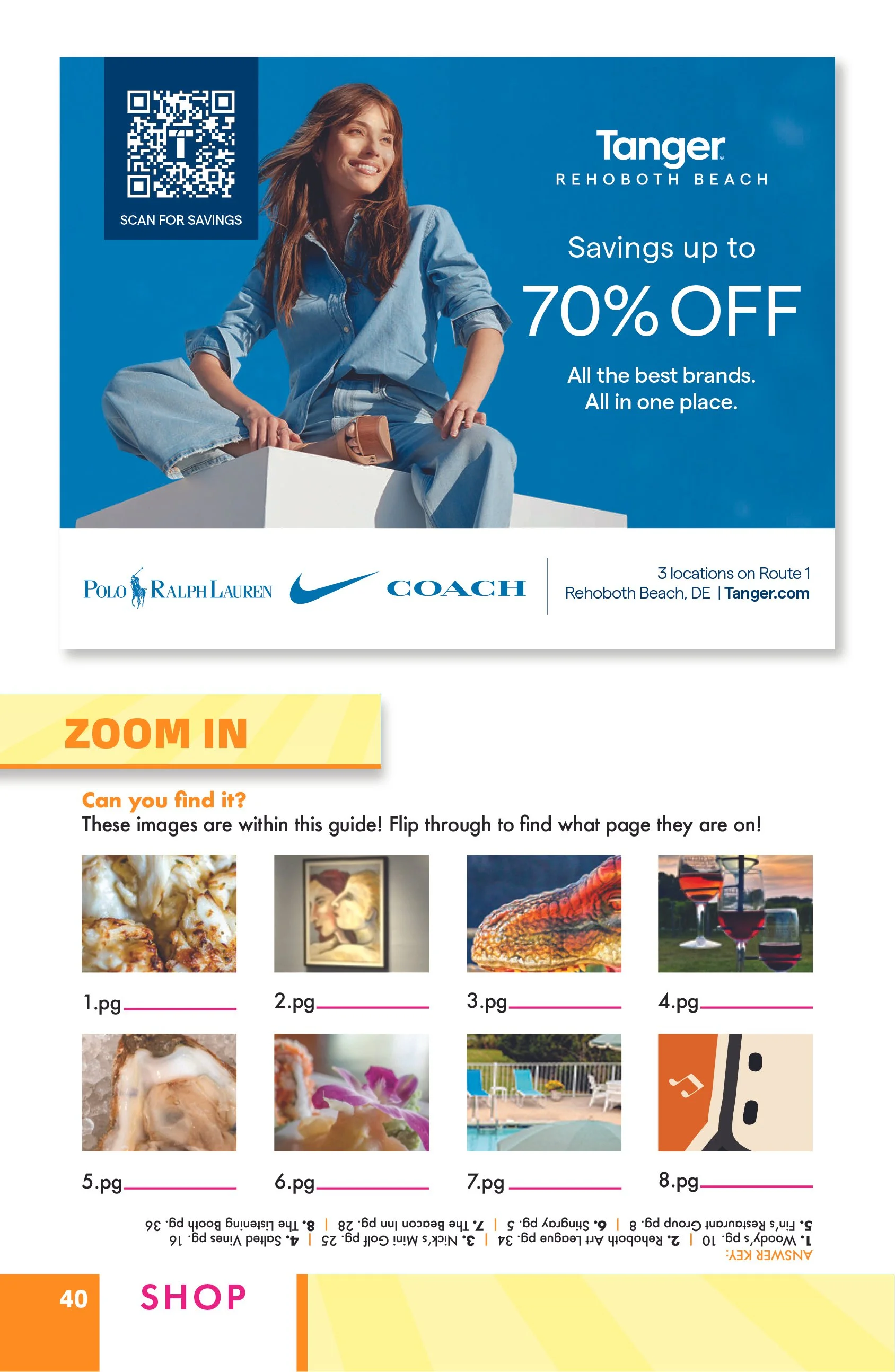
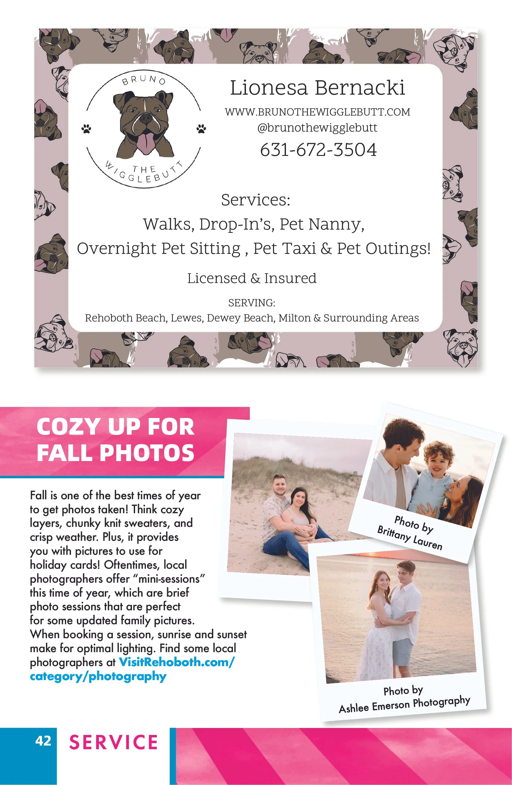
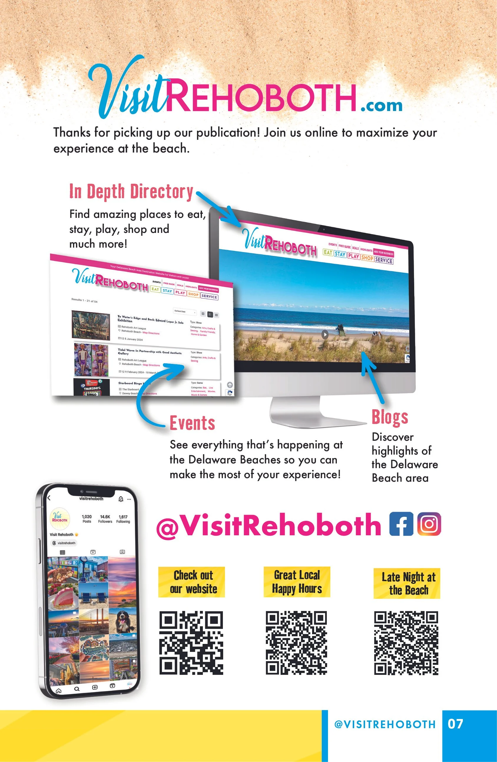
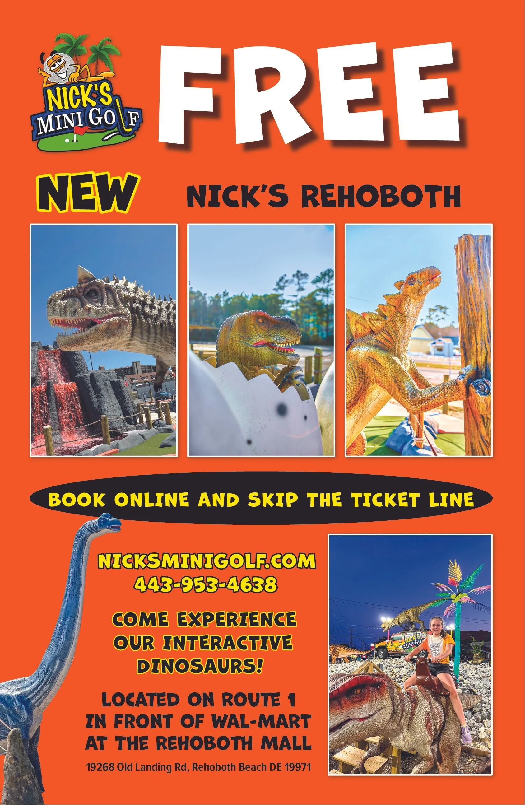
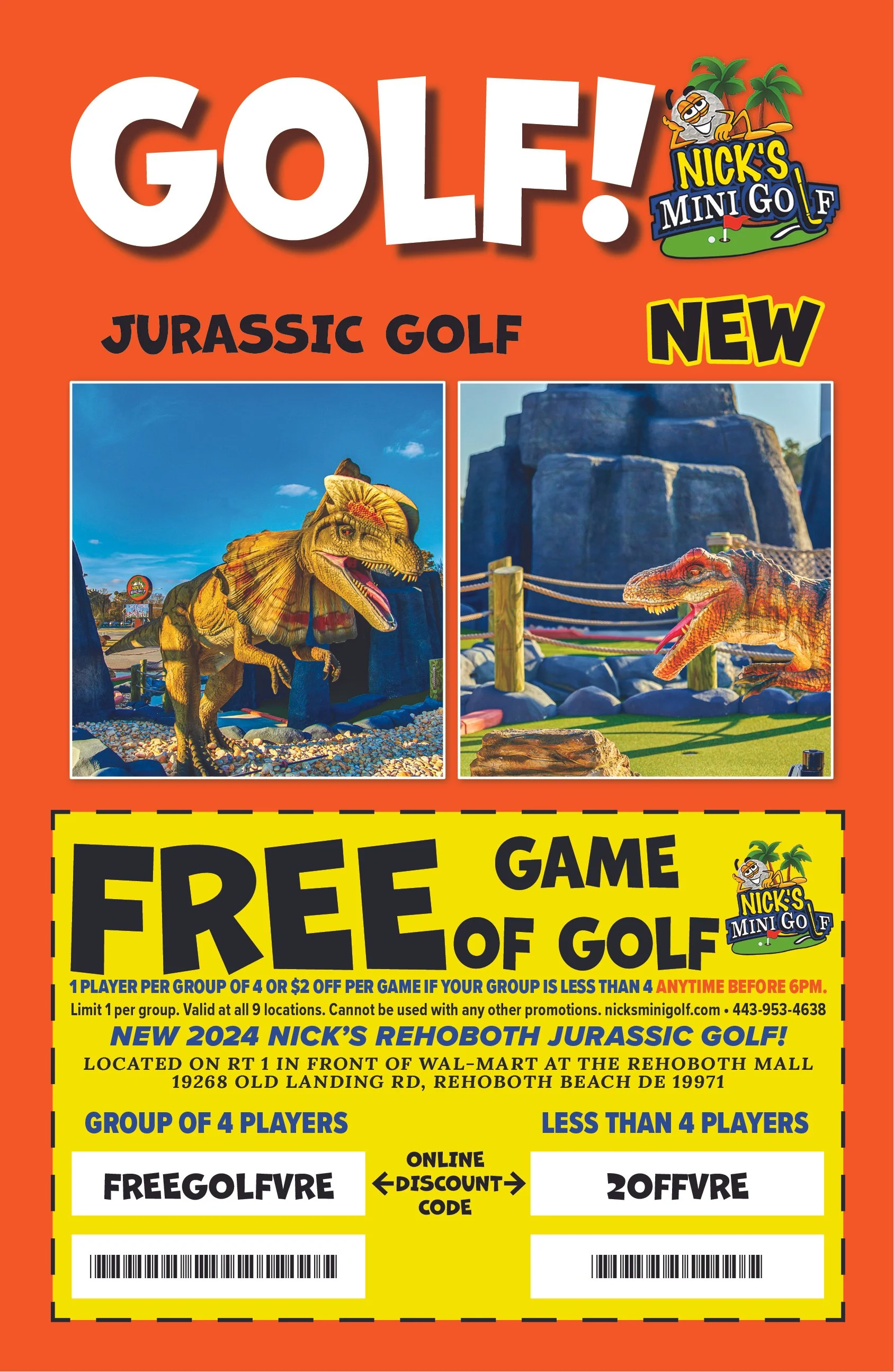
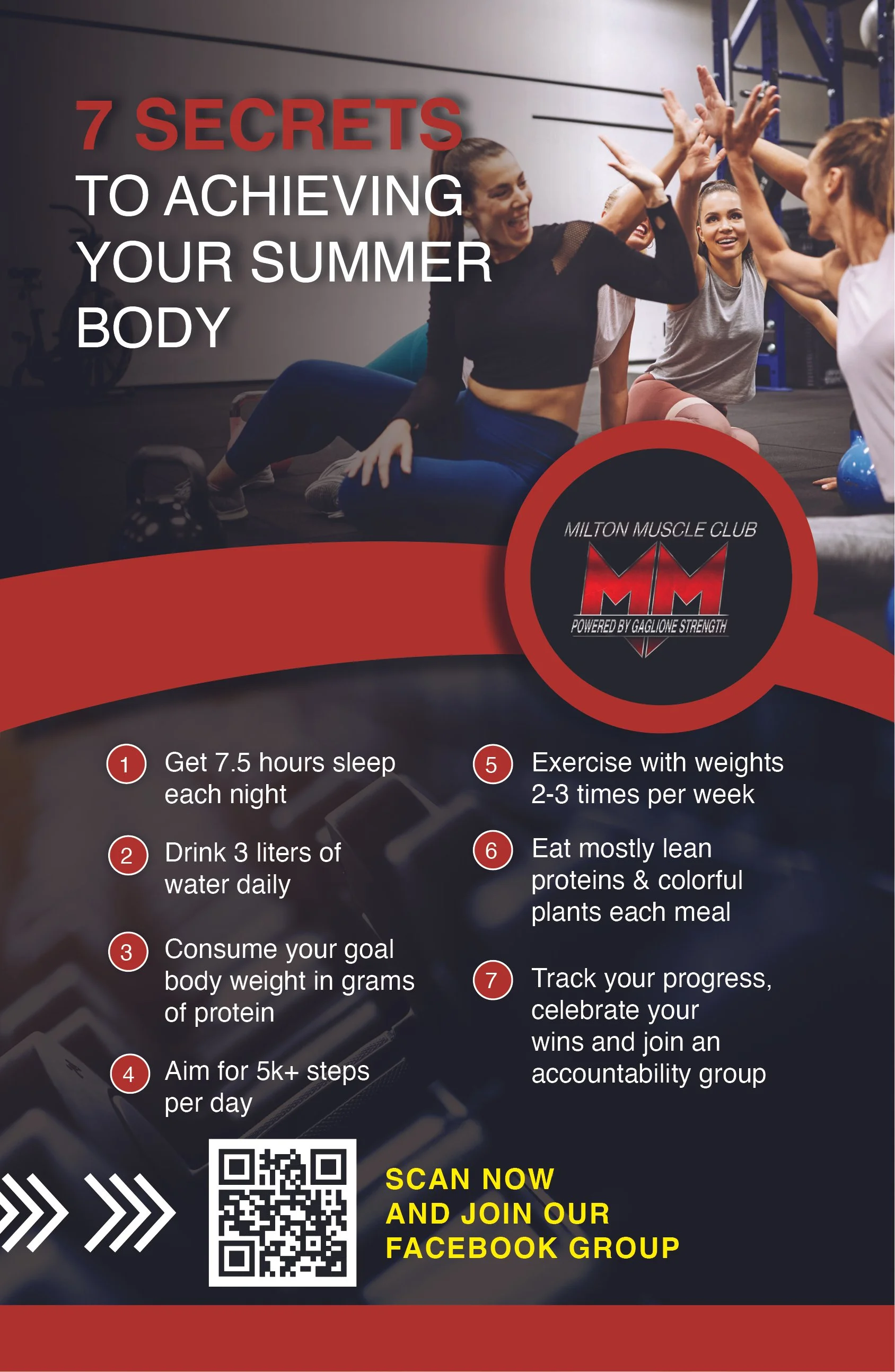
Photography was given room to create moments of impact, while typography and structured content blocks helped break down more information-heavy pages. I intentionally varied pacing throughout the guide, moving between immersive imagery, editorial features and practical visitor information to create a more engaging reading experience.
Advertiser Integration
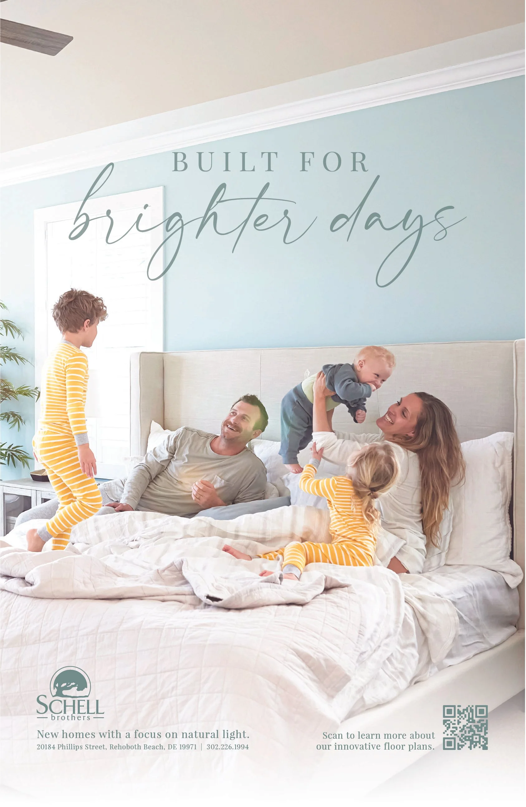
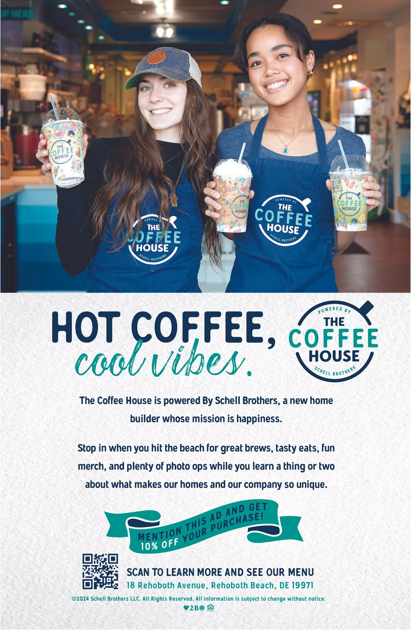
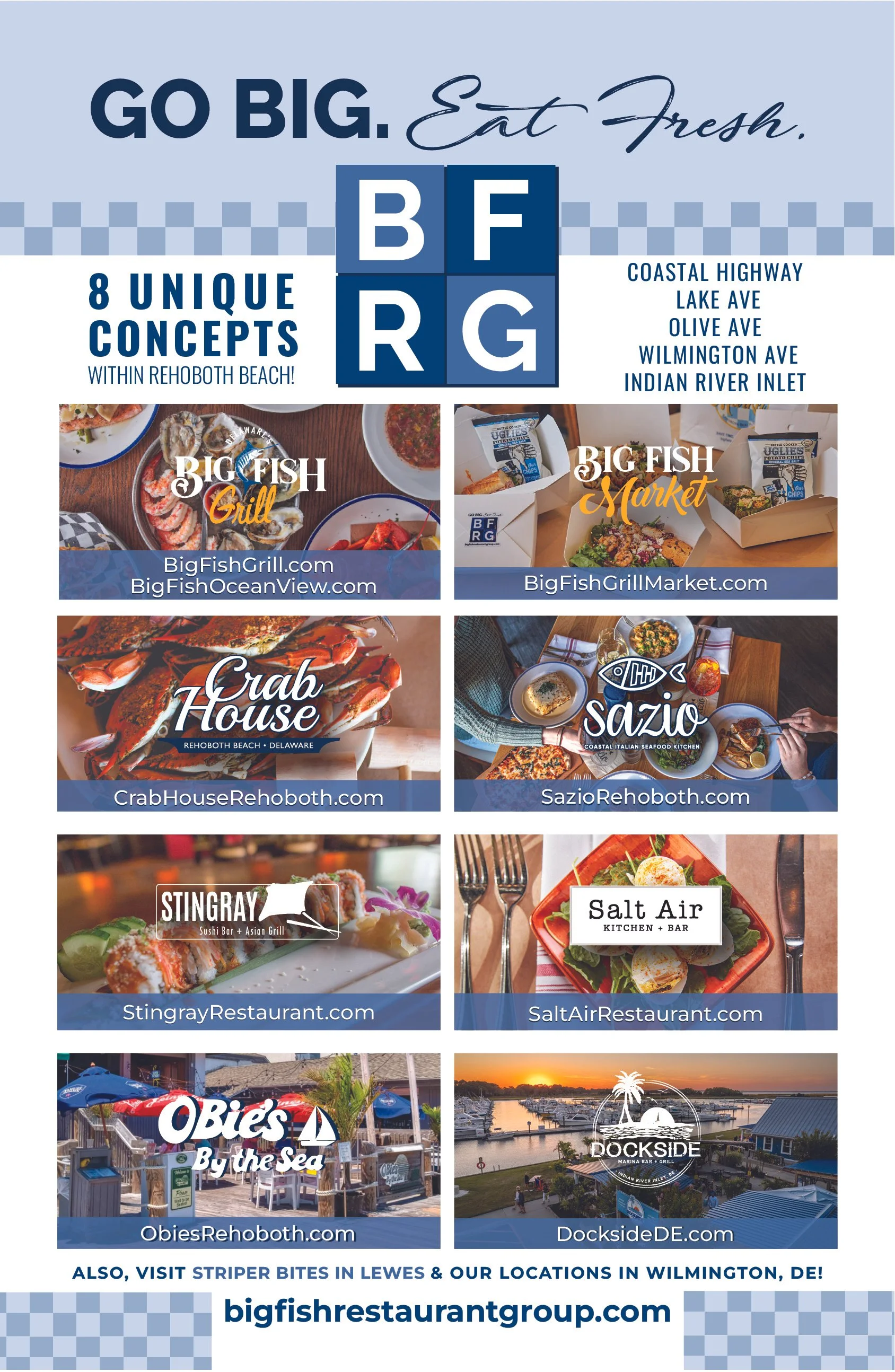
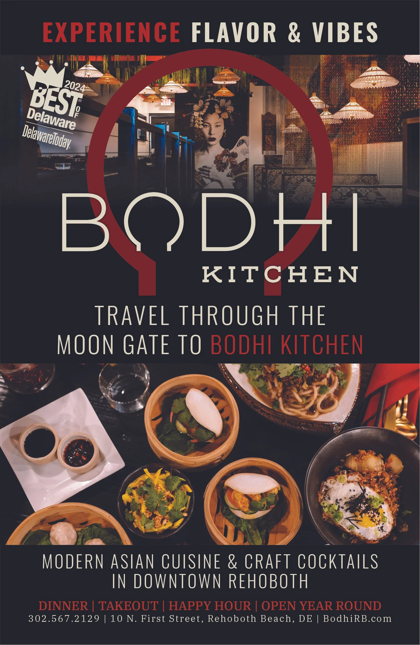
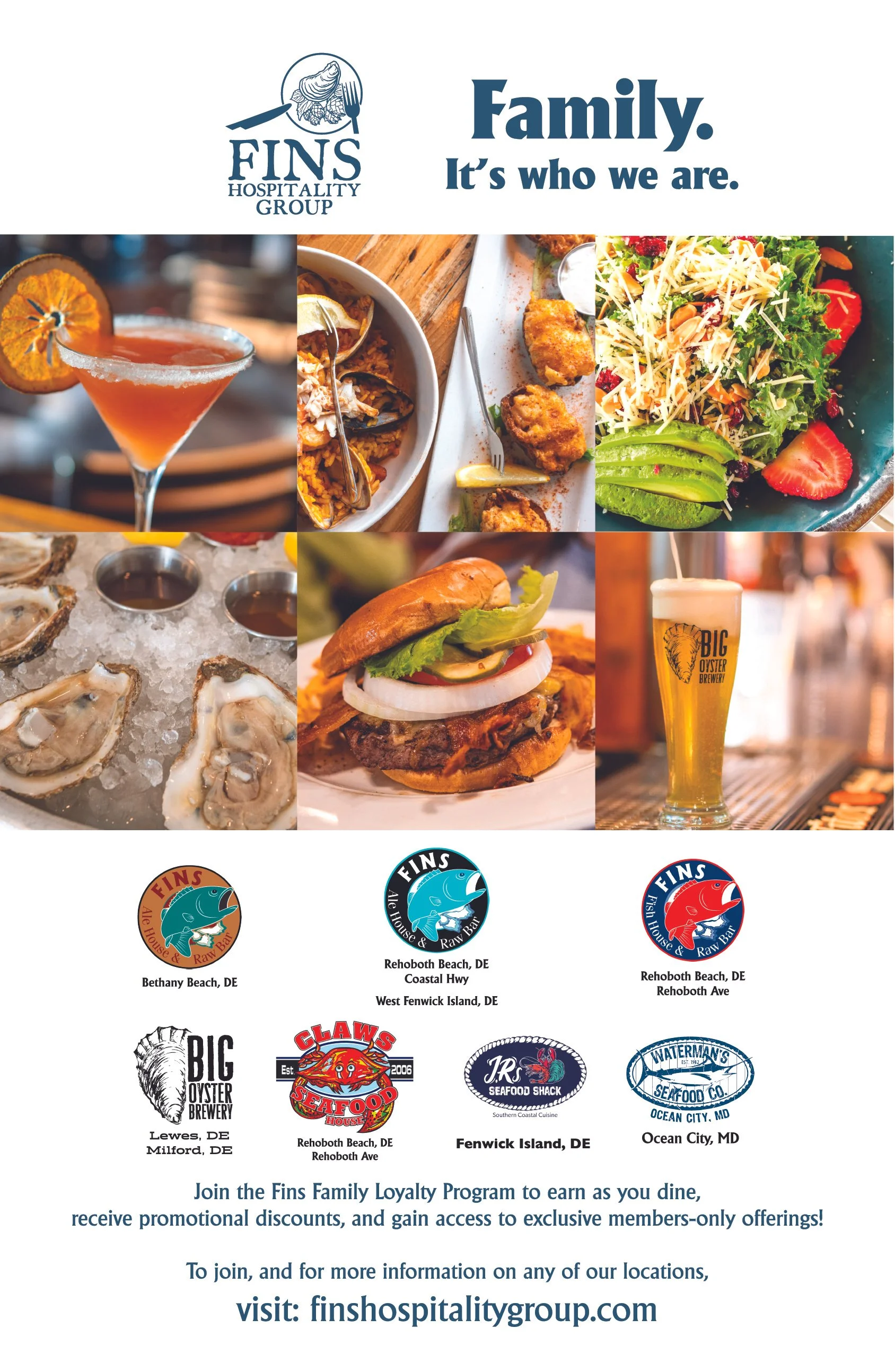
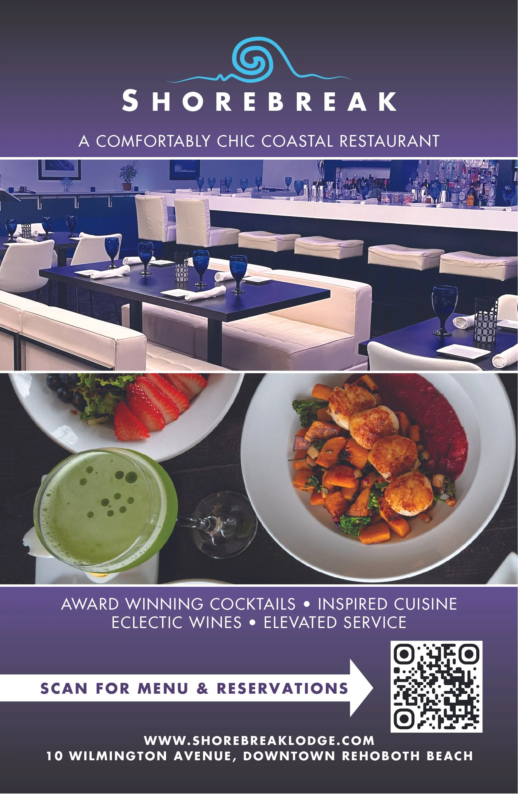
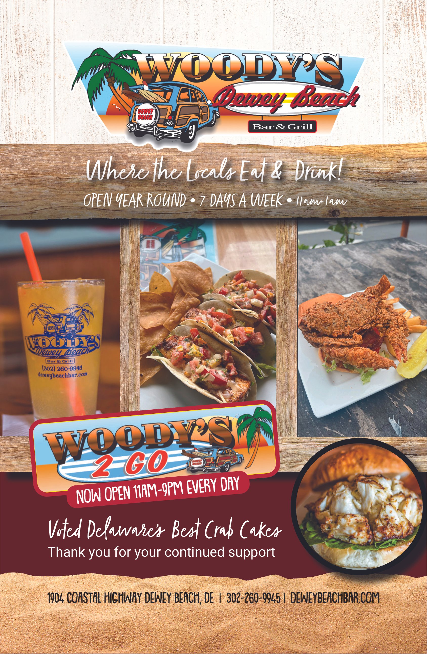
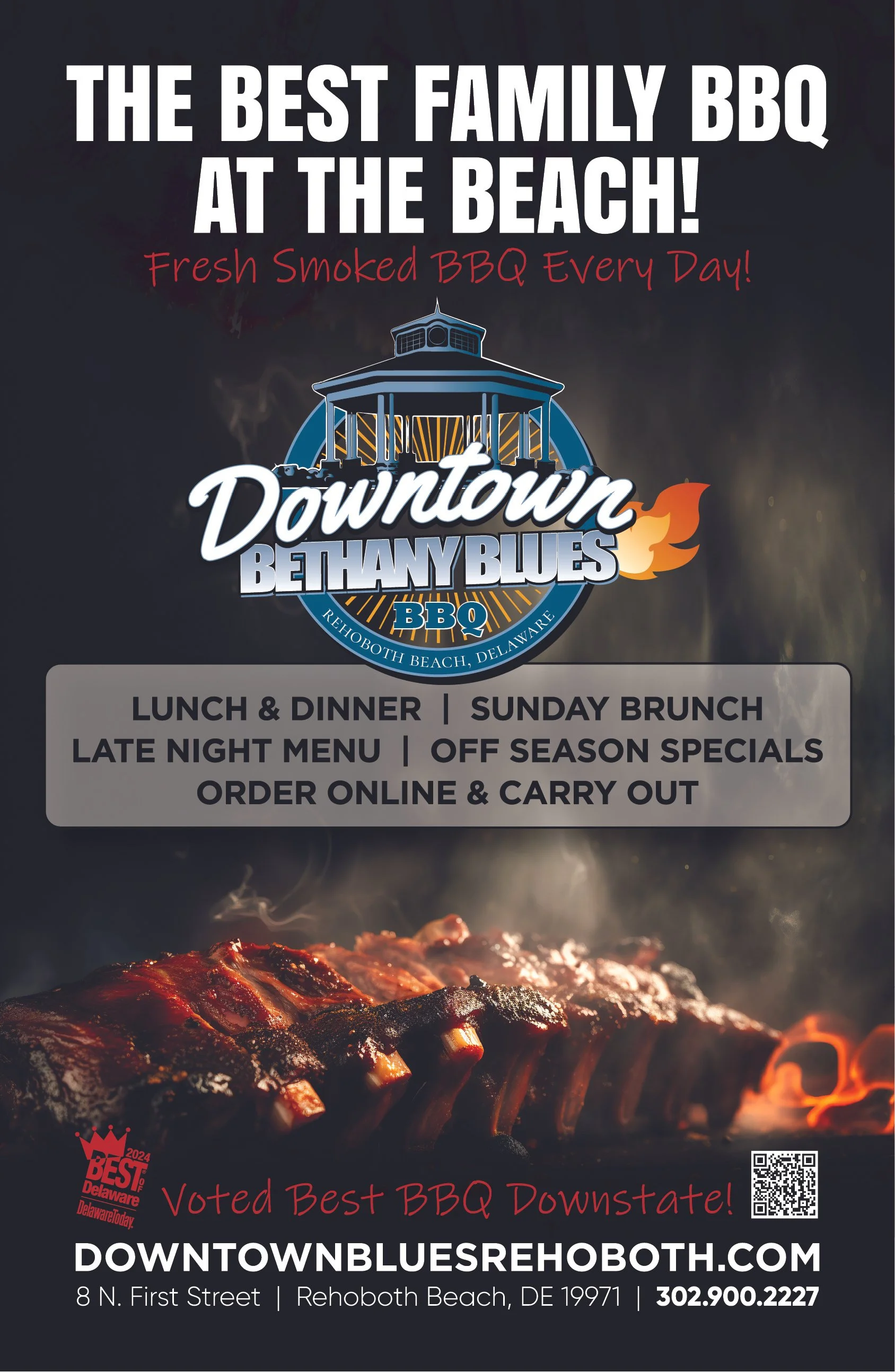
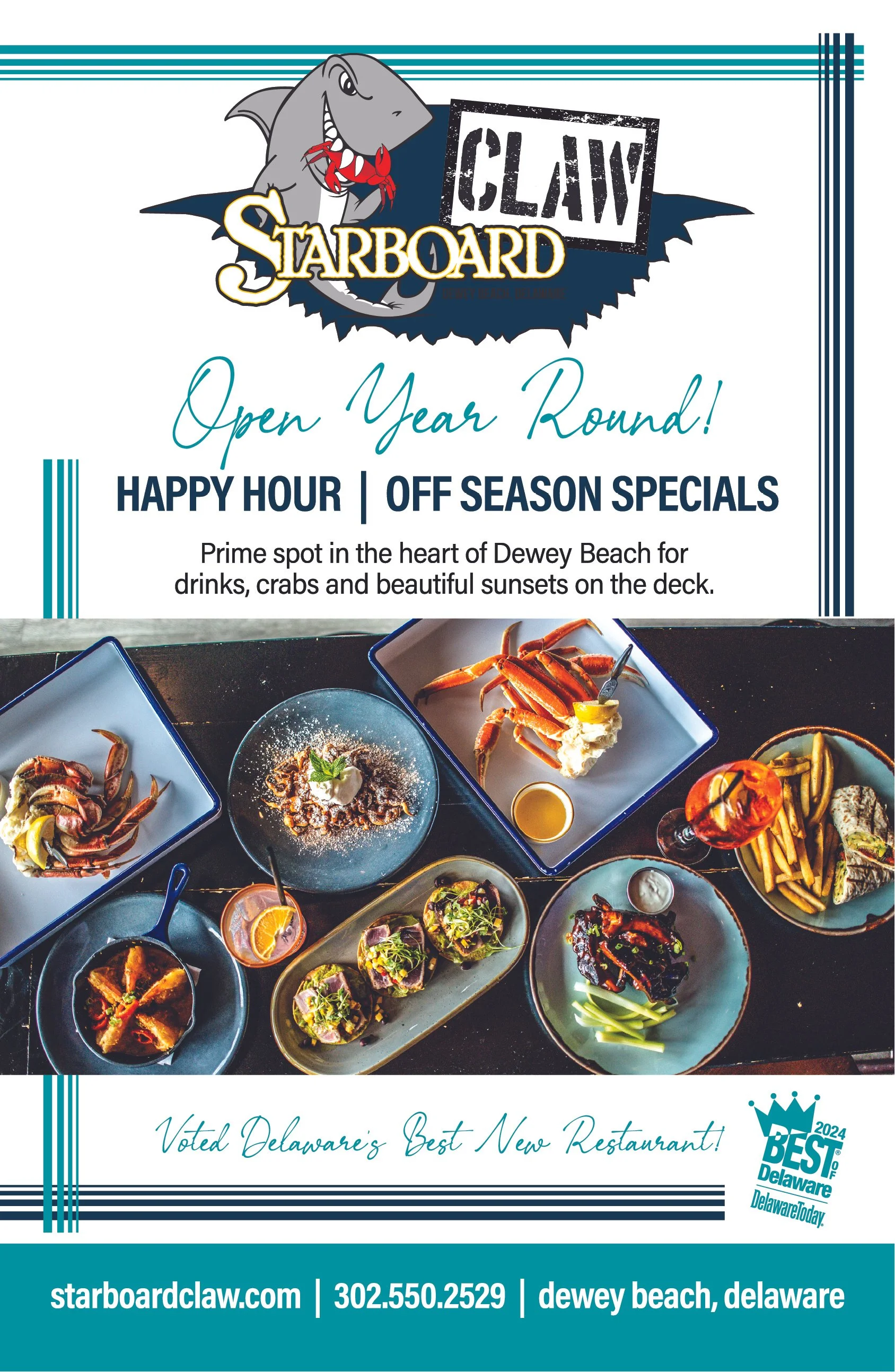
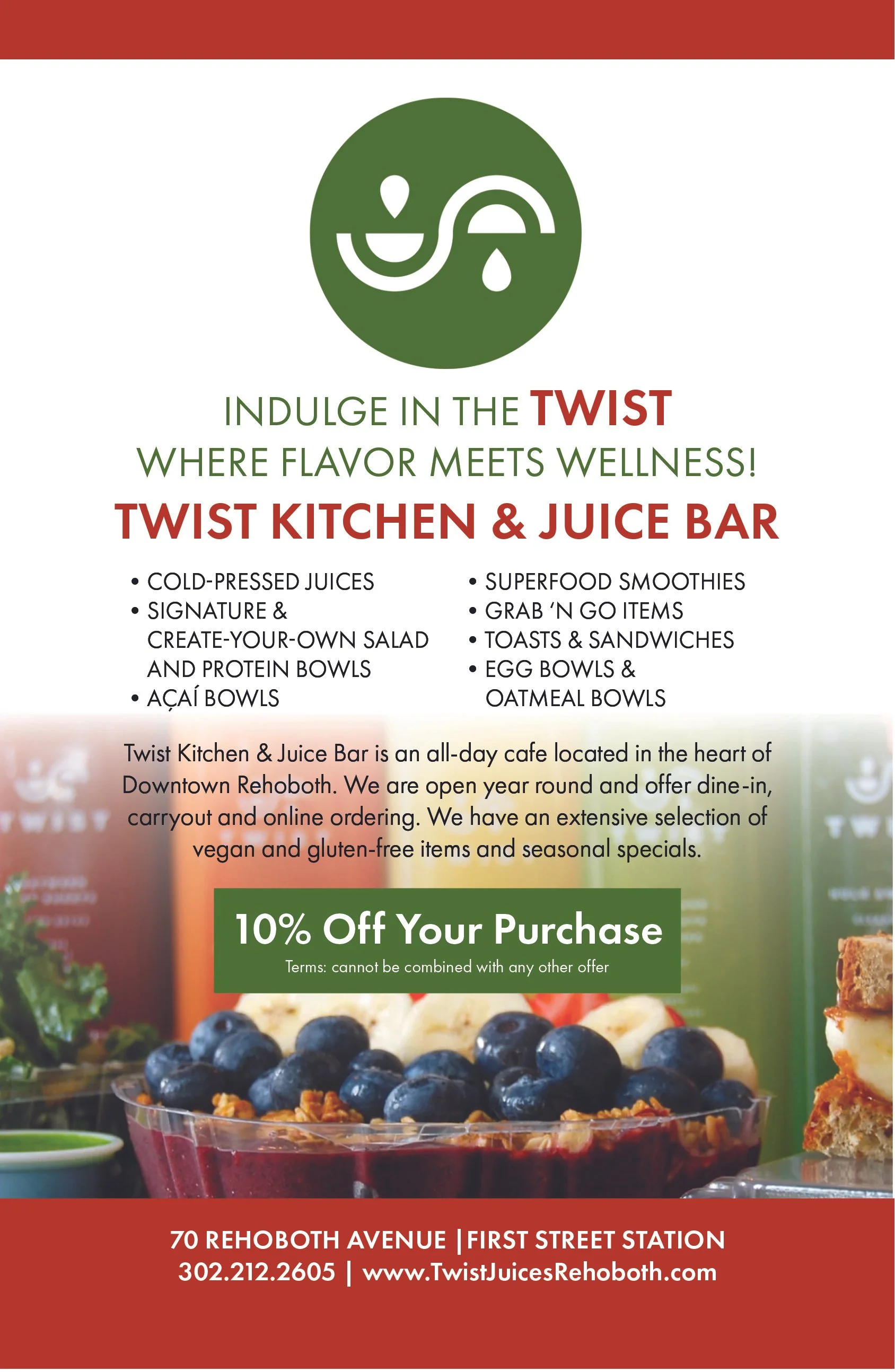
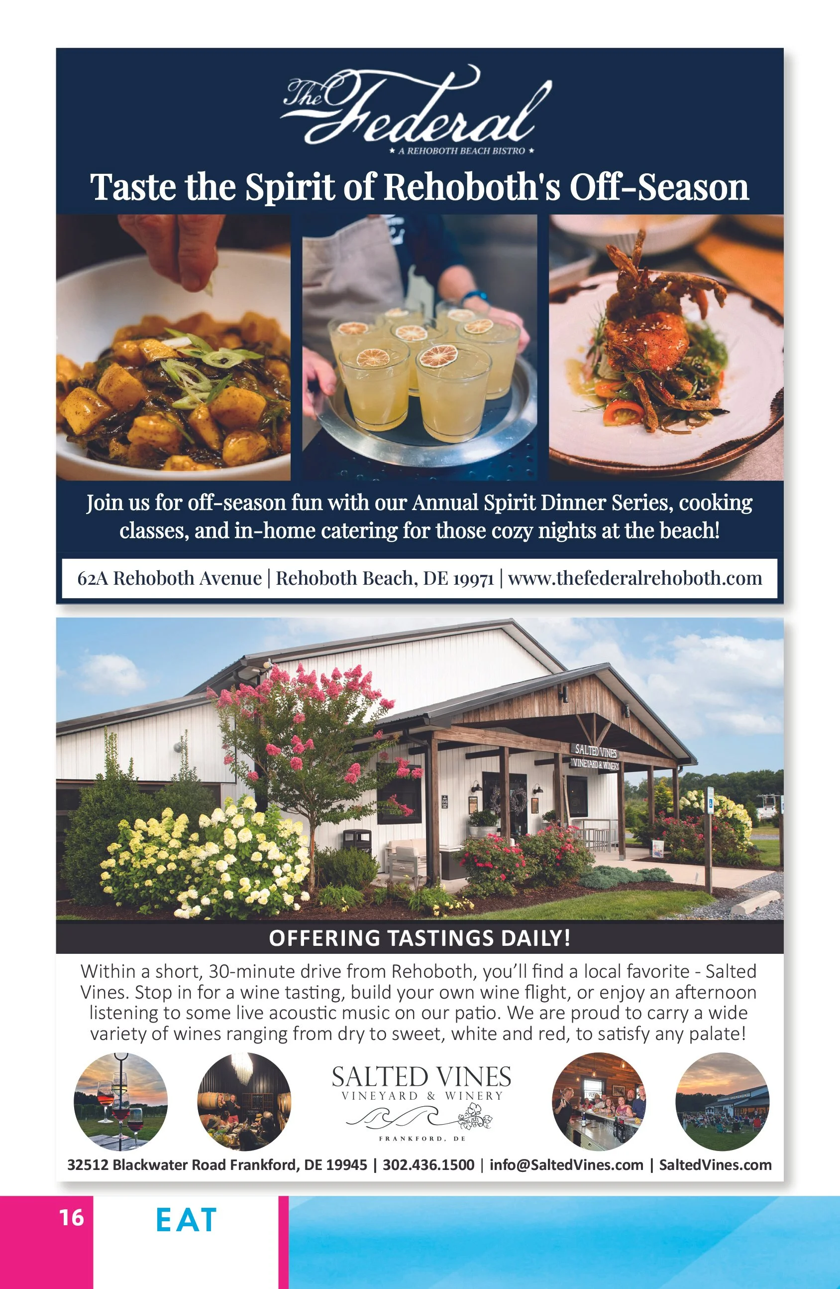
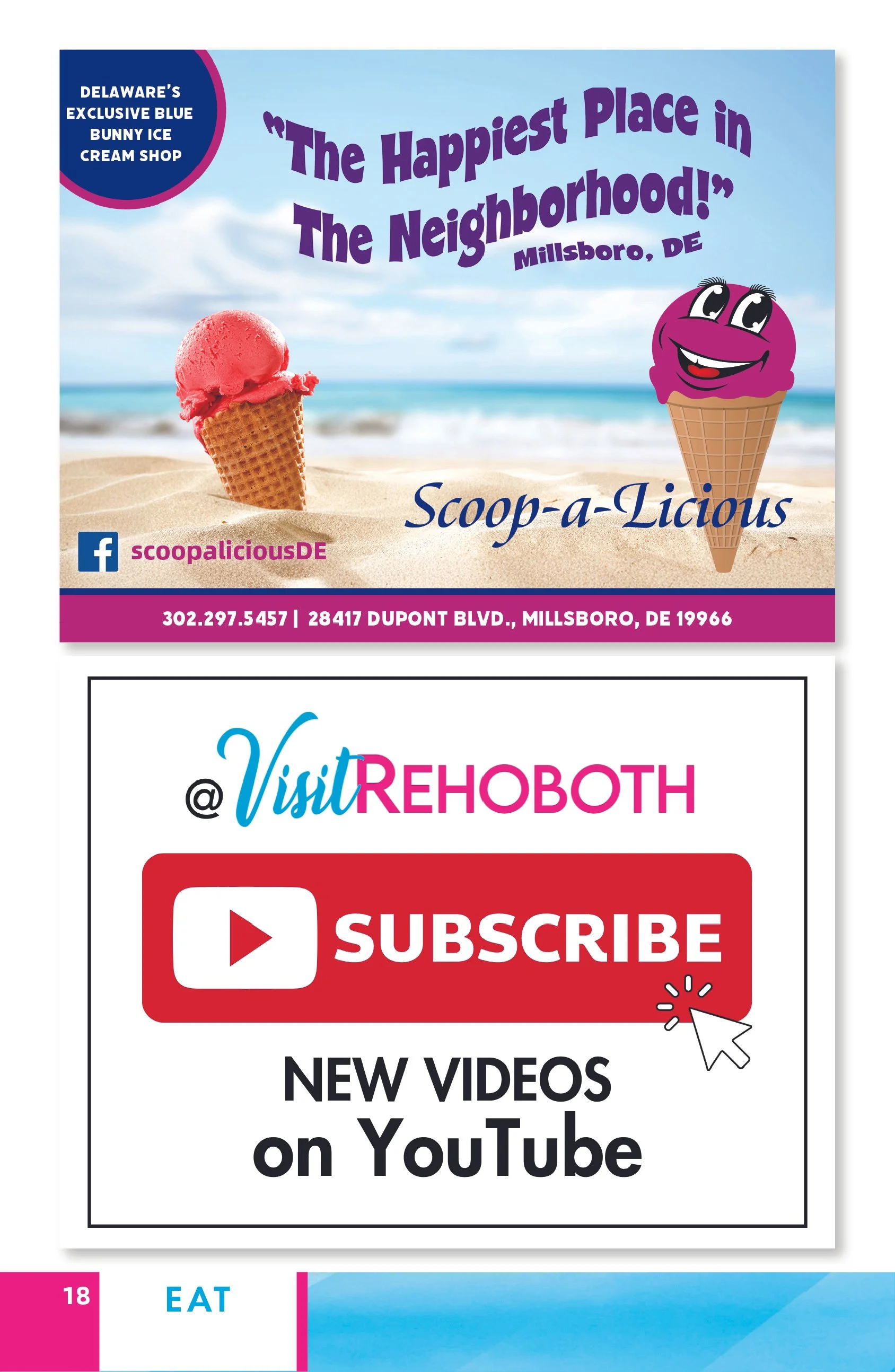
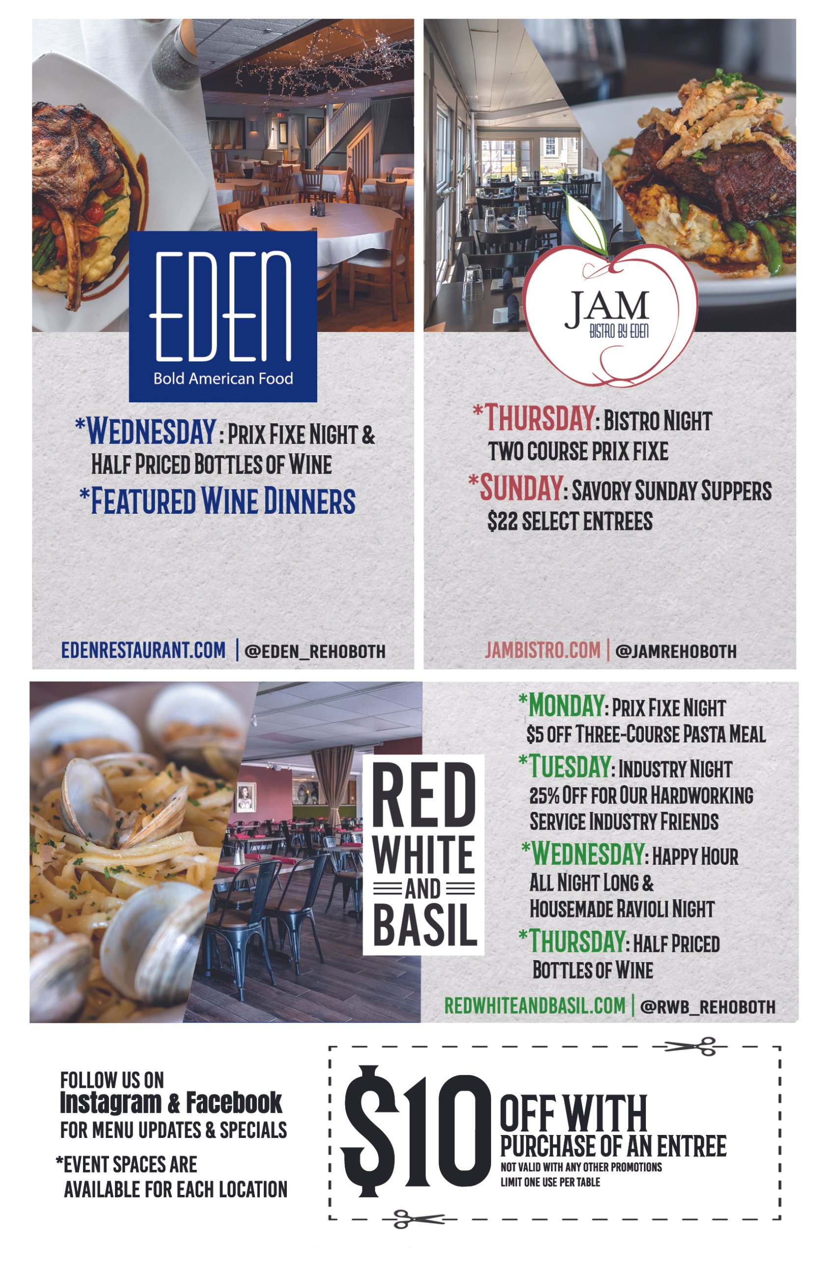
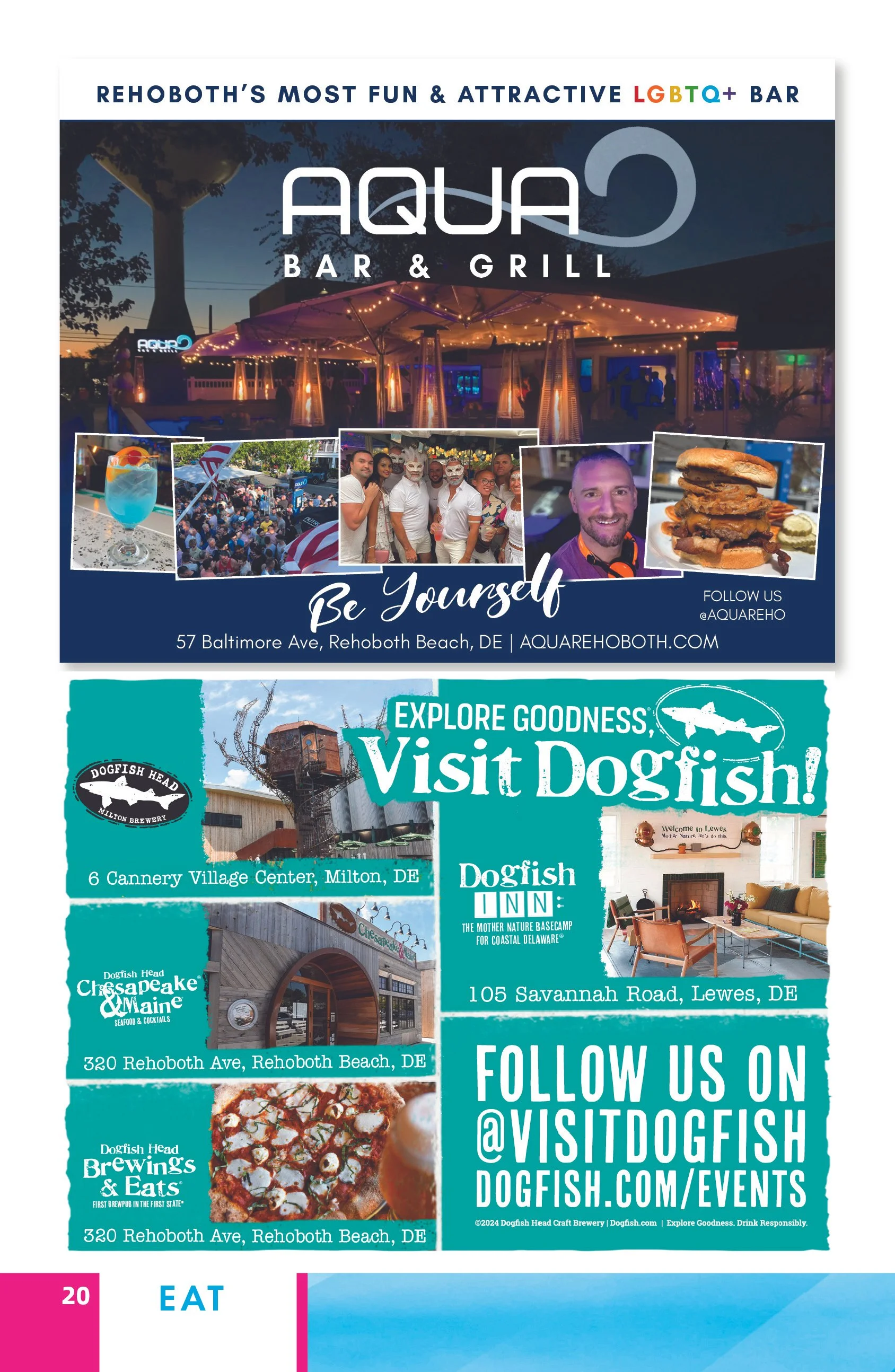
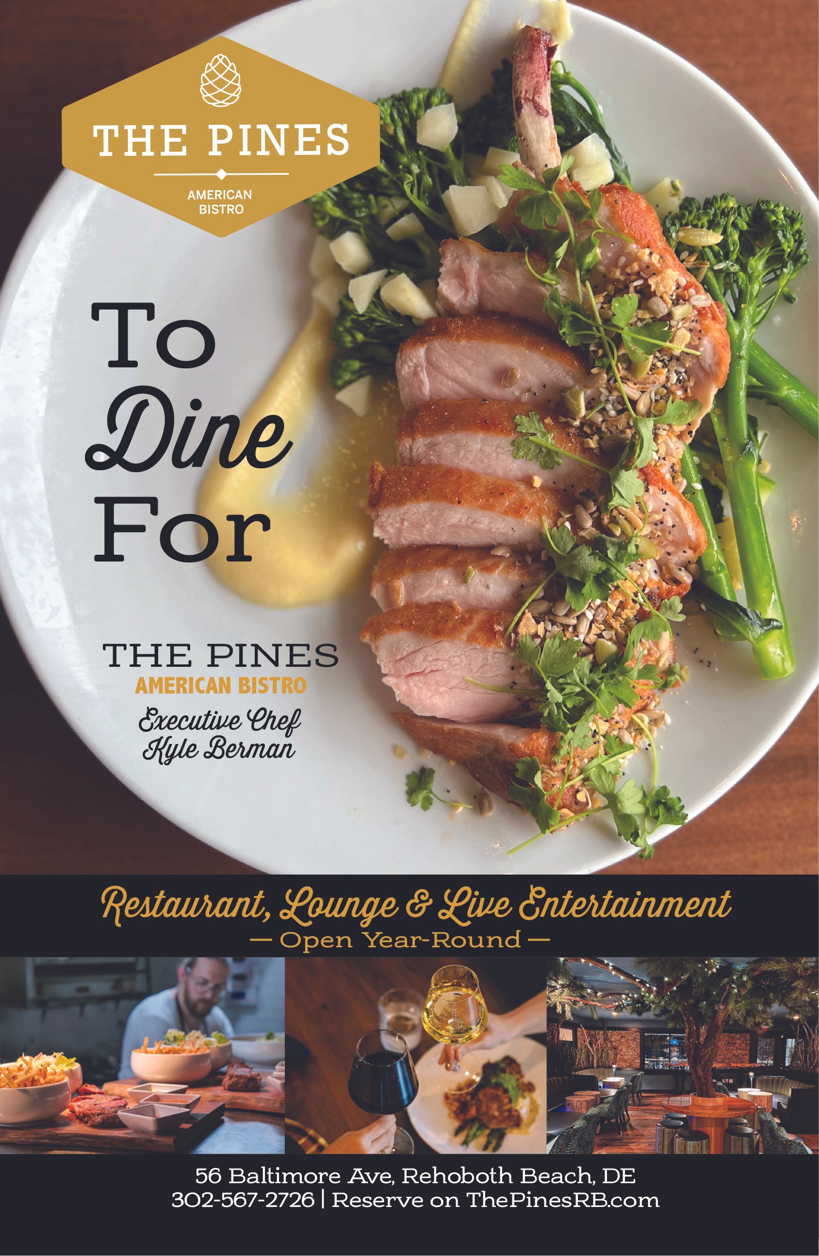
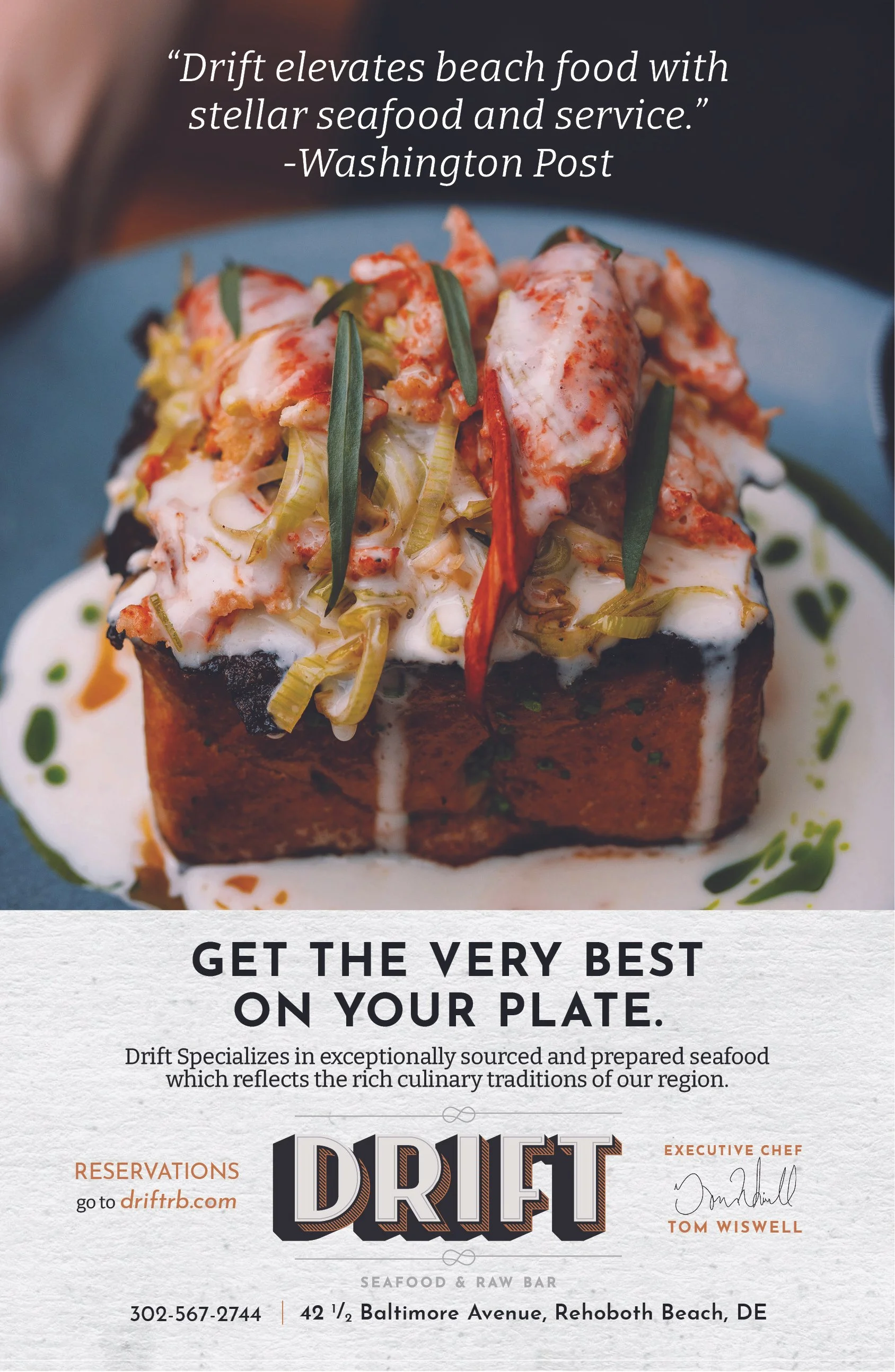
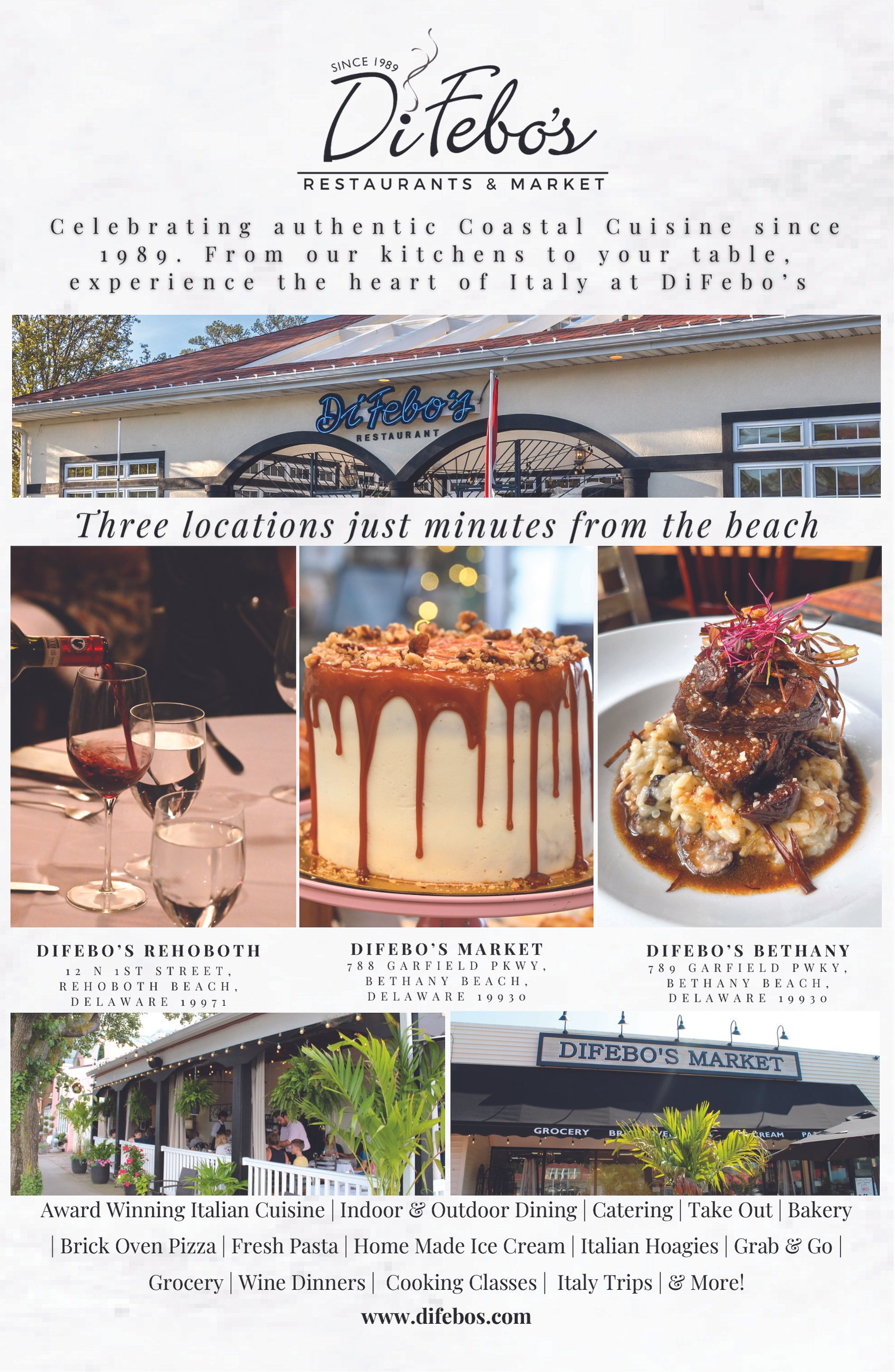
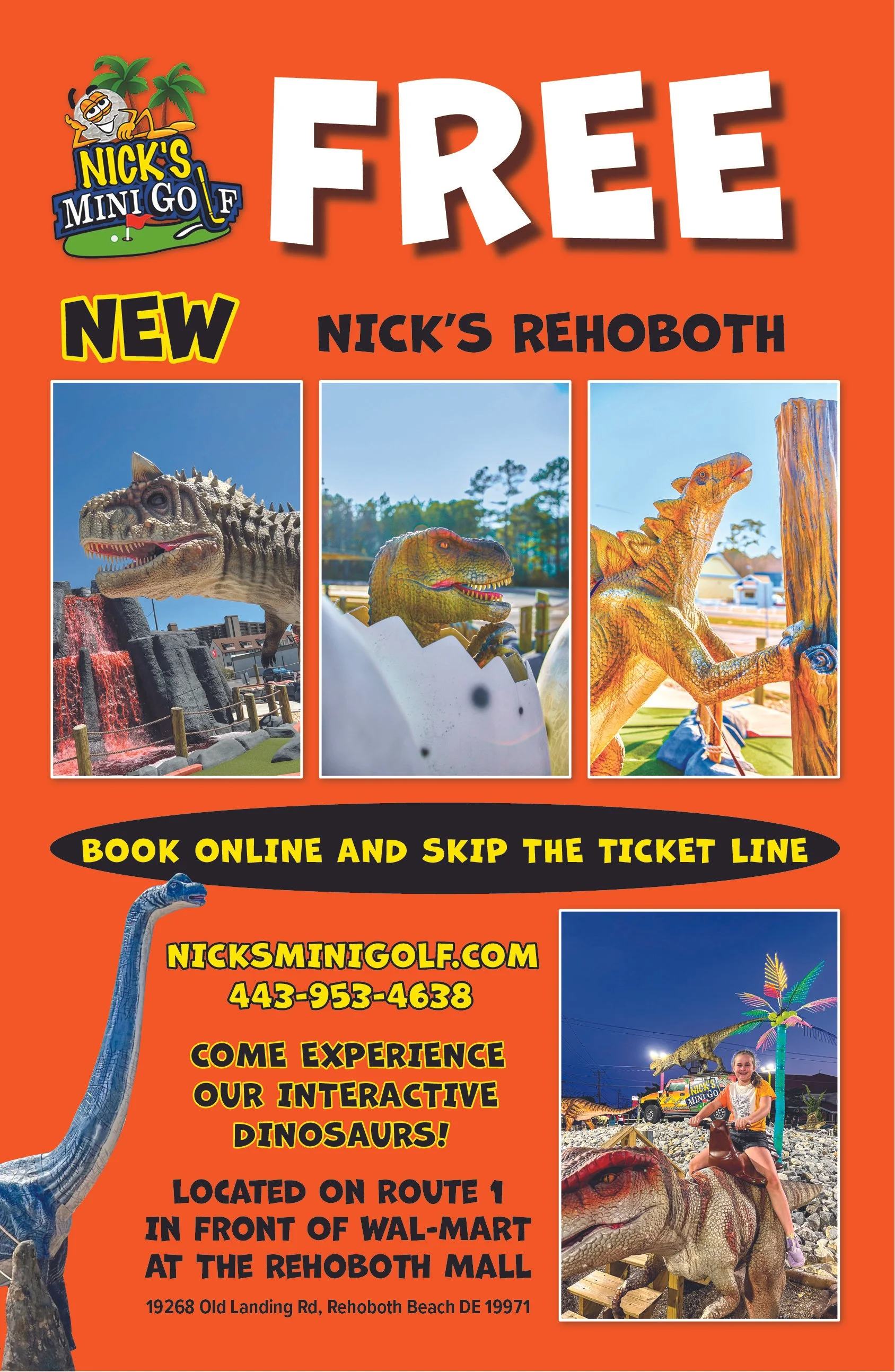
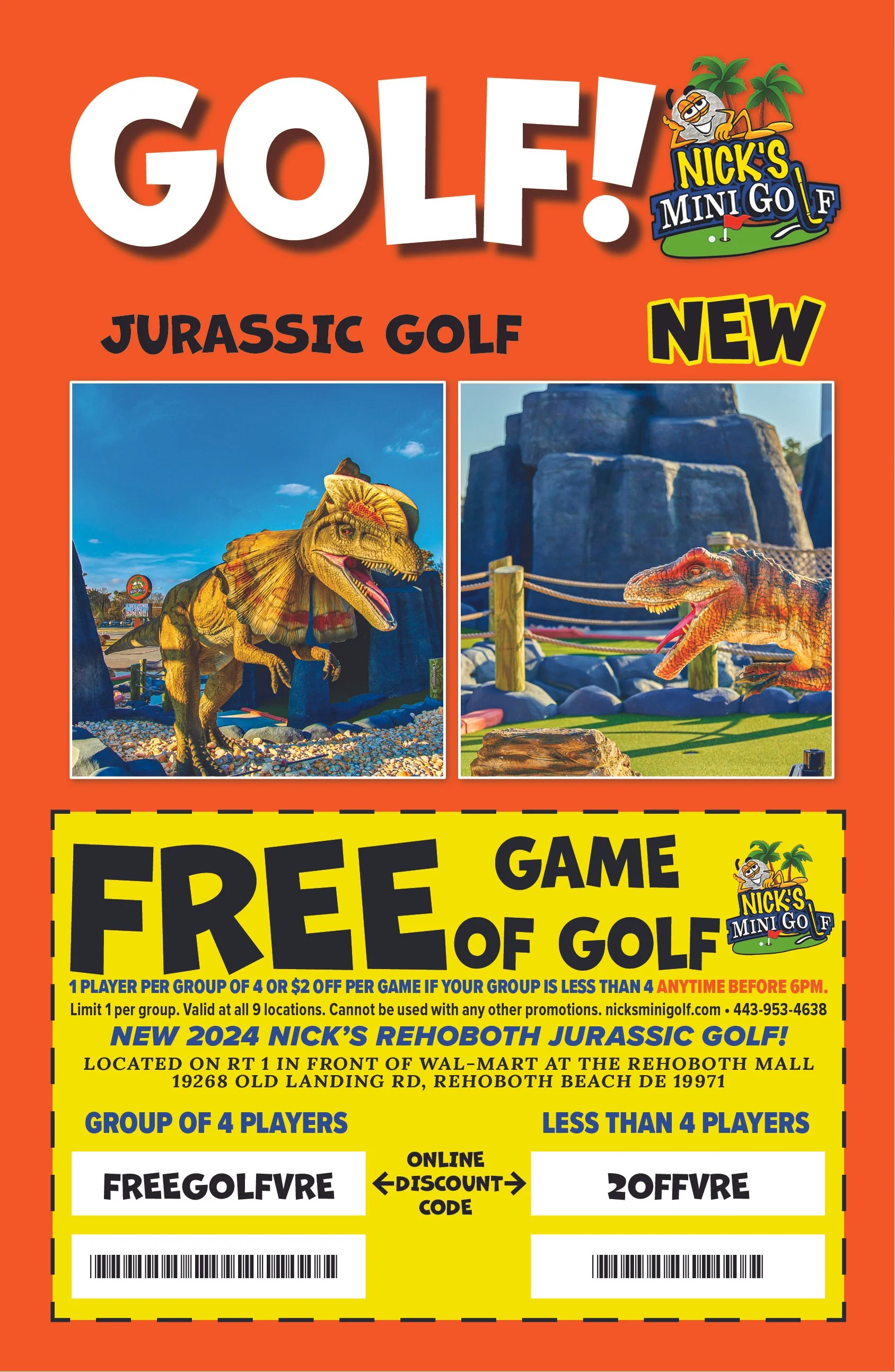
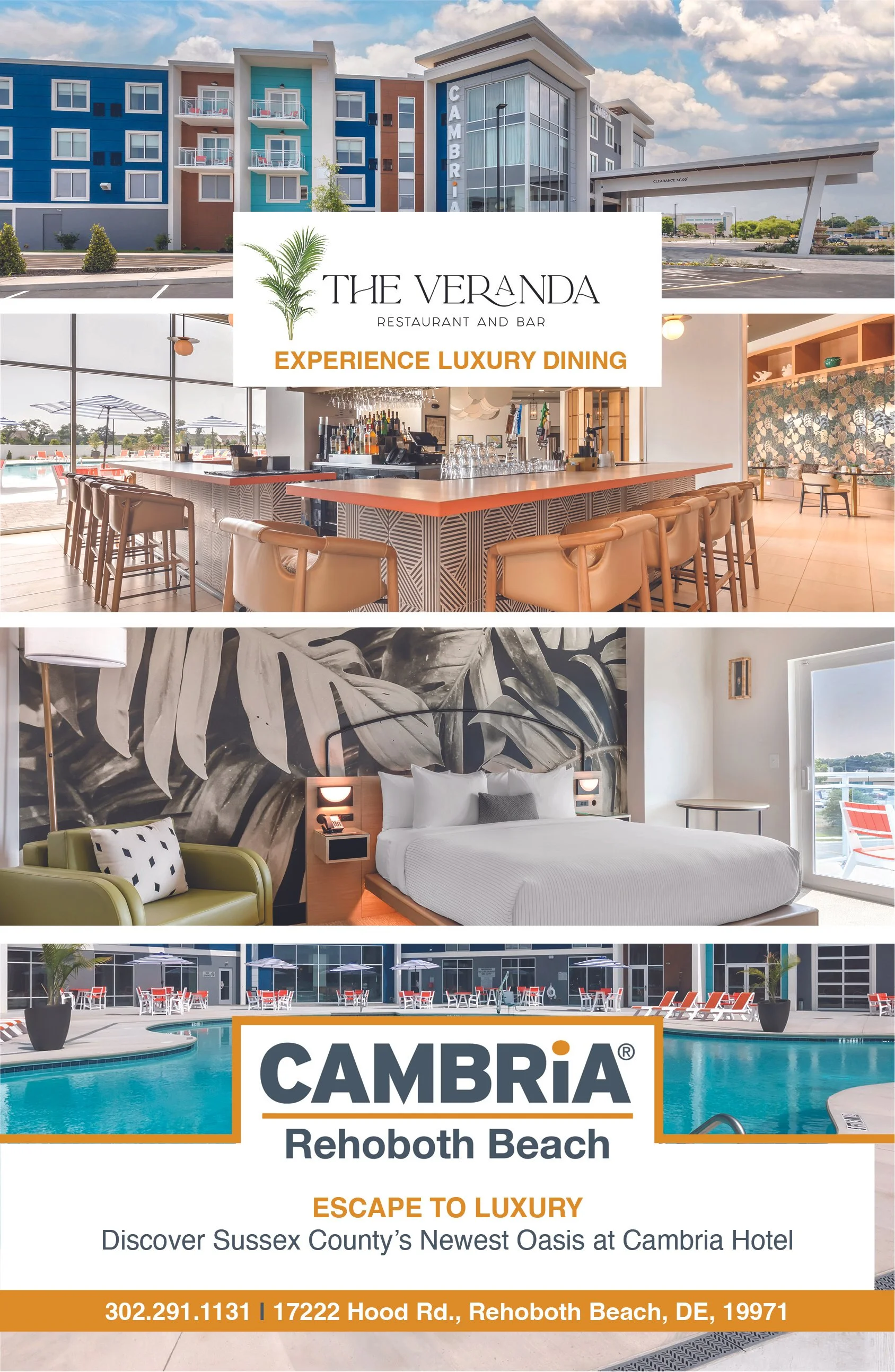
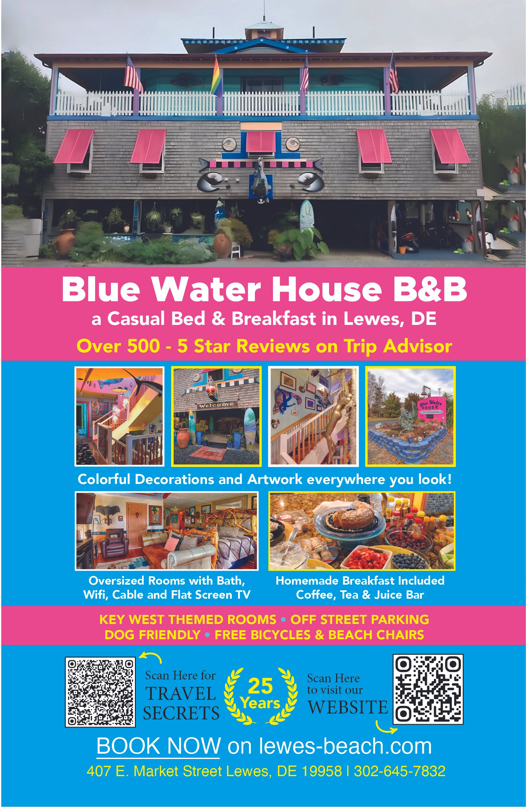
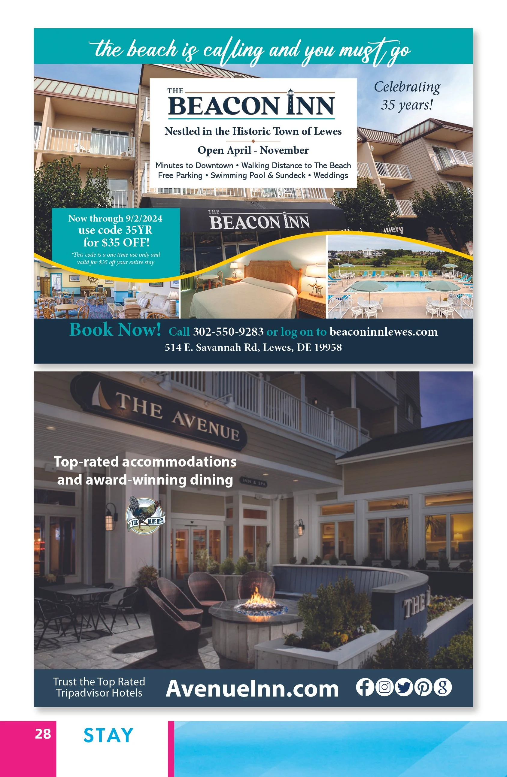
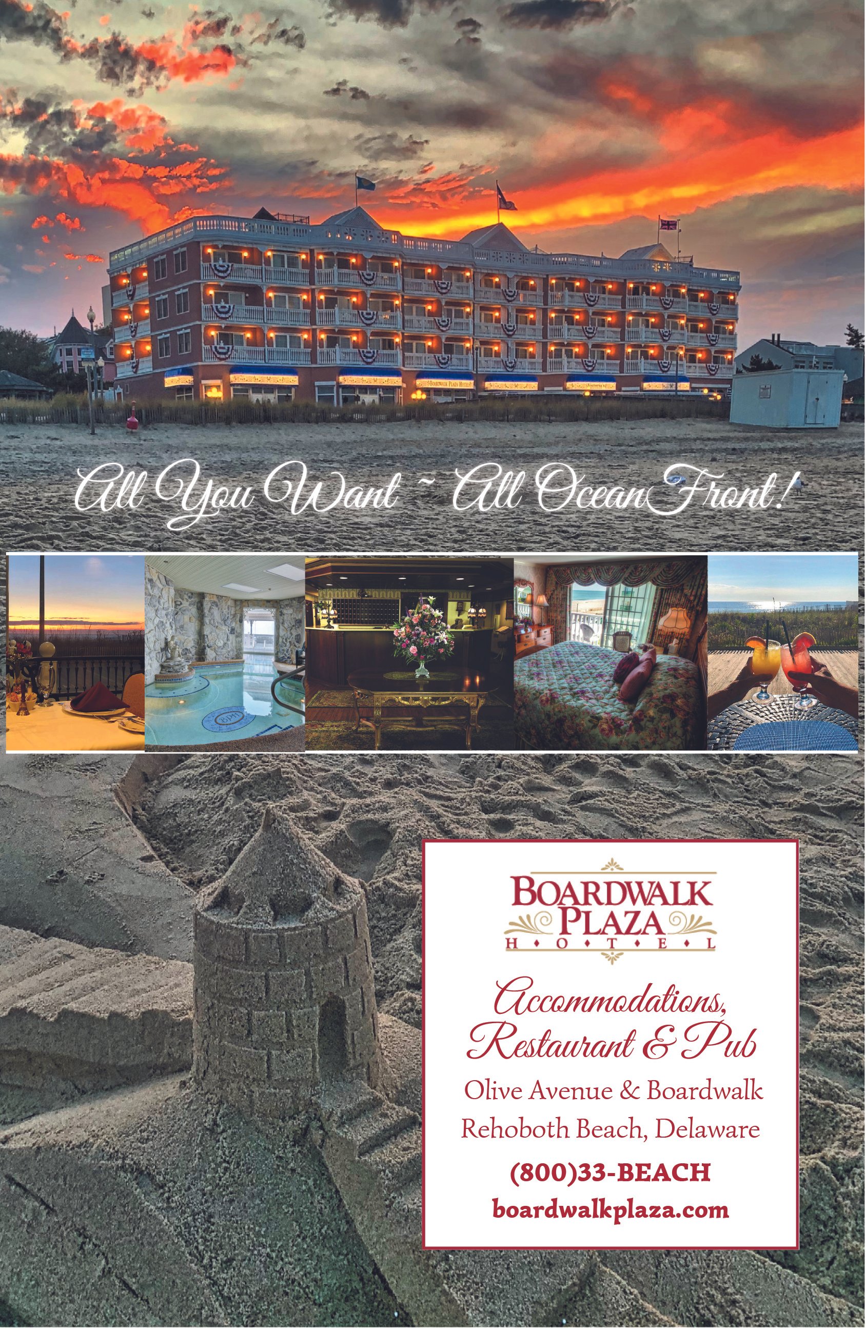
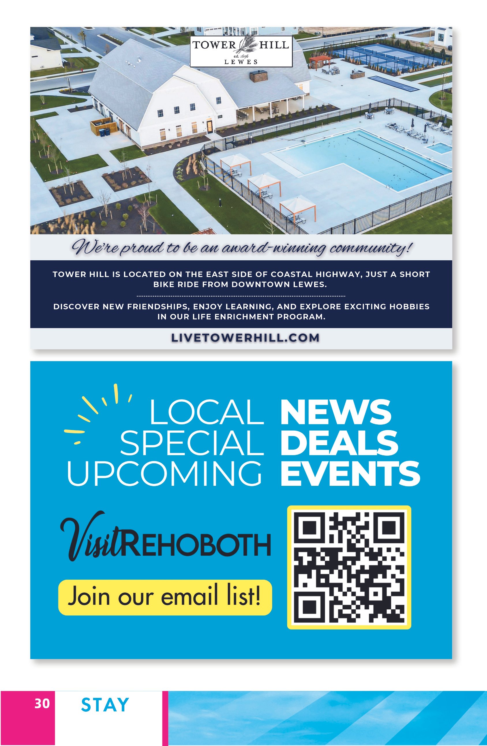
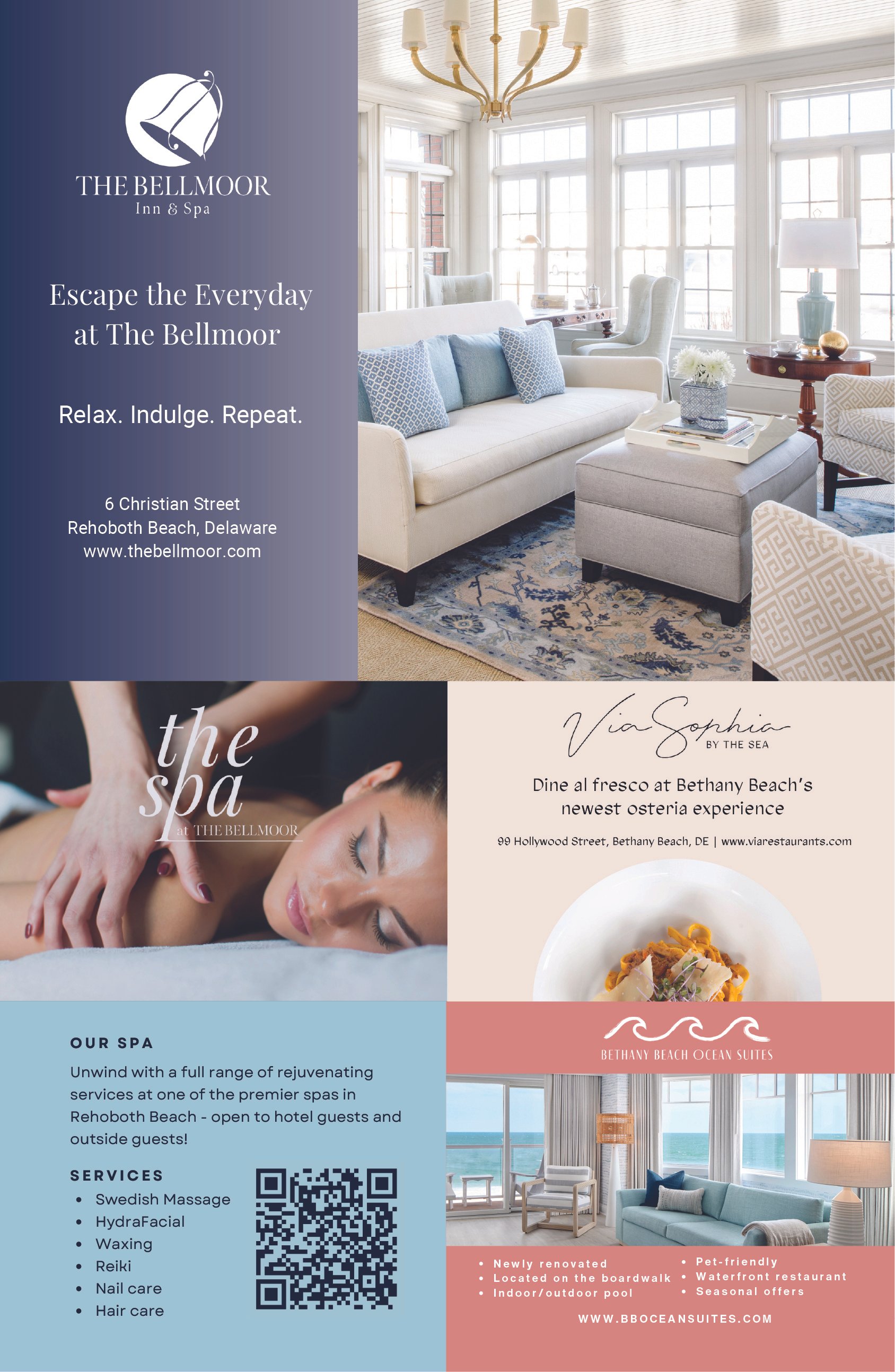
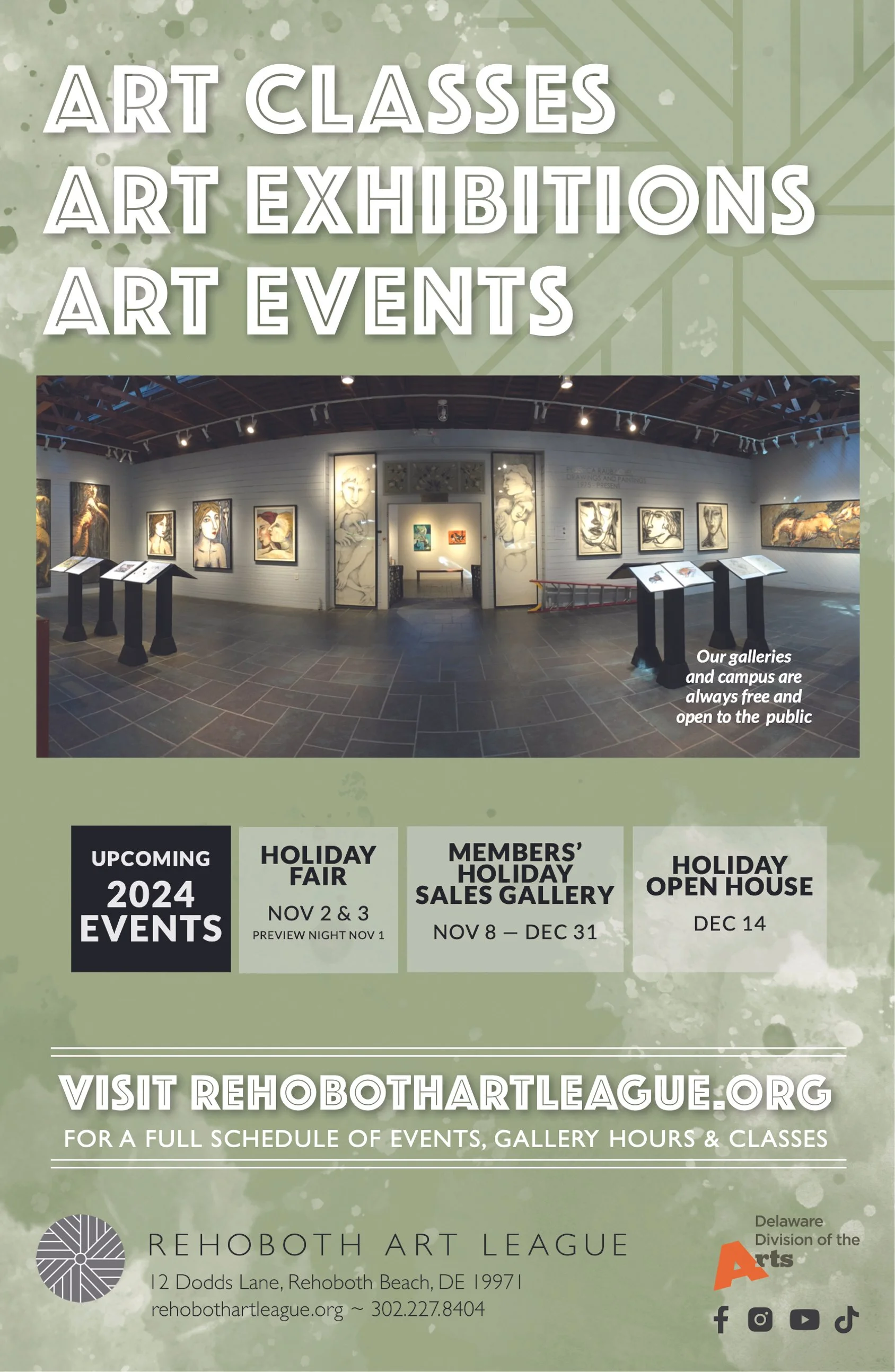
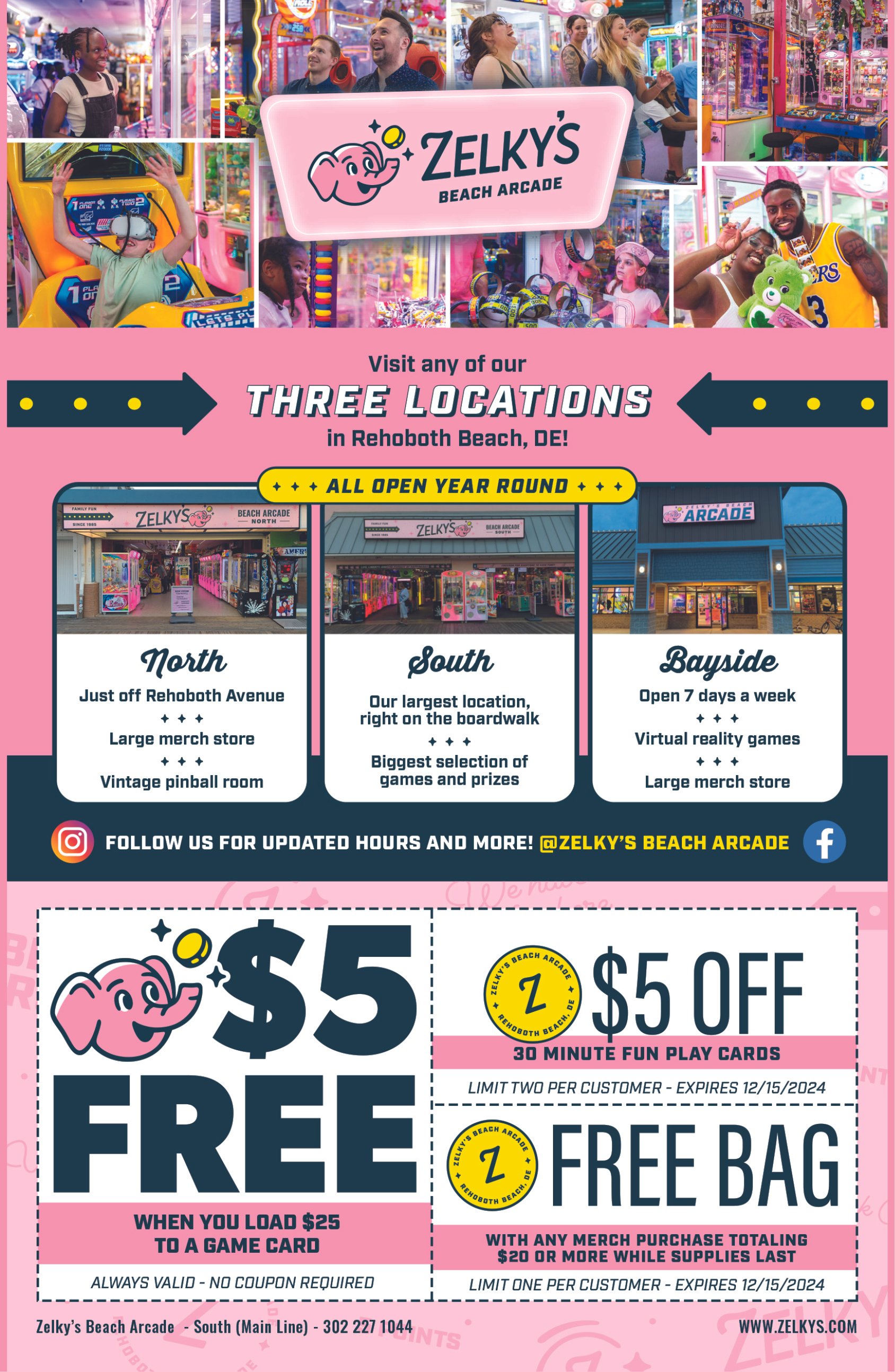
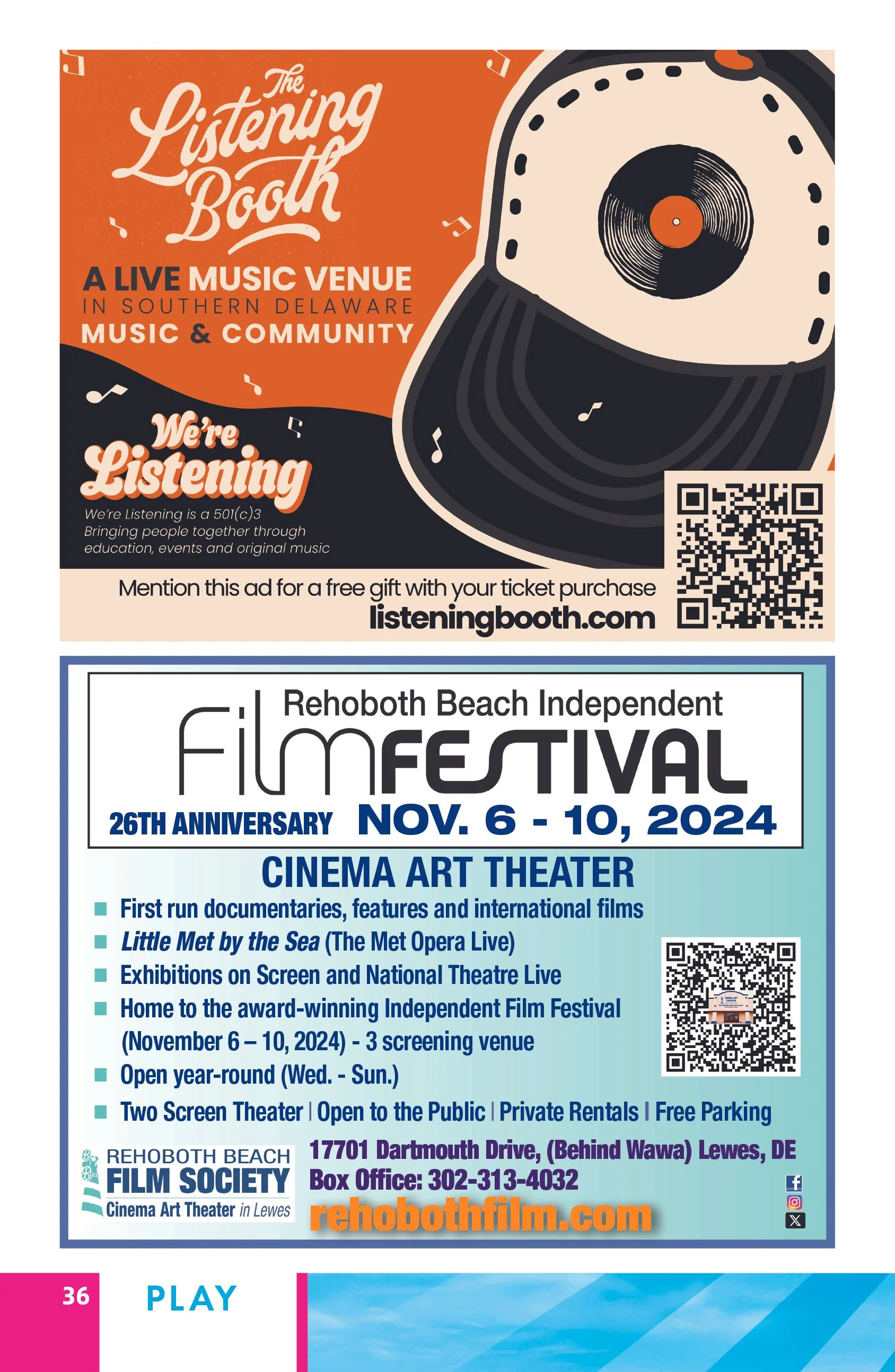
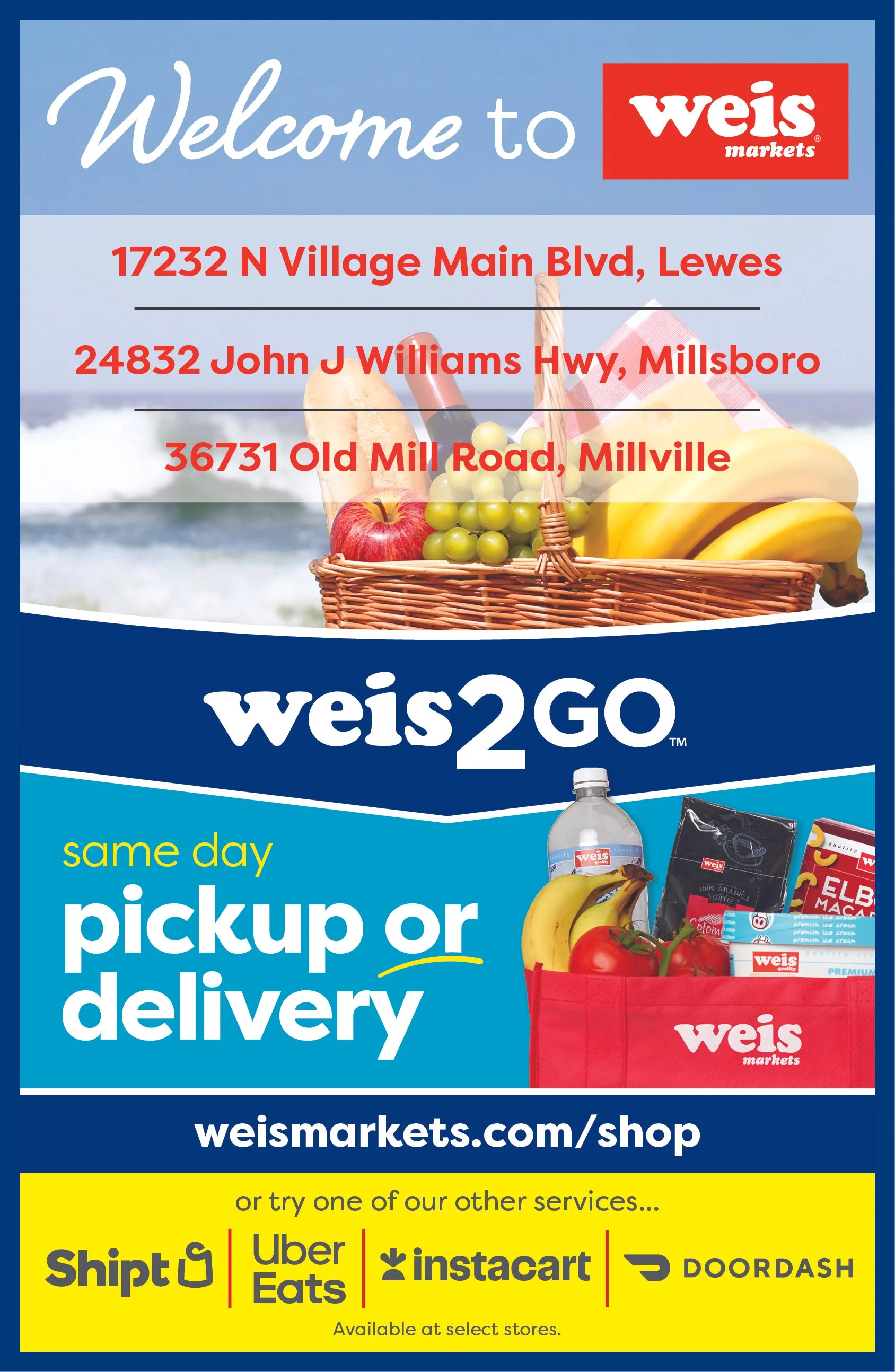
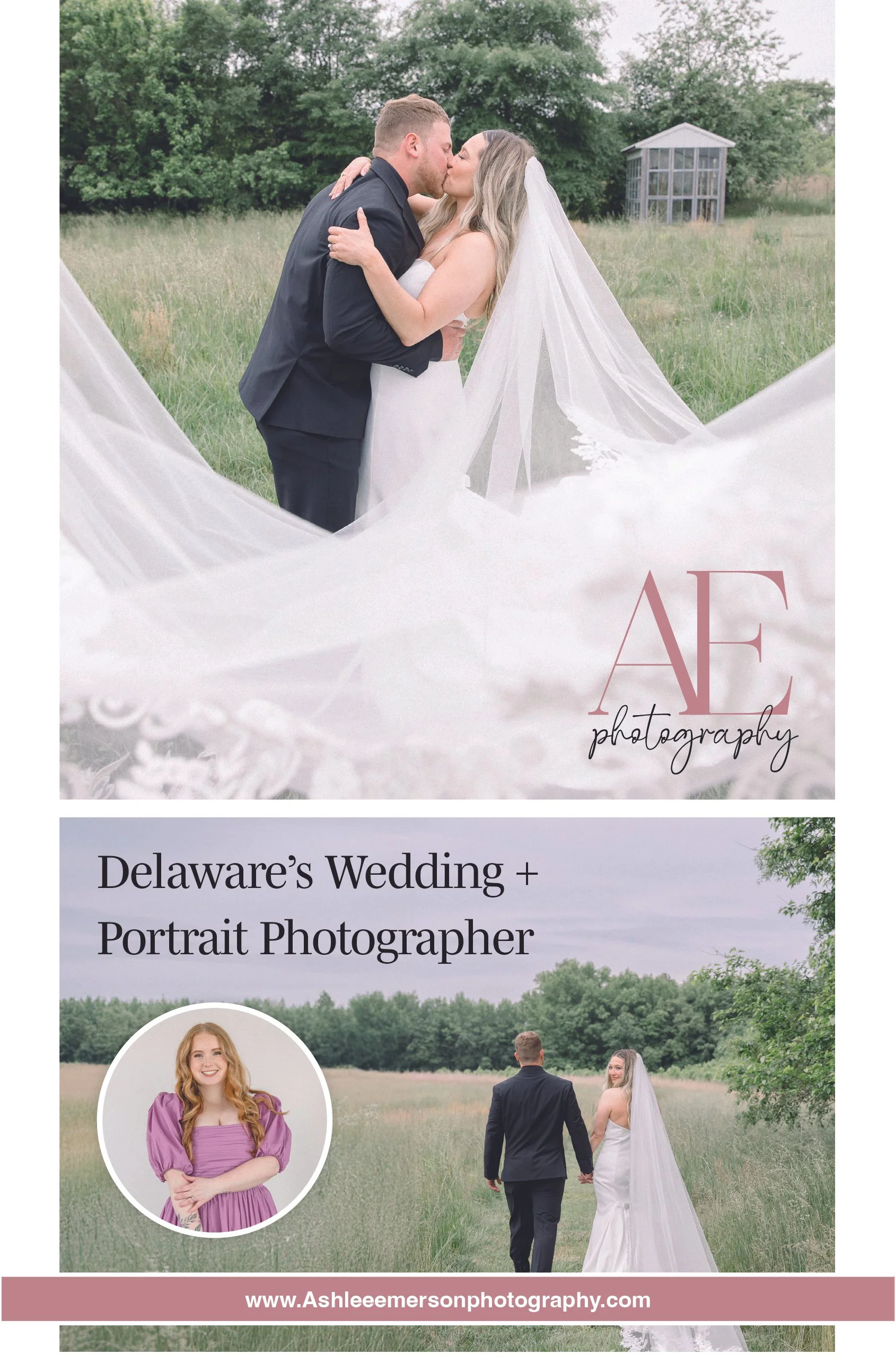
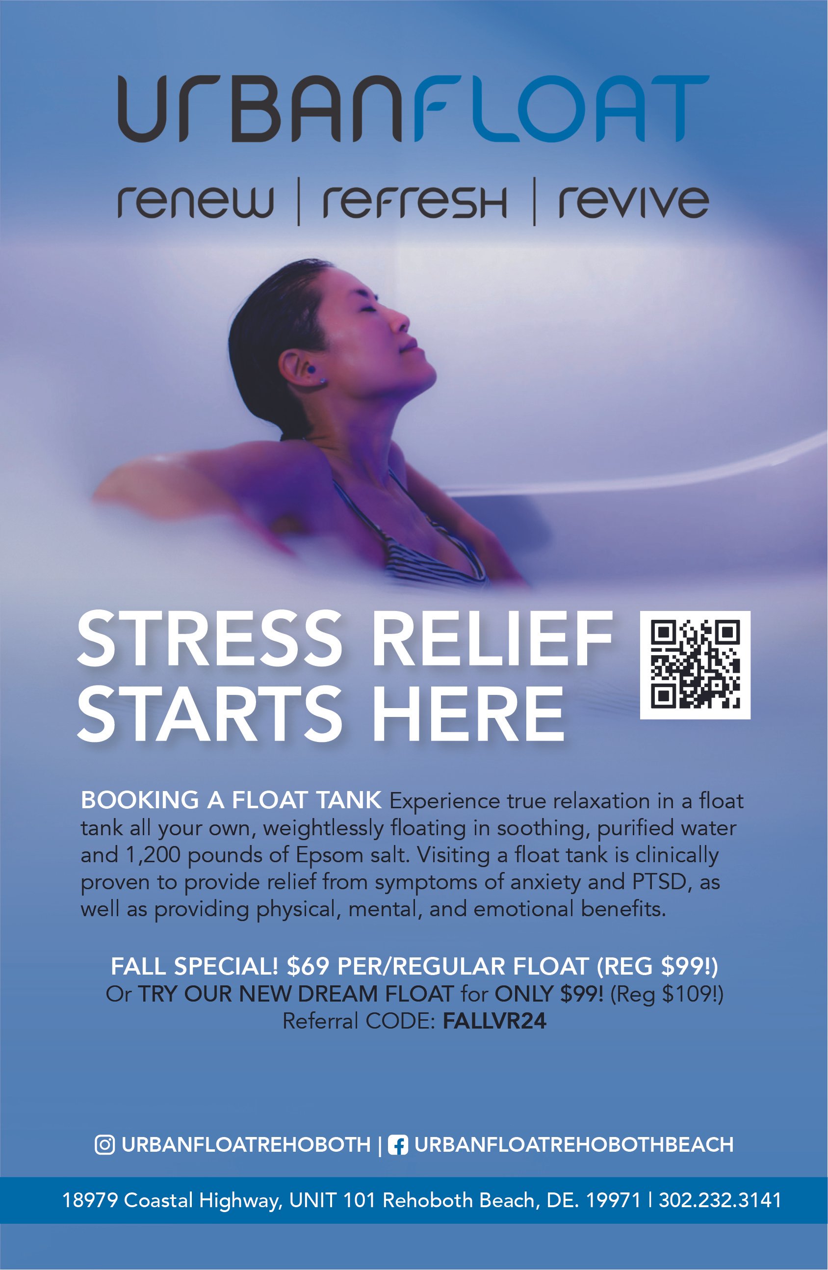
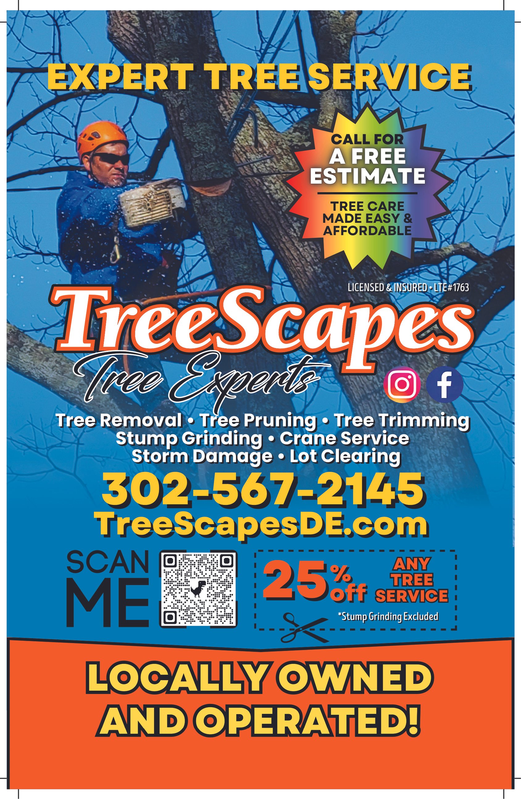
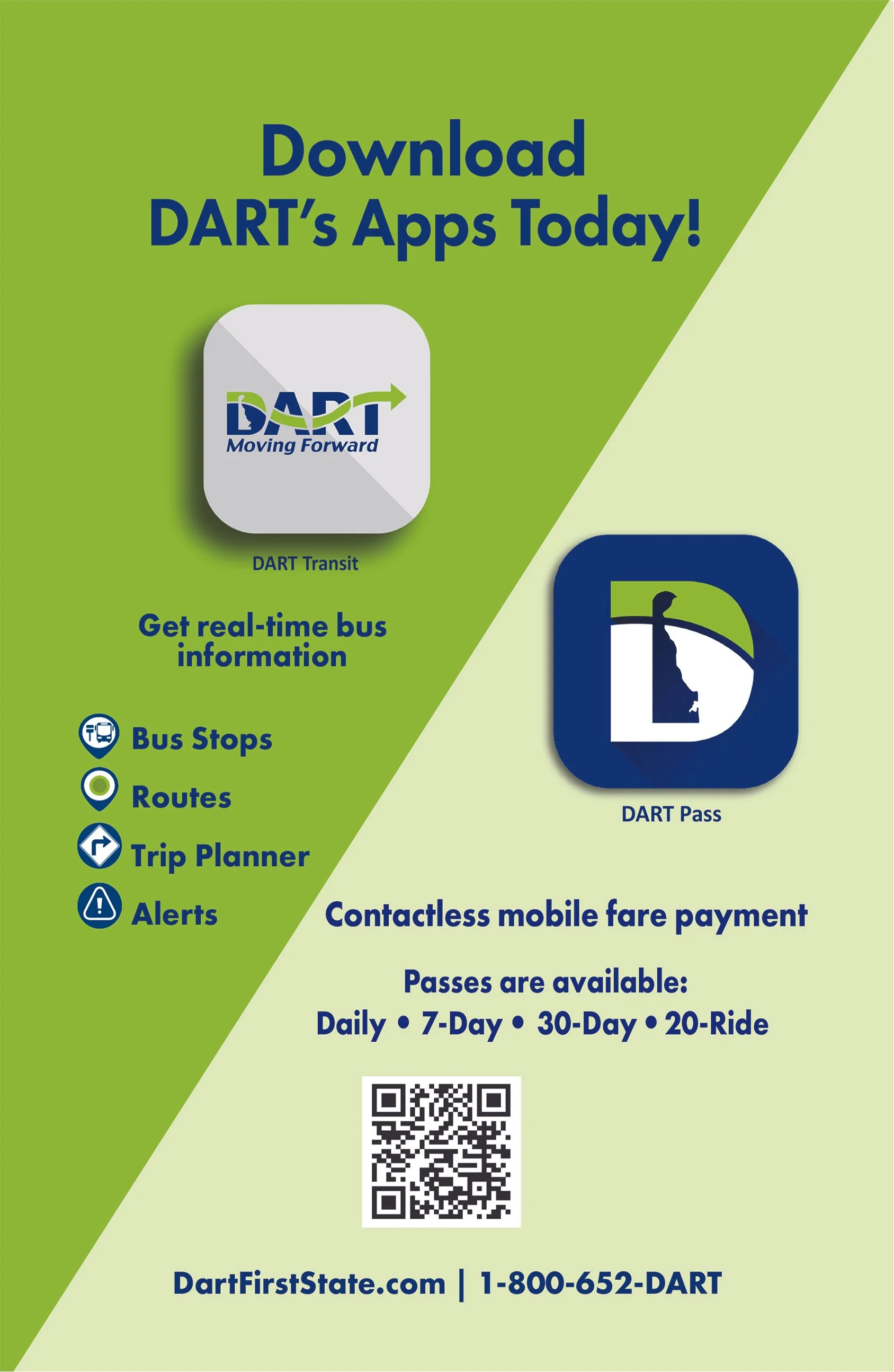
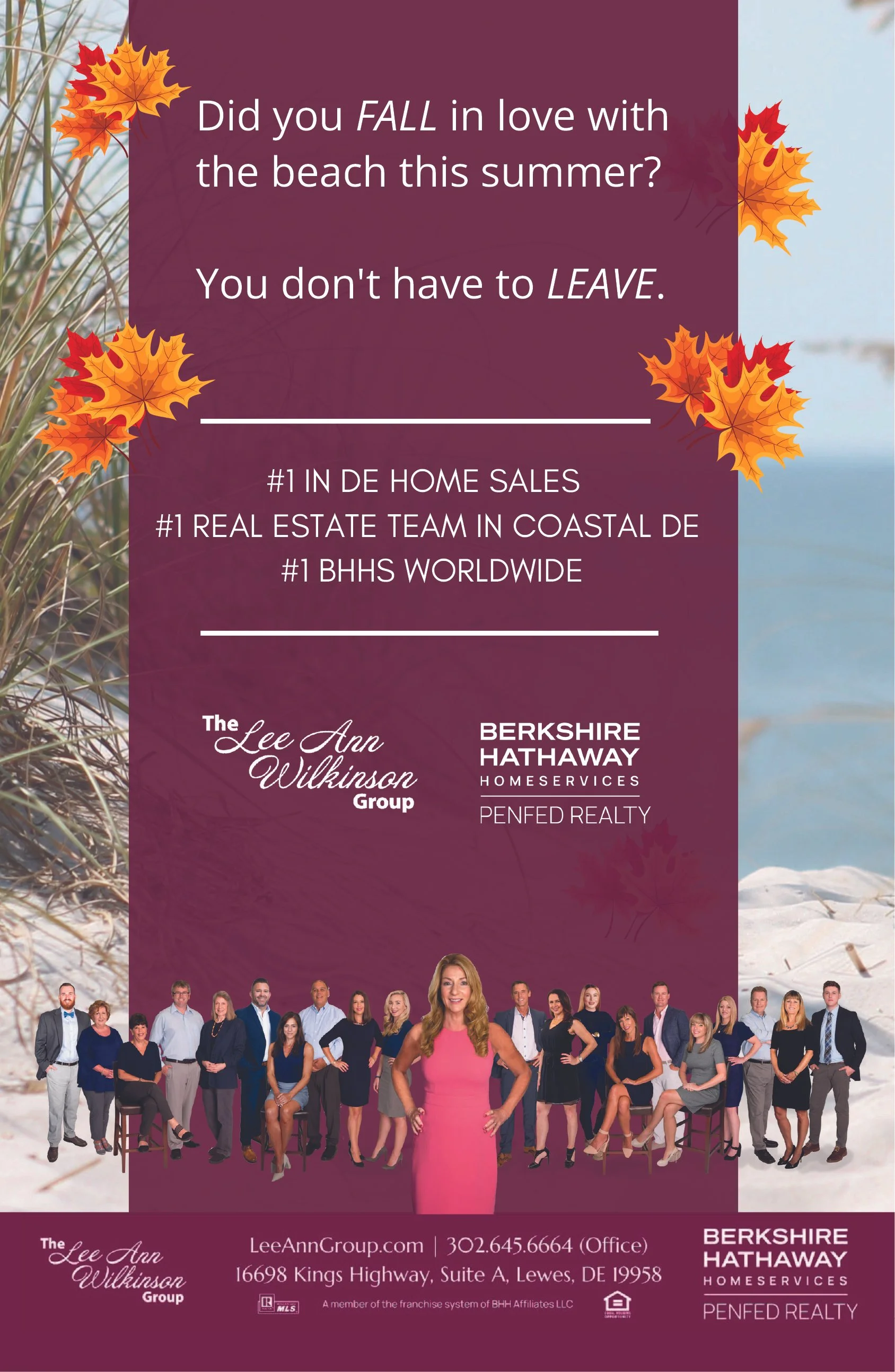
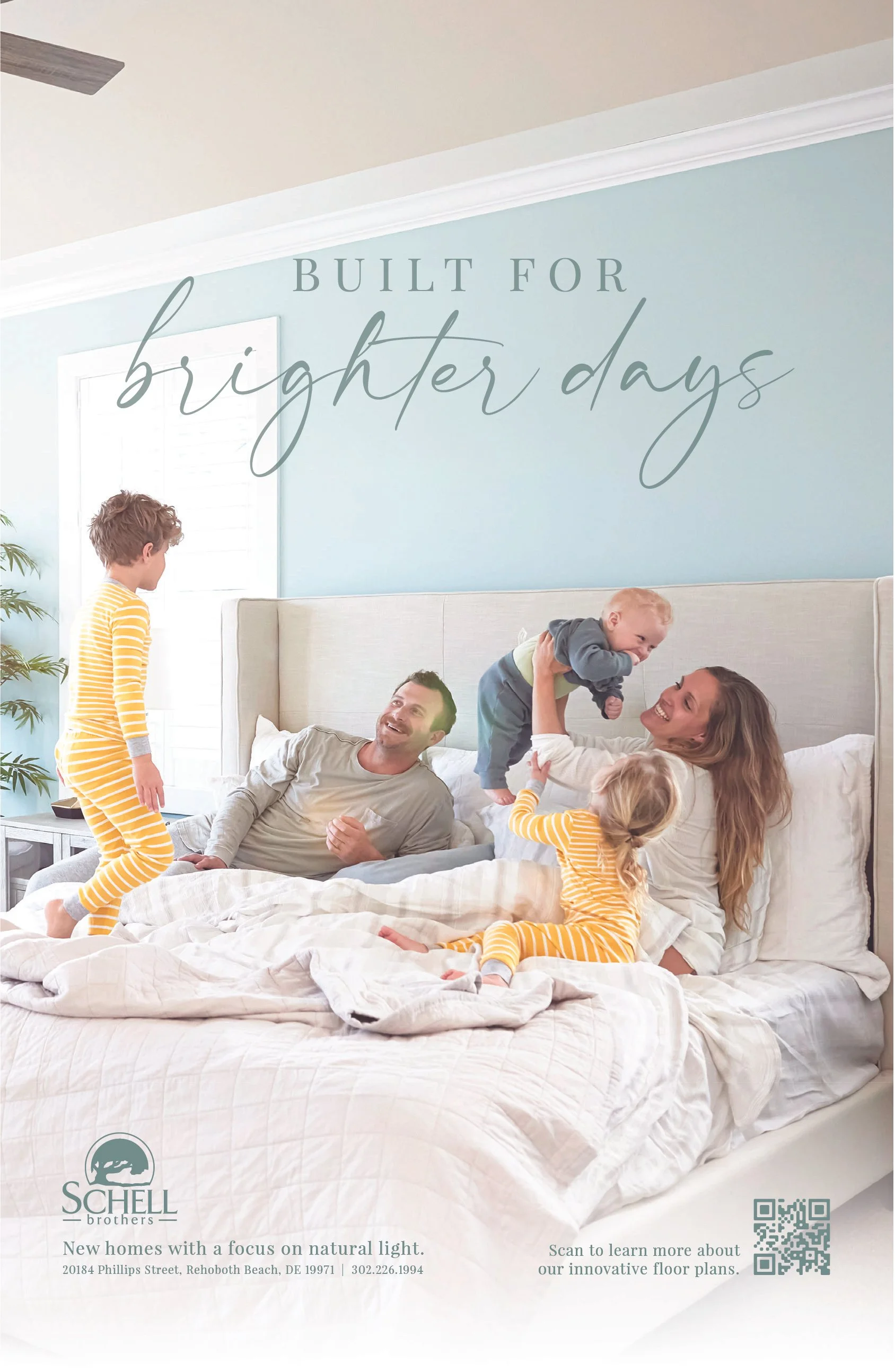
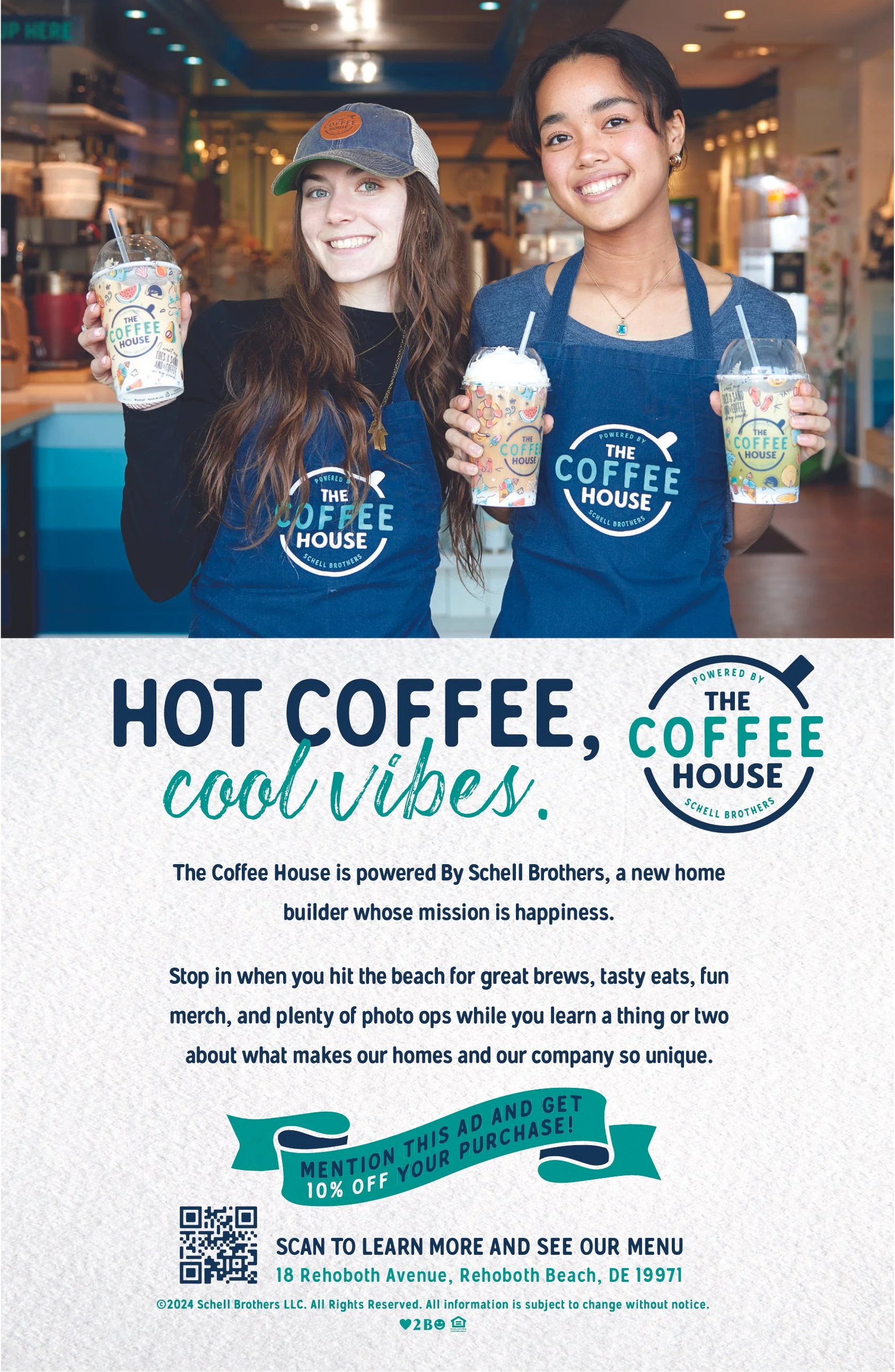
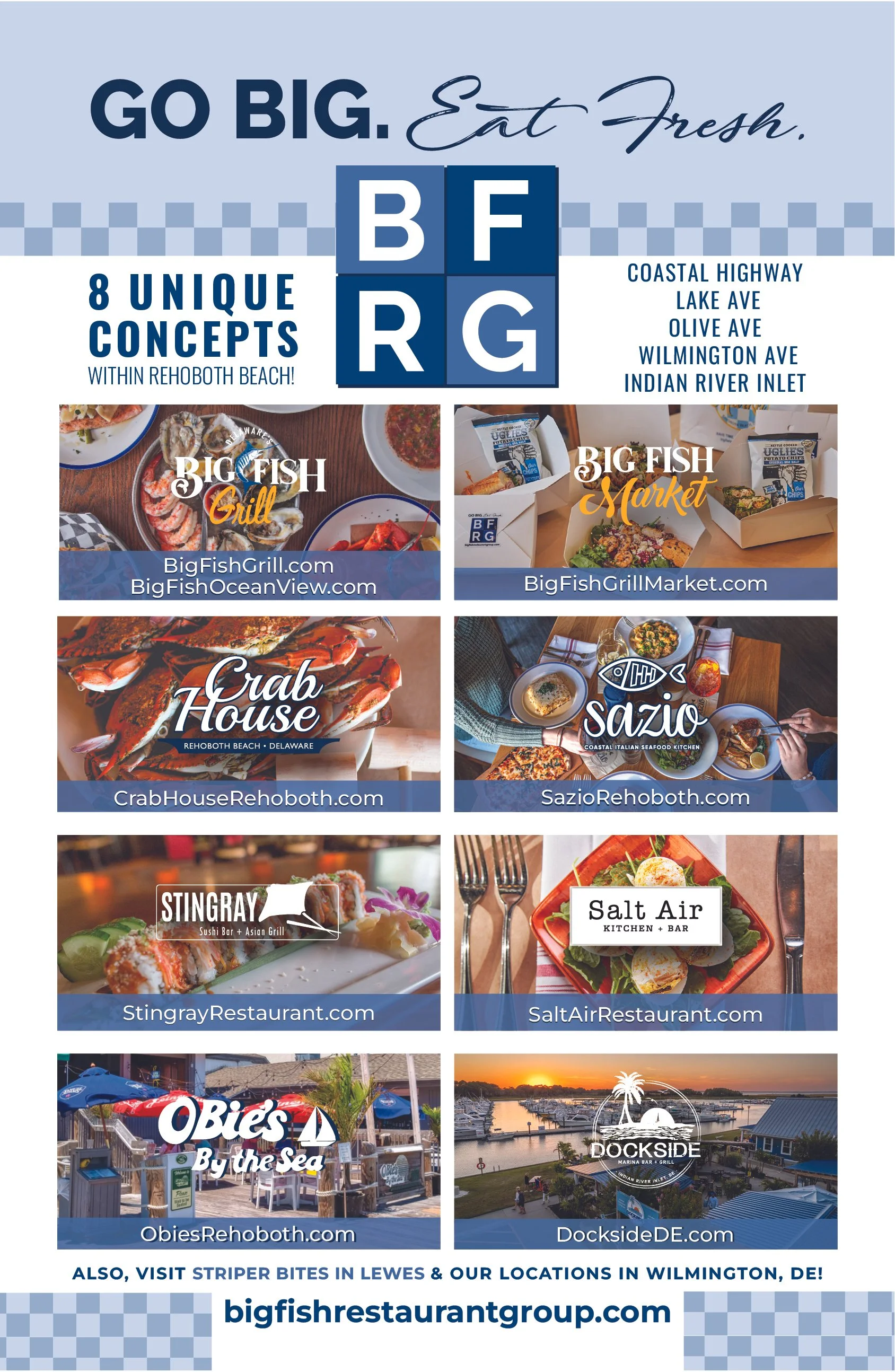
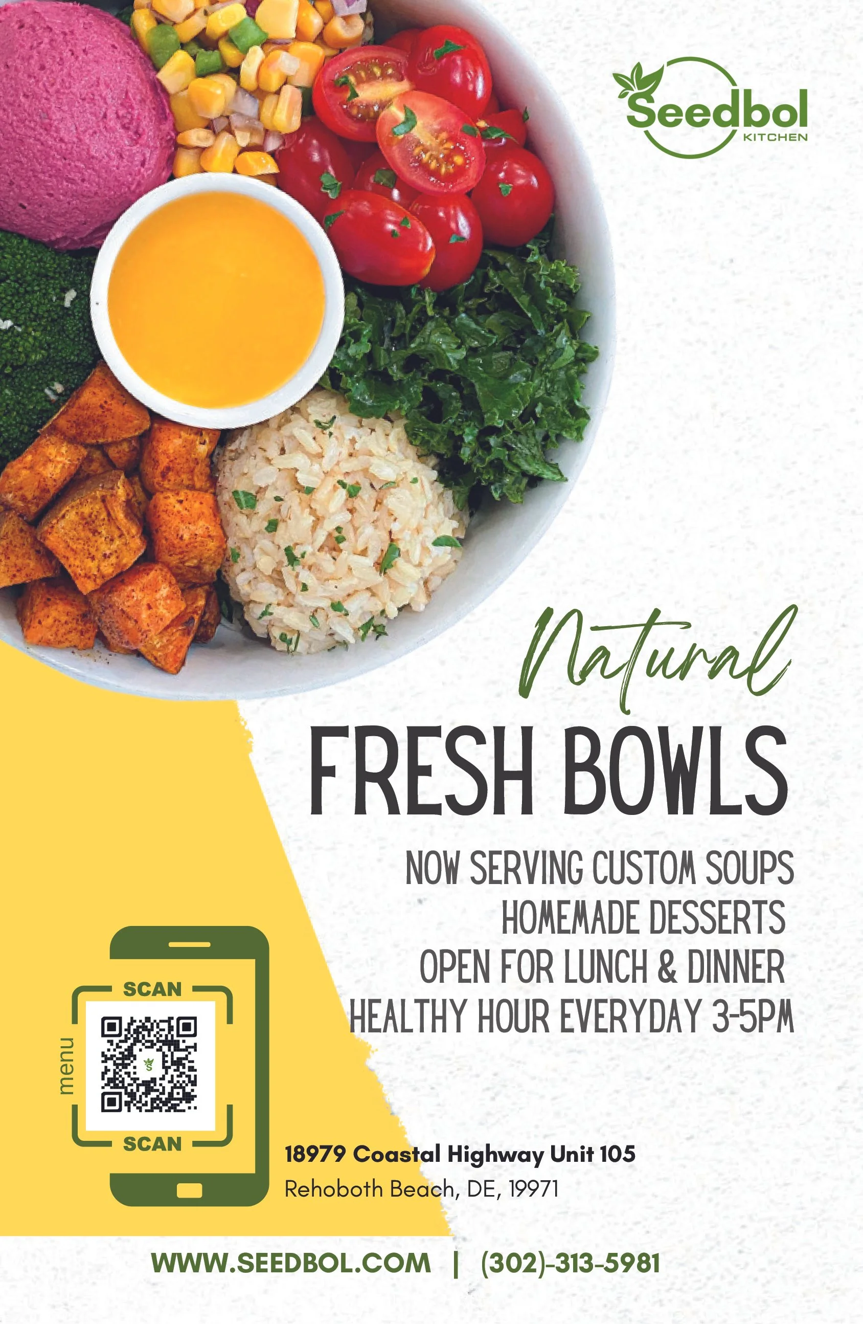
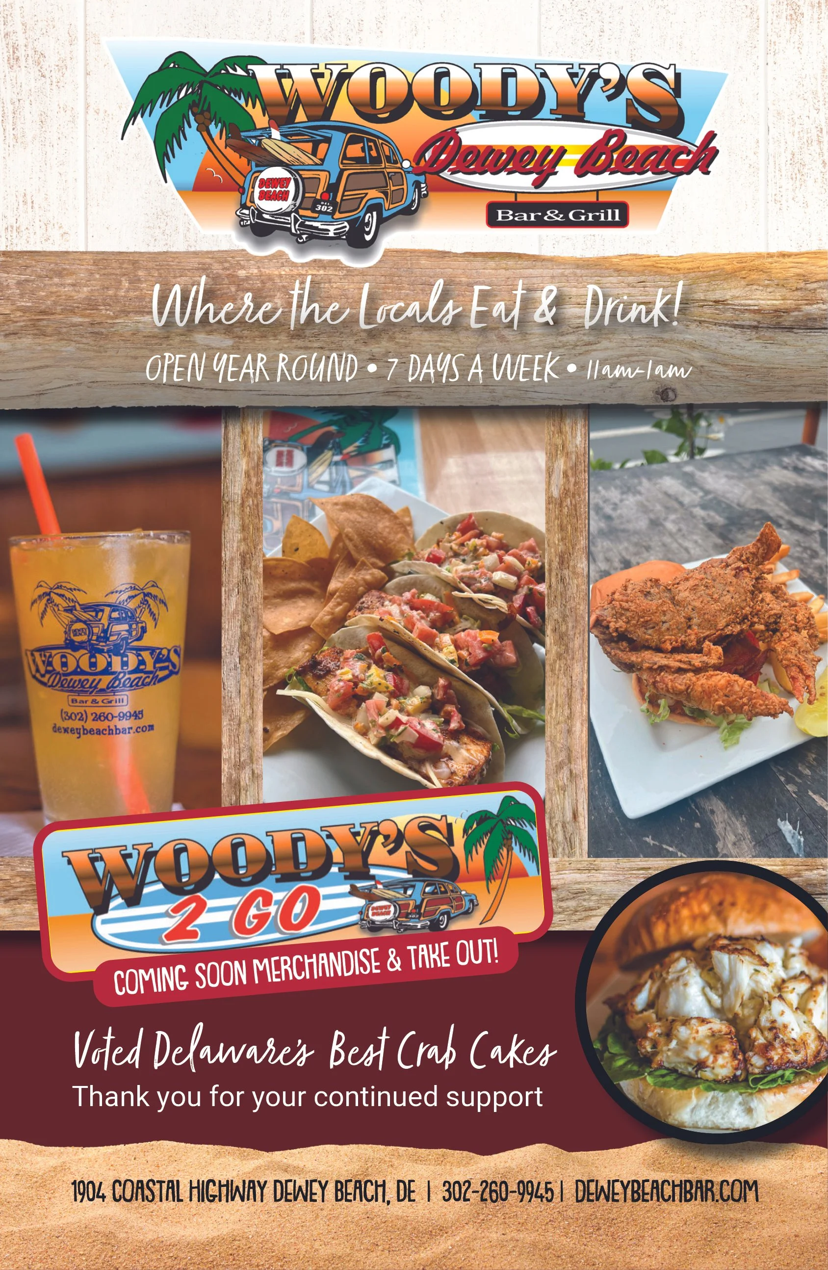
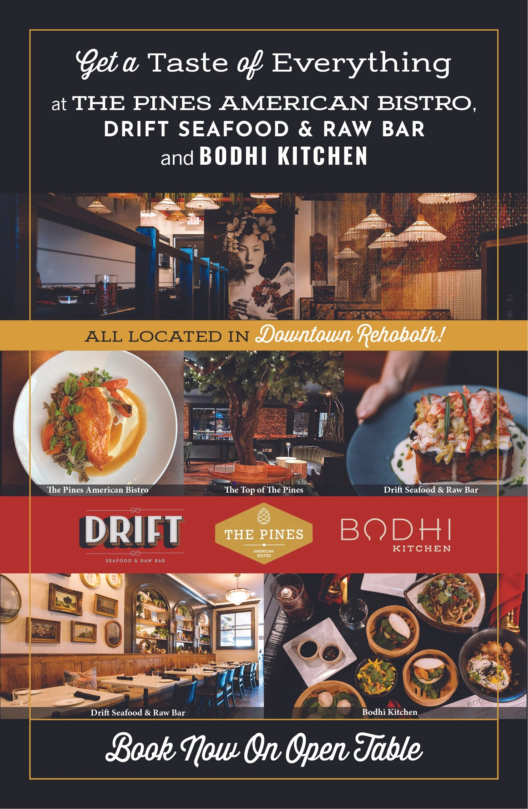
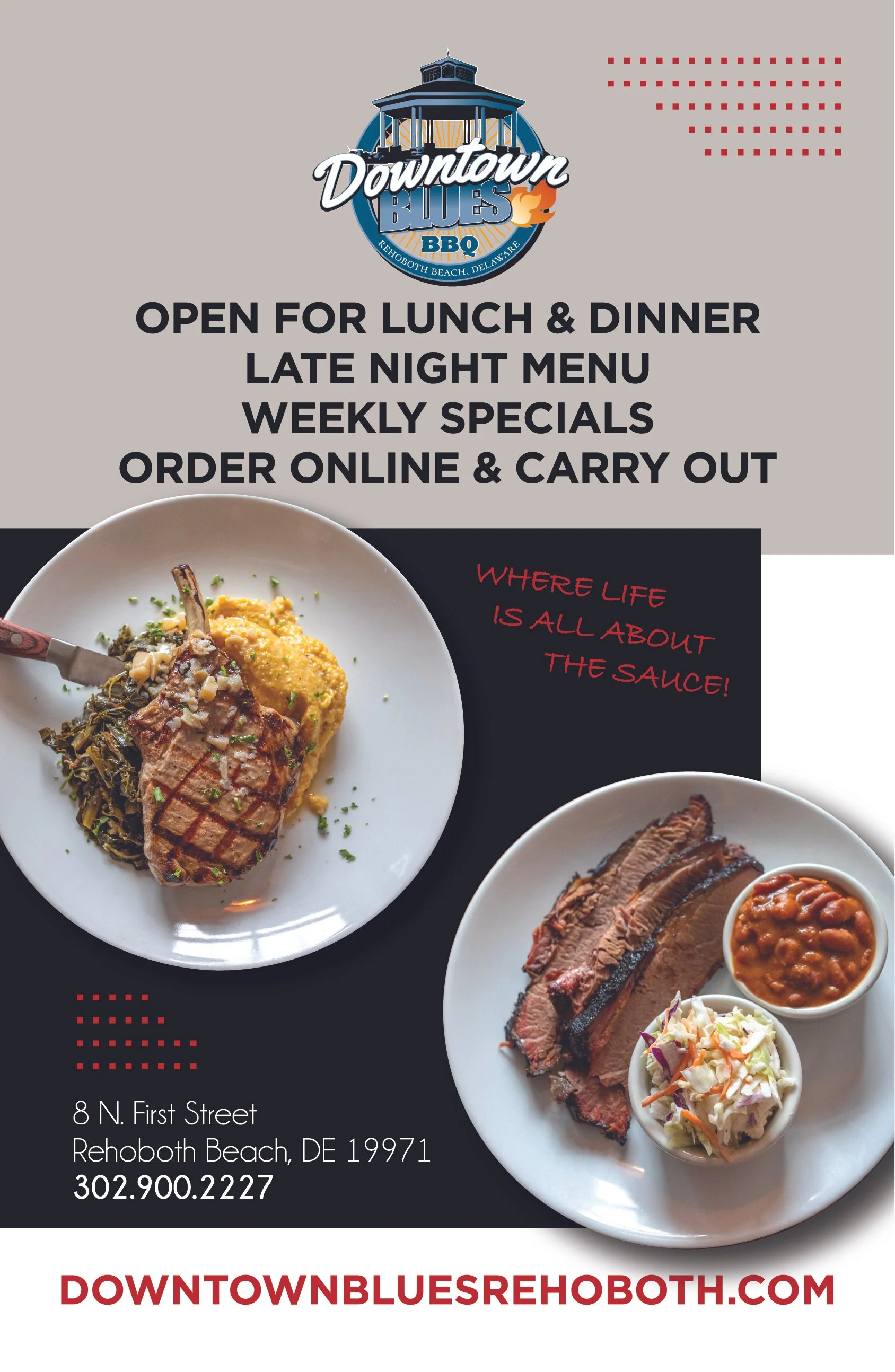
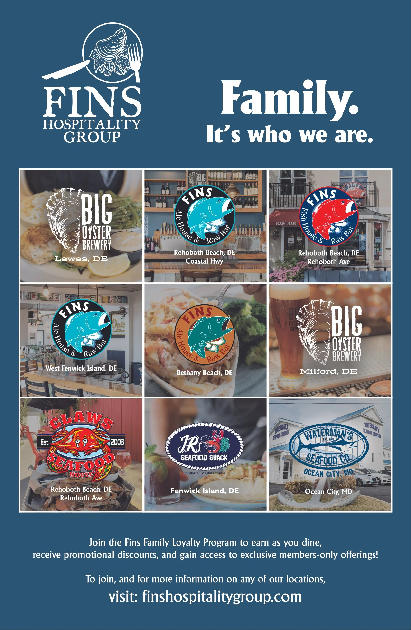
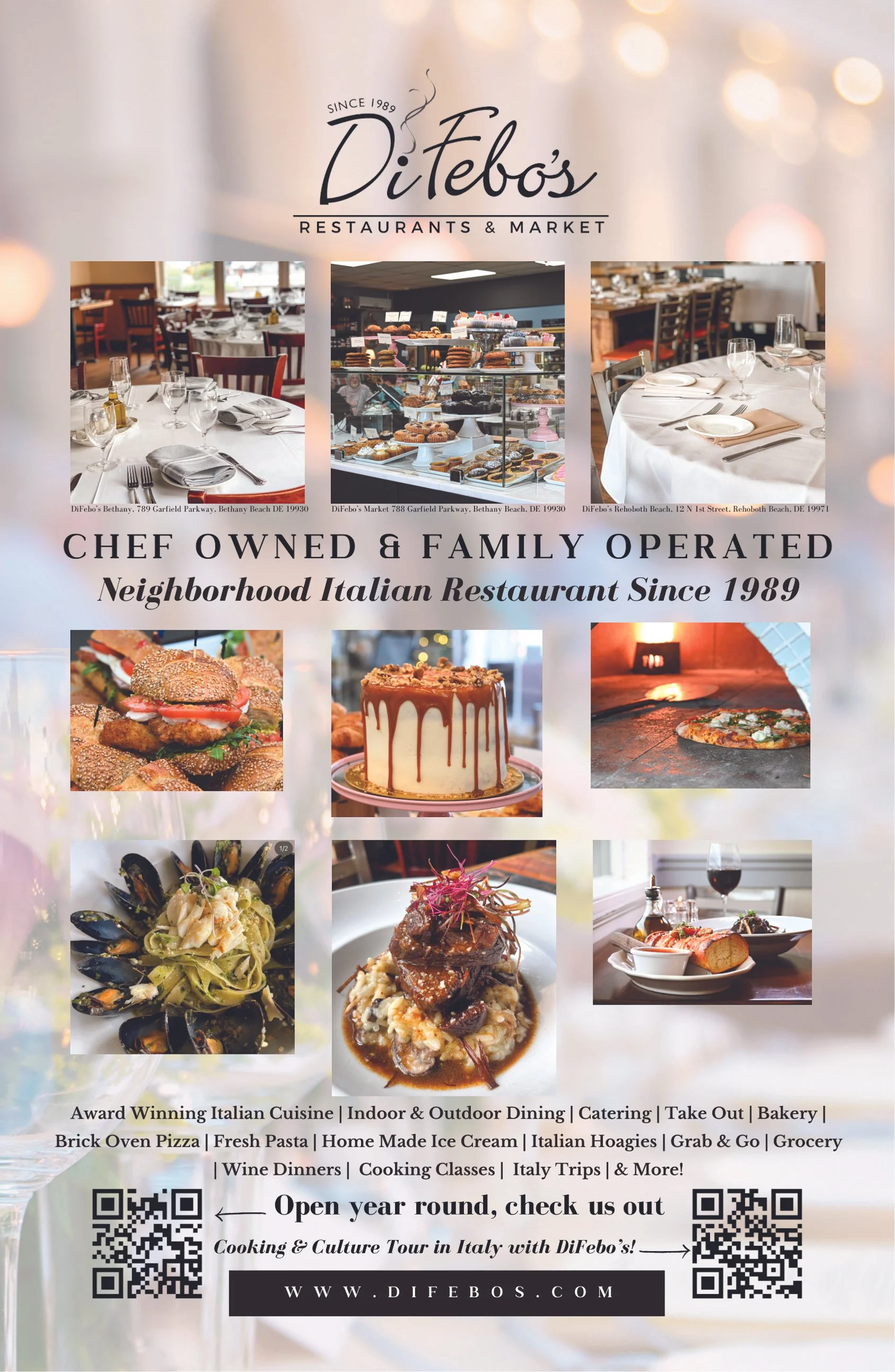
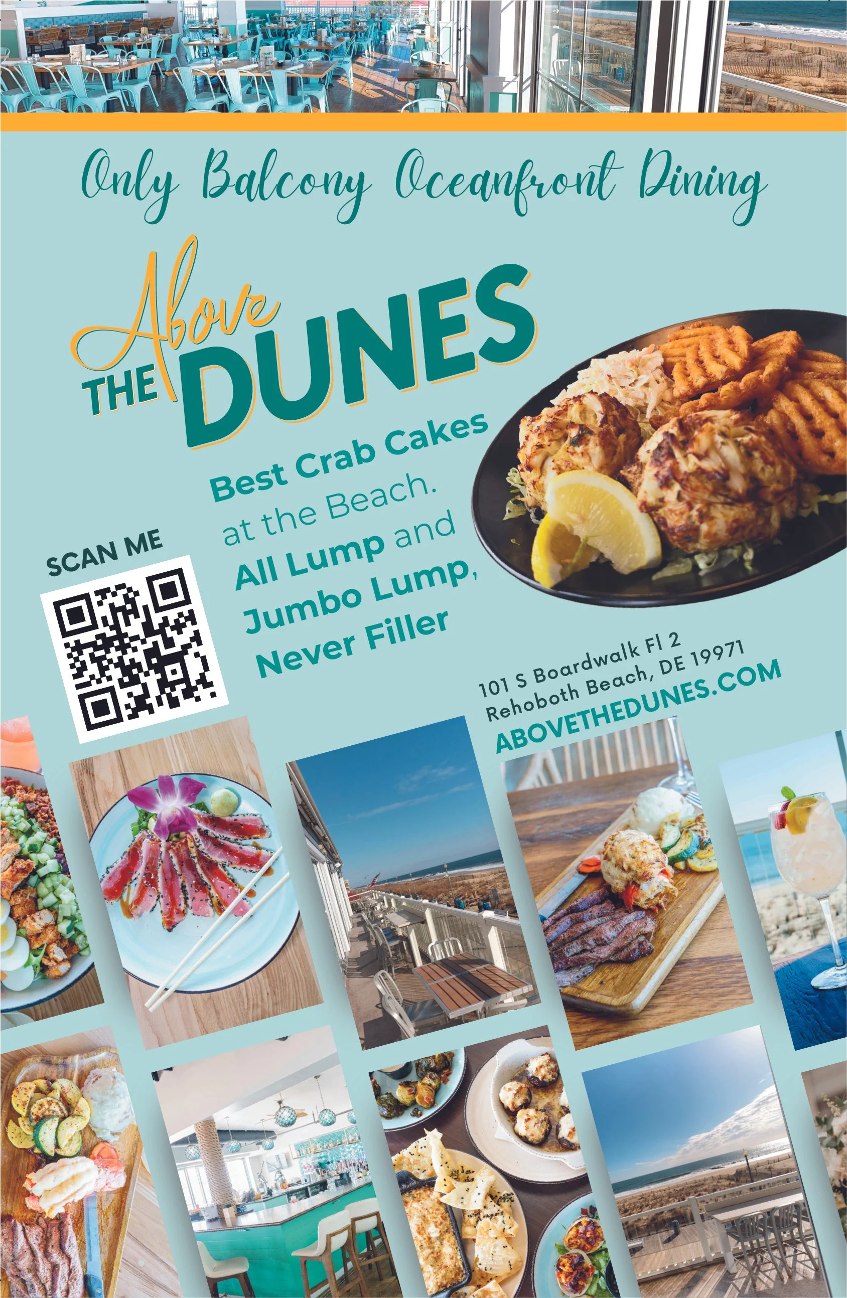
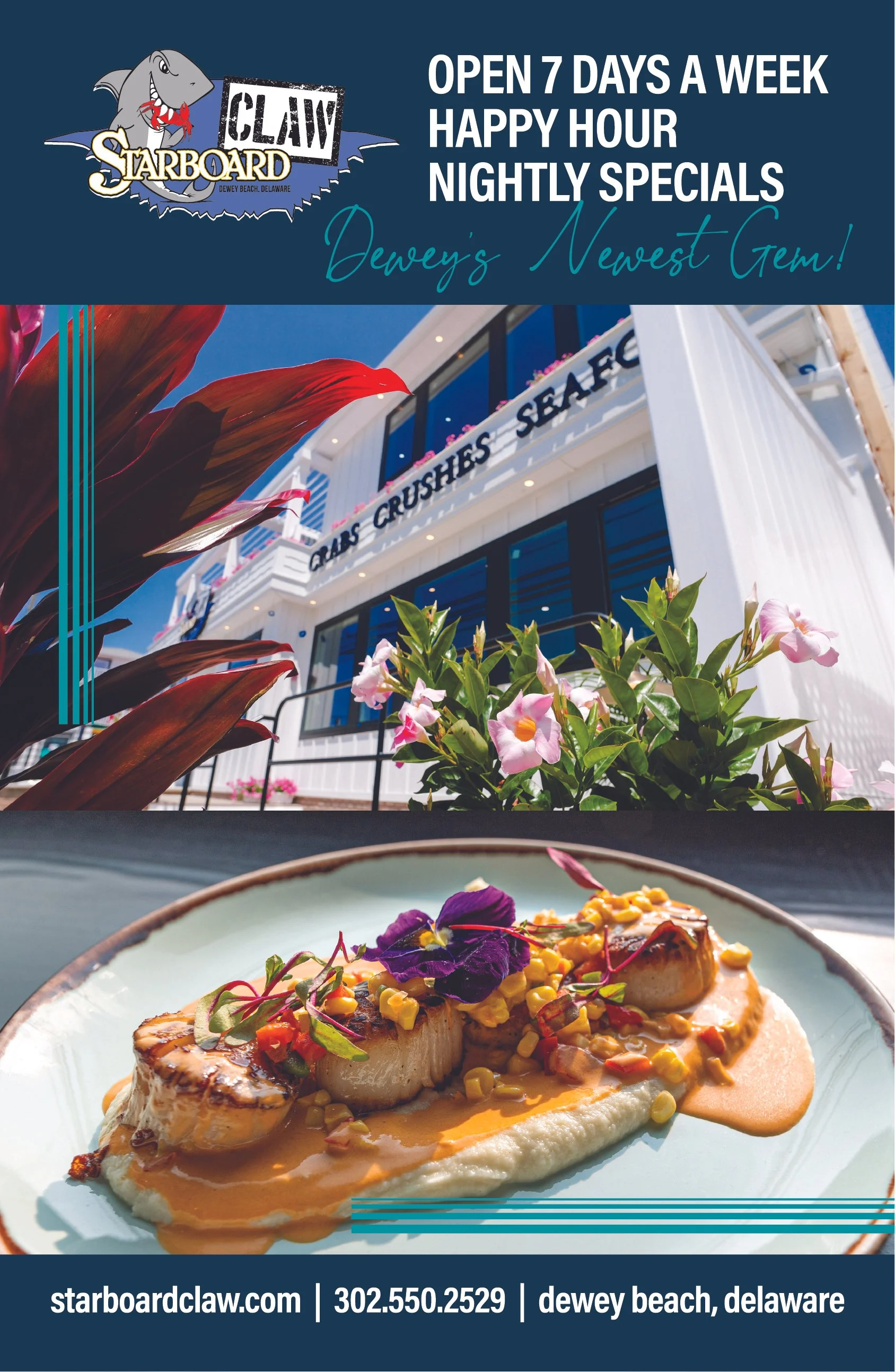
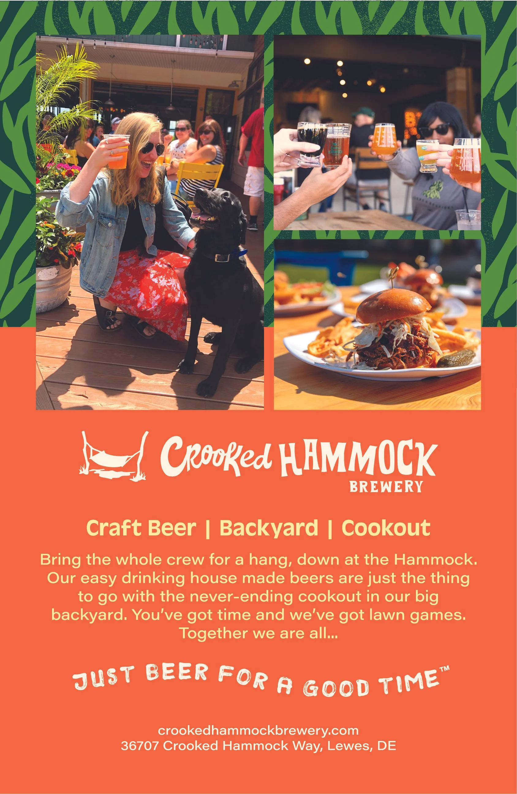
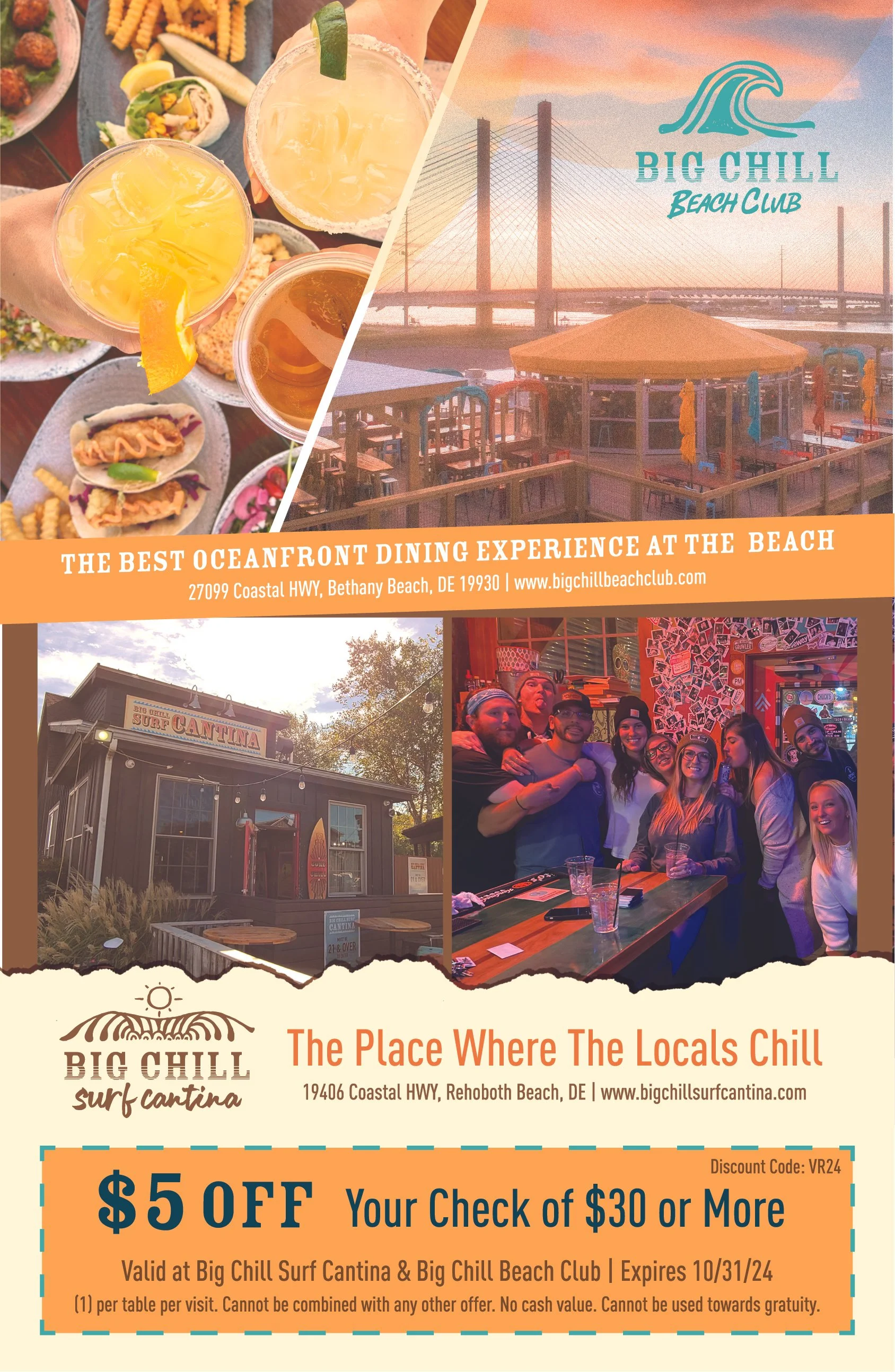
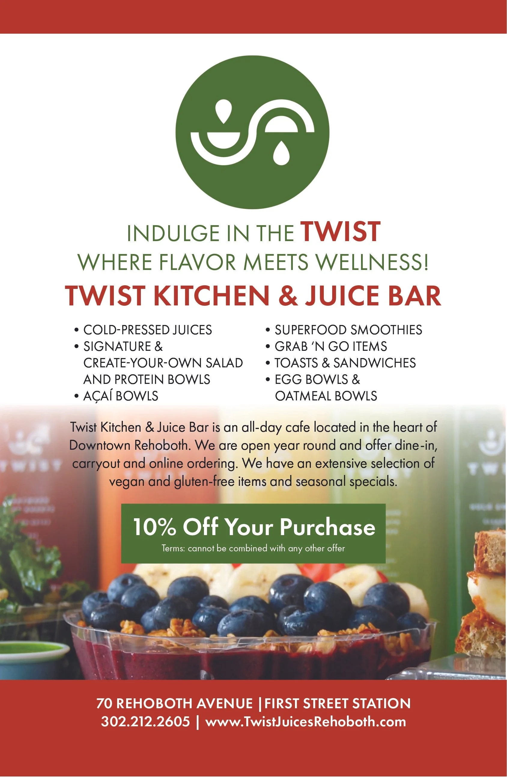
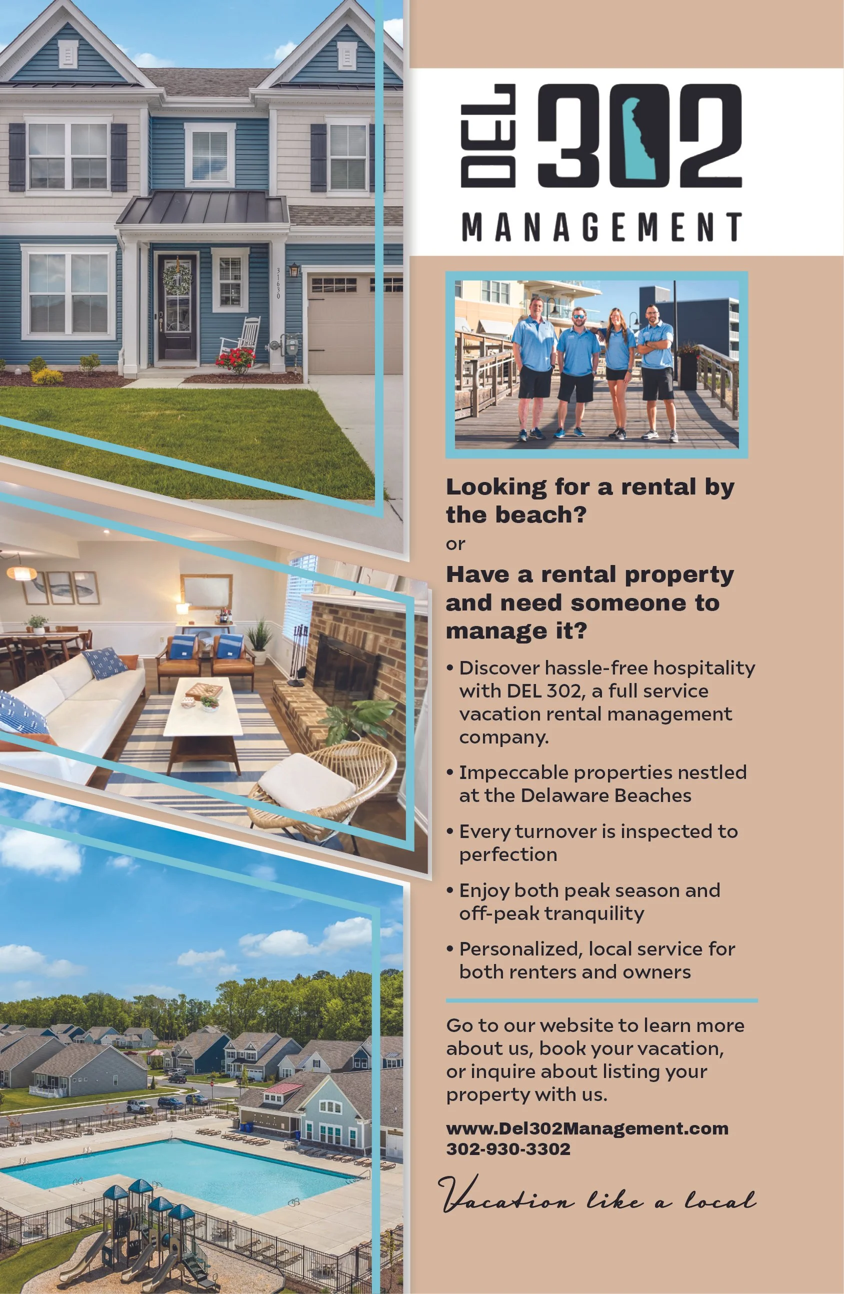
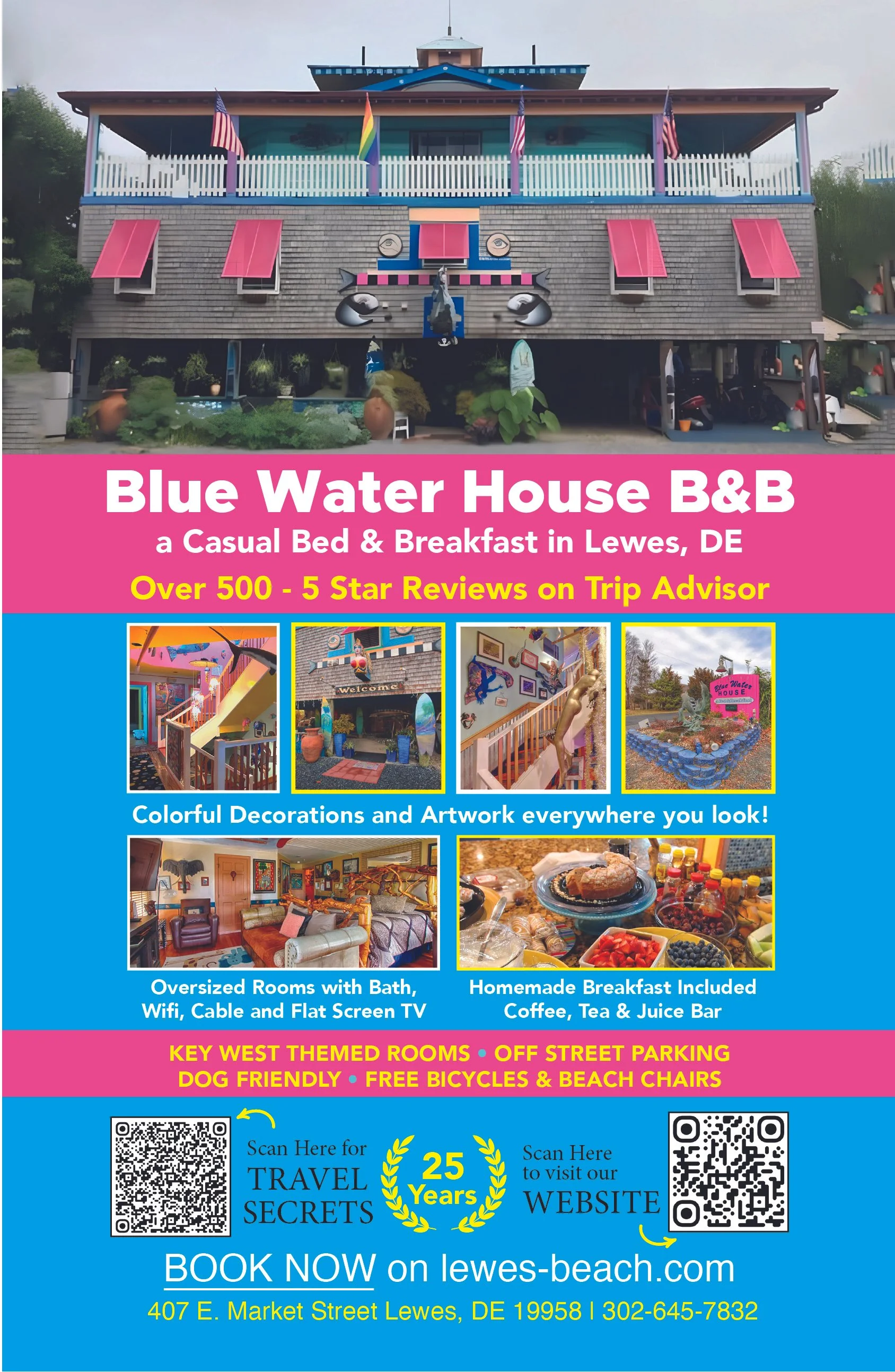
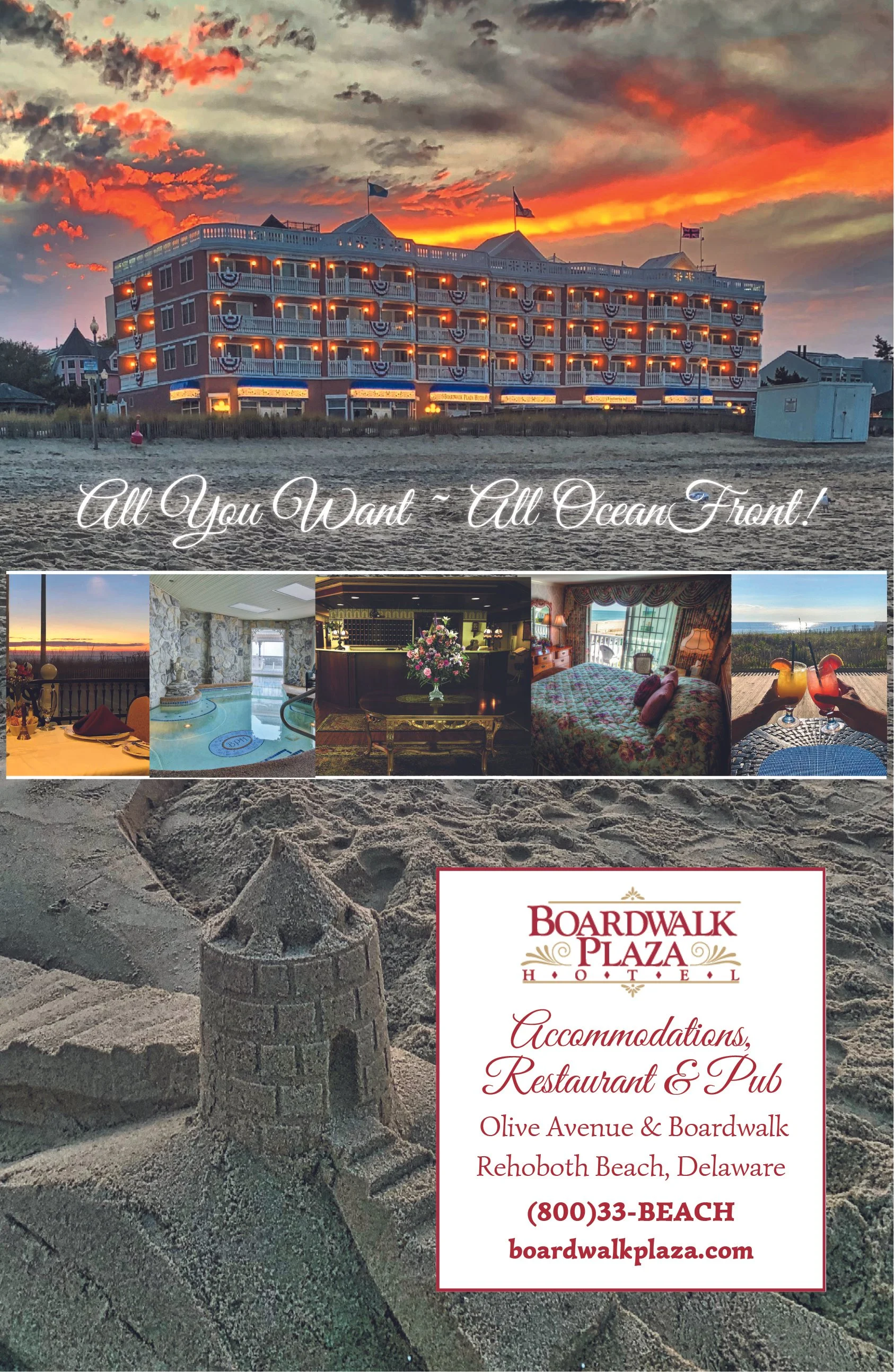
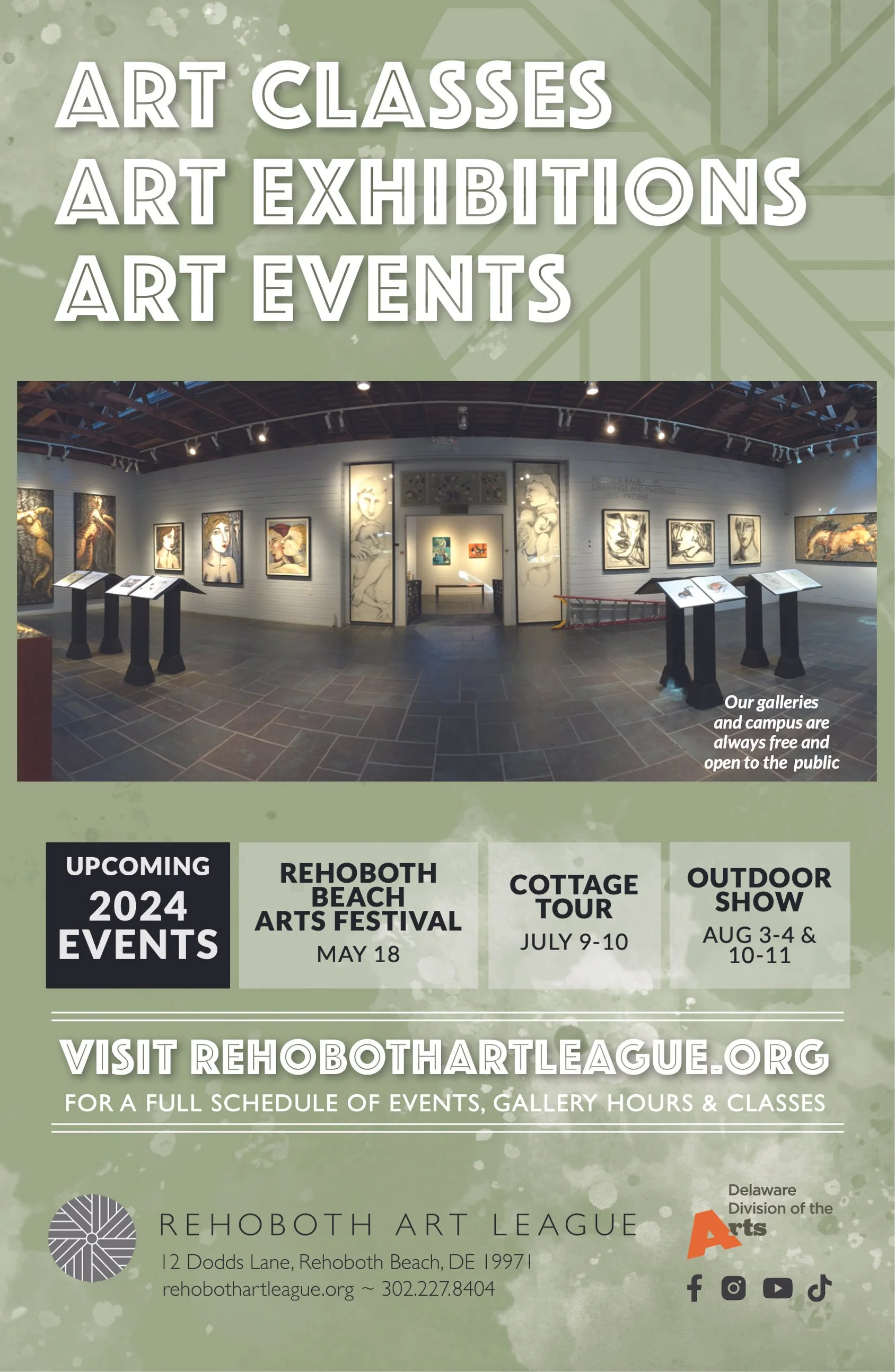
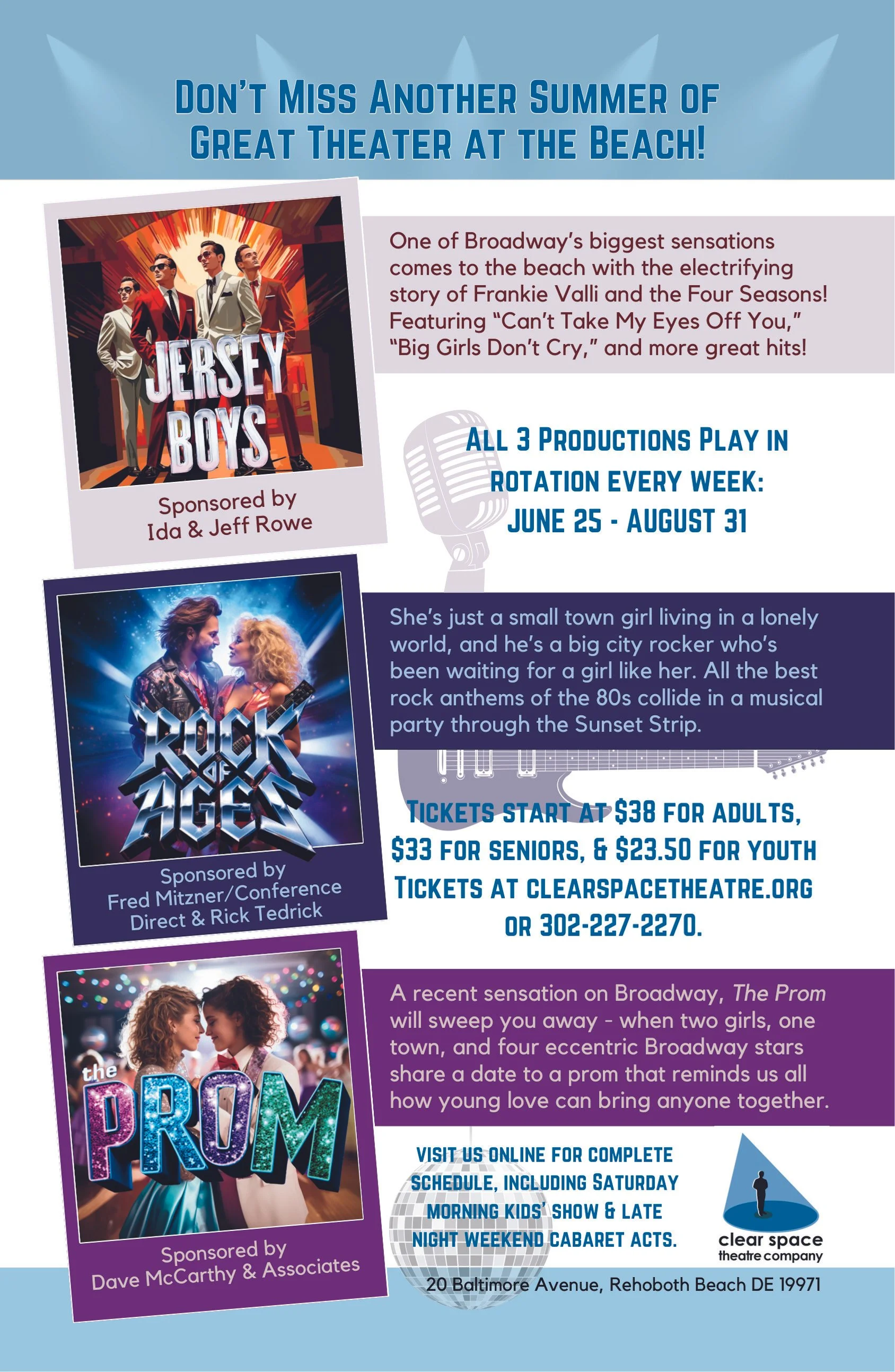
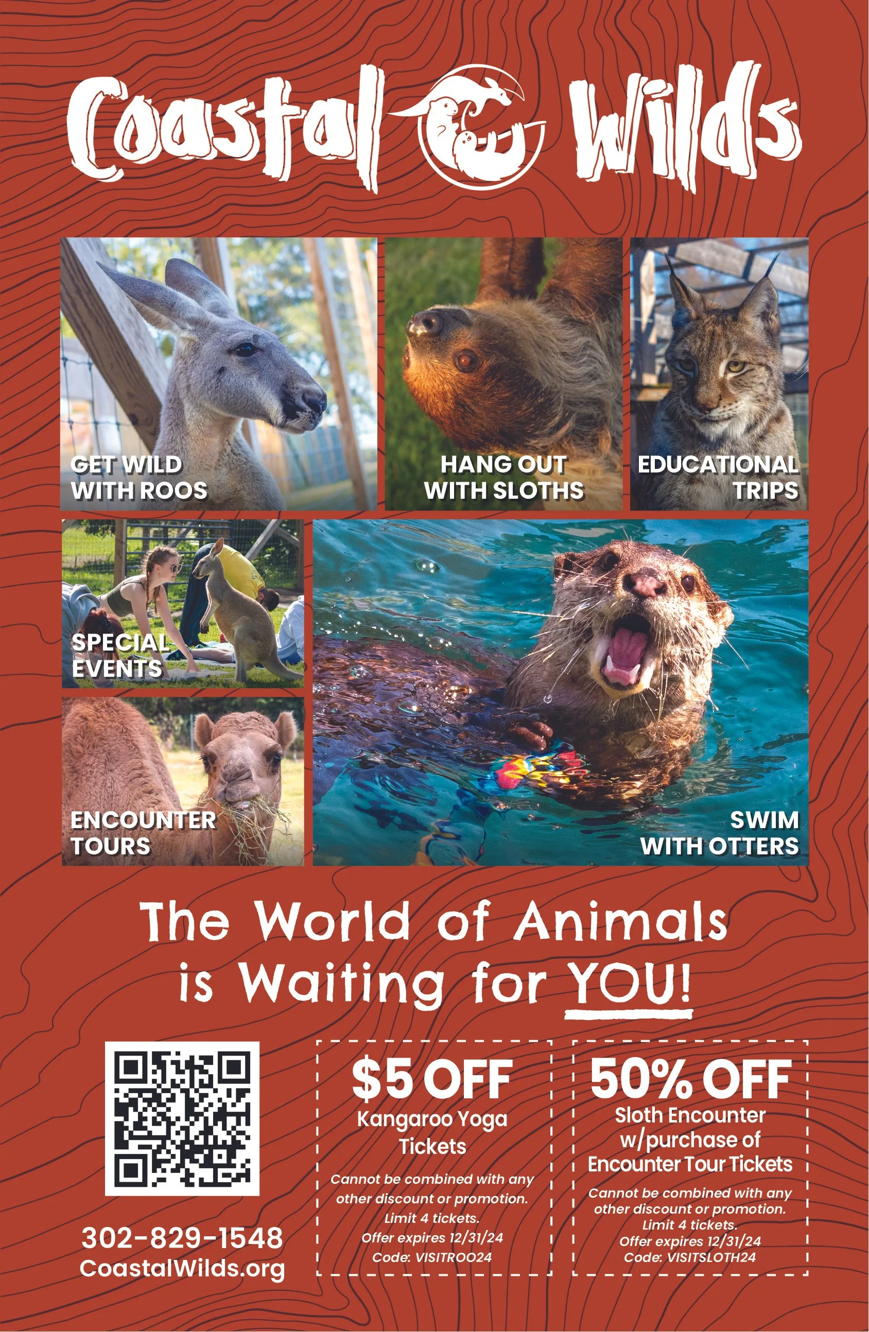
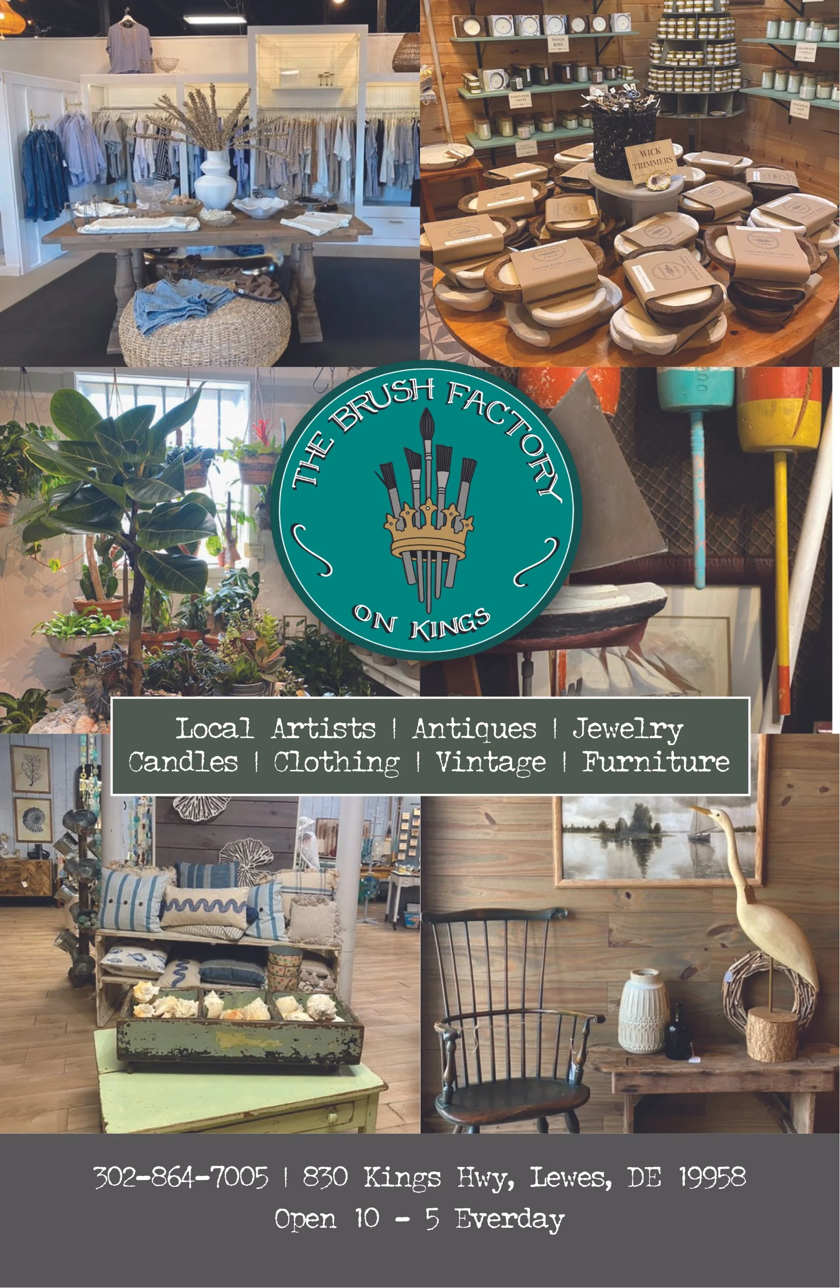
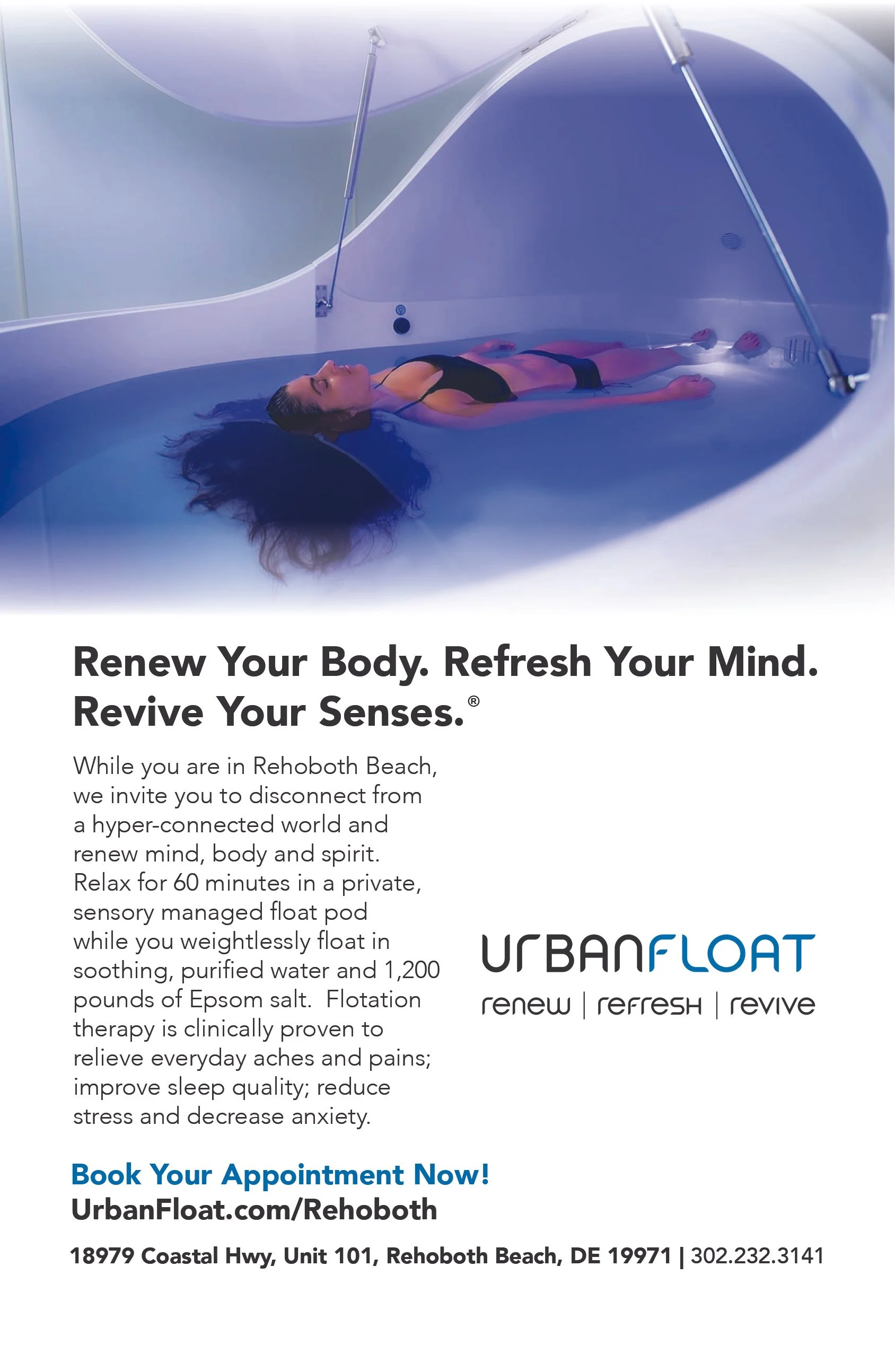
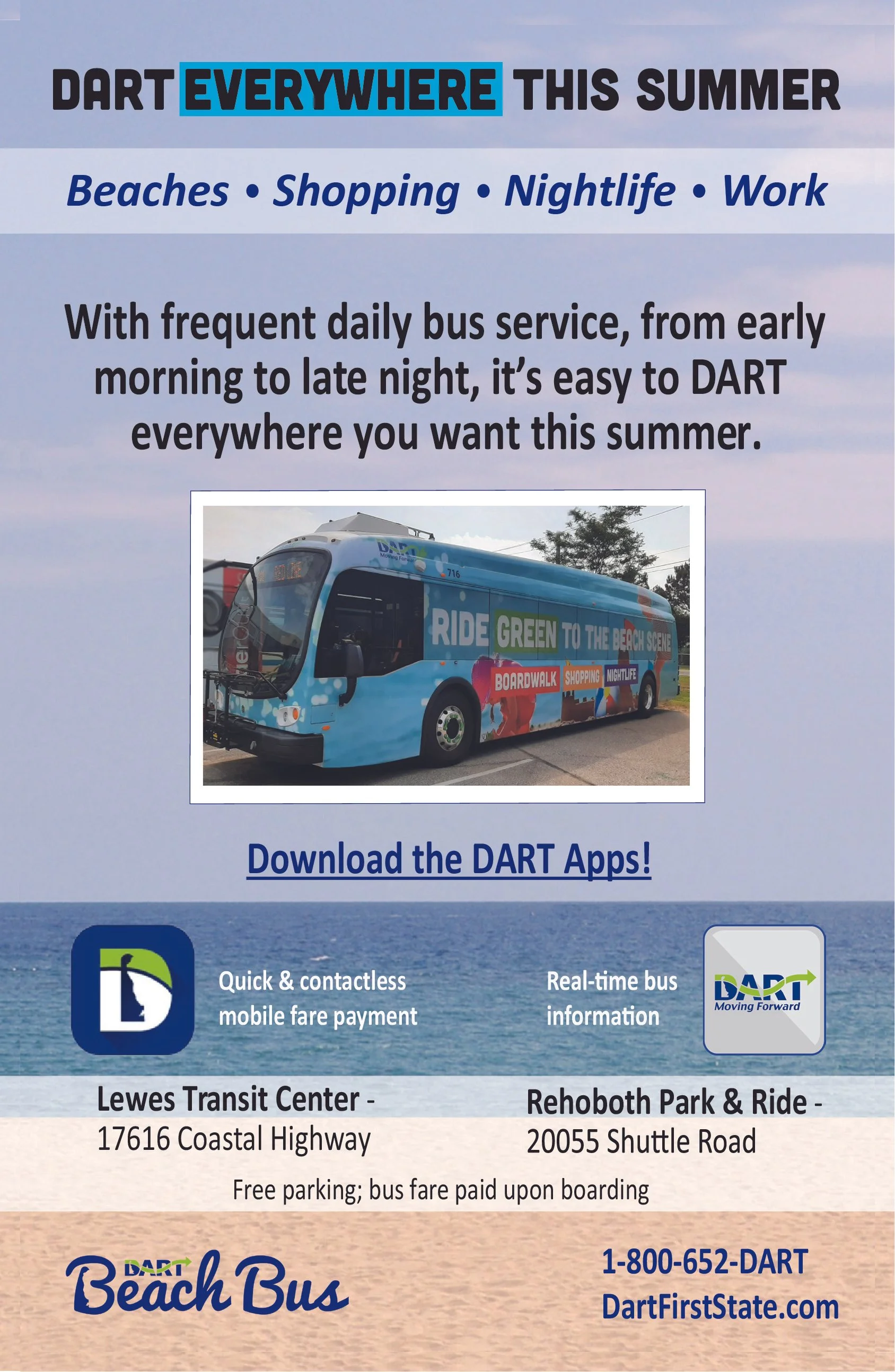
Because the guide also served as a promotional platform for businesses throughout the region, advertiser content needed to feel naturally integrated without compromising the editorial experience.
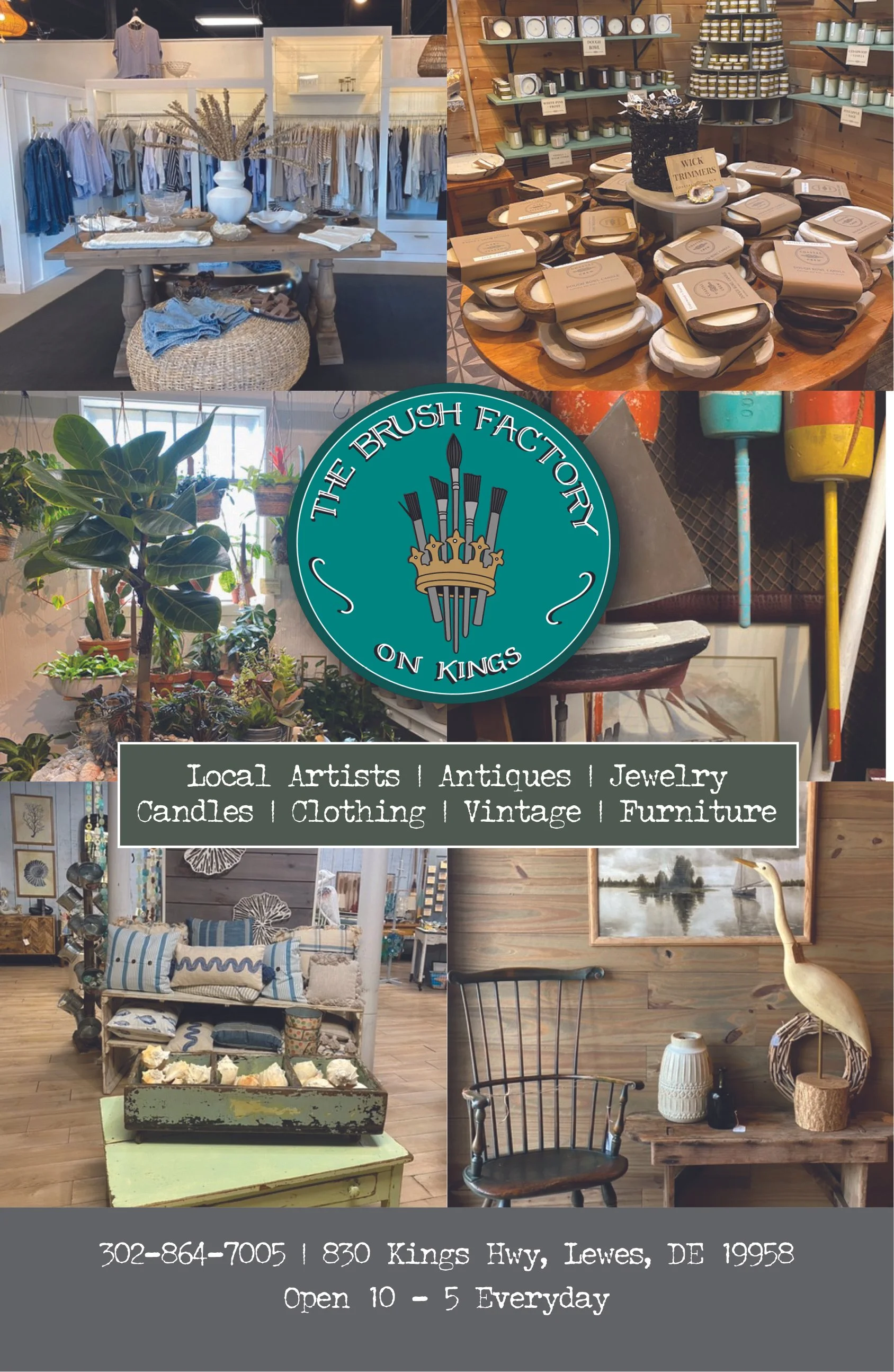
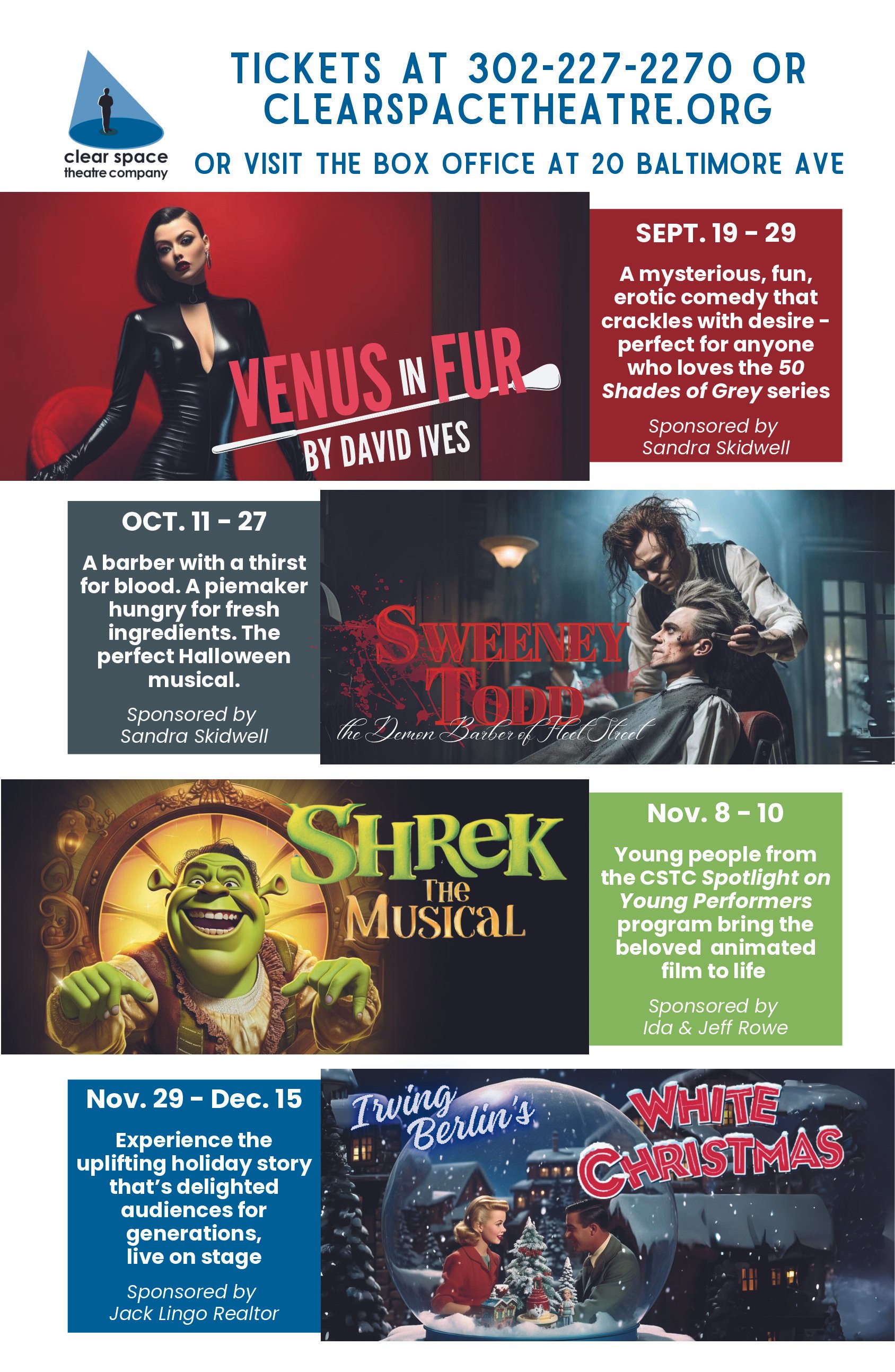
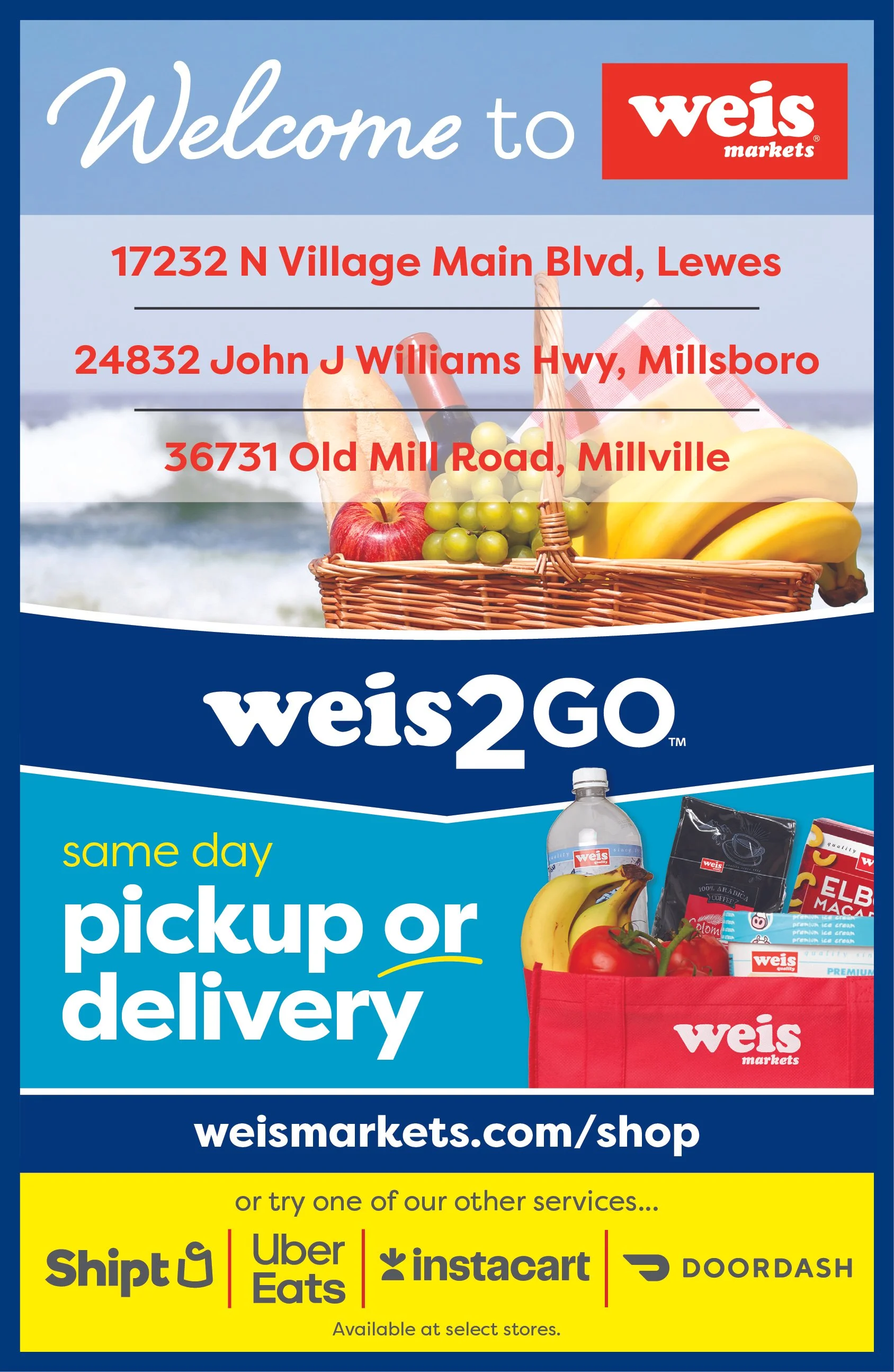
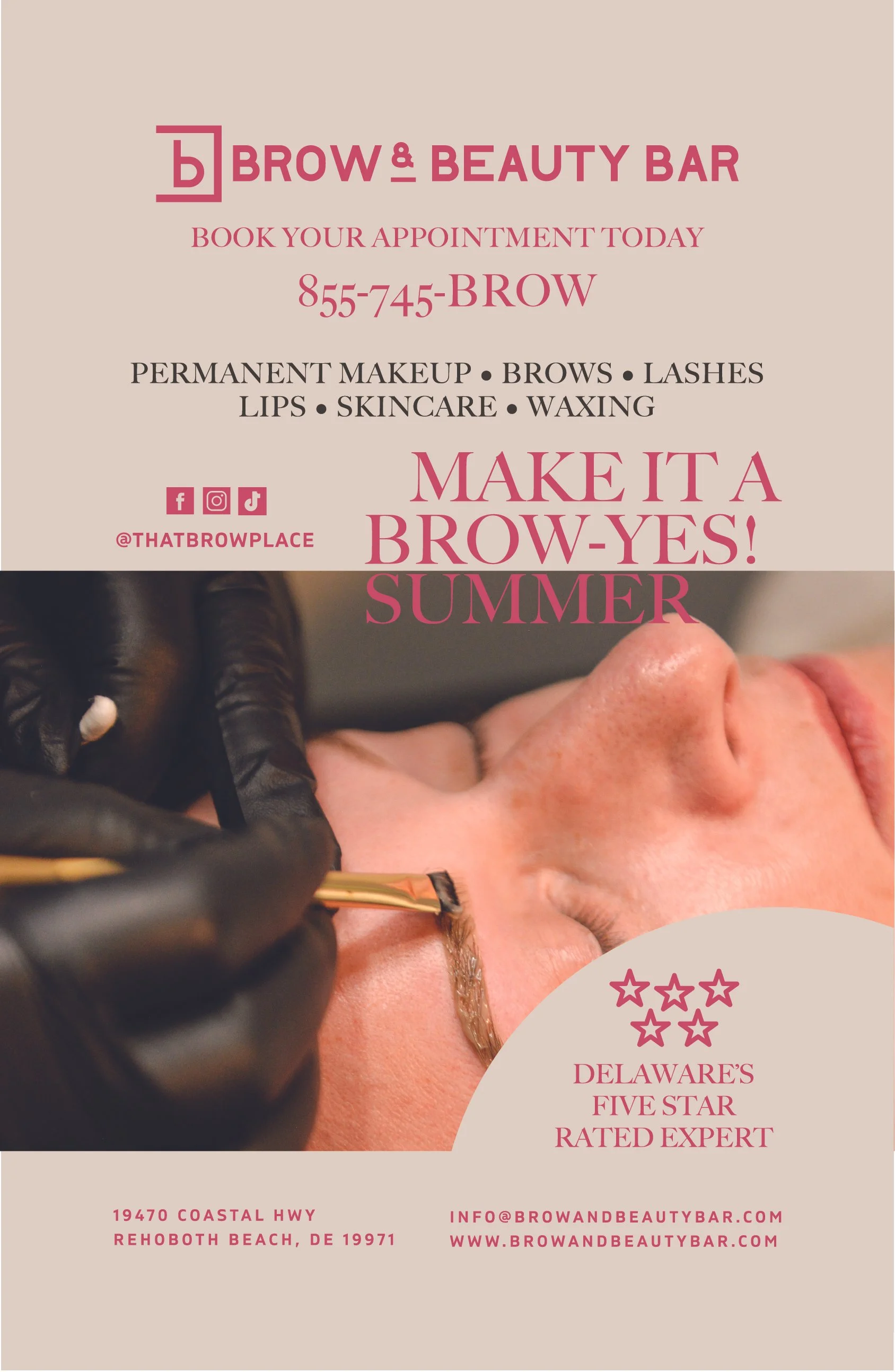
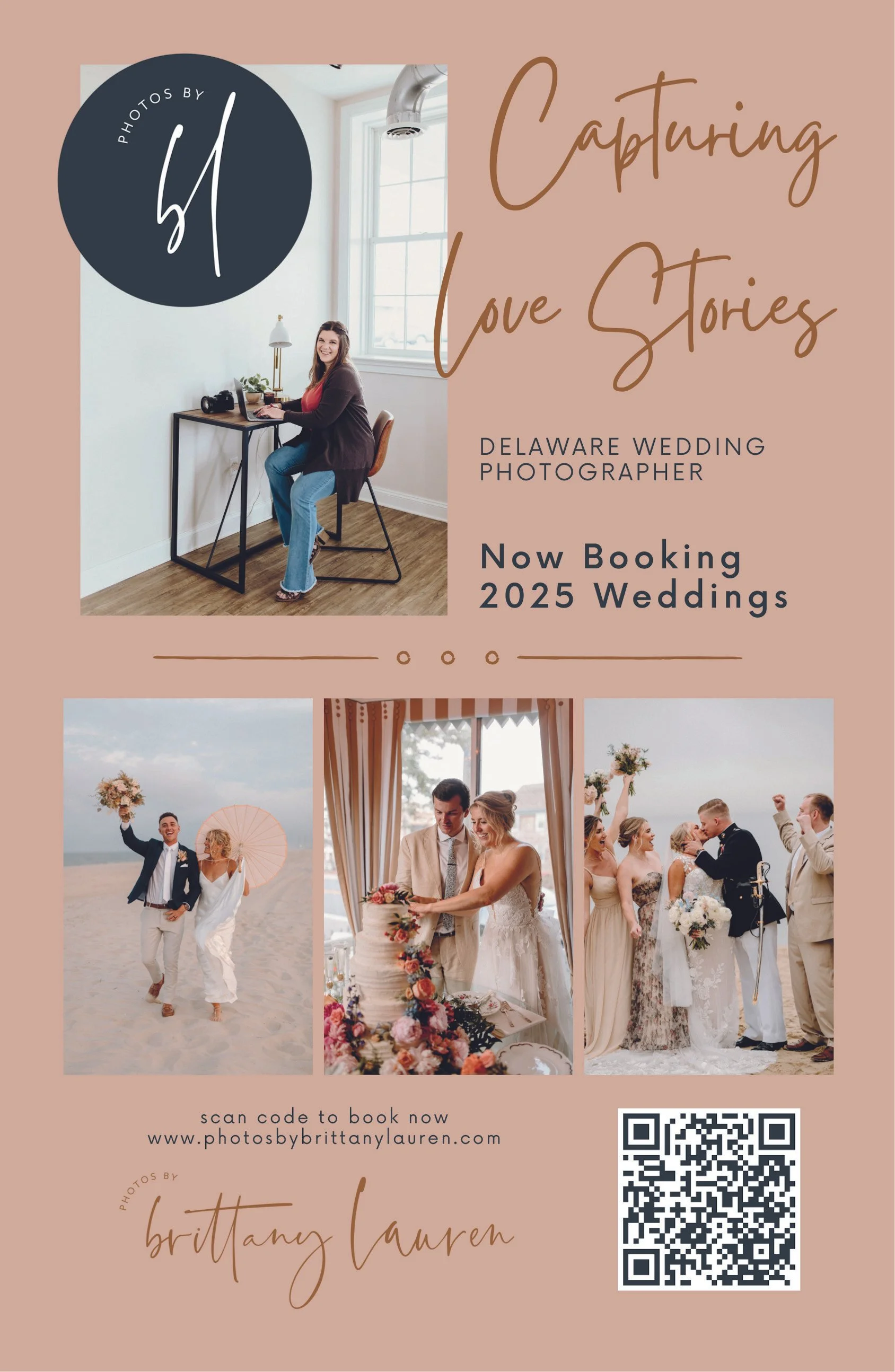
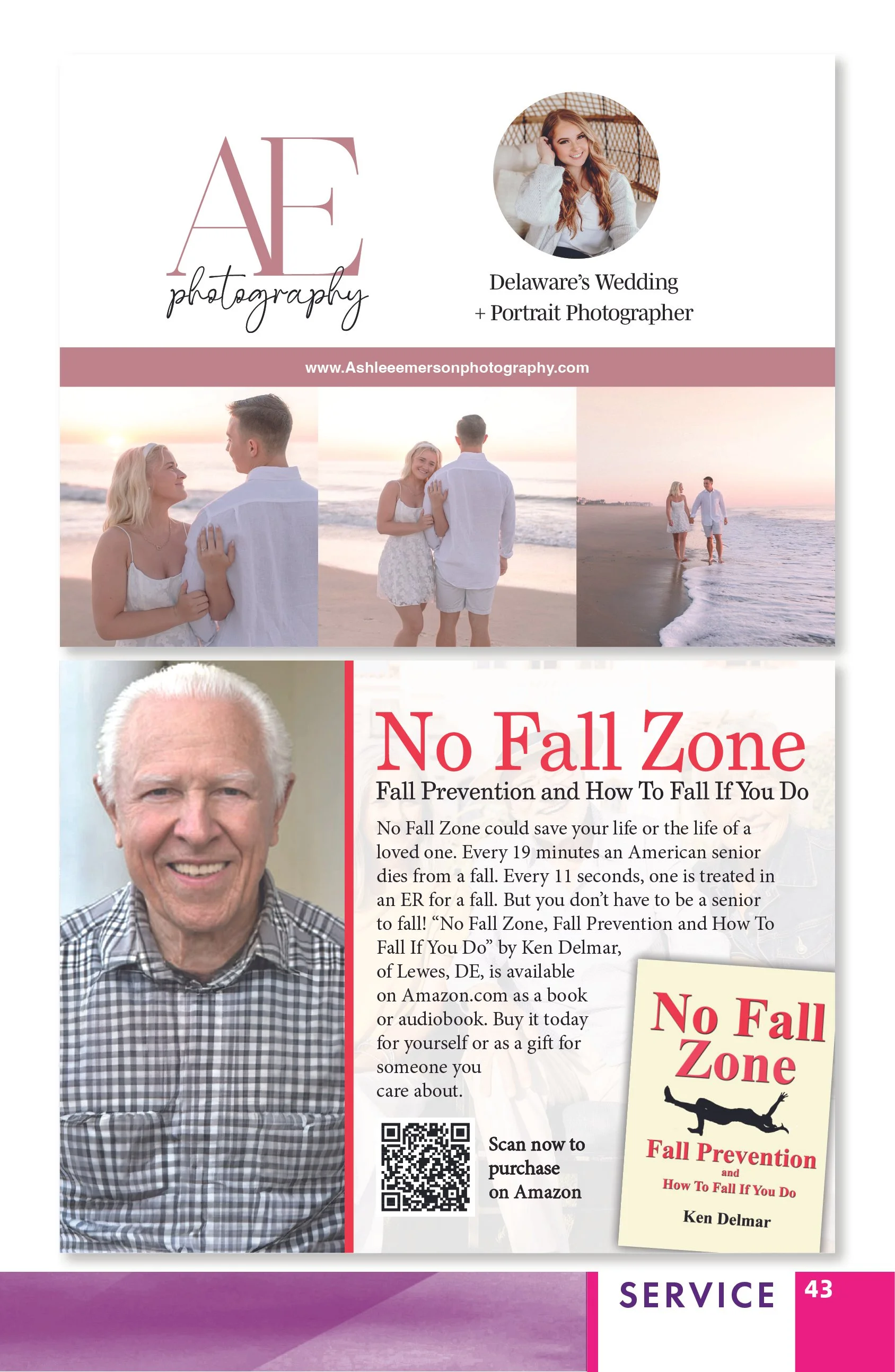
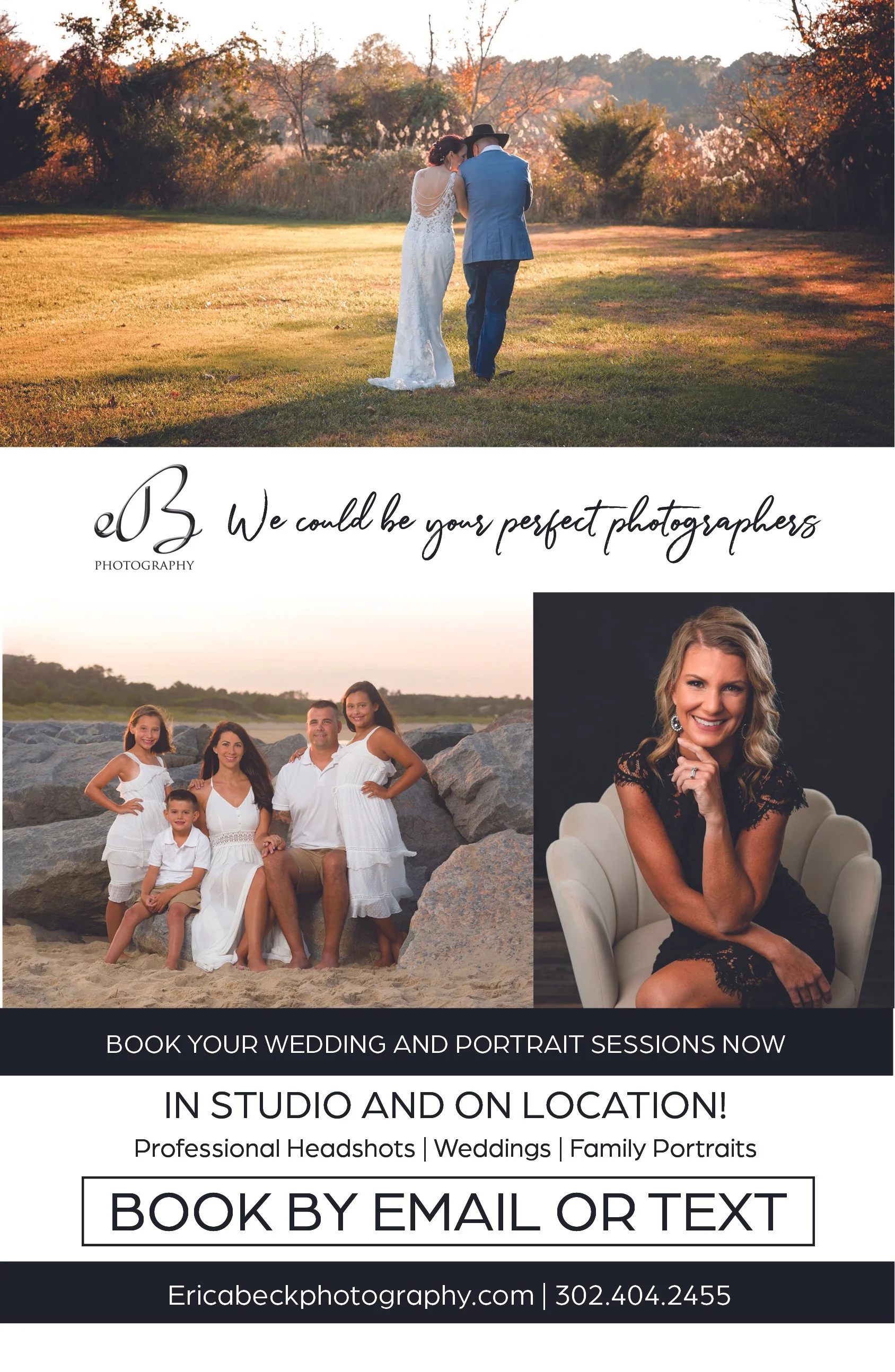
I designed the publication system to accommodate advertisements and sponsored content alongside editorial features while maintaining clear hierarchy and visual separation. This allowed the guide to support its business objectives while preserving a polished, reader-focused experience.
The Result
The finished publication delivered a vibrant and accessible guide to the Delaware beaches that balanced editorial storytelling, visitor information and business promotion within one cohesive visual system.
The project demonstrates my ability to take ownership of a large-scale publication from initial creative direction and original illustration through editorial design, art direction and final production, while designing for both the audience experience and the publication’s broader business goals.
Recognition
Winner of the 2024 GDUSA Digital Publication Award.
Visit Rehoboth Fall Issue
-
A 47-page seasonal visitor guide that extends the Visit Rehoboth identity into fall through custom illustration, warm editorial styling and flexible layouts for stories, resources and advertisers.
-
My Role
Lead Publication Designer & Art Director
Project Scope
Creative Direction · Cover Illustration · Publication Design · Editorial Layout · Visual Systems · Typography · Image Art Direction · Advertiser Integration · Digital Production
Project Overview
Following the summer edition, Visit Rehoboth needed a fall publication that would continue the established visual identity while introducing a distinct seasonal experience for visitors and local businesses.
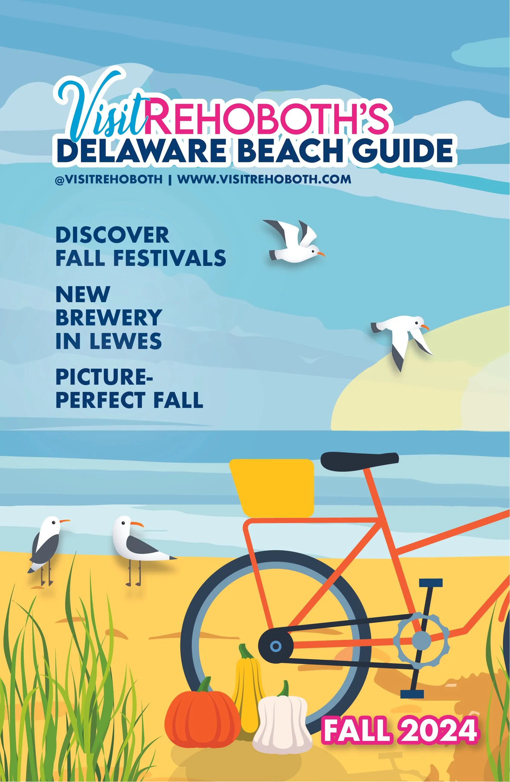
I led the visual development of the 47-page guide, creating the illustrated cover from scratch and adapting the publication system for fall. The custom artwork combined recognizable coastal imagery with autumn elements, including a bicycle, pumpkins, shoreline grasses and seagulls, allowing the guide to feel seasonal without losing its connection to the Delaware beaches.
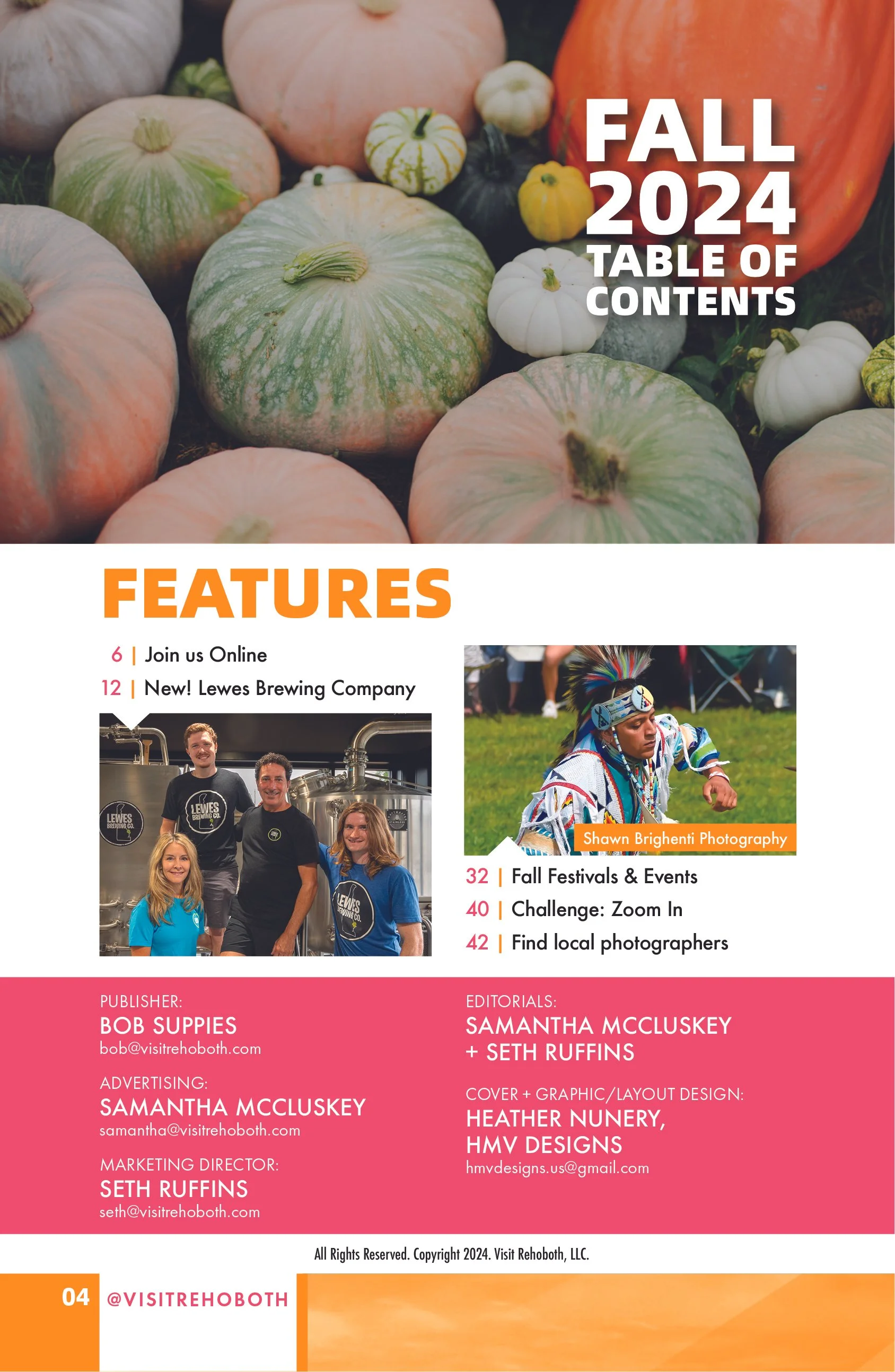
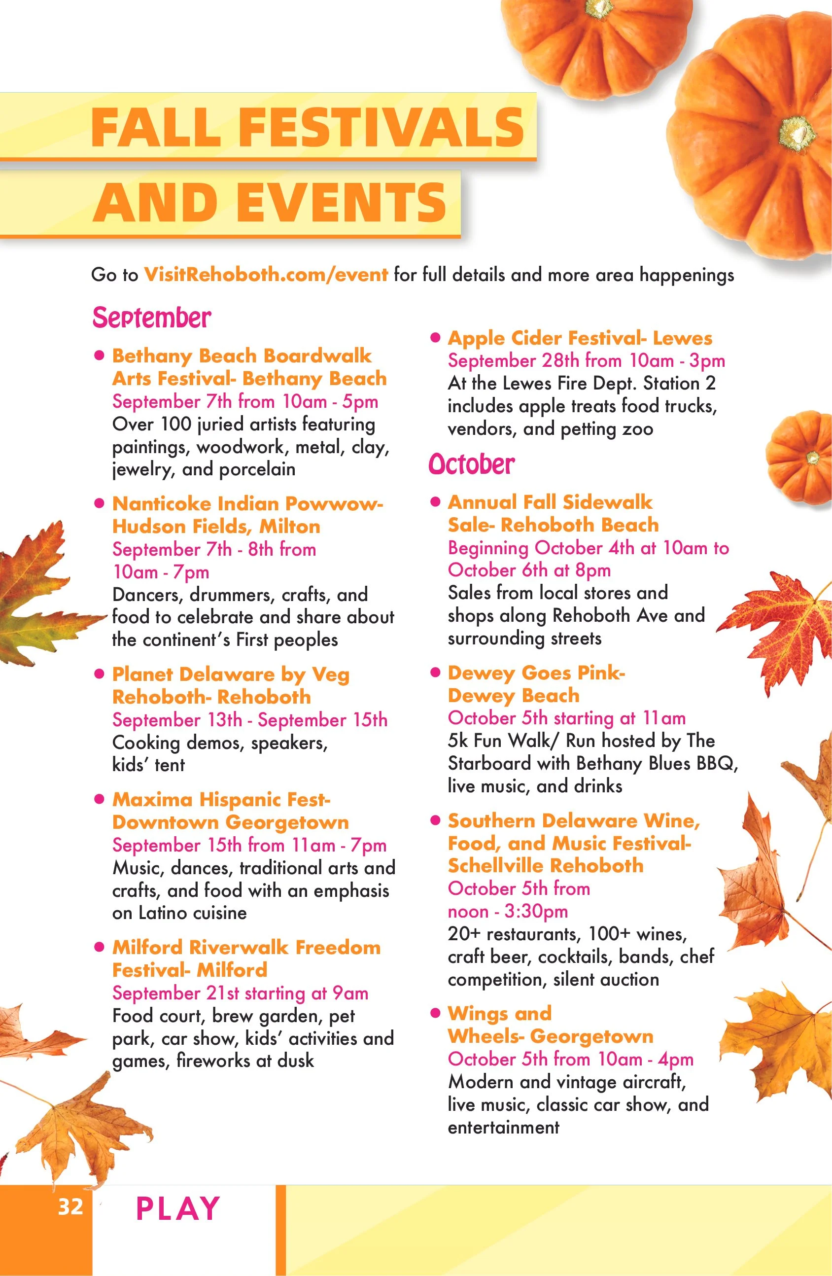
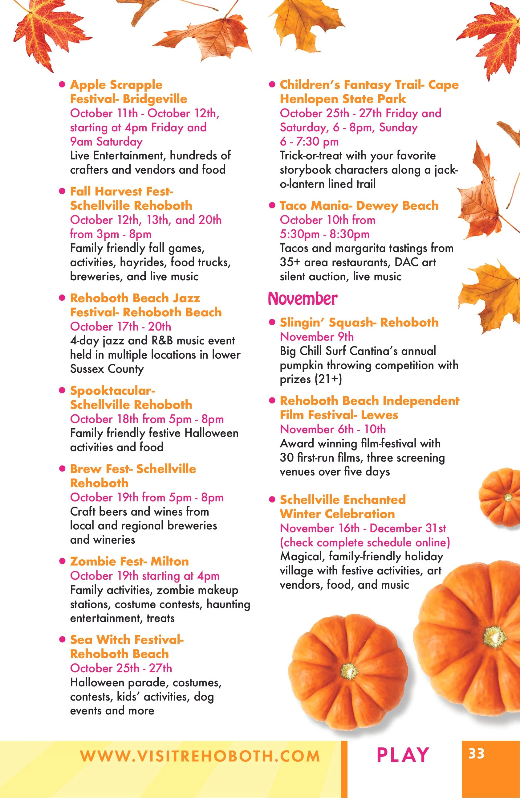
Throughout the publication, I used warm seasonal accents, bold typography, color-coded content sections and flexible editorial layouts to organize articles, event listings, visitor resources and advertiser content. Feature spreads highlighted local businesses, fall festivals, dining, accommodations, entertainment and community experiences while maintaining a cohesive visual rhythm across the issue.
The final guide expanded the publication beyond the traditional summer tourism season, creating an engaging resource that encouraged visitors to explore coastal Delaware throughout the fall while continuing to support local organizations and businesses.
Editorial Challenge
The fall issue required a seasonal shift without losing the recognizable voice of the Visit Rehoboth publication. The content moved beyond summer tourism into dining, shopping, community life and year-round experiences, so the visual system needed to feel warm and inviting while remaining flexible enough for varied stories and advertiser needs.
Creative Direction
I developed a richer seasonal palette and adjusted the pacing to create a more grounded editorial tone. Large photography established atmosphere, while structured columns and clear headlines made longer features easy to navigate. The layouts allowed architecture, food, people and local details to work together as a broader portrait of the destination.
Building a Cohesive Issue
Every story arrived with a different combination of copy, photography and supporting information. I used a modular grid to maintain consistency while giving each feature an appropriate visual emphasis. Repeated typographic cues, disciplined spacing and purposeful image groupings connected the pages from beginning to end.
Editorial and Commercial Balance
Local businesses were an essential part of the issue. I integrated advertiser and partner content into the page sequence so that it remained visible and effective without interrupting the editorial flow. The result was a publication that served readers, visitors and participating businesses equally well.
Production and Result
I managed the issue through final print production, checking image resolution, typography, page order, alignment and visual continuity. The completed fall edition extended the publication’s seasonal identity, strengthened its destination storytelling and demonstrated a scalable approach to regional editorial design.